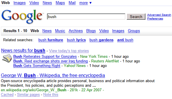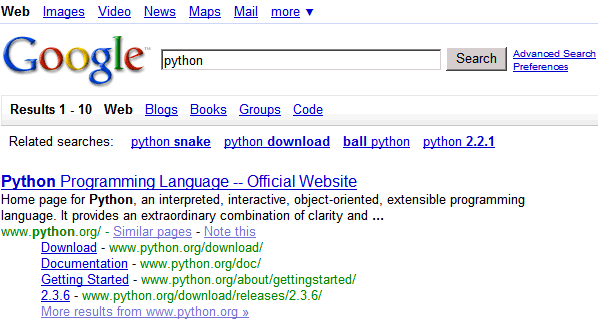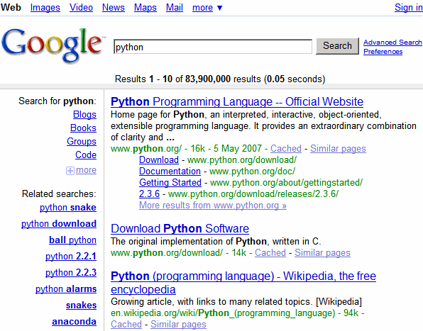
Courtesy of Webbsnack, here's how you can test this new design.
Copy this code:
javascript:document.cookie= "PREF=ID=fddb01133a87d314:LD=en:CR=2:TM=1177334998:LM=1177334998:GM=1:S=OOg0FEVzpPplxe9J; path=/; domain=.google.com";void(0);
go to google.com/ncr, paste it in the address bar, press enter, then search for something clever. I absolutely love the new design, but if you don't like it, clear your Google cookie and it'll go away.

Small observation: the number of results should be at the top of the page. I sometimes search for things on Google just to see the number of results (this is my primitive grammar checker).
Update: There's an alternative version for this new layout.

The code for the second design (via Blogoscoped):
javascript:document.cookie= "PREF=ID=9d04e374b01fd77c:TM=1177187296:LM=1178229339:DV=AA:GM=1:IG=3:S=Iiqx5SsQA0p79zvy; path=/; domain=.google.com";void(0);
Pretty slick, like it and YES, the number of results should be on top
ReplyDeleteo nice
ReplyDeleteI really like this design! I agree, the number of results would do better at the top.
ReplyDeleteGreat!
ReplyDeleteI don't see to the dictionary page anymore. Many of my searches are for spelling and definition purposes. This needs to be replaced up at the top.
ReplyDeleteGreat, just the number of results should be at the top as you all said and I would rather see the Next page button and the results ABOVE the second input box.
ReplyDeleteIt's a bit new to have the Goooooooogle search on the bottom left and not bottom centered. It should be above the second input box.
ReplyDeleteThe related searches is a really cool feature to help people refine their searches, but the way it is presented makes it look like ads. That needs some working on.
Yep, I liked the centered aspect of the results. It gave balance to my screen. I probably need to see it a couple of times before I get used to it. What I REALLY like is the links to others search queries and others google search engines on top.
ReplyDeleteI agree : numbers should stay !
its not working for me for some strange reason.
ReplyDeleteI get redirected to google main page...
Yeah, I was also redirected to the Google Homepage!
ReplyDeleteYou can't be redirected to the homepage, because my direction said to type the JS code when you are at Google's homepage. After you paste that JavaScript code, nothing should happen (the void(0) should prevent this). Just type your query and you should see the new design.
ReplyDeleteI indicated to go to google.com/ncr because that code won't work for localized versions of Google. If you use google.de, you'll have to replace google.com with google.de in the code.
If it's still not working, what browser/OS do you use?
Just let you know, I translated your post to Traditional Chinese again ( 2nd time ). ( previous one is here ) ^^ thanks a lot.
ReplyDeleteIt works great in Firefox, thanks. I tried it in Internet Explorer and Google Page, it doesn't work there though with the Javascript code.
ReplyDeleteIf you are using the Stream result from CustomizeGoogle in firefox, it doesn't work, at least for me.
ReplyDeleteI tested the code with four browsers:
ReplyDelete* IE 5.5 - it didn't work
* IE 7.0 - ok
* Opera 9.20 - ok
* Firefox 2.0.0.3 - ok
It's a standard JavaScript code that saves a cookie for google.com.
agree with Justin...
ReplyDeleteBut, that's because, if you stream the results then it always displays 'Results 1 -10' at the top. I mean it will never say 11 - 20, even after you have gone through 1000 pages. And that's logical.
However, if you are using the customizegoogle add-on for FireFox and if the option for link to other search engines is on, somehow it disables it and now it doesn't give links to Yahoo, MSN etc.
Customize Google and other scripts that change Google's interface (or any other web page) rely on some things from the code: the id of an element, some fixed text, the path to a table etc. If Google redesigns the page, the code changes and some of these scripts will fail to work.
ReplyDeleteIt sucks. Search menu (web, images, video…) is related to search field. On the top it looks like "click and go away" not as switch search.
ReplyDeletePlace there links to the services like gmail, reader and so on and leave search tabs next to the search field.
justin: I've tried streaming with the new design. It should be working.
ReplyDeleteIonut Alex Chitu: Everything, except links to other search engines, works with the new design. Links to other search engines will work with the next CustomizeGoogle version.
Did anybody notice the results page scrolling down indefinitely as it is in Live Search, whoa, there is no need to click the "o" in Google anymore!
ReplyDeleteI found my own problem. It was not with CustomizeGoogle; the problem was with TabMixPlus since I made it open a new tab from Address bar. So, when I paste and enter the script, it simple open a new Untitled tab. Now I disabled it and tested the script with CustomizeGoogle turned on (including Stream result), the new interface is working and so is the streaming of results.
ReplyDeleteSorry to have said the problem was with CustomizeGoogle.
Prasanna: It's not the new interface that streams the search results.
ReplyDeleteJust an update
ReplyDeleteGooglers may look at the blog ?
The result numbers are at the bottom of the page at the right side of "Next".
Nice information. Funny how others took your work and claimed it for their "find" while browsing.
ReplyDeleteThat crap catches up on people.
Keep up the good work.
The Google homepage should have been left alone.there was no need to mess with a design that has worked for years,but i quess someone at google needed to justify their paycheck at stockholders's expense.
ReplyDeleteI hate this new layout with a passion. Switching search types (something I do a lot) is very uncomfortable with this layout, and the top bar looks a bid empty, especially when viewed in widescreen.
ReplyDeleteI hate the new layout.. I use Google groups a lot and I hate clicking the stupid "more" option, and I don't like that the "web" option changes locations once you're in the groups search. (i.e. I used to easily switch between groups and web... not I have to "more" from groups, and web isn't the left-most option.
ReplyDeleteAnyway to disable this?
I found my own problem. It was not with CustomizeGoogle;I use Google groups a lot and I hate clicking the stupid "more" option,i quess someone at google needed to justify their paycheck at stockholders's expense.
ReplyDelete