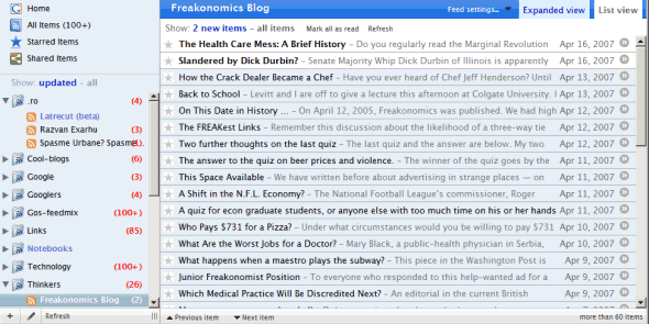
Hicksdesign
wrote a custom theme for
Google Reader, influenced by the clean design of Mac applications. The theme is actually a user stylesheet that includes new icons and leaves more room for the content. It should work in Firefox, Opera, Safari, Camino, Omniweb (from the instructions, in Opera and Omniweb setting up the theme is a one-step process).
There's also
a similar theme for Bloglines, the elder brother of Google Reader.


seems really mac
ReplyDeleteexcept for the windows scroll
ReplyDeleteit's horrible!
Razvan Exarhu in reader. Bravo dom'le, bravo! :))
ReplyDeleteLove the Freakanomics blog shoutout... That's one of my favs!
ReplyDeleteyeah, the windows scroll is a little bit annoying.
ReplyDeletebtw, how about putting tis theme for gMail. I've always thought that the gMail layout is not so good
1-click Apollo version: jinsync.com
ReplyDelete