
At the Searchology event that happened today at the Googleplex (and is still available here), Google talked about the past, the present and the future of search. They explained that search is a difficult subject with a lot of problems yet to be solved, but search is still Google's core competency.
Universal Search
Google launched the universal search that adds news, images, videos, books and local results in the standard results. "Google's vision for universal search is to ultimately search across all its content sources, compare and rank all the information in real time, and deliver a single, integrated set of search results that offers users precisely what they are looking for."
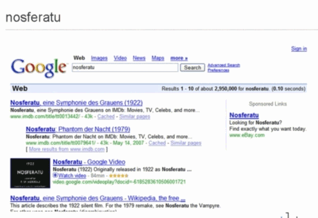
This screenshot shows a video integrated in the main search results and a Plus Box that lets you view the video inline. And in the case of Nosferatu, you can see the whole movie.
New Design
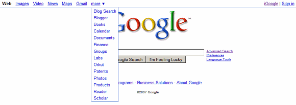
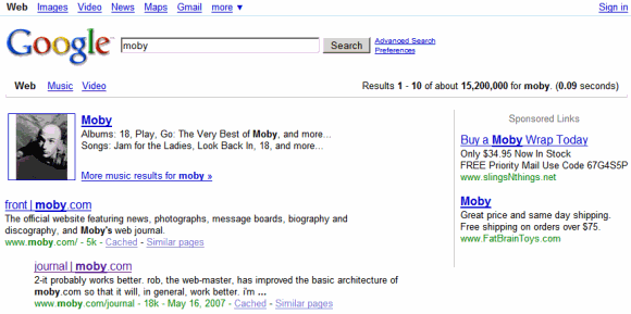
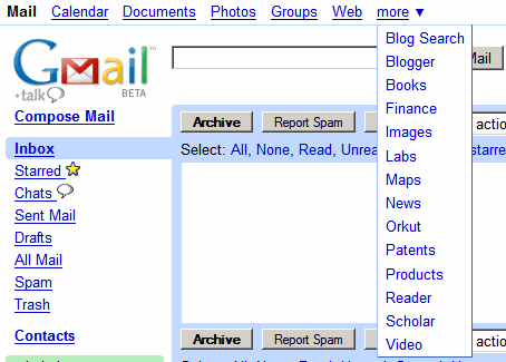
The interface we talked about last month will also be live for everyone. Google adds a horizontal navigation menu to all of its services, but the menu will feature different links based on the page you're currently viewing. Everything will go live in a few hours.
Search experiments
But the most exciting launch for those who try to find all the new Google features is Google Experimental, a new place from Google Labs where you can see new features and layouts tested for the search results. You can play with them and send feedback so that Google makes them better and they eventually become a part of the Google search experience.
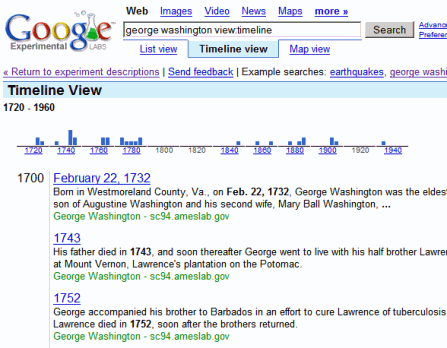
As anticipated here, Google tests new ways to view results. "With the timeline and map views, Google's technology extracts key dates and locations from select search results so you can view the information in a different dimension." So you can view the location a page refers to on a map. There's also a timeline view that shows results sorted by the most important dates included in the pages.
Another cool new feature is keyboard shortcuts for the search results. For example, you can navigate in the list of results by pressing j and k and visiting the selected result by just pressing enter. Like in vi and Gmail.
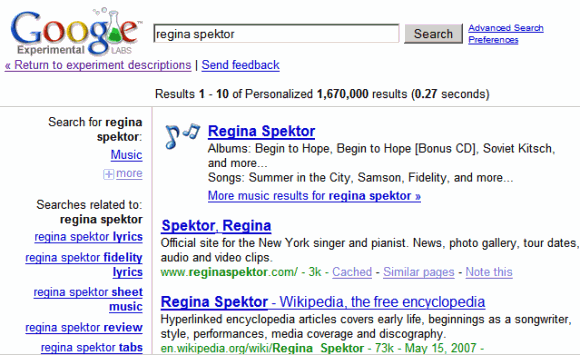
Google also tests two designs: one that places the navigation links and the refinements to the left:
... and one that moves them to the right:
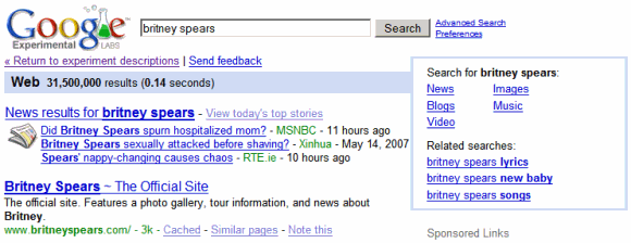
Now you don't have to change your cookies to test new designs anymore, you can just use them from Google Experimental. That doesn't mean Google's random experiments end here: they'll still test features on small samples of users, but those who want to see the new features have a Google site to quench their curiosity.
Searching for meaning
But Google's experiments with search continue. In the next weeks, Google's quality will improve by including results from modified queries that are likely to produce better results.
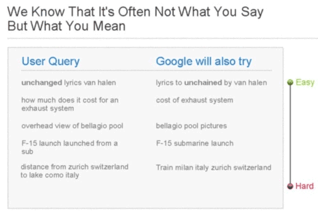
They'll also translate your query into 11 other languages and show results from these searches if they're relevant. Just in case you search for [French recipes] and the best French recipes are... in French. Using Google Translate, you'll be able to read the pages in your native language. As if everyone spoke a single language.
To sum up
Google's search results will be better because they'll include content from specialized search engines. Google will translate your query to different languages and even slightly alter it to show better results. It will also be easier to navigate to other Google sites and to go to the most appropriate service for your query.
What if I don't want my web search polluted with multimedia results and search suggestions? Will there be a Google Classic?
ReplyDelete"I do think this opens the door for a richer medium on the search results page," said Marissa Mayer, Google's vice president of search products and user experience. "For us, ads are answers as well."
ReplyDelete...so this is a prelude to video ads in Google search results?
Is Google jumping the shark here? I find this whole thing worrying.
<< What if I don't want my web search polluted with multimedia results and search suggestions? >>
ReplyDeleteWhat pollution? The only new thing you might see is a thumbnail for news, videos and images. But that should be useful.
Google search has always included all kinds of pages. Google Video, YouTube, Metacafe etc. were indexed by Google and you could see them in the search results. This is a good opportunity to discover interesting content from Google Books, for example. I bet that very few people explicitly search for books, but sometimes a book could be the perfect search result.
<< so this is a prelude to video ads in Google search results? >>
ReplyDeleteI don't think so. For the moment, the only Google properties that test or have tested video ads are Google Video and YouTube. And they're still experimenting even on these two video sites.
Marissa mentioned in her answer that they don't have video ads in plan for Google search. But you never know...
"What pollution? The only new thing you might see is a thumbnail for news, videos and images. But that should be useful."
ReplyDeleteThat pollution! You didn't get images and video preloads before, and the addition of even MORE suggestions at the bottom of the page kinda sucks. I've always found "did you mean" unhelpful and annoying, and now there's more of that?
I don't even care if they leave the main search as a horrible amalgam, but a Google Classic would be nice for non-lowest-common-denominator users.
Some reasons for the universal search.
ReplyDelete*** the OneBox is... one box
<< Until now, we've only been able to show news, books, local and other such results at the top of the page, like this example for [trends in education]. But it's a tall order to earn placement at the top of our search results, so plenty often we end up not showing these kinds of results even when they might be useful. >> (Google Blog)
*** too many search tools, too little time to check all of them
<< Back in 2001, Eric asked for a brainstorm of a few "splashy" ideas in search. A designer and product manager at the time, I made a few mockups -- one of which was for 'universal search.' It was a sample search results page for Britney Spears that, in addition to web results, also had news, images, and groups results right on the same page. Even then, we could see that people could easily become overwhelmed with the number of different search tools available on Google -- let alone those that would be created over the next few years. This proliferation of tools, while useful, has outgrown the old model of search. We want to help you find the very best answer, even if you don't know where to look. >> (Marissa Mayer)
*** better search results ranked globally
<< Now you'll be able to get more information Google knows about directly from within the search results. >>
Mr. Anonymous,
ReplyDeleteIf you don't like Google improving your search you are free to use Yahoo! I hear they don't clutter their search results with valuable information. Though good luck navigating Yahoo!
Mr. jdmartindale, by the same logic if you don't like my ideas you're free to not respond to my posts.
ReplyDeleteI don't believe worshipful Yes-Men have never been good for creative refinement. The reason I criticize Google is pretty much because I don't want it to become as crappy as Yahoo.
I don't like the new format. I appreciated the smaller links at the top, as well as links to things that were most important to me - such as Google Reader! How could they just remove that button and put it in a dropdown? Argh!
ReplyDeleteI'm using Camino browser on an apple iBook G4, and the Google logo doesn't appear right in all pages of my search results.
ReplyDelete<< How could they just remove that button and put it in a dropdown? >>
ReplyDeleteMaybe they should've let you choose a list of favorite services.
is there a way to use the old google search? i dont use jscript if not necessary, especially not on google, and now i dont get imagesearch link without jscript
ReplyDeleteand i dont want to search for videos and images, when i search for information (when i search for video and images, i go to video or image search)
so pleaseeeee, is there a way to change this new layout and search to old one, thank you
desperate
Well, if you're desperate, here are some ideas. Maybe they work for you:
ReplyDeleteDirect IP address: http://72.14.207.107 (other datacenters)
SearchMash: http://www.searchmash.com (Google experimental interface)
Scroogle: http://www.scroogle.org/cgi-bin/scraper.htm (this is a scraper)
AOL Search powewred by Google: http://search.aol.com/aol/webhome (WTF, AOL looks exactly like the old Google!)
At least your post explains why my google homepage has become more cluttered and unusable. [insert google fanboy rebuttal here] I like how they give you a choice of using iGoogle; perhaps they could extend that concept of "choice" to these recent "improvements".
ReplyDeleteI'm honestly rather surprised to see such a negative response to the new interface and developments with Google. The interface is a much needed overhaul, IMO, and it's nice to see some of the obscurer search features more readily accessible now. I suppose you can't please everyone, though, and change is one of those things that so seldom goes down well.
ReplyDeleteFor those of you begging for a Classic interface, www.google.co.uk still uses the old style interface for the time being, so if you are adamant on your continued use of the "Classic" style, then that's one solution for you. Not sure how long it'll be till we Brits catch up with the US interface, though, so it may be a stop gap solution at best.Now, personally, I can't wait for us to adopt the new interface for the UK site, but maybe that's just me judging by some of the comments.
As for the Universal Search / including image / video in search results... well... again, I'm all for it. If I'm searching the Net for something, I'd like to be presented as much relevant data as possible, irrespective of the form that data comes in. Google may be able to provide a more relevant result by incorporating these different search facets than if they relied on the older web page only search. Why feed me 10 useless hyperlinks when by expanding the search breadth you can give me more useful, targeted and relevant content that may otherwise have been excluded? So long as Google doesn't become cluttered with this new array of results, and I have faith in Google's design team not to allow that to happen, then I, for one, more than welcome these changes to the system.
Also, wow... people are still paranoid of using Javascript as part of their web browsing experience? Mind boggling. I do try to stick to server sided scripts when I'm doing web design for this very reason, but it's so long since I met anyone who refused to embrace Javascript that I was beginning to think that I was being overly conservative and catering to a non-existent niche. I don't know whether to be pleased that there is a niche my programming caters to, or a little disheartened that Javascript is still being viewed as a boogeyman in some quarters.
begging... paranoid... some people really can't take criticism of the Goog without resorting to personal attacks on the critic. That's weird.
ReplyDeleteI created a module that allows you to configure the links at the top of the page.
ReplyDeleteYou can get the module here
Share and Enjoy.
Paul
PS - Great Blog!
I'm pretty surprised by the example shown here: so Google is supposed to enhance the search "overhead view of Bellagio pool" by the query "bellagio pool pictures"... Really? Isn't Google supposed to search "bellagio pool" in Images search instead?
ReplyDeleteDo you know what's funny? All the blogs that talked about this feature managed to ruin the top results for this query: overhead view of Bellagio pool.
ReplyDeleteAbout your question, Google doesn't change the scope of the results. So the search results page [bellagio pool pictures] should include some relevant images and a link to more image results, but not redirect you to Google Image Search.
Sometimes you can find very good web pages that include a lot of pictures related to your query if you search for: [query images], [query pics] or [query screenshots].
E.g.: Windows Vista pics
what happens if u cant see the white bar like i can see the tools at top but i cant see the white bar, i cant see the new google design for some reason
ReplyDeleteLike a few others have already said.......... K.I.S.S. (Keep It Simple Stupid).... they need to hang that up in their offices. My eyes type in the center of the screen, I don't want to have to look way up in the corner if I don't need to. If they want to put in more options I'm all for that but at the same time shouldn't change the way things look and feel, an OPTION should be something I can add... IF I WANT TO ADD IT... NOT THEM! When I go into Google Video and click something I've searched for and I get a big search frame in my face it just whizzes me off. Just a personal opinion but Google needs to get rid of all the "Big Shots" and get back down to the "nitty gritty", to many people over there having to create stuff just to keep there jobs and telling the users how it's better for them (sales and marketing).
ReplyDeleteDid I read that one piece correctly... it pretty much said.... the users weren't using that so now we stuck it in there face because we want them to use it.
It's pretty bad, I now have http://72.14.207.107/ and http://video.google.com/ seperately bookmarked in my personal toolbar (Firefox) right next to each other... two Google bookmarks instead of one!
Despite the 3 methods listed by Google for getting rid of the drop down list of previously entered searches, I cannot get rid of the list. No way! No how! And the list ONLY appears under Google, not Internet Explorer.
ReplyDeleteI sure hope the maker of the "Customize Google" addon for Firefox gives us an otion to block videos on the search results pages.
ReplyDeleteIf not I'll have to dust off my Platypus addon and do it myself. :)
Well it seems like other search engines already have these features yet it has been shown that google gets 40% more traffic than those sites. So why would google change an already working system? Personally the only negetive I see so far is a more condensed page with options I don't really care about. Therefore, with all things considered, google should just give the user two, clear options on what they want to see: old-school or new-school.
ReplyDelete