
Announced in April, the new version of iGoogle that brings social applications is tested in a small number of randomly selected Google accounts.
The new iGoogle places the tabs on the left-hand side of the page and you can expand the tabs to see the list of gadgets and status information, like the number of unread Gmail messages. There's a new chat feature borrowed from Gmail that lets you chat with your contacts while visiting iGoogle - that means iGoogle gets a sense of presence because you'll know when your contacts are online. Since the chat feature will be enabled by default, it's obvious that Google will be able to add options for sharing items and discussing posts with the contacts that are online.
iGoogle also adds a list of updates from your contacts similar to Facebook's newsfeed: you can see stories shared by your contacts in Google Reader, recent photos uploaded to Picasa Web Albums, Google Talk status messages, shared iGoogle themes and gadgets.
Another change is that gadgets have an expanded interface, called canvas view. Gadgets authors will take advantage of this to display more information and make their gadgets more interactive, while your feeds can be read in a Google Reader-like interface. In the future, iGoogle will support OpenSocial applications and the transformation to a social site will be complete.
Google announced that the canvas view will be rolled out to a small percentage of users this month and to more users in July, while the OpenSocial applications "will not work in production until later this summer".
Update (Oct. 16): The new iGoogle has been launched.

foisting the side bar tabs on the end user is rude and arrogant. in my role as an instructional technology coordinator i have canceled friday's in-service for 100+ staff establishing igoogle as a start page. the failure to offer an opt-out choice for the side-bar-waste-of-space and the inability to move gadgets among tabs dissuades my advocacy. this is a quality-lacking, disappointing change by and to igoogle.
ReplyDeleteHATE IT!!!! what were they thinking over there at google? they should have at least given us the option to keep it the way we had it, not just change it on us. Don't like it at all! I hope they read this stuff so they can see how many people feel the same way!
ReplyDeleteGOOGLE PLEASE CHANGE IT BACK!!!!!!!!!!!!!!!!!!!!
Everything looks funny... I don't really like it
ReplyDeleteNew layout sucks, and I don't want to see the first line of my emails or edit them from googleig; thats what gmail is for!.
ReplyDeletePD: google.com.ar/ig still has the old layout.
My homepage was also "upgraded" this afternoon without my desire to do so. Google had a good thing going: integrated everything! If I have to switch to a different homepage, it means another login for me when I want to check my email... UGH. Worst part: tab things on the side.
ReplyDeleteThanks Alex for the Tip on the UK Google I tried it and my homepage is back as it should be Yeahhh!!!! lets hope it stays that way ;0
ReplyDeleteI'll be ok if you give me the option to have my tabs back on top. I want three apps columns. Not three apps and the new tab only column (which makes four).
ReplyDeleteWell,.. " finally launched"
ReplyDeleteI want to hide the left-hand navigation tab. Since I only have one page of information, which contains just the info I want to see at a glance when I start my browser, the left hand navigation is useless and takes up 1/4 of my screen width. I would love an option to "collapse" that column and free up that space for the actual content.
Please FIX this.
I really liked the old version, why can't we "customize" according to our needs, that left bar is totally a waste of space for some people.!
I really dislike the new page. It was an unpleasant surprise.
ReplyDeleteUgh. I might have to go back to My yahoo. Get rid of the "home" thing on the left taking up all of my space!!!!
ReplyDeleteHuh. Well, this is weird. (1) the day started with Google having: restarted my computer, signed me out of iGoogle, disallowed yesterday's 20-browser Firefox session to be re-instated, lost yesterday's work, and shoving this new shit left column/tab on iGoogle; (2) this afternoon despite homepage being iGoogle, it started defaulting to a shitty new version of gmail, despite repeated attempts to get back to the dashboard view with my tabs and RSS feeds; (3) now a 3rd view of new iGoogle has appeared WITHOUT the left column/tab (thank jeebus) but featuring these bloated unwieldy expanded RSS summaries - which, when you disable (per above) takes away ALL summaries - so it's all or nothing: giant summaries or headlines only.
ReplyDeletegmail is chaos and a total shit experience like removing SEND option from the top of your compose window and requiring scrolling to the bottom of the thread to find SEND and so much more.
This is nothing short of bizarre. WTF is going on with Google???
This is horrible! Please give me my old page back!
ReplyDeleteugh. This has made my page cluttered and ugly.
ReplyDeleteIt wastes space at the side, and this together with the details under every news headline means I have to scroll way down to see all my gadgets.
I like headlines, if I want the rest of the story I can hover or click. I don't want the whole story right there.
I hate the sidebar. Hint tabs go on top - see Chrome. Really mean not offering an opt-out. Its kicking off on the wires - PULL IT NOW!
ReplyDeleteI think it sucks! I want my old layout back? the "HOME" sidebar is useless and takes up space. How do I get rid of it?
ReplyDeleteI also do not like this new version
ReplyDeleteBut thanks to the use above who said to use Adblock plus and
google.com#TD(class=leftborder)
...thanks...it basically back to normal :-)
my screen isn't as wide as yours. give me the option to remove it
ReplyDeletealso, if some gadget is selected in the sidebar, and I hit the "home" hotkeys on my browser, it stays on the gadget. Now I have to hit my brower's home PLUS google's home just to get back to the gadget summary?
ReplyDeleteNot that I'm leaving Google. My Yahoo looks interesting. UI seems solid in comparison to this mess. Has anyone had experience with My Yahoo? Good or Bad?
ReplyDeleteHate the tabs. Hate the summaries. Just like everyone else here. Google should at least give us the option to choose which version of iGoogle we want.
ReplyDeleteI DETEST the new igoogle. My account, e-mail, search are all going to yahoo unless google lets me know how to go back to the old format in the next couple days. I think there pretty arogant changing things without letting us have a say, or giving us the option to stay with the old format. Perhaps it's just the geek mentality that gets off on new programs with no thought to the human beings who actually use them--and pay their salaries by making them the largest search engine in the world. The least they could do is give us a link so we can talk to them directly.
ReplyDeletei could get use to the tabs on the side but what's up with each widget having 3x as much text? instead of just the headlines, there is 2 more lines of description... WAY too much wasted space...
ReplyDeleteI don't like the side tabs either. I'm okay with the new functionality, just not on the side
ReplyDeleteI hate igoogle now, can't stand to look at it. How could they ever think this was an improvement. This is where product drives design and leaves out the users.
ReplyDeleteworst part is, you can't even contact google to complain. you have to post is some blog that won't get read by people who can make a difference
ReplyDeleteCan't send from gmail within new igoogle. Must go to "full gmail". It sucks. Change it back.
ReplyDeleteI prefer the old system much better over this
ReplyDeleteGooge guys -- take a minute to stand in a circle and repeat together the successful web-designers mantra:
ReplyDelete"USABILITY! USABILITY! USABILITY!"
Tabs on top is the convention. Why? Because that's what people prefer to use.
What happened to my home page??? Is there anyway to get rid of the "home" column? It is totally wasting space on the left. Also, why are the news tabs adding a line of detail? Any way to get rid of that? Much cleaner looking with only the title. Why was this changed? Do we have a choice????
ReplyDeleteI have to agree. I do NOT like the new layout. I liked having my tabs. This new way uses up way too much screen real-estate.
ReplyDeleteI had had my igoogle as my homepage for quick access and convience. But until it goes back to my preferred way I will quit using it. I know this wont effect google in any way but I wont use something that I dont like and I no longer like igoogle.
igoogle suddenly became an oxymoron. Don't fix it if it ain't broke! At least give me the option to go back to the original format.
ReplyDeleteI can't believe google let me down. Woe we be.
As someone above said you can use
ReplyDeletehttp://www.google.co.uk/ig
to have your old layout. So until they wake up and fix it, or until they force even the uk igoogle to be the same screwed up personal page as they screwed up the rest, I'll use
http://www.google.co.uk/ig
for my homepage. If it gets screwed up as the rest are then it's back to my yahoo for me also.
I HATE THE LEFT MARGIN!!!! WITH A PASSION!!!!
ReplyDeleteI always welcome iGoogles tweaks but this new change is completely controlling! Why?? Why not have a tiny button to test out the new layout and go back to old if you want to?? I swear, all the reasons that I have been loyal to Google over the years just seem to be very slowly disappearing! VERY DISAPPOINTED ABOUT THIS! VERY VERY!! It's like someone coming into your very spacious living room and adding a partition without your consent! My home page is the most important part of the internet for me... absolutely out of order Google, you should be ashamed!!!!!!
I am using
ReplyDeletehttp://www.google.co.uk/ig
now. Thank you for a tip.
What a disrespect to their customers.
Google is evil :-(
The interface looks cleaner, but I still like the tabs at the top and the expandable stories.
ReplyDeleteUseless bells and whistles. One of the reasons I really enjoyed the old google layout was it fit quite well to the (smallish) screen of my venerable Dell 600m--now everything is cramped, and there's a nasty lack of balance. Hasn't anyone at Google ever taken a course in publications design?!?
ReplyDeleteThis side tabs is just waste of screen space. Put the tabs back on top. The new style of gadgets is generally good, especially the gmail. And... let us choose by ourselves if we would like to join the experiments.
ReplyDeleteIt's one solid page of text with no white space, like a newspaper. Really difficult to read onscreen. Since the left tab is not optional I will check out other alternatives.
ReplyDeleteThanks for trying, but this look doesn't work for me at all.
I really don't like this tab on the left..everything is smooshed and I had it just like I liked it. I'm turning off iGoogle.
ReplyDeleteNever thought I would go "backward," but I just set up myYahoo. It's not bad! Better than this new iGoogle. Only thing missing is RSS to gmail, tho the way gmail is trending...
ReplyDeleteHate it. Give us the option of the old layout or the new one. Then the people will decide.
ReplyDeleteI don't like it either. I guess I have to go back to Yahoo. : (
ReplyDeleteI hate the left menu of the 5 things I can already see on my home page. An uneeded layer of complexity. Why? WHY!
ReplyDeleteIt would be nice to have the option of placing tabs back on the top. I sometimes use a vertical screen and the sidebar takes up too much room.
ReplyDeleteThis is ridiculous! I've spent half an hour trying to figure out how to attach a file in the new Gmail and I still don't see how... I rely on google and gmail for work and I'm at a loss. It's despicable how google is forcing this half-baked beta on us like we're guinea pigs.
ReplyDeleteI agree - I want the old style back. The left nav takes up too much room and now I can't fit all my stuff on the screen. If I program all of my hot links and bookmarks in the middle, what do I need the left nav for?? Nothing! I don't like the expanded widgets... again, I want them collapsed for a reason and don't want the whole page filled up. And I REALLY don't like when one of the items I click refreshes into a frame below the google header. I want a new clean page.
ReplyDeleteIt's not just the left tabs.... I can't even click on my mail to go to the sender's web.
ReplyDeleteEven ATT site is much better than this new Google page. Absolutely terrible!
I got it and I hate it. One of the things I liked about the old iGoogle interface was the expanding/collapsing headlines. I like the option of seeing less by default and expanding if I want to see more. Google hasn't left me with that option. My browser now looks cluttered and busy. I also like the tabs on the top.
ReplyDeleteBetter find a way to hide those tabs, definitely very annoyed by the unbalanced nature of this distribution.
ReplyDeleteFound this on a Google groups site (http://groups.google.com/group/Google_Web_Search_Help-Personalizing/browse_thread/thread/373cbc3001235fa9?hl=en#)
ReplyDelete>Firefox users - there's a greasemonkey script that will allow you to
collapse the annoying sidebar by clicking on an arrow. To use it, you
have to have greasemonkey installed, which you can get here:
https://addons.mozilla.org/en-US/firefox/addon/748
Then restart Firefox, and go here and install this script:
http://userscripts.org/scripts/show/30414
It worked for me!
Well, it seems like the left side bar is a smash hit!
ReplyDeleteI don't know about returning to 1.0, but please let us switch off the left side bar. I'll check back now & then, but it's gmail.com for me instead.
I only have ONE tab! I have been on igoogle for more then a year. The tab on the side is taking up valuable real estate! I am near-sighted! I do like the idea of being able to chat from there though!
ReplyDeleteI seriously hope that Google people read these comments and at least revise to allow the option to revert to the previous iGoogle. New format sucks. Kind of makes me wonder who they had beta-testing...
ReplyDeleteThe side bar sucks but those using firefox can do this
ReplyDeleteThis Adblock Plus rule will remove the new left tab:
google.com#TD(class=leftborder)
Not my post just a copy from anonymous and it works
HATE IT! Please bring back the earlier version of igoogle! I loved it. This one is very inconvinient!
ReplyDeletealso theres no drop down anymore. so if i click on gmail tab, it take me to my god damn mail page when all i want is a drop down!
ReplyDeletePlease go back to earlier version.
I HATE this new igoogle.
ReplyDeleteWhy did they add this? You were able to completely customize what you wanted before!
wow even after reading all the negative reviews, I have to say that I like the new igoogle :D It's crispy clean, professional looking, and I can see everything.
ReplyDeleteWow it looks like utter crap now. Thanks for screwing up my igoogle.
ReplyDeleteAt least the UK language thing seems to "fix" it for the moment.
The asymmetry of the new layout makes me physically ill. If they don't put it back the way it was I'm going to have to find a new homepage. Right now I'm using the Irish version. WTF were you people thinking???
ReplyDeleteI hate the new igoogle! It's so crowded and awkward. Please give me back old igoogle.... Please?
ReplyDeleteFIX FIX FIX FIX FOUND
ReplyDeleteIN IGOOGLE SETTINGS CHANGE LANGUAGE FROM US TO UK AND RESTART THE BROWSER
PRESTO NO MORE STEAMING CRAP
MAKE SURE TO SAVE SETTINGS HTOUGH
ReplyDeleteDear Google,
ReplyDeleteYou're my favorite search engine and that's why you are also my homepage. I have loved you for years -ever since you became the alternative to the ever annoying and ridiculously flashy Yahoo! that only seemed concerned with selling me stuff I didn't want. You were different Google, you anticipated my needs in a discreet, pleasant way with your oh-so-smart text ads. For all of this I have loved you and remained loyal for years.
But today, you ripped my heart out. You put the needs of "developers" ahead of mine. In my eyes you're still the best, but how could you take advantage of our relationship like this? I mean, I love you but I just don't know if I trust you anymore. It's going to take some time to build this trust back.
If you want me and don't want us to break up, please remove the left tab bar and the two line previews that take up so much precious space on the home page . . . space that used to be ours, Google . . . space that left us free to focus on each other.
I want to believe in us Google. Help me believe.
Sincerely,
The Google User.
Add my voice to the "Bad moce Google" crowd.
ReplyDelete-- I dont use chat and dont want it on my page
-- my page in FF3 has decided it can only display 2 columns not 3 - and rearranged all my gadgets
--I want the minimize button back. Why make me click through a menu to get it?
-- The Tab column takes up way more screen space than the tab bar did - and I only have 3 tabs.
I appreciate that google wants to provide its users with new features; I'd appreciate if google allowed users who don't want the new features to change back to the classic design without that roll-up sidebar to the left.
ReplyDeleteWhat a waste of space... I much preferred my old arrangement. How can I get rid of the tabs on the left? And why won't my Gmail open in a new tab? Ridiculous! Gmail won't even open some links in emails for me now.
ReplyDeleteThe left tab is a total waste of space. Please, please make the new layout optional.
ReplyDeleteUsing the uk version works for me, but who know for how long.
ReplyDeleteI guess if the tabs stay on the side I'll eventually migrate to another service like netvibes.
Some cretin had nothing better to do. Please delete this new tab and give us back our old iGoogle.
ReplyDeleteAbsolutely hate the new iGoogle, and hate the way it changed on me without giving me a choice. I could go into all the design and aesthetic reasons, I'm a web designer, but getting the new iGoogle was like being insulted. I used to actually like the look of my home page, and used it to coordinate lots of stuff online. I'm just going to switch or build my own home page from scratch.
ReplyDeleteThe left tab drives me CRAZY! I have a small laptop screen and do NOT need a tab to tell me what I already know! Please give us the option to GET RID OF IT!
ReplyDeleteTo go back to the old igoogle, click on "Classic Home".
ReplyDeleteI loved the new face.
If your goal was to have me return to MyYahoo as my home page. Mission accomplished!
ReplyDeleteNew IGoogle an abomination! My husband and daughter agree. It is like a messy desk, it is visually offensive in the lack of symmetry. It just popped up on our screens yesterday but today I hate it more than ever. Google has been holding its own in this financial mess, but looks like it has a death wish.
ReplyDeleteI don't want to read the whole article on my homepage. I can click if I want to read more.
ReplyDeleteHEY, GOOGLE,COLLAPSE THE FREAK'N EXPANDED ARTICLES!!!
Holly CRAP this sucks! WTF google? What the hell were your 'usability' people thinking? That it would be ok to waste the left 2 inches of screen, showing me whats in a tab, when I CAN SEE WHATS IN THE TAB BY LOOKING AT THE DAMN SCREEN IN FRONT OF ME! Also, what the hell happened to the feeds? There is no more little plus symbol (+) next to the articles, forcing me to open a ton of tabs to read all the feeds. I loved having everything on one single page, its why I used iGoogle instead of Yahoo. This is more like Yahoo than it needs to be. Let us move the tab location, and bring back full feeds of the articles! Damn.
ReplyDeleteDoes anyone at Google read blogs and forums? I did a five-minunte Google search about the new iGoogle and I found the vast majority (read 99%) of comments being negative. Google, HELLO????? Anybody there????? Come on, change it back and we'll pretend that it never happened...
ReplyDeleteI want my money back!
ReplyDeleteOh yeah, it was free.
Can no longer view enough of my Finace Portifolio without shrinking everything else to make it useful. Can't shrink or remove sidebar - takes up a lot of space relative to value. Already have favorites so why do I need or want this sidebar? Give me back old or allow to modify the new!
ReplyDeleteThis new version just sucks. Tabs belong on the top--what on earth does it get Google to take up so much space and put it on the side. It's messed up the entire page. I keep gmail on my page to track the counts. If I wanted a preview of my email on the screen for everyone to see, I'd keep gmail open all the time. Give us choices and stop trying to tell us what we want. Trust me, you do not know what users want better than they do. Stop trying to be another Microsoft!!!!!
ReplyDeleteI thought I clicked on something by mistake to change my views. I don't like it. I want my tabs back on top, it condenses the columns to much.
ReplyDeleteI hate the new igoogle. How do I get the old one back? Does anyone have a fix that works?
ReplyDeleteHATE it. Please give us old igoogle back. This is trash. Give us OLD VERSION! Why would you want to mess up a good thing?
ReplyDeleteWHY would you impose this crap on us? Socialism at work? Part of Obama's New World Order? No, this is not what's "best" for us. This still is America, at least until January! This mess looks like crap, buggey, inefficient, and shoved down our throats. Give back what we had and let well enough alone!
ReplyDeleteit's a terribel "improvement" and i pray they give us the option to switch to the old one!
ReplyDeleteI want the old look back. This one is really uncomfortable. Big bulbs taking up too much space and anyone can read the beginning of my mails!!! Horrible.
ReplyDeleteI agree with E Camp that this sucks and takes up way too much space. Now I basically lost a bunch of real estate to a stupid column just for tabs which is 99% empty. Let the users choose the layout.
ReplyDeleteNew iGoogle sucks! moving the tabs from the top to the side now wastes more space and makes the page look uncentered if you don't have a ton of tabs and items.
ReplyDeleteNew version has taken away the ability to one-click expand and collapse feed boxed. Now it takes 2 clicks and a mouse move. Also they took away entirely the plus sign on feed news title links that let you expand the description if the title interested you.
Now you only have to option of all the titles are expanded by default, or turning them off completely.
The only thing I like about the new iGoogle is the rounded look.
the left navigation bar is a waste of time for some users, and the impossibility to remove it is even worse. There are severas things I dislike about the new format, but the left bar is the worse.
ReplyDeleteI'm currently using igoogle.co.uk, until they change it too.
I'm in the look for alternatives to igoogle, since it won't let me "customize " I would have to change to a more useful main page.
I love everything about it !
ReplyDeleteI can manage my school, my websites, my numerous blogs, and just about everything from there now....very cool...very very cool
Baba
Incredibly bad. More functionality? Then why do I have to scroll down to the bottom of an email to reply after clicking the GMail gadget and not getting the fully functional GMail like I used to be able to do?
ReplyDeleteGoing to iGoogle UK or Ireland no longer works. They've rolled the new version out everywhere. I heard from a friend of a friend who works at Google that there is and will be no way to go back to the old version as they have entirely rewritten all the back end code for this design (freakin' morons).
ReplyDeleteSend your feedback to this address:
gblog@google.com
Bombard the crap out of it... please.
Actually going to google.co.uk/ig or setting the language to English (UK) still works.
ReplyDeleteNew iGoogle is a disaster. I thought all the wasted space was bad, but now I find that the links in my emails have stopped working. Go back, go back, go back.
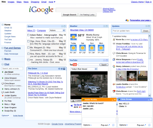
ReplyDeleteThe new igoogle does not look like the image above. Every widget has multiple lines of text, which takes up extra space. gmail is open and showing the first 5-6 emails - we cannot "hide" that anymore. Tabs?! tabs take time to load; old igoogle had everything loaded when the page was brought up.
ReplyDeleteOld igoogle come back! Or at least let us opt-out of the new interface.
(don't make me switch to pageflakes!)
Chris (above) is right, email links don't work!
ReplyDeleteHey everyone, I'm with you. I hate the new layout. And I REALLY hate that they didn't ask us or give us a way to switch back to the previous layout. I've posted a couple times above. The co.uk way still works as does changing your language to english(uk). But consider goign to the link below and sending Google your negative feedback as well. They may not be readign these blogs. But they say they read all the feedback we send at the link
ReplyDeletehttp://www.google.com/support/accounts/bin/request.py?contact_type=feedback
In an attempt to try to live with the annoying side bar and RE-rearrange my tabs (i.s. add more tabs so that I can have everything I regularly use - argh) so that all gadgets in a tab (once again) fit on the screen without the nedd for additional scrolling, I discovered that I can no longer drag gadgets from one tab to another. Now I must delete them and RE-ADD them to a different tab. Bollocks.
ReplyDeleteHave found a work-around for gmail links issue. Try this: From iGoogle home page, click on the link that says 'gmail" instead of "inbox', and gmail opens full screen and the links work. However, i still hate the new home page and will look elsewhere for new homepage is this isn't fixed soon.
ReplyDeleteAlex,
ReplyDeleteNOOOOO!!!
Google UK at "google.co.uk/ig" and/or a change to English (UK) no longer works for me on the west coast. Is there something else to do settings-wise to make that work?
Also, I am signed into chat on the full version of Gmail, but on iGoogle signed out, despite refreshing. That's just silly.
ReplyDeleteCan't stand the format, using IE and Firefox...will be changing home page if it's made permanent.
ReplyDeleteI HATE the new left side layout of iGoogle, is there a way to get it to go back to the old style? I can't stand having all of my stuff smooshed up because my page is now twice as long where I used to be able to see everything on one screen, I didn't have to scroll down more than 1 roll to get to the bottom now it takes like 3!!
ReplyDeleteI do NOT like the new igoogle. Please give us the option of opting out.
ReplyDeleteThe tab takes up space and makes the page unbalanced. The page no longer has a nice flow to it.
I'm surprised no one has stared a "Dump iGoogle" campaign.
ReplyDeleteWhat a nasty dis-improvement. It reminds me of how they "improved" the Rotten Tomatoes website and made the text smaller, movies harder to search for, and reviews harder to read, all while providing lots more pop up ads.
Hate the sidebar instead of the top tabs and also that there are blurbs on all of the rss feeds instead of just titles. It's so hard to scan through and the amount of wording on a page has become overwhelming instead of the nice abbreviated overview that I've come to know and love :)
ReplyDeleteThis totally works in Firefox!!!! Yay!!!
ReplyDeleteAnonymous Anonymous said on October 16, 2008 2:12 PM PDT:
This Adblock Plus rule will remove the new left tab:
google.com#TD(class=leftborder)
How do I get rid of the new left column? It is squishing the other columns and making Google reader "mark as read" when I want to "refresh"
ReplyDeleteI want a way to go back to the old format.
ReplyDeleteIt's horrid! Takes up too much screen real estate. Why didn't they just leave it in a tab interface? I want the old iGoogle back and from all the forums I'm reading, alot of other folks do too.
ReplyDeleteWhat do you think?
ReplyDeletepageflakes
netvibes
myYahoo
that's what I think
Why can't I go to iGoogle from the Gmail page? Can anybody pls explain?
ReplyDeleteIn the post above, I meant why doesn't Google provide a link to iGoogle from the Gmail page :)
ReplyDelete:(
i don't like the new layout of igoogle because most of time i use small notebook (13') the new layout take too much space.
ReplyDeleteis it possible for me to use the old layout for my igoogle?
thank you
Google Inc talks only to themselves these days. Look no further than the inconceivable inattention to customer needs evidenced by this interface change.
ReplyDeleteJust awful. No option to reverse back. Google now = microsoft. Awful
ReplyDeleteI can't click inside any of my gmails anymore. I like to expore inside them, but they are now dead. I have to delete them. We lost that feature. How many more of those features have we lost? If I have trouble with my email again, I will be changing again. I liked Google, but I do agree with others, that you need to make these changes. I also agree with a lot of people that I want the option to let the side bar go. I got a widescreen for a reason, not to shorten up my screen with side bars that take up my new space. Give us that option to turn that side bar on or off. You will help a lot of us. It sounds like there are a lot of unhappy campers out there. You changed it, so fix it.
ReplyDeletegoogle.co.uk is definitely the way to go until we -the loyal (though SERIOUSLY considering defecting) users are heard... come on, igoogle, at least give us a CHOICE between what we all obviously loved and this new HORRIBLE CRAP!
ReplyDeleteI think its great... but maybe I can understand the reactions from some of the people above. I work on a 24 inch monitor so I have plenty of space :). I'm happy with the new version :)
ReplyDeleteI agree this new format is hideous. I want the tabs back at the top. The UK version is working for now. Also the youtube gadget is changed in the new version and there is no more list. Google STOP CHANGING THINGS FOR THE SAKE OF CHANGE. Give us the option. You don't really know everything. Change it or I am gone.
ReplyDeletehate the new format. want my old page back. pesky wasted space in my left nav.
ReplyDeleteI, too, want to switch back. I think I'll try the UK option for a while.
ReplyDeleteDon't like new arrangments of tabs!
ReplyDeleteIt sucks. Just an excuse to create space for advertisements. Fix it soon or I am gone no more google for anything period. Will drop igoogle home page gmail and maps and mobile maps. Simply will not tolerate having my browsing decisions made for me.
ReplyDeleteNew layout sucks! Bring back the old or at least give us the choice between the two.
ReplyDeleteThanks for the tip on Pageflakes Ionut Alex Chitu just set it up and it's good.
ReplyDeletet
I miss the ability to move feeds from one tab to another. Now I have to be on the tab where I want the feed to appear instead of being able to subscribe anywhere and drag it where I want it.
ReplyDeleteI couldn't figure out how to get rid of the left "home" tab so I just set my homepage to Yahoo for the first time in 4 years.
ReplyDeleteGoogle has screwed up with this one! It's just like the new facebook layout, it sucks!
I have read a lot of your posts on this site. A lot of you feel the same way as I do. The iGoogle sucks, it is a pain to use, etc....WELL I FOUND A TRICK......TYPE WWW.GOOGLE.CA
ReplyDeleteits the Canada version. it is what we all have been using before the new change. Enjoy the tip and pass it on.
I absolutely hate the new layout. I do not wish to see the links to what is already on my igoogle page on the right. I understand that some users my find this a useful feature but there are those of us (plenty of them) that do not! There should be some way of turning it off.
ReplyDeleteI hate the new igoogle, too. I wonder why igoogle does not offer choice of layout (old vs. new), since google has been sell it as 'your personalized Google page'!!!!!
ReplyDeletenot a good page
ReplyDeleteWas a big surprise and I thought I had caused it. So counter intuitive and very wasteful of space. I've switched to 43marks.com already. Not as interoperable, but at least I can control what it looks like and how it navigates. MyMSN (eek!) is even better than this new layout!
ReplyDeleteI prefer the old Igoogle page much better. The home tab on the left side of the page is terrible terrible terrible idea. Unless Google get rid of home tab on the left, It leave me no choice but to use Yahoo.
ReplyDeleteEpic Fail.
ReplyDeleteGoogle crumbled under an avalanche of user vitriol and returned the ability to have one's tabs on top... where they belong.
may i have the old iGoogle set-up? please....?
ReplyDeleteIT has been said, but let me add one more voice to the choir: Were people really calling for less screen real estate and tabs to be on the left? I miss having more horizontal space for reading the news.
ReplyDeleteThe new tab makes the page useless for me. I had it set up so that all the info I wanted was visible when the screen came up. Now I have to scroll. The tab merely repeats what's on the page. I'll be switching to something else unless there is an option to get rid of it - SOON!
ReplyDeleteEverything E Camp said. Good job, Google! The whole point of iGoogle is that it's individualized. So what do you do? Set your most ADHD-challenged developers loose making changes that take control out of the individual user's hands and clutter up the screen with a bunch of crap I don't want, don't need, and can't change. I hate what's been done to Gmail especially--my favorite browser-based email app, RUINED. And there's nothing I can do but complain about it.
ReplyDeleteSo I'm complaining.
Thank God for English UK - I hope Google doesn't screw up that version for all of us who hate the new "improved" format.
ReplyDeleteCan somebody say "New Coke"?
This is the second Post Comment I am writing as the first one was apparently deleted by this great new iGoogle system. I am not going to write it up all over again as I am too tired at this point. Suffice it to say, the iGoogle is a major step backwards for Google. The old Personalized Google Home Page and gadgets I could use, but this I can't. "Home" icon does not work, weather does not update with the changing date, much of the data is incorrect, Gmail attachments can not open and can't forward using Bcc.
ReplyDeleteWow, I hate the new layout. Such a step back. Thanks Google!
ReplyDeletei don't like the new igoogle at all. in trying to get my old google back i wound up deleting everything and had to start new and i can't stand it!!! UGH!!
ReplyDeleteThis is seriously amateur-hour. Google made this, right? I mean, this wasn't farmed out to some kid in his basement, was it? Because I can't believe Google would make something that actually kills active links in Gmail when viewed through this new iGoogle thing. Everything else, all the other offenses, is secondary - not having clickable links is just astonishingly STUPID. And it's STILL that way after several days, so that means it's INTENTIONAL! Stunning.
ReplyDeletelinks in emails do not work in the poorly thought out iGmail.
ReplyDeleteWhat was Google thinking? I admit I like the canvas view of the widgets but the trade-off with gmail being in castrated view and the huge amount of dead space under the tabs is awful. I would truly like to be able to choose the version I use. At least let full gmail open correctly!
ReplyDeleteTo get around iGoogle's incredibly stupid and annoying left side tab, type in: www.igoogle.ca (for Canada) and make it your default. This is a work around, but it returns the site to normal.
ReplyDeleteThe tabs on the side: major horrible waste of space. Even on my massive LCD, I never run my browser in full screen mode, I don't want it to take up that much more space. This... just... sucks. And many of the widgets are acting broken and unpredictable. For the most part, these changes feel more invasive to my content in a way I do not like. Please give us the old way back.
ReplyDeletePlease let me change this back to the old version! The js trick isn't working for me.
ReplyDeletePlease bring back the one-click Expand/Collapse of windows (different from the present one-click Maximize/Minimize).
ReplyDeleteI think the new iGoogle is terrible, awful, horrible. In general, it sucks huge. I'm done with google as a homepage if we don't at least get the option to switch back.
ReplyDeleteTypically everyone gets all tight about a little bit of an update and have a huge cry over it.
ReplyDeleteNew iGoogle is much better, looks better, feels better. Old iGoogle looked like it was designed in 1995.
If it were up to some people, we'd still be clicking on dorky start buttons and stupid draggable toolbars in 200 years.
Stop repeating the word "sucks" just because you are all 10 year old unappreciative dorks. Embrace change and enjoy a little bit of surprise. Otherwise, go back to Windows '95 and click on your dumb beveled toolbars.
ReplyDeleteNew iGoogle is excellent. No problems.
If google doesn't change it back or give me an option to go back to the old version I'll stop using google. Simple as that.
ReplyDeleteI gave the new version a chance for a few days, and I cannot stand it anymore, I want the old one back.
I absolutely hate the new version of igoogle. The GMAIL add-in doesn't load correctly. I do not like the expandable tabs on the left. It is terrible. Please allow users to go back if they so choose!!
ReplyDeleteI DO NOT like the new left-side tabs on my iGoogle page! Now I can't access my other tab pages. I want to be able to see the WHOLE PAGE from each tab! The new format stinks! Go back to the ORIGINAL top tabs, PLEASE!!!!!!
ReplyDeleteHate the new iGoogle? Sign the petition:
ReplyDeletehttp://www.petitiononline.com/igoogle/
As of yesterday afternoon, the signature count stood at 1649, this morning the count was up to 1739. It's a viral revolution, bebe!
I hate this thing. It takes forever to load which is UNACCEPTABLE for a homepage. I'll go back to the clean one.
ReplyDeleteWhy isn't there an option to put the tabs on top how they were? I hate them on the left. They just take up space and act the same as they did before. How is this an improvement?
ReplyDeleteI love the new iGoogle. Its sleek, streamlined and great to use. I agree that folks should have the option to choose if its possible but I'm definitely a fan!
ReplyDeleteigoogle, must be going Communist to force left tab on people, without any options to opt out.
ReplyDeleteeven, even if you like it: the concept of forcing Home page items all people, will eventually destroy igoogle. If they do not change their policies and have Options remove "left tab";I am history.
Not sure if this would do any help, but you can sign a petition on
ReplyDeletehttp://www.petitiononline.com/igoogle/petition.html
The new igoogle and gmail gadget are terrible. I cannot send emails from the gadget and the new igoogle wastes space with the Home tab on the left side. Please please go back to the old igoogle.
ReplyDeleteThe new iGoogle is total crap. I hate it. So why wasn't there a choice to keep the older style of iGoogle. It was great!
ReplyDeleteNot happy at all with the new iGoogle format. That "Home" tab along the left side of the screen wastes valuable space and is utterly useless. Please give us the option to restore the old format.
ReplyDeleteI want my tabs back!
ReplyDeletei want old version google!
ReplyDeleteI really don't like this at all, the side tabs take up too much room ,and you can't open attachment or links in email. Google products have all been great designs up till this point, and as far as I can tell, they are not responding t public sentiment against the new design. I"m going to stop using IGoogle till this is fixed, or we have a chance to opt out of the new design, or after reading notes above, I may visit the uk site.
ReplyDeletegoogle canada hasn't gone all left sided, works and looks like pre change igoogle
ReplyDeletei want my old google homepage back.i can`t find my things: weather , close tabs, minimize,and everythings lopsided. i want to scream!!!
ReplyDeleteI had my homepage just the way "I" like it with the items "I" wanted to use. Due to the change I now have redundant entires that take up more of the page when opened. I left My Yahoo for iGoogle...Now where will I go? Program an OPT OUT.
ReplyDeleteI hate it... after spending weeks setting it up because YAHOO made changes that made their interface unusable you guys throw me a curve that approaches the same thing.
ReplyDeleteRealize that many of us don't give a damn about social networking and we actually use the Internet for work!!!!!
I'm disgusted by your arrogance. What the hell is wrong with you people? IGoogle wasn't BROKE and you screwed it up. WHEN are you going to give your customers the option to switch back?
ReplyDeletethe new igoogle is slow, buggy, ugly, and for less functional for me. I really want to be able to use tabs as I used to. Time to get a new home page I guess...
ReplyDeletePlease give me my old igoogle back!! I can't open the full gmail and i can't seem to get used to this new stuff!!
ReplyDeleteGoogle just lost another long time user. None of the suggestions to remove the left hand tabs work. What a sad way to treat their users...
ReplyDeletegood to see so many people complaining and funny some are defending. I hate it, too!! I can't believe google doesn't even let you go back to the old layout. They could at least ask? or test the new layout and get some feedback?
ReplyDeleteWhy would you ever force your users to use broken and useless features? You've changed, Google...
ReplyDeleteHad the new Igoogle for one day only then it was gone as quickly as it arrived. I liked the layout and the smooth edges of the boxes, but didn't see the point of the left hand tab bar.
ReplyDeleteI left Yahoo because they ruined it just like they are ruining igoogle!!!
ReplyDeleteI DO NOT like the new iGoogle layout and gmail keeps acting weird. The left column takes up too much space so that I can't see my gadgets properly. I really don't need my gadgets on tabs, I was quite capable and efficient at finding them before. I want an option to change it back!! This sucks!!
ReplyDeleteTABS ON TOP! GIVE US THE OPTION TO HAVE THE TABS ON TOP! And, yes, I do know where my capslock key is. I'm just out of patience with your absolute lack of responsiveness to your dissatisfied customer base.
ReplyDeleteI HATE the new format too. I do not want the stupid thing on the left side and see no way to be rid of it. It takes up space on the page and is useless to me as I dont have tons of things on the page. This SUCKS
ReplyDeleteI tried the UK version. It is still the old one but I am not able to add some gadgets to it that I have on my regular one. Why oh why did you have to change the format! Looking around for a new service to use or may possibly create my own webpage to use as a homepage instead. This SUCKSs
ReplyDeleteI actually like the new iGoogle, but recently mine got reverted back to the old one. Was this intended?
ReplyDeleteI don't find anything I like about the new version vs. the one I've used for the past year. I do find these new problems:
ReplyDelete1) Can't drag & drop the modules between tabs, which used to be simple. 2) None of the "unclutter the homepage" gadgets work anymore, and I wish I could remove the search bar and buttons from the top, since Google search is already displayed on my Firefox toolbar, I don't need it and it covers so much of the pretty theme pictures 3) I do not like the left margin list instead of the tabs. It would be better if this were an option as I've seen lots of forum comments where others don't like the new look either. 4) the links at the top of the page take up too much room - I'd prefer a hide/expand option as they just add clutter to the visual.
I too hate the new igoogle. I've switched to my.yahoo for my homepage for now. Please bring the former version of igoogle back or at least give an option. I really enjoyed it.
ReplyDeleteI HATE HATE HATE the new igoogle. It has TOTALLY messed up my layout. What I loathe most of all is that useless Navigation thing. How can I get rid of it?
ReplyDeleteThis is a very heavy-handed move by Google. If I cannot get my layout back the way it was, I'm switching to Yahoo.
WORKAROUND FOR THOSE WHO ABSOLUTELY, POSITIVELY HATE, LOATHE AND DESPISE THE NEW IGOOGLE:
ReplyDeletewww.google.ca. (Canada still running old version. Set it as your browser home page and everything goes back to normal.)
ANNOYING BUG: fine, now I can't see the title of the feeds anymore. It's a good chance to change feed reader - a previuos happy and now angry user >:(
ReplyDeletePlease let me get rid of the giant theme taking up so much real estate!!!!!
ReplyDeleteI hate that Google says that they know what I want to see on my portal, instead of providing me the flexibility to arrange things the way that I want to see them.
ReplyDeleteto the Google guys: webpages SCROLL VERTICALLY. Vertical space is not important, thus the tabs before was waaay better than the menu thing on the left hand side of the screen, which takes up too much space. Give me my screen space back!
I guess it's time to go check out my old Yahoo portal...
Please let me know how to get the old google.com back. I HATE the iGoogle and am going to change my browser page if I can't return to the old google.
ReplyDeleteI would like to point out that this new look wastes a lot of my home page on the left side please give me the option to have it the way that it was which wasted the row across that held the tabs wich after scroling down was at no cost of realeastate at all once you had scrolled down.
ReplyDeleteThe new way wastes the entire west coast all the time with basicly nothing there at all.
Please put it back the way it was or give us an option to choode the old style, .. . PLEASE.
I like all the new changes, but please give us an option to remove the chat gadget if we do not want it. It nearly doubles page load times for me. At least have it remember to stay signed out.
ReplyDeleteIt seems rather silly to have 4 different implementations of the same client by the same company, all with different feature sets. I don't need another chat gadget forcing itself on my homepage without an opt-out.
It's pretty cool! Kind of confusing though!
ReplyDeleteBTW, the new IGoogle is only set up on www.google.com, if you go to, for example www.google.nl and then go to igoogle it's still the old one. Google usually first aires it's new features for US. With gmail chat it was like that too. When they just released the chat feature in gmail I accidently changed language to "UK english" and poof chat feature was gone.
ReplyDeleteSo now I use http://www.google.nl/ig. It's still completely English, so that shouldn't be a problem. Not sure if it will find more Dutch site than if I would search through google.com.
For everyone who hates the new igoogle, you can use www.google.ca/igoogle and you'll still receive the old igoogle (tabs on the top of the page). Not sure why .ca is old and .com is new...
ReplyDeleteIf it aint broke - dont fix it - I did not know what that crap was on the left of my homepage! In trying to get rid of it before understanding what it was I have now lost the whole of my homepage!!!!
ReplyDeleteWhich eejit decided we needed something without asking in the first place!!!!
Give me back my homepage or I am going over to Yahoo!!!!
You douchebags...