"One of the first developers to create gadgets for iGoogle was Labpixies. Over the years, we worked closely together on a variety of projects, including the launch of a number of global OpenSocial based gadgets. Recently, we decided that we could do more if we were part of the same team, and as such, we're thrilled to announce the acquisition of Labpixies. We are looking forward to working with Labpixies to develop great web apps and leverage their knowledge and expertise to help developers and improve the ecosystem overall," mentions Google Code Blog.
iGoogle really needs some new ideas to remain relevant. The updated interface launched in 2008 and the social gadgets launched last year weren't very popular. For example, the NY Times Crossword gadget developed by LabPixies only has 92,000 users, although it was a featured social gadget.


This should be interesting for Android game development.
ReplyDeleteiGoogle needs a lot of improvements to remain relevant:
ReplyDeleteOne of them is the interface. The top of the page (the one which contains the search engine) is too big, and should be smaller. That space is necessary for gadgets. The design of the boxes and tabs are a bit ugly, even when you change the theme. Characters in the tabs are too big also... is all that space that necessary? NO! (at least for most of users).
The "Updates" tab should be replaced by a Buzz tab, and social gadgets should send their updates in there.
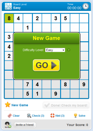
One very ANNOYING thing in iGoogle is when you are playing a sudoku and the page refresh itself and make you lost the game. I sent a lot of suggestions and feedback about that.
Besides, it need a bit of more "web 2.0" features.
Oh, and I forgot: the "Friends" tab and the Chat box should be unified to save more space.
ReplyDeleteThat's interesting. Congrats job LabPixies! The funny thing to me is that I used iGoogle initially and then it started to become overwhelming due to all the gadgets. Maybe it was buggy initially and it turned me off, but I'm not sure why I went back to normal Google rather than iGoogle. Maybe I'll try that again.
ReplyDeleteI'd like to see a simplified version of iGoogle (iGoogle Lite) that looks like the classic Google homepage, but lets you add a custom background image and mini-gadgets for weather information, Google Calendar agenda, Gmail messages, news etc. The initial version of iGoogle looked like this.
ReplyDeleteGoogle is starting to position itself as a content provider.. specially on mobile device mainly those using Android!
ReplyDeleteI sure hope they get to create that killer apps for Droid!!!
http://teknisyan.blogspot.com
http://thingsigotfromthenet.blogspot.com
Alex, that iGoogle Lite idea is great...iGoogle has become bloated/cluttered and they've locked down how much you can alter its appearance since inlined gadgets are no longer allowed.
ReplyDeleteI feel the same way - iGoogle has become way too bloated. I've recently changed my iGoogle homepage to just news feeds. I think if they would more seamlessly integrate other social media (like Facebook and Twitter) then it would really be a hub for most Gmail users.
ReplyDeleteI had internet tv gadget from labpixies on netvibes. Comes google and eat that gadget and now it is gone. I stopped using igoogle that sidebar drove me crazy. At first one could simply work around it now it simply takes up space. Netvibes is actually better than igoogle and hope I do not give ideas to google to snatch netvibes. maybe I should one day work at google and really listen to the users and remove that igoogle sidebar.
ReplyDelete