What if you want to include a link to a Google search results page and the URL needs to be short? Instead of copying the URL from the address bar and including a lot of unnecessary parameters, you can manually build a simple URL:
http://www.google.com/search?q=test
Obviously, you should replace "test" with your query. If there are multiple keywords, replace space with "+" like this:
http://www.google.com/search?q=test+my+speed
You could drop "www." from the URL:
http://google.com/search?q=test
Google now uses AJAX to load search results, so you can replace "search?" with "#":
http://google.com/#q=test
You can even drop the slash after "google.com" and the URL works in most desktop browsers, but not in mobile browsers. You could also replace "google.com" with "google.ca" or other Google domains, but you'll get different results.
Fortunately, Google owns the googl.com domain and you can use this URL:
http://googl.com/#q=test
February 28, 2013
Upcoming Google Translate Features
Google Translate has some cool features that aren't yet publicly released. They're disabled, according to the source code of the page.
The text-to-speech feature will allow you to select the dialect for languages like English, Spanish, Portuguese and Chinese. It's nice to compare American English, British English and Australian English.

There's also a phrasebook feature that could help you learn some useful phrases and words in a variety of foreign languages. Another disabled feature is a dictionary view, but it's not clear if it only uses Google's dictionary data. Google could also monetize the service by including contextual ads.

The text-to-speech feature will allow you to select the dialect for languages like English, Spanish, Portuguese and Chinese. It's nice to compare American English, British English and Australian English.

There's also a phrasebook feature that could help you learn some useful phrases and words in a variety of foreign languages. Another disabled feature is a dictionary view, but it's not clear if it only uses Google's dictionary data. Google could also monetize the service by including contextual ads.

Drag and Drop Links to Google Translate
Google Translate has a quick way to translate pages: just drag and drop links to the Google Translate page. You'll see a big yellow box at the bottom of the page when you're about to drop the link. Instead of copying the URL, pasting the URL and clicking "Translate", you can translate the page using a simple drag and drop.

This feature would be even more useful if you could drag and drop pages that are already loaded in a different tab. I've tried to do that in Firefox, Opera and Chrome, but it only worked well in Chrome. The other browsers added some new characters to the URL and Google had to translate error pages. Chrome is already integrated with Google Translate, so you don't have to use this feature.
You could also select some text from a page and drag it to the input box (ignore the yellow box this time). If instant translation is enabled, you don't even need to click "Translate".
Google Tests a New Navigation Interface
Google tests a new navigation menu that's more compact and includes fewer services. You need to click an icon that's placed next to the "sign in" button and you can access popular services like Google Maps, YouTube, Gmail, Google Drive and Google Calendar. For some reason, the menu includes a redundant icon for Google Search even when you're using Google's search engine.
The interface seems to be inspired by Chrome's app launcher, uses less space, but it's not very obvious. It's like a new version of the hidden navigation menu that was launched back in 2011 and removed after a few weeks.


{ Thanks, Maurice. }
The interface seems to be inspired by Chrome's app launcher, uses less space, but it's not very obvious. It's like a new version of the hidden navigation menu that was launched back in 2011 and removed after a few weeks.


{ Thanks, Maurice. }
February 27, 2013
Google Drive Video Embeds, Too Limited
If you thought that you can upload videos to Google Drive and embed them into your site just like you can do with YouTube videos, think again. I've uploaded a video to Google Drive, added the embed code to a blog post and after a few hundred views, the video stopped playing. Here's the Google Drive error message: "Unable to play this video at this time. The number of allowed playbacks has been exceeded. Please try again later."
As you can see, even the video player from Google Drive has been removed:

After deleting the embed code from the blog post, Google no longer displayed the error message and the video started to play again.
As you can see, even the video player from Google Drive has been removed:

After deleting the embed code from the blog post, Google no longer displayed the error message and the video started to play again.
Chrome Shows Which Tab Is Making a Noise
If you've read the previous post about the animated YouTube favicon, you should know I was wrong. It's not a new YouTube feature, it's a new Chrome feature that tries to detect the tabs that are producing sounds and adds an animation to the favicons.
The feature is currently available in the Canary channel and the latest Chromium builds, so it's not yet ready for primetime. For example, Chrome animates the Google Music favicon even if there's no music playing, but the feature works well for YouTube videos.


While it's nice to be able to tell which tabs are noisy, the animated favicons are distracting and many people find them annoying. Why not add a widget that lets you control the volume for each tab or mute some of tabs?
{ Thanks, everyone. }
The feature is currently available in the Canary channel and the latest Chromium builds, so it's not yet ready for primetime. For example, Chrome animates the Google Music favicon even if there's no music playing, but the feature works well for YouTube videos.


While it's nice to be able to tell which tabs are noisy, the animated favicons are distracting and many people find them annoying. Why not add a widget that lets you control the volume for each tab or mute some of tabs?
{ Thanks, everyone. }
Gmail Attachments in Google Drive?
Jérôme Flipo spotted a new GDrive feature in an animated GIF file shared by the Google Drive team: a "Gmail attachments" section.
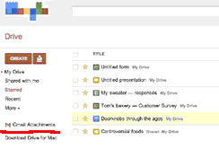
It turns out that there are many references to Gmail attachments in Google Drive's code, so this new feature is not yet enabled in the public version of Google Drive, but Google employees test it.


It's likely that you'll be able to manage Gmail attachments from Google Drive, find attachments and share them with other people. Google Drive is already the central file repository for most Google services.

It turns out that there are many references to Gmail attachments in Google Drive's code, so this new feature is not yet enabled in the public version of Google Drive, but Google employees test it.


It's likely that you'll be able to manage Gmail attachments from Google Drive, find attachments and share them with other people. Google Drive is already the central file repository for most Google services.
February 26, 2013
A Disrupting Google Easter Egg
You might remember the [do a barrel roll] Easter Egg which rotates Google's search results page. The query is so popular that it's the first suggestion when you type "do a" and Google Instant automatically shows the results for [do a barrel roll] and triggers the Easter Egg.
"The issue is, if you search for just [do a] in Google with Google Instant on, it will show you the search results for [do a barrel roll] and just spin the screen before you can complete your query. So if you meant to search for [do a hop skip and a jump], good luck because before you know it, the search results will take an unexpected turn," reports Search Engine Roundtable.

Actually, you can continue entering the query and the Easter Egg will disappear, but few people will do that. This is an example of Easter Egg that disrupts the user experience and makes Google Search more difficult to use.
Google could trigger the Easter Egg only if you type the entire query or if you select the first suggestion. Another option is to delay the Easter Egg animation.
"The issue is, if you search for just [do a] in Google with Google Instant on, it will show you the search results for [do a barrel roll] and just spin the screen before you can complete your query. So if you meant to search for [do a hop skip and a jump], good luck because before you know it, the search results will take an unexpected turn," reports Search Engine Roundtable.

Actually, you can continue entering the query and the Easter Egg will disappear, but few people will do that. This is an example of Easter Egg that disrupts the user experience and makes Google Search more difficult to use.
Google could trigger the Easter Egg only if you type the entire query or if you select the first suggestion. Another option is to delay the Easter Egg animation.
Hide Google's Navigation Bar
If you don't like Google's black navigation bar or you don't use, there's a simple way you to hide it: just bookmark this URL https://www.google.com/webhp?esrch=Agad::Public. It's used by the A Google a Day site, which shows daily puzzles you can solve using Google search. Unfortunately, this interface doesn't show very recent results (from the past week), so you can solve the puzzles on your own, without spoilers.

You can right-click the search box in Chrome, Opera and Firefox, select "Add as search engine", "Create search" or "Add a keyword for this search" and create a new search engine you can trigger using a keyword.

Tecno-Net reports that Google tests a new interface that hides the navigation bar on search results pages and only shows it when you visit the homepage.

You can right-click the search box in Chrome, Opera and Firefox, select "Add as search engine", "Create search" or "Add a keyword for this search" and create a new search engine you can trigger using a keyword.

Tecno-Net reports that Google tests a new interface that hides the navigation bar on search results pages and only shows it when you visit the homepage.
1TB of Google Storage? Buy a Chromebook Pixel Instead
If you've ever wanted to buy 1TB of Google storage to upload all your documents, videos, photos and audio files to Google Drive and Google+ Photos, now it's cheaper to buy Google's Chromebook Pixel. When you pay $1300 for the ultrabook, Google also offers 1TB of storage for 3 years.
The regular price for 1TB of Google Drive storage is $50/month, so Google offers $1800 of storage for only $1300 and the hardware is "free". Obviously, there's a big difference between monthly payments and an upfront payment, not to mention that you may not need 1TB of storage right now and you can always upgrade later.

Google only offers 100GB of storage for 2 years when you buy any other current-generation Chromebook (Samsung Series 3, Samsung 550, Acer C7, HP Pavilion 14), so you only get $120 worth of storage. Chromebook Pixel users get 10 times more storage and an additional year for using it. And that's not the only "goody": "your Chromebook comes with 12 free [Gogo in-air internet] passes that you can use over 2 years on domestic US flights."
The regular price for 1TB of Google Drive storage is $50/month, so Google offers $1800 of storage for only $1300 and the hardware is "free". Obviously, there's a big difference between monthly payments and an upfront payment, not to mention that you may not need 1TB of storage right now and you can always upgrade later.
Google only offers 100GB of storage for 2 years when you buy any other current-generation Chromebook (Samsung Series 3, Samsung 550, Acer C7, HP Pavilion 14), so you only get $120 worth of storage. Chromebook Pixel users get 10 times more storage and an additional year for using it. And that's not the only "goody": "your Chromebook comes with 12 free [Gogo in-air internet] passes that you can use over 2 years on domestic US flights."
February 21, 2013
Google's First Ultrabook
Chromebook Pixel is the first Chromebook designed by Google and the first premium Chromebook. Until now, Chromebooks used low-end CPUs, average displays and plastic chassis. Google decided to change all that and build "the best laptop possible" to inspire other manufacturers. It's like the first Nexus Chromebook.

But why is it called Pixel? It's the first Chromebook with a retina-like display, 3:2 aspect ratio and 2560x1700 resolution. Much like Apple's Retina MacBook Pro, Chromebook Pixel uses pixel doubling to make everything look sharp and crisp. The display has "the highest pixel density (239 pixels per inch) of any laptop screen on the market today" and it's a 12.85-inch IPS touchscreen with 400 nit brightness and 178° extra-wide viewing angles.
Pixel has an anodized aluminium body, glass touchpad, backlit keyboard, hidden vents, Intel i5 processor and 4GB of RAM. "The touchpad is made from etched glass, analyzed and honed using a laser microscope to ensure precise navigation. The Pixel also has powerful, full-range speakers for crisp sound, a 720p webcam for clear video, and a total of three microphones designed to cancel out surrounding noise," informs Google.
Google also includes 1TB of free Google Drive Storage for 3 years. You can also buy a special model with an integrated LTE modem for Verizon.
The Verge has some cool pictures. "There are subtle design touches throughout the machine that help add to the 'premium' feel that Google is going for. The fan vents out in the hinge, every edge is subtly bezeled to prevent sharp angles, the speakers are fairly loud despite being hidden underneath the keyboard, and Google even opted to not put labels next to the ports."
The downside is that Google's Chromebook is really expensive: $1300 (WiFi)/$1450 (WiFi+LTE). It's more expensive than Apple's MacBook Air and most ultrabooks. While it has a better display, Chrome OS is more limited than MacOS (or Windows) and it only became popular when Samsung and Acer started to offer $200-$250 Chromebooks. When you can buy tablets with high-resolution displays for $400 (Nexus 10) or $500 (iPad), the $1300 Chromebook Pixel feels out of place and overkill. After all, you can buy a Nexus 4, Nexus 7, Nexus 10 and a Samsung Chromebook for less than $1200. An ARM device would've been a lot cheaper, but less powerful.
"The Pixel will be available for purchase starting today on Google Play in the U.S. and U.K., and soon on BestBuy.com. The WiFi version ($1,299 U.S. and £1,049 U.K.) will start shipping next week and the LTE version ($1,449) will ship in the U.S. in April. If you're interested in a hands-on experience, you can visit select Best Buy (U.S.) and Currys PC World (U.K.) store locations."
Now Google has a good reason to open its own physical stores.
{ via Google Blog }
New Google Weather OneBox for Desktop
Google updated the weather OneBox from the desktop search interface to match the tablet interface. The new OneBox is huge, it includes more information and it's more interactive. While the old OneBox only displayed the weather forecast for 4 days, the new one has an hourly and an 8-day forecast for temperature, precipitation and wind.

Here's the old interface (I've managed to take this screenshot by pretending I'm using IE7 and changing the user-agent):


It's interesting that many search features are first added to the mobile/tablet interface and a few months later to the desktop UI.
{ Thanks, Mikhail. }

Here's the old interface (I've managed to take this screenshot by pretending I'm using IE7 and changing the user-agent):


It's interesting that many search features are first added to the mobile/tablet interface and a few months later to the desktop UI.
{ Thanks, Mikhail. }
Google Drive's File Previews
Google Drive has a new feature that lets you preview files using an interface borrowed from Google+. This feature is not restricted to photos and videos, it also works for Google Docs documents, presentations, spreadsheets, forms, drawings, Microsoft Office files, PDF, PostScript and XPS files and TrueType fonts.
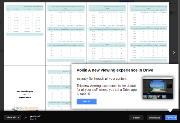
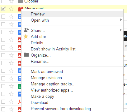
It's interesting that Google Drive shows the new previews if you click a file that's not associated with a web application. For examples, the previews don't show up if you click a Google Docs document, so you need to right-click the file and select "Preview".
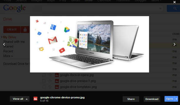
"When previewing a file, it's easy to flip through nearby files by clicking the arrows on the left and right sides of the preview window. This is a great way to scan through a group of photos you've stored in your Drive," explains Google. You can also use the left and right arrow keys to navigate to the other files and up/down arrow keys to scroll up/down in documents. While the previews don't let you edit documents, you can select text, zoom in or out, find text (Ctrl+F), print the documents or share them with other people.
The feature is currently rolled out, so you may not see it yet in your account. Check back later or sign in to a different Google account.
{ via Google Drive Blog }

It's interesting that Google Drive shows the new previews if you click a file that's not associated with a web application. For examples, the previews don't show up if you click a Google Docs document, so you need to right-click the file and select "Preview".

"When previewing a file, it's easy to flip through nearby files by clicking the arrows on the left and right sides of the preview window. This is a great way to scan through a group of photos you've stored in your Drive," explains Google. You can also use the left and right arrow keys to navigate to the other files and up/down arrow keys to scroll up/down in documents. While the previews don't let you edit documents, you can select text, zoom in or out, find text (Ctrl+F), print the documents or share them with other people.

The feature is currently rolled out, so you may not see it yet in your account. Check back later or sign in to a different Google account.
{ via Google Drive Blog }
February 18, 2013
Chromebooks and Battery Life
There's something wrong about the latest Chromebooks: battery life. Cr-48, Google's prototype hardware, had a 63Wh battery that provided more than 8 hours per charge. Samsung's first Chromebook had a similar battery that provided "up to 8.5 hours of continuous use".

For some reason, a few months after introducing the Series 5 Chromebook, Samsung switched to a different battery: 41Wh and only 6.5 hours of use. The updated Series 5 Chromebook, which uses a Celeron processor, has a battery with a larger capacity: 51Wh, but the same battery life. Samsung's latest Chromebook, which uses a Cortex A15 chip, has a 30Wh battery and the same battery life because the ARM chip is more efficient.
What about the latest offerings from Acer, Lenovo and HP?
- Acer C7: 37Wh, 2.5Ah, 3.5 hours battery life
- HP Pavilion: 35Wh, 2.55Ah, 4.25 hours battery life
- Lenovo X131e: 6.5 hours battery life.
It's not clear why the latest Chromebooks no longer have a great battery life, but the new batteries are obviously cheaper and lighter. Google's Chromebook features page no longer mentions the word "battery", even if this was one of the main selling points for the first Chromebooks.
Google Docs Templates, Still Available
Google has recently updated the "Create" menu from Google Drive and removed the templates option from the menu. You can still find it if you visit this page.
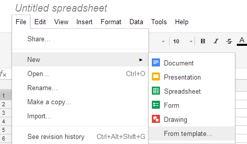
Another workaround is to create a document, spreadsheet, form, drawing or presentation, click the "File" menu, select "New" and then "From template".
Maybe Google finds a way to integrate the templates section with the Google Drive apps, so that it doesn't open in a new tab.
Another workaround is to create a document, spreadsheet, form, drawing or presentation, click the "File" menu, select "New" and then "From template".

Maybe Google finds a way to integrate the templates section with the Google Drive apps, so that it doesn't open in a new tab.
February 13, 2013
Google OS, Developed in 2006?
Update: Peter Kasting, an engineer on the Chrome team, says that this story could be inaccurate: "I was skeptical of this story, and according to a fellow Chrome developer, there's no connection between Jeff's work and Chrome OS". Jeff Nelson has a patent for "Network based operating system across devices", but it's only vaguely related to Chrome OS. His LinkedIn page claims "Mr. Nelson invented Google Chrome OS while working at Google in 2006."
Was Chrome OS developed before Google Chrome? Jeff Nelson, a former Google engineer, says that he started working on a Google OS prototype in 2006. The goal was to make Firefox run faster, so he used this browser.
"It was a chopped down Linux distribution - as so many 'new' operating systems are, these days. I wrote the first version as early as July 2006 and showed it around to management. Instead of launching a project, the response was extremely tepid. My boss complained, 'You can't use it on an airplane.' Actually, you could as, under the covers, it was still a bare-bones Linux distribution and could execute any Linux program installed on it," Jeff explains. "The main priority when I started constructing the operating system was the need for speed - to create a super-fast operating system."
Jeff was developing web apps at Google and he had to restart the browser frequently. "Restarting the web browser was a particularly slow operation, often taking 30-45 seconds, whether IE or Firefox, Linux or Windows. However, even simple tasks such as displaying a directory in a file explorer were unreasonably slow operations, requiring several seconds for a task that should be nearly instantaneous. (...) The solution? Move the entire desktop operating system into RAM. By moving the entire operating system into RAM, that immediately took off the table the largest performance bottlenecks in the operating system: File I/O."
Most tasks were now completed almost instantly, Firefox restarted in 1 second and even the code compiled faster. The problem was that RAM is a volatile memory, so you could lose data if you didn't save it to the disk. He solved the problem by only using web apps and performing some backups to a local storage media. Web apps solved many other problems: avoiding software installation, using less storage, many apps weren't available for Linux.
"Thus, tracking down web apps to replace any and all functionality normally found on a desktop, became a priority. That's how the seeds of the webapps on the Chromium desktop, albeit originally written in HTML and running on Firefox, were planted," concludes Jeff.

Google released a lot of web apps in 2006: Google Chat, Google Page Creator, Google Calendar, Google Spreadsheets, Google Docs, Picasa Web Albums, Google Apps for Your Domain. Chrome was launched 2 years later and the first prototype Chromebook (Cr-48) was available in December 2010.
{ via Chrome Story}
Was Chrome OS developed before Google Chrome? Jeff Nelson, a former Google engineer, says that he started working on a Google OS prototype in 2006. The goal was to make Firefox run faster, so he used this browser.
"It was a chopped down Linux distribution - as so many 'new' operating systems are, these days. I wrote the first version as early as July 2006 and showed it around to management. Instead of launching a project, the response was extremely tepid. My boss complained, 'You can't use it on an airplane.' Actually, you could as, under the covers, it was still a bare-bones Linux distribution and could execute any Linux program installed on it," Jeff explains. "The main priority when I started constructing the operating system was the need for speed - to create a super-fast operating system."
Jeff was developing web apps at Google and he had to restart the browser frequently. "Restarting the web browser was a particularly slow operation, often taking 30-45 seconds, whether IE or Firefox, Linux or Windows. However, even simple tasks such as displaying a directory in a file explorer were unreasonably slow operations, requiring several seconds for a task that should be nearly instantaneous. (...) The solution? Move the entire desktop operating system into RAM. By moving the entire operating system into RAM, that immediately took off the table the largest performance bottlenecks in the operating system: File I/O."
Most tasks were now completed almost instantly, Firefox restarted in 1 second and even the code compiled faster. The problem was that RAM is a volatile memory, so you could lose data if you didn't save it to the disk. He solved the problem by only using web apps and performing some backups to a local storage media. Web apps solved many other problems: avoiding software installation, using less storage, many apps weren't available for Linux.
"Thus, tracking down web apps to replace any and all functionality normally found on a desktop, became a priority. That's how the seeds of the webapps on the Chromium desktop, albeit originally written in HTML and running on Firefox, were planted," concludes Jeff.

Google released a lot of web apps in 2006: Google Chat, Google Page Creator, Google Calendar, Google Spreadsheets, Google Docs, Picasa Web Albums, Google Apps for Your Domain. Chrome was launched 2 years later and the first prototype Chromebook (Cr-48) was available in December 2010.
{ via Chrome Story}
WebM and Broken Promises
Two years ago, a surprising post from Chromium's blog announced that Google Chrome will drop support for H.264 HTML5 videos. "Though H.264 plays an important role in video, as our goal is to enable open innovation, support for the codec will be removed and our resources directed towards completely open codec technologies."
Nothing happened since then, so I assume that Google changed its mind. Mostly likely, Google hoped that this announcement will increase WebM's adoption, but that was wrong. Other than YouTube, few other sites converted their videos to WebM. Why spend time and money to convert videos when they could simply use a Flash player?
After all, Adobe Flash doesn't support WebM and that's the second broken promise: "As Kevin Lynch mentioned today at Google I/O, we are excited to include the VP8 video codec in Flash Player in an upcoming release, which will help provide users with seamless access to high quality video content on all of their Internet-connected devices," announced a blog post from 2010.
Adobe didn't support the VP8 codec, so Flash is still mostly H.264-only. And so are Internet Explorer, Safari, iOS, Windows Phone. WebM is mostly non-existent in the mobile space and that's where the future lies. Even if Android 2.3+ supports WebM, there aren't many devices with hardware acceleration for WebM.
Now Firefox's Windows nightly builds allow you to play H.264 HTML5 videos using the Windows Media Foundation backend. "That means if you're using a Windows computer that already has a licensed H.264 decoder installed, you'll be able to enjoy HTML5 video that's been encoded using MPEG LA's codec."
That means in the near future the most important browsers will support H.264 videos natively and WebM will matter even less. There's a VP8 successor that's more efficient, there's WebP for images and there's the WebRTC API for native video chat apps, but H.264 will continue to dominate web video. Those broken promises just made it more obvious.
Opera Switches to WebKit and Chromium
After many years of dealing with site compatibility issues, Opera found the solution: it will switch from its proprietary rendering engine (Presto) to WebKit and will be powered by Chrome's open source version, Chromium.
"Presto is a great little engine. It's small, fast, flexible and standards compliant while at the same time handling real-world web sites. It has allowed us to port Opera to just about any platform you can imagine. (...) It was always a goal to be compatible with the real web while also supporting and promoting open standards. That turns out to be a bit of a challenge when you are faced with a web that is not as open as one might have wanted. Add to that the fact that it is constantly changing and that you don't get site compatibility for free (which some browsers are fortunate enough to do), and it ends up taking up a lot of resources - resources that could have been spent on innovation and polish instead," explains an Opera employee.
"For all new products Opera will use WebKit as its rendering engine and V8 as its JavaScript engine. It's built using the open-source Chromium browser as one of its components. Of course, a browser is much more than just a renderer and a JS engine, so this is primarily an 'under the hood' change. Consumers will initially notice better site compatibility, especially with mobile-facing sites - many of which have only been tested in WebKit browsers. The first product will be for Smartphones, which we'll demonstrate at Mobile World Congress in Barcelona at the end of the month. Opera Desktop and other products will transition later," mentions Bruce Lawson.
The problem with Opera is that it has a low market share on the desktop (about 1-2%) and not many web developers bother to test their sites in Opera. Google's sites have always had issues in Opera and most Google web apps don't officially support Opera (check the system requirements for Google Drive). Gmail's help center actually mentions that "We don't test Opera, but believe it works with all of Gmail's features." Probably Google doesn't want to allocate resources for testing sites in a desktop browser that's not popular, but it has a completely different rendering engine.

In a perfect world, browsers and sites would just follow the standards and everything would work well, but it takes time to create the standards and browsers implement their own version in the meanwhile. Not to mention that browsers have all kinds of quirks.
Google launched Chrome in 2008 and one of the reasons why it chose WebKit was that "we knew we didn't want to create yet another rendering engine. After all, web developers already have enough to worry about when it comes to making sure that all users can access their web pages and web applications."
WebKit started in 2001 as an Apple fork of KDE's KHTML engine, it was used to build Safari, a few years later it was open sourced and Nokia ported WebKit to Symbian. WebKit is now the most popular mobile rendering engine, since it powers Safari Mobile and all iOS browsers (other than thin clients like Opera Mini), Android's stock browser, Chrome for Android and many other mobile browsers. WebKit's combined market share is now more than 40%, according to StatCounter and Wikimedia's stats.
"Presto is a great little engine. It's small, fast, flexible and standards compliant while at the same time handling real-world web sites. It has allowed us to port Opera to just about any platform you can imagine. (...) It was always a goal to be compatible with the real web while also supporting and promoting open standards. That turns out to be a bit of a challenge when you are faced with a web that is not as open as one might have wanted. Add to that the fact that it is constantly changing and that you don't get site compatibility for free (which some browsers are fortunate enough to do), and it ends up taking up a lot of resources - resources that could have been spent on innovation and polish instead," explains an Opera employee.
"For all new products Opera will use WebKit as its rendering engine and V8 as its JavaScript engine. It's built using the open-source Chromium browser as one of its components. Of course, a browser is much more than just a renderer and a JS engine, so this is primarily an 'under the hood' change. Consumers will initially notice better site compatibility, especially with mobile-facing sites - many of which have only been tested in WebKit browsers. The first product will be for Smartphones, which we'll demonstrate at Mobile World Congress in Barcelona at the end of the month. Opera Desktop and other products will transition later," mentions Bruce Lawson.
The problem with Opera is that it has a low market share on the desktop (about 1-2%) and not many web developers bother to test their sites in Opera. Google's sites have always had issues in Opera and most Google web apps don't officially support Opera (check the system requirements for Google Drive). Gmail's help center actually mentions that "We don't test Opera, but believe it works with all of Gmail's features." Probably Google doesn't want to allocate resources for testing sites in a desktop browser that's not popular, but it has a completely different rendering engine.

In a perfect world, browsers and sites would just follow the standards and everything would work well, but it takes time to create the standards and browsers implement their own version in the meanwhile. Not to mention that browsers have all kinds of quirks.
Google launched Chrome in 2008 and one of the reasons why it chose WebKit was that "we knew we didn't want to create yet another rendering engine. After all, web developers already have enough to worry about when it comes to making sure that all users can access their web pages and web applications."
WebKit started in 2001 as an Apple fork of KDE's KHTML engine, it was used to build Safari, a few years later it was open sourced and Nokia ported WebKit to Symbian. WebKit is now the most popular mobile rendering engine, since it powers Safari Mobile and all iOS browsers (other than thin clients like Opera Mini), Android's stock browser, Chrome for Android and many other mobile browsers. WebKit's combined market share is now more than 40%, according to StatCounter and Wikimedia's stats.
February 12, 2013
Chrome's Giant Touch-Optimized Menu
Somewhere between Chrome 25 (beta) and Chrome 26 (dev), the browser's menu got bigger. It's now optimized for touch interfaces even if you're using a non-touch computer. I've checked the height of the menu and it's now 580 pixels, instead of 420 pixels. That's a 38% increase and it makes the interface more difficult to use for mouse users.

When you use Chrome's sync feature, the menu's height becomes 625 pixels. Here's how a recent Chromium build looks on my 1280x800 laptop and remember that most laptops sold right now have a 1366x768 resolution:

Chrome also changed the contextual menu:


When you use Chrome's sync feature, the menu's height becomes 625 pixels. Here's how a recent Chromium build looks on my 1280x800 laptop and remember that most laptops sold right now have a 1366x768 resolution:

Chrome also changed the contextual menu:


Mobile Google Contacts Alternative
For some reason, Google doesn't offer a mobile interface for Google Contacts. Sure, you can use the autocomplete feature from Gmail to find an email address or sync your contacts using CardDav or Exchange, but there's no mobile app for Google Contacts.
I've tried to use the standard desktop interface available at google.com/contacts, but it's slow and hard to use on a mobile phone. Fortunately, Google still offers the old version of the Google Contacts site at google.com/contacts_v1 and it works a lot better on a smartphone.

Update: There's another option - https://mail.google.com/mail/h/?v=cl (thanks, Alexandre).
I've tried to use the standard desktop interface available at google.com/contacts, but it's slow and hard to use on a mobile phone. Fortunately, Google still offers the old version of the Google Contacts site at google.com/contacts_v1 and it works a lot better on a smartphone.

Update: There's another option - https://mail.google.com/mail/h/?v=cl (thanks, Alexandre).
From Sleekbooks to Chromebooks
What happens when you take a thin and light Windows PC and transform it into a Chromebook? Here are 2 examples of laptops from HP and Lenovo that have been morphed into Chromebooks. Both replaced an Intel Core i3 CPU with a Celeron CPU, the standard HDD with a 16GB SDD and Windows with Chrome OS. HP made some additional changes and removed 2GB of RAM and replaced the 2 USB 3.0 ports with USB 2.0 ports.
The price dropped from $590 to $330 for the HP laptop and from $620 to $430 for the Lenovo laptop. The less expensive Intel CPU and the free Chrome OS license help manufacturers save about $200.


The price dropped from $590 to $330 for the HP laptop and from $620 to $430 for the Lenovo laptop. The less expensive Intel CPU and the free Chrome OS license help manufacturers save about $200.


February 11, 2013
Chromebook Pixel
Chromebooks started as an experiment and ended up becoming best-selling Amazon laptops. They're so popular that more and more computer manufacturers release Chromebooks: Lenovo launched the 11.6-inch ThinkPad X131e Chromebook for schools and now HP launches a 14-inch Pavillion Chromebook.
Today's Chromebooks are a lot more powerful than the original Chrome OS devices, since they traded Intel's Atom for Celeron and Cortex-A15, but they're not high-end devices. Celeron is a low-end CPU, displays are average, build quality is not great. It's hard to come up with a premium notebook that costs less than $500.
Well, it turns out that Google works on a new Chromebook that features a backlight keyboard, aluminum casing and a high-resolution 2560x1600 display with touch support. Unlike the previous Chromebooks, it's designed entirely by Google. Here's a leaked ad for the upcoming Chromebook Pixel:
Nexus 10 has the same resolution and Chromebook Pixel could use the same Cortex-A15 SoC that also powers the Samsung Chromebook. It's not clear how much it will cost, but the ARM SoC is a better option than a powerful Intel CPU since the device could be a lot less expensive. If Samsung's Chromebook costs $250 and Nexus 10 costs $400, it's likely that Chromebook Pixel will cost less than $500. The first premium ARM laptop.
YouTube Background Audio in iOS 6.1
For some reason, the latest version of Apple's mobile operating system breaks one of my favorite features: playing videos in the background. It worked in Apple's old YouTube app, YouTube's mobile site and almost any other video app/site (an important exception is YouTube's official app). Close the app, double-tap the Home button, swipe from left to right and tap the "Play" button to continue playing the video in the background. In iOS 6.1, the "play" button doesn't work.

It's a great feature for music videos, podcasts, ambient sounds and it's unfortunate that Android doesn't include it and Apple (accidentally?) disabled it in iOS 6.1. Until Apple fixes the bug, you can install two third-party YouTube apps that use some undocumented APIs to support background audio: McTube and YouPlayer. McTube continues to play the video after closing the app, while YouPlayer lets you manually enable background audio.

It's a great feature for music videos, podcasts, ambient sounds and it's unfortunate that Android doesn't include it and Apple (accidentally?) disabled it in iOS 6.1. Until Apple fixes the bug, you can install two third-party YouTube apps that use some undocumented APIs to support background audio: McTube and YouPlayer. McTube continues to play the video after closing the app, while YouPlayer lets you manually enable background audio.
New Interface for YouTube Channels
YouTube tests a new interface for channels. For now, the updated layout is only available for a few channels like Sorted Food, iJustine, The Pet Collective and YouTube's own channel, but it will soon be enabled YouTube-wide.
What are the changes? The persistent left sidebar and the list of featured channels limit the channel's real estate, but make the interface more consistent. Most of the features from the old interface are still available, but they're more difficult to find. For example, to find the "feed" view, you need to click the arrow next to the home icon and click "feed". The list of playlists, the featured playlists and the list of likes are buried in a drop-down. There's also a new "about" section that shows the channel description, the number of subscribers and the video views, which is used to be placed in the right sidebar. The search box is only displayed when you click the new search icon.
The channel trailer replaces the featured video for non-subscribers. "You can show a trailer that will only appear to viewers who aren't already subscribed to your channel. This is your chance to let visitors know what your channel is all about and tell them why they should subscribe."


{ Thanks, Sterling. }
What are the changes? The persistent left sidebar and the list of featured channels limit the channel's real estate, but make the interface more consistent. Most of the features from the old interface are still available, but they're more difficult to find. For example, to find the "feed" view, you need to click the arrow next to the home icon and click "feed". The list of playlists, the featured playlists and the list of likes are buried in a drop-down. There's also a new "about" section that shows the channel description, the number of subscribers and the video views, which is used to be placed in the right sidebar. The search box is only displayed when you click the new search icon.
The channel trailer replaces the featured video for non-subscribers. "You can show a trailer that will only appear to viewers who aren't already subscribed to your channel. This is your chance to let visitors know what your channel is all about and tell them why they should subscribe."


{ Thanks, Sterling. }
February 8, 2013
Permalinks for Google Drive Images
While Google Drive lets you upload any file, the support for files that can't be edited using Google Docs/Sheets/Slides is limited. For example, you can embed PDF files and videos, but Google doesn't offer permalinks for images.
So you've uploaded a photo to Google Drive and the only options are to download the file and link to the image page. But what if you want to embed that image in a web page or simply post a direct link to the image? You may think that right-clicking the image lets you copy the image URL, but that's not true. Even if you check the source code of a page or use features like Firefox's "view page info", you'll get a link that doesn't work.
Fortunately, there's an easy solution - replace this URL from the address bar:
http://docs.google.com/file/d/FILEID/edit
with:
http://drive.google.com/uc?export=view&id=FILEID
(where FILEID is a long sequence of digits and letters).
This only works if you've changed the visibility options to "public on the Web" or "anyone with the link" in the Share dialog.
Here's an example:

You can also use:
http://drive.google.com/uc?export=download&id=FILEID
to trigger a download and this works for any non-private Google Drive file, not just for images.
{ via Stack Overflow. Photo licensed as Creative Commons Attribution. }
So you've uploaded a photo to Google Drive and the only options are to download the file and link to the image page. But what if you want to embed that image in a web page or simply post a direct link to the image? You may think that right-clicking the image lets you copy the image URL, but that's not true. Even if you check the source code of a page or use features like Firefox's "view page info", you'll get a link that doesn't work.
Fortunately, there's an easy solution - replace this URL from the address bar:
http://docs.google.com/file/d/FILEID/edit
with:
http://drive.google.com/uc?export=view&id=FILEID
(where FILEID is a long sequence of digits and letters).
This only works if you've changed the visibility options to "public on the Web" or "anyone with the link" in the Share dialog.
Here's an example:
You can also use:
http://drive.google.com/uc?export=download&id=FILEID
to trigger a download and this works for any non-private Google Drive file, not just for images.
{ via Stack Overflow. Photo licensed as Creative Commons Attribution. }
Convert Images Hosted by Google to WebP
WebP is one of the best thing that happened after Google acquired On2 in 2010. While WebM doesn't have a strong adoption outside YouTube and Firefox started to support H.264 after a few years of fight, WebP is an image format that's already used by many sites and applications. It can replace both JPEG and PNG and you can use it to create images that are compressed more efficiently (by about 35%) and look better. "By converting PNGs and JPEGs to WebP, the Chrome Web Store was able to reduce image sizes by about 30% on average," informs Google.
The format is supported by Chrome, Opera, Android 4.0+ and there are many tools that help you convert images to WebP and view them. It's also interesting to find that all the images hosted by Google services like Picasa Web, Blogger and Google+ can be converted to WebP using a simple URL adjustment.
Here's an example of JPEG photo hosted by Google+:
https://lh5.googleusercontent.com/-b1qAbtG7VuI/TqON2f_eReI/AAAAAAAA4P4/r_5AKUt42rg/s633/DSC03146.JPG [57 KB]
To convert the photo to WebP, just replace "/s633/" with "/s633-rw/" ("/sNUMBER/" with "/sNUMBER-rw/") :
https://lh5.googleusercontent.com/-b1qAbtG7VuI/TqON2f_eReI/AAAAAAAA4P4/r_5AKUt42rg/s633-rw/DSC03146.JPG [33 KB]
I'll also include the URL of a PNG screenshot from the previous post:
https://blogger.googleusercontent.com/img/b/R29vZ2xl/AVvXsEicVfiEO2pa4LOGuuoRK_F6b2sy_oNSbjq2GJD6XIPSiCbbKcW9XS_vei2Dr73XDZ_P-abuK-ECWeM5JpQhbrck1KMqN9olbGl4MipMJ7xZ4-OaR8uZsEb6h0oiExJOV7-PdBmdpg/s640/new-gdrive-create-menu.png [21 KB]
Here's the WebP photo:
https://blogger.googleusercontent.com/img/b/R29vZ2xl/AVvXsEicVfiEO2pa4LOGuuoRK_F6b2sy_oNSbjq2GJD6XIPSiCbbKcW9XS_vei2Dr73XDZ_P-abuK-ECWeM5JpQhbrck1KMqN9olbGl4MipMJ7xZ4-OaR8uZsEb6h0oiExJOV7-PdBmdpg/s640-rw/new-gdrive-create-menu.png [14.5 KB]
Third-Party Apps, More Visible in Google Drive
Google Drive updated the "create" menu. Now third-party apps are placed next to Google's apps and are easier to find. There's also a new option to "connect new apps" that displays the list of Google Drive apps (there are more than 100 applications). It's still an iframe for the Chrome Web Store collection, but you no longer have to open a new page to find an app. Another advantage is that you can filter the apps by category and restrict the search results to Google Drive apps. I've always found it weird that the Google Drive apps are listed in the Chrome Web Store, even though they don't require Chrome.


"The Google Drive Create menu now elevates Drive-connected apps to the same level as Google apps such as Docs and Sheets. This makes Drive-connected apps easier to reach and more visible to Google Drive users," informs Google.
There are apps for editing photos and videos, for creating web pages, for editing music, for merging PDF files, signing documents, faxing documents, creating whiteboards, diagrams, invoices and even designing t-shirts.
The Old Image Search, Still Available
The old Google Image Search interface is still available in the OneBox result that's displayed for some Google searches like [tropical birds] or [europe map]. If you add "image", "images", "photo" or "photos" to your query, Google will show 4 times more image results. It's like a simplified image search interface inside the regular Google Search.


February 7, 2013
Google Drive Site Hosting
You can now create sites in Google Drive, but it's just a nice trick, not a full-fledged feature. To get started, create a new folder, right-click the folder and use the "share" feature to make the folder public. All the files of the site you want to create will be placed inside this folder.
Unfortunately, you can't create the HTML, JS and CSS files in Google Drive using the default apps, so you need install a third-party app like Drive Notepad, Neutron Drive or create these files using a native text editor or HTML editor. Make sure you have all the required files, including a file named index.html. When you upload the files to the folder you've just created, disable the conversion option.
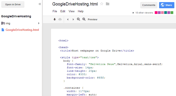
Click the index.html file and then click the "Preview" button to see a live version of your homepage. The files are hosted at googledrive.com and have long URLs you can't customize. Here's an example.
Another downside is that you can create multiple files that have the same name, so a new version of the index.html file doesn't replace the existing file, but it adds a new file. You can always use the "manage revisions" option, but it would be nice have a traditional folder feature. For now, it's a good idea to use the Google Sync apps.
{ Thanks, Michael. }
Unfortunately, you can't create the HTML, JS and CSS files in Google Drive using the default apps, so you need install a third-party app like Drive Notepad, Neutron Drive or create these files using a native text editor or HTML editor. Make sure you have all the required files, including a file named index.html. When you upload the files to the folder you've just created, disable the conversion option.
Click the index.html file and then click the "Preview" button to see a live version of your homepage. The files are hosted at googledrive.com and have long URLs you can't customize. Here's an example.

Another downside is that you can create multiple files that have the same name, so a new version of the index.html file doesn't replace the existing file, but it adds a new file. You can always use the "manage revisions" option, but it would be nice have a traditional folder feature. For now, it's a good idea to use the Google Sync apps.
{ Thanks, Michael. }