March 29, 2013

Attach Images in the New Gmail Compose Interface

Gmail's new compose interface has many useful features, but there are also some annoyances.

The old interface had two ways to upload images using drag and drop: as attachments or as inline images. The new interface only lets you embed an image inside the message when you drag and drop it. There are many reasons why you might find this feature annoying: it's more difficult to compose a message after adding a bunch of images, the images could be distracting, Gmail no longer adds cool options like "download all attachments", "view" or "download" when you open the message, some mail clients block inline images.


Fortunately, you can use the "attach files" paperclip button to add image attachments. The "insert photos" button will embed the images. If you still want to drag and drop a photo, you can drag the photo you want to attach and some other random file (for example, a PDF file or another image) and remove the random file. It's a workaround that forces Gmail to treat images like regular files. When you drag and drop multiple images, they're added as attachments they're now embedded, but you can use the same trick (updated: June 2013).


For now, you can "temporarily switch to the old compose" interface by clicking the arrow button at the bottom of the compose box and selecting the corresponding option, but the new interface is here to stay, while the old one will be retired in the near future. The new UI for composing messages is now the default for all Gmail users.

Update (June 2013): There's now a way to attach images using drag and drop without using these workarounds.

March 28, 2013

Context-Sensitive Spell Checking in Google Chrome

Chrome is the first browser that has a smart spell-checking feature powered by a web service. Originally, Chrome only relied on a local dictionary. Then Chrome's team started to add suggestions from a Google service to the contextual menu and improve the list of suggestions from the local dictionary.

Chrome 26 dramatically improves spell checking by bringing the Google Docs and Google Search spell checker to the browser. "We're now rolling out support for grammar, homonym and context-sensitive spell checking in English, powered by the same technologies used by Google search. Support for additional languages is on the way," informs Google. Right now, this feature is not available in Chrome for Mac, but it will be added soon.

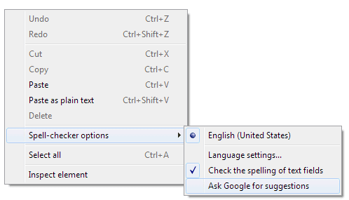
The enhanced spell-checker is opt-in, so it's not enabled by default. You need to right-click a text field, go to "Spell-checker options" and make sure that "Ask Google for suggestions" is enabled. It's a privacy-sensitive feature, since everything you type is sent to Google's servers.


Context-sensitive spell checking, first available in Google Wave, is incredibly useful. Sometimes you can make mistakes and write "fund a place" instead of "find a place" or "took a brake" instead of "took a break". A regular spell-checking software can't detect these errors because "fund" and "brake" are words from the dictionary. Google uses the language models built for Google Translate to find the words that don't belong in a certain context and highlights them. Right-click the underlined words and click Google's suggestions.


Even if you enable online spell-checking, Chrome will still use the local dictionary feature. The spelling errors that have a red underline come from the dictionary, while errors with a green underline are detected by the web service.


Unfortunately, Google's technology is not smart enough to find mistakes like "its a wonderful life" or "their coming today".

Google Translate Mistakes

The Google Translate app for Android has some text files that include translation mistakes (/sdcard/Android/data/com.google.android.apps.translate/files/ol/v3r1/c_p). Some of them have been reported by users, blogs, news sites, while others are new. It's not clear why the application needs these lists since Google has fixed these translation errors.

Here are some examples:

German to English: Stuttgart -> London, tischen -> Nazi, Sheraton -> Hilton, StepStone -> Monster, Kilo -> pounds

French to English: le président américain -> Bush, toussaint -> Halloween, Homme -> Female ("homme" means "man" in French, "le président américain" means "the American president")


Spanish to English: Madrid -> London, útil -> helpful Google Translation, amor -> truelove ("útil" means "useful" in Spanish, while "amor" means "love").

English to Russian: jew -> жид (Yid, used as a derogatory epithet by antisemites), altogether -> обнаженная модель ("nude model" in Russian).

English to French: boobs massage -> Ségolène Royal, boobs massage -> Kaamelott Saison, it sucks -> elle suce

English to Spanish: quiz trivia -> vínculo con Israel

Catalan to English: Jordi Pujol -> Abraham Lincoln

English to Latin: English -> Latin, New York -> Romae, New York -> Londini, Milan -> Lib

English to Dutch: please -> iPhone, feet -> meter

Hungarian to English: magyar -> English, Kossuth Lajos -> Abraham Lincoln

Icelandic to English: Sigur Rós -> Foo Fighters, Sigur Ros -> Anastacia

Latin to English: Libri -> Random, Libri -> Reviews, Arma Virumque Cano -> Chairman Meow

Russian to English: Вконтакте -> Facebook, Вконтакте -> Twitter, Вконтакте -> OpenID ("Вконтакте"/VK is a popular Russian social network), ОС -> Windows ("ОС" means operating system in Russian), Уважаемый Дмитрий -> Mr President ("Уважаемый Дмитрий" means "Dear Dmitry", while Dmitry Medvedev was Russia's President), Владимир Владимирович -> Mr Prime Minister ("Владимир Владимирович" means "Vladimir Vladimirovich", while Vladimir Vladimirovich Putin was Russia's Prime Minister), скрыто -> email ("скрыто" means "private, secret"), Сплин -> Metallica (popular Russian rock band).

Serbian to English: Mitar Mirić -> Rihanna, Miric -> Jackson

Swedish to English: Runkar -> Heil Hitler, kronor -> dollars

Google's machine translation algorithms are often fooled by proper nouns used in similar contexts (Madrid in Spanish vs London in English, Sigur Rós in Icelandic vs Foo Fighters in English), by measurement units and currencies (feet in English vs meter in Dutch), but there are also non-obvious mistakes.

Offline Google Translate for Android

Google Translate is useful, but you need an Internet connection to translate some text. Google's servers process your request, so language models are always up-to-date, you can translate long texts instantly and you don't need to download huge databases. Unfortunately, Google Translate is especially useful when you visit foreign countries and you may want to avoid the high data roaming fees.

Now you can use Google Translate offline if you have an Android device. Just install the latest version of the Google Translate for Android and you can download the core translation files for more than 50 languages. If you've already installed the application, you need to manually update it. The compressed language files have about 150MB (200MB after extracting the files from the archive) and are stored on your SD card if your Android device has one.

"You can select [Offline Languages] in the app menu to see all the offline language packages available for download. To enable offline translation between any two languages, you just need to select them in the offline languages menu. Once the packages are downloaded, you're good to go," informs Google.


The application works well offline, but you may need to wait a few seconds if you want to translate long texts. Offline translations are less accurate since Google lets you download some simplified language models.

Here's a side-by-side comparison of the offline and online translations of a French text from Le Monde:

March 27, 2013

Mobile Gmail Navigation: Replacing Buttons With Gestures

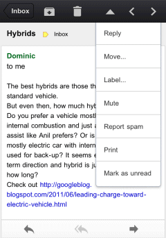
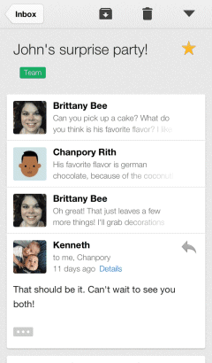
There's a new version of the Gmail app for iOS that brings a very useful feature: swipe left or right to move to the previous or next conversation.

What's old is new again. The first version of the Gmail app for iOS included this feature, but it used arrow buttons instead of gestures, just like the desktop Gmail and the mobile site.


For some reason, the buttons have been removed in Gmail 2.0, released in December.


Gmail 2.1 uses swipes for navigating between messages, but this features is not yet available in the new mobile Gmail site.

While buttons may clutter the interface, gestures could be more intuitive if they're properly implemented. Google made at least two mistakes when it added gestures for navigation: the mobile interface for Blogger blogs and the mobile Chrome. The original version of the mobile Blogger interface was terrible because it was easy to accidentally load the next/previous post when scrolling. Chrome for Android/iOS still has an annoying feature that lets you navigate between tabs using swipes. Try to use Google Image Search and you'll notice how easy is to trigger this feature accidentally.

Fortunately, swiping works better in the Gmail app for iOS, just like in the Gmail Android app.

March 25, 2013

Google Shows Results for Similar Searches

Google has a new feature that shows results for different versions of your query. Usually Google removes one or two keywords from your query or replaces them with similar keywords if there aren't many relevant search results for your original query.

For example, when you search for [google maps flash html5 api v4], Google also shows results for searches like: [google maps flash html5 api], [google maps html5 api v4], [google maps flash api], [google flash map api]. It's interesting to notice that the first page of results shows 2 results for your query and 8 results for related queries, but the numbers are different depending on the query.


Here's another example: [gingerbread install chrome browser manually]. This time, Google returns 4 results for your query and 6 results for related queries. Obviously, you can't install Chrome in Android 2.3 and Google's results should help you find this information.


This feature used to be an experiment, but now it should be publicly available. Unfortunately, Google shows results for too many different queries and not all of them are useful. Some of Google's suggestions remove important keywords from the query and that's a mistake. For example, removing "gingerbread" from [gingerbread install chrome browser manually] returns results related to the desktop Chrome. Maybe Google could automatically detect nonessential keywords and show results that don't include them instead of cluttering the list of results with so many options.

March 24, 2013

Google+ Search Filter for Photos

If you want to restrict Google+ search results to posts that include photos, you can now do that. After performing a search, click the "Everything" dropdown and select "Photos".


"You can find any photo post (...) from items shared only with you, to public photos shared by some of the great photographers on Google+. Here are some searches that I enjoy: [Long exposure], [Steel wool], [Cartoons]," says Google's Dave Cohen.

Unfortunately, Google shows a long list of posts instead of a grid of photos. It's worth pointing out that the search results don't include photos uploaded to Google+ that haven't been explicitly shared.

{ via Search Engine Roundtable }

Google Discontinues Blocked Sites Feature

Google had a powerful feature that allowed you to block all search results from a domain. The feature was quickly removed from the interface, but Google still included it in the search preferences page. Last year, the feature disappeared and it came back after a few weeks, but not everyone could use it.

Now Google officially discontinued Blocked Sites. "To block particular sites from your search results, we recommend the Personal Blocklist Chrome extension from Google. You may also download your existing blocked sites list as a text file."


Blocked Sites isn't Google's first attempt to create a feature that lets you hide results from certain domains, so I'm sure we'll see other similar features in the future.

{ Thanks, Dan. }

March 20, 2013

New Gmail Shortcuts for Composing Messages

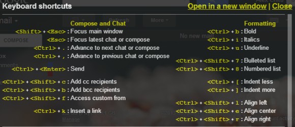
Gmail's new interface for composing messages has some cool keyboard shortcuts:

* Shift+Esc - focus the main window
* Esc - focus the latest chat or compose box
* Ctrl+. - advance to the next chat or compose box
* Ctrl+, - advance to the previous chat or compose box
* Ctrl+Enter - send message
* Ctrl+Shift+c - add CC recipients
* Ctrl+Shift+b - add BCC recipients
* Ctrl+Shift+f - add custom from

These shortcuts are displayed when you mouse over some buttons from the rich-text editor:

* Ctrl+Shift+2 - insert emoticon
* Ctrl+Shift+7 - numbered list
* Ctrl+Shift+8 - bulleted list
* Ctrl+Shift+9 - quote text
* Ctrl+[ - indent less
* Ctrl+] - indent more
* Ctrl+Shift+l - align left
* Ctrl+Shift+e - align center
* Ctrl+Shift+r - align right

You can see the entire list of shortcuts by pressing Shift+? in the Gmail window.


{ Thanks, Cougar. }

YouTube Search Trends

You can now restrict Google Trends results to YouTube. Just like web search, image search, news search and product search, YouTube is a great way to measure people's interest over time.


"Google Trends enables you to take popular search queries and explore traffic patterns over time and geography. Now we've added YouTube search data going back to 2008, making it another great tool to look at video trends. Visit Google Trends and enter any search you'd like and then, on the left, choose 'limit to' for YouTube. You can slice by region or category as well," explains the YouTube Trends blog.


It's interesting to compare web search trends with YouTube trends. For example, [Galaxy] and [Android] are just as popular when it comes to web search, but [Galaxy] is a lot more popular than [Android] on YouTube.

Google Keep, Now Available

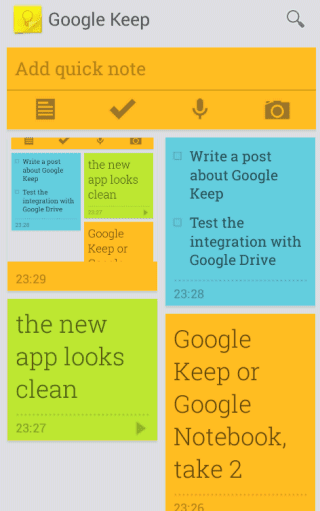
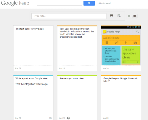
Google Keep has been launched: it's Google's latest attempt to create a service for taking notes. Unlike Google Notebook, Keep is a Google Drive app (the Drive integration is not yet ready for public release), it doesn't have a rich-text editor and it's optimized for mobile.

There's an Android app and a desktop site. Both use the sticky notes metaphor and you can choose the color for each note, add text, images, lists and voice recordings that are automatically converted to text in the mobile app. Both interfaces let you choose between the grid view and the list view.


Google Keep lacks many of the features that were available in Google Notebook: labels, sorting, comments, multiple notebooks, rich-text editor, sharing. It looks like a lightweight Google Notebook for mobile devices.

"With Keep you can quickly jot ideas down when you think of them and even include checklists and photos to keep track of what's important to you. Your notes are safely stored in Google Drive and synced to all your devices so you can always have them at hand," informs Google.

It's likely that each Google Keep note will be a file in Google Drive, so you'll be able to share it with other people, add it to a folder, download it etc.

For now, Google Keep is the only Google Drive service that has more features in the Android app than in the desktop interface.


{ Thanks, Sterling. }

March 19, 2013

Google Image Search to Add Filters For Animations and Transparent Images

Google tests a new version of the advanced image search page that lets you restrict the results to transparent images and animated images. The most popular image file formats that support transparency are GIF and PNG, while most animated images are GIF files.


Animated GIFs made a comeback and they're popular again. "Just as the LP has enjoyed a second spin among retro-minded music fans, animated GIFs — the choppy, crude snippets of video loops that hearken back to dial-up modems — are enjoying an unlikely vogue as the digital accessory of the moment," says the New York Times.

Update: the feature is now available. Check the animated GIFs for [Gmail] and the transparent PNGs for [Nexus 7].

March 17, 2013

Google Keep, a New Service for Taking Notes

Carlos Jeurissen found some interesting hints about a new Google Drive app called Keep. There are multiple references to Google Keep in the GDrive code, including some URLs like: https://drive.google.com/keep/?note. In fact, the codename for Google Keep is "memento" and the MIME type for Google Keep files is "application/vnd.google-apps.note". Obviously, Google Keep is a replacement for Google Notebook, a service that has been discontinued back in 2009.


Carlos also found the service's icon and a short URL that redirects to the Play Store page for a non-existent Google Keep app.


Google has a cool Chrome extension called Scratchpad. It's great for taking notes and it syncs with Google Docs. Let's hope that Keep is better than both Scratchpad and Google Notebook.

Update: Android Police has some screenshots of the new service.

{ Thanks, Carlos. }

March 16, 2013

Chrome for Android Shows Update Notifications

One of the greatest Chrome features is that it's always up-to-date. You don't have to worry about checking for updates and installing a new version, at least when it comes to the desktop Chrome.

iOS doesn't update apps automatically. The App Store shows notifications when the apps you've installed are updated and you need to install updates manually. Google's Play Store for Android has an option for updating apps automatically, but it's not enabled by default.

The beta version of Chrome for Android started to display an infobar that informs you there's a new version you can install: "Chrome just got better! A new version is available. Update". Sterling, a reader of this blog, noticed the notification when visiting the Chrome Releases blog, but that could be a mere coincidence.


Maybe it would be more useful to ask users to enable automatic updates.

{ Thanks, Sterling. }

Chromebook Pixel's Raison d'Être

I was still trying to figure out why Google released Chromebook Pixel, when I realized that I wrote a post last year which answered this question "avant la lettre". It's weird to quote an old post, but here it is:

The trouble with Chromebooks is that Google can't come up with a powerful ultrabook that costs $700 or $800 because people would think it's too expensive. Why not get an ultrabook that runs a full-fledged operating system and install Chrome?

To solve this issue, Google could try to change people's perception about Chrome OS and show that it's not just a browser. The latest Chrome OS releases made a lot of important changes: the browser can be minimized and resized, it's easier to open multiple windows, there's a desktop and a taskbar, you can change the wallpaper, there are cool applications like the media player, ScratchPad or Calculator that no longer open inside the browser. By including great applications that work offline (a dictionary, some games, a contact manager, a calendar app) and encouraging developers to build standalone apps that work outside the browser, Google could show that Chrome OS is more than just a browser.

That's what Google did. After buying Quickoffice, Google ported the mobile app to Chrome using Native Client. Right now, it only opens Office file in read-only mode, but it will soon support editing files. It's not exactly Microsoft Office, but it's a pretty good office suite that works offline.

Google also works on a Google+ Photos app powered by Native Client that will let you import photos from your camera or phone and upload them to Google+. The most useful feature: automatic selection of the best shots.


Chrome OS already has many features that live outside of the browser and it will add even more. Powerful Native Client apps that also work offline will allow Chrome OS to compete with full-fledged operating systems like Windows and Mac OS. Chromebook Pixel is Google's way of telling the world to take Chrome OS seriously. Chrome OS is no longer an experiment and a Chromebook is no longer useful just as a second device, it could become your main device.

Google's RSS Subscription Extension, Removed From Chrome Web Store

Update (March 19): The extension is back, but Google Reader and iGoogle have been removed from the list of default feed readers. Apparently, the extension was removed by mistake. {via François}

Three years ago I tried to convince the Chrome team that it makes sense to add native support to feeds. At that time, Google built an extension that showed feed previews and allowed you to subscribe to feeds. The explanation for building an extension instead of implementing the feature in Chrome was simple:

"This decision was made based on our philosophy of trying to limit ourselves to adding only the UI features that a vast majority of users need and allow each user to customize the browsers to fit their needs with Extensions. Given that most people are not familiar with and don't consume RSS feeds, we thought that RSS support would be a better fit as an extension, at least to begin with."

In 5 months, more than 300,000 people installed the extension. More than 1,600 people starred a feature request for implementing RSS detection natively. Chrome still doesn't have this feature and the extension released in 2010 has been removed from the Chrome Web Store a few days ago. The issue is that the extension used Google Reader to preview feeds and Google Reader will be discontinued in July.


"RSS Subscription Extension" had 869,743 users. You can still find at least two extensions based on Google's code.

Chrome Web Store and Unsupported Operating Systems

If you use a phone or a tablet and click a link that sends you to a Chrome Web Store page, you'll see this message: "Sorry, your operating system is not supported just yet. The Chrome Web Store is available on Windows (except RT), Mac and Linux. Why don't you send yourself a reminder to try it later?"


What if you open the same page in Firefox, Internet Explorer or any other desktop browser? The page loads and you only see a short message informing you that "you will need Google Chrome to install most apps, extensions and themes". That's the right thing to do and it's surprising that Google doesn't load a page because "your operating system is not supported just yet".

You can't install extensions if you use any other browser than Chrome (for desktop), but there are other reasons to open a web page. Maybe you want to read the reviews, write a review, check the screenshots. For now, you can install Chrome for Android or iOS and use the "request desktop site" feature to load the offending page.

Google Play does a much better job: it not only loads in almost any browser and operating system, but it also lets you install applications remotely.

Chrome's Integration With Google Search

I've recently updated my Chromebook to the latest dev channel release of the Chrome OS and I've noticed a lot of intriguing new features that are likely to be added to all platforms. All the features are still experimental, so they could change before they make it to the stable channel.

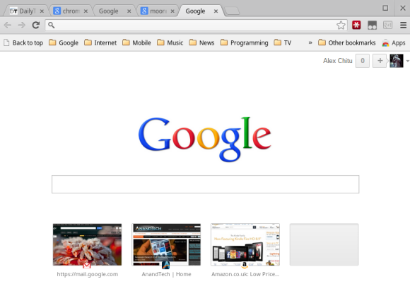
The new tab page is now Google's homepage without the navigation, the footer and the search buttons. The only thing that's kept from the old version of the new tab page is the list of frequently visited pages, but you can only see 4 pages instead of 8. The apps are available in the app launcher and there's also an "Apps" button in the bookmarks bar that links to a new internal page (it's empty right now).


What happens when you try to use the search box? It's just like the search box from Google's homepage, you're starting to type and the search box changes its position. This time, you're using Chrome's omnibox to type your query. As you can see, it's a clever trick: Chrome shows the familiar search box from Google's homepage, but it sends you to its own address bar.


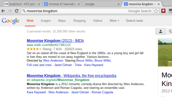
The most interesting change is that Google no longer shows the URL in the address bar for Google search results pages. Instead you'll see the query you've just typed, so you can easily change it. In fact, Google's search results pages no longer include a search box and you're only left with Chrome's omnibox.


All of these features closely integrate Google Search with Chrome. Google will find a way to make these features work even if you use Bing or Yahoo as a default search engine, but it's obvious that they're optimized for Google Search. If you also enable instant search in Chrome, search results pages will load as you type the query in the omnibox.

There are some things I don't like. Loading Google's homepage (actually this page: https://www.google.com/webhp?sourceid=chrome-instant&espv=2) every time you open a new page is inefficient and unnecessary. The updated new tab page lacks many of the features that made it useful: loading almost instantly and displaying a list of pages you are likely to visit, including frequently visited pages, apps, pages you've recently closed or pages from other devices.

Closely integrating Chrome with Google Search breaks a lot of things. For example, you can't edit the URL to tweak some parameters, the "I'm feeling lucky" feature is no longer available and the omnibox doesn't include visual spell checking, enhanced suggestions and probably other features. Suddenly, an important part of the search page will be included in Chrome and that's strange. And all of this to teach Chrome users to search from the omnibox.

"Since we launched Chrome, the team has continued to work on ways to make it fast and simple for people to use. To that end, we're going to begin testing variations of Chrome's New Tab page (NTP) in which a user's default search provider will be able to add a search box or otherwise customize the NTP. While you can search straight from the omnibox in Chrome, we've found that many people still navigate to their search engine's home page to initiate a search instead. The goal is to save people time by helping them search and navigate the web faster. We'll also allow search engines to display the user's search terms right in the omnibox, which avoids the need for a second search box on the results page," informed the Chromium blog in December.

Update: To try this feature in Chrome, open a new tab, type chrome://flags, press Enter, find "Enable Instant extended API" (use Ctrl+F), select "Enable" from the drop-down and click the "Relaunch now" button at the bottom of the window to restart the browser. To disable the feature, use the same instructions, but select "Disable".

A Google Experiment Hides the Navigation Bar

There's an interesting Google experiment that seems to be limited to Chrome 27 (dev/canary channel). The experiment removes Google's navigation bar from both the homepage and the search results pages.


To confirm that the experiment is limited to Chrome 27, I opened Firefox, changed the user agent to "Mozilla/5.0 (Windows NT 6.1) AppleWebKit/537.33 (KHTML, like Gecko) Chrome/27.0.1441.2 Safari/537.33" using this extension and the navigation bar was gone.

Maybe the experiment has something to do with all the strange features that will be added to Chrome: search box on the new tab page, special Google interface that removes the search box, replacing the URL with the search terms in the address bar for search results pages. More about this in a future post.

March 15, 2013

Google Tests Instant Site Search

Google shows a search box below the top search result, especially for navigational queries like [nytimes], [youtube] or [engadget]. The search box allows you to type a new query and restrict the results to that site. Obviously, you can still use the site: operator, but most people don't know about it.


Now Google tests a similar feature as part of Google Instant. After typing a query that has a dominant search result, Google shows a new option: "search within [your query]". Select that option and Google lets you type a new query and restrict the results to that site. It's somewhat similar to Chrome's "tab to search" feature, except that you use Google, not the site's search engine.


It's interesting to notice that Google shows suggestion when you search within a site. If you use the site: operator, Google doesn't show suggestions and the results aren't displayed as you type.


{ via Tecno-Net }

March 14, 2013

Find the Best Translation and Improve Google Translate

Google Translate shows a new message at the bottom of the page: "Would you mind answering some questions to help improve translation quality?" It's not a boring survey, it's actually a great way to test your foreign language skills by picking the best translation.


Here's the link, just in case you can't find it. The URL parameters are only for English to French translations, but you can replace "fr" with "es", "de", "it" or other language code.

{ Thanks, Samuel and Camilo. }

Google Translate Phrasebook

As previously anticipated, Google Translate added a new feature called "phrasebook". It's just a fancy name for bookmarking translations and saving them to a list. You can display the "phrasebook" by clicking the "show phrasebook" button. The list of translations is searchable and can be grouped by language pair. The feature requires to sign in to Google Account so that Google can save the phrasebook.

"Phrasebook for Google Translate jumpstarts this slow learning process by allowing you to save the most useful phrases to you, for easy reference later on, exactly when you need them. By revisiting the useful phrases in your Phrasebook from time to time, you can turn any brief translation into lasting knowledge. It's easy to start using Phrasebook. Simply click the star under the translated text to save the translation in your Phrasebook," explains Google.


Unfortunately, this feature is not very useful to generate phrasebooks because Google Translate doesn't do a good job when it comes to translating short phrases. "You are welcome" is translated "Vous êtes les bienvenus" instead of "Je vous en prie", while "What is your name?" is translated "Quel est votre nom?" instead of the more common "Comment t'appelles-tu?" or "Comment vous appelez-vous?". Not to mention "Mon nom est" instead of "Je m'appelle". Maybe Google should have generated some phrasebooks with common phrases.

{ Thanks, Florian. }

Larger URLs for Google Search Results

Google emphasizes web addresses displayed below the links to the search results. URLs are a lot larger and are harder to ignore. The "share" link for Google+ is also more visible, although it's still displayed when you mouse over a search result.


Here's a side-by-side comparison with the old interface:

Google Reader Data Points

It's hard to estimate the number of Google Reader users, but here are some data points:

- the most popular feed has more than 24 million subscribers (CNN):


- the second most popular feed has 6.6 million subscribers (Engadget):


- the third most popular feed has 1.7 million subscribers (NY Times)

- Google's official blog had 100,000 subscribers in 2007 and now it has about 353,000 subscribers


- JoelOnSoftware.com had 42,000 subscribers in 2008 and now it has 148,000 subscribers.

- according to FeedBurner, 87% of the subscribers to this blog's feed use Google Reader or iGoogle. Google Reader says that this blog has 115,035 subscribers, while the total number of subscribers is 144,173. Here are the FeedBurner stats (the green lines show the number of subscribers):


Here's the Google Trends chart for [google reader]:

March 13, 2013

No More Google Reader

Google announced that Google Reader will be discontinued on July 1st. It's a sad news, but it was inevitable. Google Reader has always been "on the chopping block" because it never got enough traction.

Everything started with a feed parser built by Chris Wetherell that turned into a feed reader, helped by Ben Darnell, Laurence Gonsalves, and Mihai Parparita. The product was launched in 2005 as a Google Labs project and it was significantly improved one year later, when the Google Reader team launched a completely new version. Over the years, Google Reader integrated with iGoogle, added social features and handled feed serving for all Google products. Back in 2007, Google Reader crawled 8 million feeds and 70% of the traffic was from Firefox users.

In 2011, Google removed Reader's social features and replaced them with a Google +1 button. It was the beginning of the end for Reader, who lost all the engineers from the original team. Google Reader is in maintenance mode ever since then.

While feeds are no longer important for many users and browsers start to drop support for reading feeds, social networks make newsfeeds popular and mobile apps like Flipboard simplify reading the news. Feeds are now a behind-the-scenes technology and full-fledged feed readers seem outdated.

"We know Reader has a devoted following who will be very sad to see it go. We're sad too. There are two simple reasons for this: usage of Google Reader has declined, and as a company we're pouring all of our energy into fewer products. We think that kind of focus will make for a better user experience," says Google's Alan Green.

It's hard to find a replacement for Google Reader, since Google Reader was the most popular feed reader and the competition couldn't keep up with it. You can still find some web-based feed readers, but none of them is as good as Google Reader. Congratulations to everyone who worked on the Reader team and thanks to all the people who subscribed to this blog in Google Reader.

Here's Google Reader's team from 2007: