Another
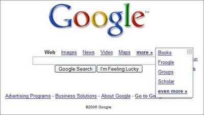
design experiment for Google homepage includes a link to Google Video, and removes the links to Google Groups and Froogle. If you click on "more", a new layer shows links to Books, Froogle, Groups and Google Scholar. This is one of the the many UI experiments made by Google in the last year. You can see a selection of the most interesting designs that were visible for a very small part of the Google users (the small descriptions are mine).
Less is more
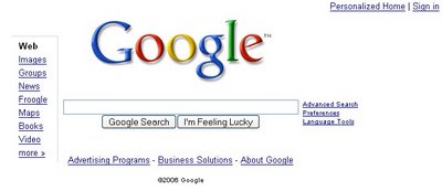
Let's copy Ask.com. Nobody will notice
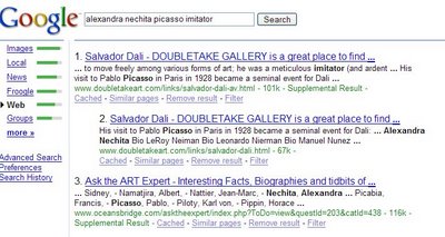
Green bars
Octopus
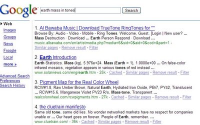
Comprehensive clutter
Sitemap Search
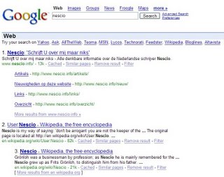
Search box invasion


I like your blog! Keep the good news coming.
ReplyDeleteWe should give every new prototype a name, in the style of the Google updates a la "Google Florida" named by WebmasterWorld. :)
ReplyDeleteI remember seeing the "Green Bars" one a while ago and not liking it alot. It disappeared soon after that. How does Google decide which ones people like and which they don't?
ReplyDeleteNo matter what the redesign is, they should make it so you do not have to go into the "more" menu in order to do a groups search. I do that more than a normal google search!
ReplyDeleteI think the joke went over a lot of people's heads.
ReplyDelete