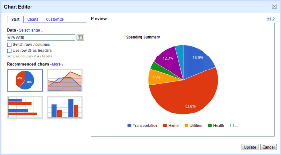
Charts look much better and you can now add timelines, organizational charts, gauges, and motion charts without using gadgets. Here are some of the new charts.
What's not so great is that you have to manually update each chart to see the new features:
Now that we have a new version of charts, you may be wondering what will happen to your old charts. You'll be able to edit your old charts for a short time, but you'll be able to create charts using the new version only. In the long term, you can keep your old charts as view-only or you can upgrade your charts to be able to edit them. When you upgrade, your data and chart type will remain the same, but the look and feel of your chart will be improved.
That's cumbersome and completely unnecessary.
The big chart should've been sorted in falling percentage order, such that it would be easy to see if the red block is more than 50% or not.
ReplyDelete(Edit: looking closer, i.e. not looking in my RSS reader, I now see the percentage is written out. Anyway, it still is the case that people tend to forget to sort data before making a graph.)
nice blog
ReplyDeletehttp://canadianpoetry.blogspot.com/
Arash
I guess improvements are always good, but what's up with the "you can't use your older charts" stuff?
ReplyDeleteI don't like the look of some of the new charts, when there are a lot of data points.
ReplyDeleteAlso when I try and publish as a web page my sheet with a chart, the link which I then view shows "access denied"? Anyone have this problem?
I got the access denied problem too
ReplyDeleteI have the same problem butsolve by again pasting the script.
DeleteReplace the script again, access denied issue is solved.
ReplyDelete