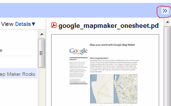
If you missed the old interface, you can now switch to the details view and see some additional information next to the filename.

There's also a small icon that lets you temporarily hide the sidebar. For some reason, Google Docs doesn't permanently hide the sidebar when you click on the arrows.

I wish for the Chrome Bookmarks feature to be brought back. Did anyone else loose this folder, or just me?
ReplyDeleteThe sidebar only shows the detail for the selected doc. When looking for the doc you want it is sometimes helpful to be able to quickly see the detail for all your docs.
ReplyDeleteAlso, How about bringing back Refresh so one can refresh the list of docs without having to reload the browser page?
Labels should be a bit more visible and organized in own column (like "last modified" and "owner" columns).
ReplyDeleteWHY don't let users choose what do and what do not want to see? I can't understand why Google is playing with us this way...
ReplyDeleteIts good that google has shown they listen to its user base. They could have avoided this whole mess by doing it better from the start though.
ReplyDeleteI agree with the above comments that refresh needs to be brought back and that labels should be in its own columns for better and easier viewing.
Id like to be able to select a label on a file and get the option of going into that label and see all of its related files.
I want check boxes back.
ReplyDeleteI want 'folders' back.
that's good to hear. why don't they just give users customizable options for which cols they want to see?
ReplyDeletegood. i wondered why it disappeared, it is very useful.
ReplyDelete