An unofficial blog that watches Google's attempts to move your operating system online since 2005. Not affiliated with Google.

Send your tips to gostips@gmail.com.

October 22, 2013

More Google Experiments That Hide Results URLs

There are at least two other versions of the Google experiment that removes search results URLs. The first alternate version places site names or domain names above the page title. For some results Google shows the site name, for other results Google displays the hostname.


The second alternate version shows both the site name and the hostname.


Which one do you like?

(As a side note, if you want to learn more about URLs, check this article written by Matt Cutts.)

{ Thanks, Rubén. }

Chrome's New Tab Page Shows Static Doodles

The last time I wrote about Chrome's updated new tab page, I complained about the animated doodles that distract you every time you open a new tab. Since Chrome replaced the new tab page with Google's homepage, you also get the doodles, including those that are animated or interactive.

Here's what I asked Peter Kasting, from the Chrome team: "If nothing can be done about the new interface, my only request would be to show a static version of the animated doodles and click a button to start the animation. That would be a big improvement. It's really annoying to see the same animation over and over again when opening a new tab page."

The good news is that Google did exactly that. The updated new tab page now shows a static version of the doodle and you need to click a "play" button to start the animation.

October 21, 2013

Google Account Chooser

A few days ago, I mentioned that Google tests a new desktop sign-in page. The new interface is called Account Chooser and this help center article offers more information.

With Account Chooser, you can personalize the Google sign-in page to remember the accounts you access frequently. You can conveniently select an account and enter its password to sign in.

If you want to add an account to Account Chooser, simply sign in and leave the "Stay signed in" checkbox selected. If you want to remember more accounts, just click "Add account" in Account Chooser to take you to the sign-in page and then leave the "Stay signed in" checkbox selected. If you want to remove an account from Account Chooser, sign out, then go to a Google sign-in page and click the Remove button below the account list.


The main takeaway is to uncheck "stay signed in" if you're using a public computer or a friend's computer. Google suggests something different, but I think it's a bad idea. "If you're signing in to your Google Account from a device that only you use (for example, a personal laptop), we recommend leaving the 'Stay signed in' checkbox selected. This ensures that you won't be constantly interrupted to re-enter your password and makes your future sign-ins easier with Account Chooser. For shared devices (a computer at an Internet cafe, for example), we still recommend that you leave the checkbox selected."


There's also a help center article about Account Chooser and federated sign-in:

"To make it easier for you to sign in to your accounts in the future, Google's sign-in page will, by default, display a list of accounts that you've previously used with a specific browser. To sign in, simply click the account entry (which includes your name, e-mail address, and photo if you have one) for the account you'd like to use. You'll then be redirected to the identity provider for your account (Yahoo mail, Hotmail, AOL mail, etc.). If you haven't typed your password recently, your identity provider may ask you to type it again. If you'd rather not use an identity provider for your Google Account, you can enable 2-step verification, or change the email address on your account to a Gmail address."

The page includes two useful links for enabling Account Chooser and disabling Account Chooser.

"If you're using a shared computer and you don't want other users to notice that you've used this computer with a particular account, you should consider using the incognito or private browsing feature of popular browsers. This way, your account entry won't appear listed on the sign-in page when another user goes to sign in," suggests Google.

This OpenID site has more information about account choosers: "Websites are replacing traditional login boxes with an account chooser to make those sites more secure and easier to use. When you try to sign in to such a site, you will see a page with the list of accounts you most frequently use on this computer."

Google tested the account chooser last year and now it looks like this feature will be enabled by default. A blog post from 2011 mentioned that "the so-called Account Chooser user interface is a replacement for traditional email/password log-in boxes used on many Web sites. The spec is part of an on-going campaign by Google and others to eliminate passwords in favor of user log-ins that rely on secure tokens which pass only authentication verification."

Change the Language of a Google Page

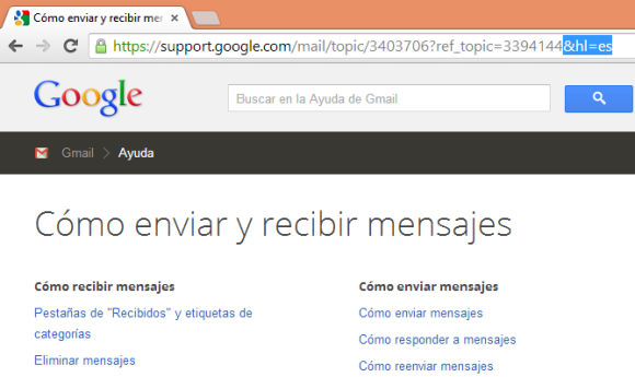
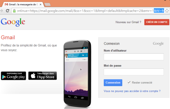
This is a very basic trick that's pretty old, but it still works in almost any Google service. If you want to change the interface language of a Google page, just add:

&hl=LANGUAGE_CODE

or

?hl=LANGUAGE_CODE 

to the URL of the page and press Enter. Replace LANGUAGE_CODE with the code of the language: en for English, fr for French, de for German, ru for Russian, es for Spanish. Here's a list of other language codes.

Google usually tries to detect your language, but sometimes it makes mistakes. A few months ago, I visited Gmail's help center and all the text from the page was in Russian. Fortunately, there's a drop-down that lets you change your language at the bottom of the page, but not all Google services offer this feature.


For some reason, the "hl" parameter doesn't change the interface language in Gmail and Google Drive, while YouTube shows a link that lets you change the language.

This trick only changes the language of the Google page you've opened. To permanently change the language used by Google services, check this page. Services like Gmail, Google Calendar and Google Drive let you change the language in the settings.

The Untranslated Google+ Share Button

Google's new navigation interface includes a redesigned "share" button that's more compact. For some reason, Google uses "share" in the English interface and "+" in the non-English interfaces.


The old share button, which is still available in Blogger, Google Wallet and a few other Google services, used this button text: "+ Share", which was translated in other languages.


{ Thanks, Florian K. }

Google Shows 3D Models for Chemical Compounds

If you search Google for a chemical compound like carbon dioxide, sulfuric acid, glucose, ethylene glycol, ethyl acetate, you'll notice that the Knowledge Graph box includes an image with the "3D" icon. Click the first thumbnail and you'll get an animated 3D model of the compound.


Google uses the player from the Google Shopping 360° Product Images feature. Here's a direct link to the player.


This is a much more complex compound:


{ Thanks, James Sacuan. }

YouTube Cards for Shows

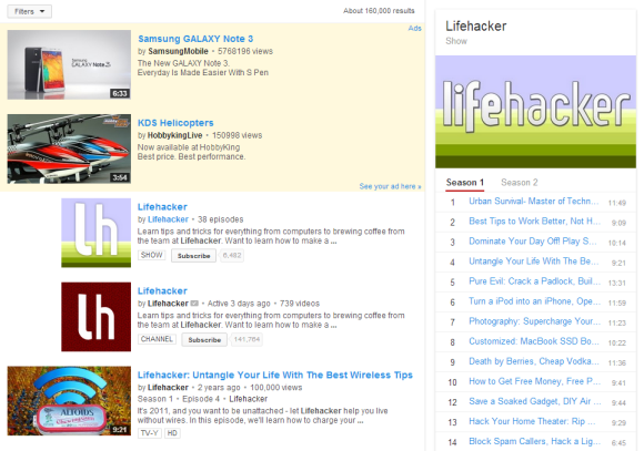
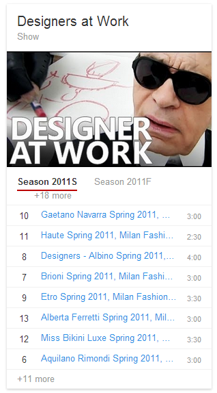
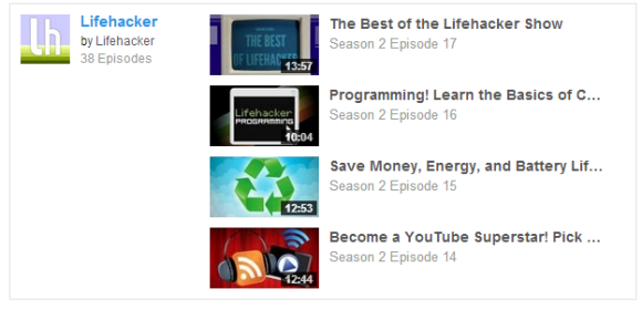
YouTube tests a new interface for the shows card that looks just like the music card. It displays a large thumbnail, a list of seasons and episodes when you search for the name of the show.

"A YouTube show is an episodic or consistently themed web series consisting of a cast along with one or various topics, styles, and/or storylines. A viewer can subscribe directly to a show as opposed to an entire channel. All episodes in a show are created by a single partner, organized into seasons and delivered consistently. Episodes may be ad-supported, purchased by rental or not monetized at all," explains YouTube.


Here's the existing interface:


Here's how you can enable the experimental feature. If you use Chrome, Firefox, Opera, Safari or Internet Explorer 8+:

1. open youtube.com in a new tab

2. load your browser's developer console:

* Chrome or Opera 15+ - press Ctrl+Shift+J for Windows/Linux/ChromeOS or Command-Option-J for Mac

* Firefox - press Ctrl+Shift+K for Windows/Linux or Command-Option-K for Mac

* Internet Explorer 8+ - press F12 and select the "Console" tab

* Safari 6 - if you haven't enabled the Develop menu, open Preferences from the Safari menu, go to the Advanced tab and check "Show Develop menu in menu bar". Close Preferences and then press Command-Option-C to show the console.

* Opera 12 - press Ctrl+Shift+I for Windows/Linux or Command-Option-I for Mac, then click "Console".

3. paste the following code which changes a YouTube cookie:

document.cookie="VISITOR_INFO1_LIVE=c1OXNGmJ090; path=/; domain=.youtube.com";window.location.reload();

4. press Enter and close the console.

To go back to the regular interface, use the same instructions, but replace the code from step 3 with this one:

document.cookie="VISITOR_INFO1_LIVE=; path=/; domain=.youtube.com";window.location.reload();

Some examples of searches: [lifehacker], [designers at work], [classical music], [gta].

{ Thanks, Rubén. }

Google Trends And the New Navigation Menu

I've recently watched someone browse the web and I was surprised to see Google's welcome message that announces the new navigation interface. If you don't hide the message or click the grid icon, the message is displayed every time you use Google. Apparently, the person next to me used Google to search the web, but he wasn't curios to check Google's app launcher.

Since the new app launcher is hidden, it's likely that less people used it than the old black bar. Google Trends shows that the search volume for queries like [google docs], [google drive], [google news] or [google calendar] increased a lot in September, when the app launcher was released. If the links at the top of the page are missing, the search box saves the day.


Here's a Trends chart that shows the US search volume for [Google Calendar] in 2013 and 2012:


{ Thanks, Jérôme. }

Picasa Web Search Goes Missing, Redirects to Google+

Ever since Google+ was launched, I wondered what will happen with Picasa Web Albums. Google now redirects all Picasa Web links to Google+ Photos, but it still lets you switch back to the Picasa Web interface. There are still Google users who haven't switched to Google+, so they need a way to manage their photos.

Picasa Web's search was a great feature that allowed you to restrict the results to your photos, the photos from your favorite users or all the public photos. Google included a lot of advanced search features, so you could sort the results by date or relevance, change thumbnail size, find Creative Commons photos, restrict the results to panoramas or portrait photos and start a slideshow from the results.


"Picasa Web Albums searches across tags, captions, album titles, album descriptions, and album locations to deliver you relevant photos and videos. Choose one of the advanced search options on the left to refine your results. Among your options are faces (with faces or without), aspect ratio (Landscape vs. Portrait vs. Panoroma), size, format (photos vs. video), camera type (Nikon, Canon, etc.), Creative Commons license type (copyright status), and the order (by date or by relevance)," informed Google.

Unfortunately, Picasa Web search no longer exists and it now redirects to Google+ Photos, which lacks all the advanced features I mentioned.


If you've joined Google+, you can see results from your photo albums and from the albums created by your circles:


If you're not a Google+ user, Google shows a list of Google+ posts that include photos:


{ Thanks, Florian K. }

October 19, 2013

A New Google Experiment Hides Search Results URLs

There's a war against URLs. Browsers start to hide them from the address bar: some remove "http" from the URL (Chrome, Firefox), Opera removes parameters, Safari for iOS only shows the domain name, Chrome and Safari show queries instead of Google's search URLs. All in the name of simplifying the interface.

A new Google search experiment replaces search results URLs with site names or domain names, depending on their popularity. Google tested a similar feature in 2011.


Most people don't understand URLs and find them too complicated. That's why many of them use search engines instead of typing URLs in the address bar, even for sites they visit frequently.

Still, web addresses are helpful because they provide useful information and they can be easily shared. If you only display "New York Times" instead of any New York Times URL, it's not obvious if you're linking to the homepage, to a section of the site, to a NYTimes blog or a blog post. URLs sometimes include useful information like the date when an article was published, the topic of the article or categories for shopping sites.

Here's an examples which shows that hiding URLs makes it difficult to distinguish between search results:


And here's the regular interface:


Google already shows incomplete URLs for search results, only displays site names for news results and replaces some URL elements with linked breadcrumbs.


{ Thanks, Rubén. }