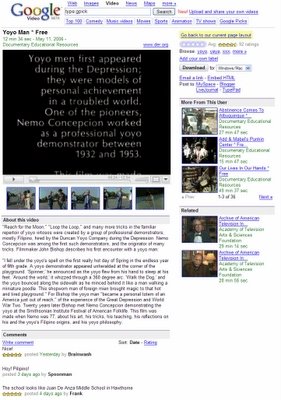
Google Blogoscoped reports a new interface experiment in Google Video. This time, it's not about the homepage, but the video page. I always liked in Google Video that the content gets the most screen space. In this experiment, Google Video tries to mimic YouTube so hard, that it's just a pale copy. The comments are placed below the video and the related video take more space. It's very hard to compete with YouTube, but losing your identity is not the right way.
To see the new layout, go to a video page and paste this in the address bar:
javascript:setCookie('np','new');window.location.reload();
If you don't like the new design, you can always go back to the current one. If many people revert to the previous layout, Google will keep it.
Kind of cool actually, the window isn't as big.. but either way I dislike both youtube and google videos crap videos, like people recording themselves to be cool, is really annoying
ReplyDelete