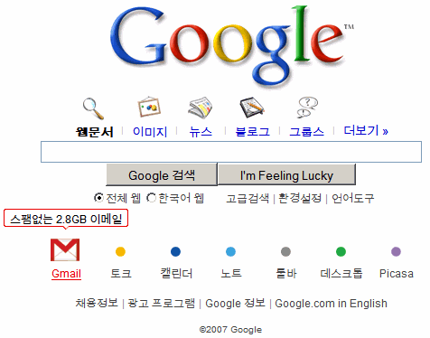
One of the first changes is a new homepage for Google Korea (English version) that uses icons to represent the services and provides more information if you hover over the icon. The homepage includes links to search services (images, news, blogs, groups), but also to Gmail, Google Talk, Calendar, Notebook, Toolbar, Desktop and Picasa.
"It was important where our classic minimalism wasn't working that we adapt," explained Marrissa Mayer to Search Engine Land. Asian Internet users want a more visual experience and Google's plain text pages aren't very appealing.

Dunno if it's bad, but I quite like the interface, especially the little poppy things down the bottom!
ReplyDeleteI wouldn't say that all Asians prefer visually rich interface.
ReplyDeleteFor example, Japanese most popoular web sites are often rather plain.
Japanese and Chinese also actively use Chinese characters that have an iconic value themselves.
Still not as good as Google X. :(
ReplyDeletethe english version is AMAZING.. i realy hope Google present us with the option of choosing a layout like this!!!
ReplyDeleteits fantstic!
anybody know whether this might be possible?
alex