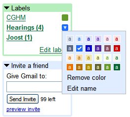

It's also easier to find related messages and to remove a label without using the drop-down.

The feature was previously available as a Greasemonkey script. I wonder if all scripts written by Mihai Parparita will become Gmail features.
{ via Blogoscoped Forum }
Update. The post from Gmail's blog that announces this feature says something interesting: "We actually kinda like folders. In fact, we're doing some work to add some folder-y-ish functionality. Stay tuned." It will probably involve some drag-and-drop.
Update 2. Gmail seems to have fixed the performance issues and doesn't cache messages so aggressively.
At last! I've been waiting fo this for a long time! Is a really useful function, hope it gets soon to my inbox ;)
ReplyDeleteI wonder if they'll ever implement some kind of hierarchy in the labels system. That way you could have some "rootlables" and depending "sublabels", instead of a never ending label list...
;) Peregrino
What link or menu is it under?
ReplyDeleteIt's in the label box on the left of the page above or under the chatbox.
ReplyDeleteI don't know if this is new or if I just missed it before, but there is also an "x" next to the label name in the detail view (see screenshot in original article) that allows you to remove a label from a message. I like the new features, keep them coming Gmail team!
ReplyDeleteD'oh! Never mind. I just re-read the post and saw that it was mentioned there. Great new feature, I just need to learn to read better :)
ReplyDeleteThis is one "feature" I could do without. I do not like it at all and I can't get rid of it. You cannot select the text colors and background colors independently. I do not want a box around the label--it is obtrusive--but if I select the only label with the same background color as the inbox, then I am forced to accept a bright blue label. It would be better if they gave us the option to not display the labels in the inbox view.
ReplyDeleteMindless and very Useless features, and as always, you can't get rid of 'em if you want to.
ReplyDeleteI'm still using the old version because I don't receive all the images whenever I get big msgs, they don't all forward when I forward them, my hyperlink just shows the code vs. the link in the signature, and worst of all, Firefox freezes up on me EVERYTIME I go back and see if any of those things are fixed!
ReplyDeleteThis is cool. I've had similar with Better Gmail. I can't wait to get it on Gmail. Would be nice if I could get the new version of Gmail. (Google Apps for my Domain user.)
ReplyDeleteWould be nice if I could get the new version of Gmail. (Google Apps for my Domain user.)
ReplyDeleteHow long we have to wait?
I wish my Gmail would upgrade! aaaah! help! still on v1.0 even in the latest browsers.
ReplyDeleteAre they simply abandoning Safari?
ReplyDeleteThey still don't support Safari 3. Anybody knows if they are working on it?
Just because you don't see the new version in your browser doesn't mean Gmail stopped supporting it.
ReplyDeleteProof
Switched from [English, UK] to [English US] Enabled the Colour (ok now Color) Labels.
ReplyDeleteMapperz
http://mapperz.blogspot.com/
Correct me if I'm wrong but I think that they have also added the "edit subject" link next to "Add Cc, Add Bcc" links when you reply to a message. Small, but useful change :)
ReplyDeleteWould be much more interesting/useful to label contacts, not only messages. Labelling all family-related, work-related, etc-related contacts would mark all work related mail with one label & color. Contact groups are not that useful - they can't be used with filtering. What do you think?
ReplyDeleteAndris,
ReplyDeleteYou're exactly right. The first things I did was make a "Family" label and color it red. It would be nice if they "auto-filled" the email addresses when you were creating filters.
This is a handy way to give some emails a priority. I really like it.
Thomas, I was wondering the same thing. We GAFYD are still second class citizens, at best.
ReplyDeleteI think GApps users (or GAFYD, whatever you like) should be grateful they don't get a buggy version of Gmail, like the rest of the people. I've already noticed some performance improvements, so in a few weeks everyone should enjoy Gmail 2.0 (and the long list of features that will be added until then).
ReplyDeleteIonut,
ReplyDeleteTruth be told, I wish I could choose that for my own domain...
* Be on the cutting edge
o use the stable stuff as long as possible
Just a little option like that :).
@John David
ReplyDeleteyou can remove the feature from each tag by, clicking following the same steps as to apply a color. But, hitting remove color in replacement for that last step.
@Ionut Alex Chitu, wrote: Well, you can. Just select "remove color" for each label.
ReplyDeleteYou have a good point, but the reason I find the colors useless is because I archive all of my emails with filters by skipping inbox, and I don't ever visit All Mail section, so the drop down arrow next to the label and little more line spacing is useless for me.
I send my best regards to G.MAIL teem engneers and disgners ,who spent long time of thier duties to istablish this high preformance , 'm waiting for this new upgrade and not wondring gmail wens last year the top 100 products , good luck to u all , thx
ReplyDeleteam i stupid, i have the latest browser but my gmail won't show any new features? do they randomly select who gets the new interface???
ReplyDeleteIf you're having trouble seeing it even now, try switching your settings in GMail to "English (US)".
ReplyDeleteStill no labels for me. :(
ReplyDeleteGood Job!: )
ReplyDelete