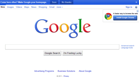
Google has always displayed a link on the homepage that bypassed country redirects: "Google.com in English" or "Go to Google.com", depending on the language. The link sent users to google.com/ncr (ncr=no country redirect), the pure flavor of Google that has all the new features and it's not biased towards the pages from a certain country.
Now the link to Google.com is also displayed below the search box so you can check the search results for the same query at Google.com. It's an useful feature, but Google also changes a cookie value and users are no longer redirected to the country-specific domain. Maybe a toggle link similar to the link to iGoogle and the classic homepage would be more useful.
{ Thanks, Arpit. }
April 30, 2011
April 29, 2011
More Ways to Upload Files and Folders to Google Docs
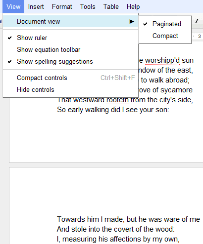
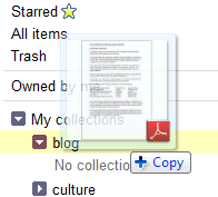
Google Chrome 7 started to support folder uploading, but not many people used this feature until Google Docs enabled it. "We've added folder upload via the new Upload menu in the latest versions of Chrome, Firefox and Safari. The existing folder structure is preserved on upload which means that folders within folders will also upload and become collections within collections," explained Google.
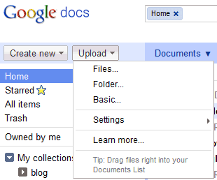
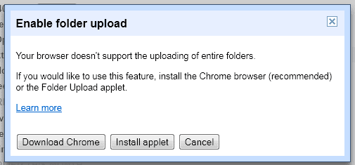
Firefox and Safari users will have to install a Java applet to upload folders. These browsers don't have native support for uploading folders, but the Java applet has an important advantage: you can upload both folders and files simultaneously.
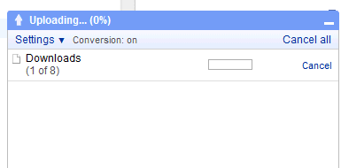
Google replaced the uploading page with a more intuitive interface. Files and folders are uploaded to the selected collection and you can check the progress in a new panel at the bottom of the page. Files are displayed immediately after they are uploaded, so you can quickly share them or edit them.
You can also upload files using drag and drop in Chrome, Firefox and Safari. It's faster and much easier, especially if you want to upload some files from the desktop. All these features are slowly rolled out, so you may not see them yet.
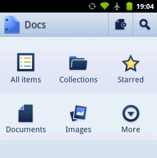
Google released a basic Android app for Google Docs that lets you upload files, in addition to viewing and editing your documents. The application doesn't add many features that aren't available in the mobile web app: you can quickly find files, share them with the phone contacts and create documents from photos. "The Docs app also allows you to open documents directly from Gmail. You can also add a widget to your home screen for easy access to three core tasks: jumping to your starred documents, taking a photo to upload, or creating a new document with one tap," informs Google.
Google Spreadsheets now lets you upload images and add them to your sheets. "From the Insert menu, select Image... Then, choose an image file to upload into your spreadsheet. With this feature, you can upload an image already stored on your computer, search for an image online, or add personal photos directly from one of your Picasa Web Albums."
Google Docs is now more about uploading and managing files and less about editing files, so the next logical step is to add file syncing.
Patents Search in Google's Sidebar
Google added a new feature to the sidebar: patents search. You no longer have to visit Google Patents to search the full text of the U.S. patent corpus since you can just click "patents" in the vertical navigation menu. Here's an example.
It may seem like a minor improvement, but this shows that Google's specialized search engines will be available from the sidebar. At some point, you'll no longer have to visit Gmail to find a contact, Google Docs to find a file or Android Market to find an Android app.
{ Thanks, François, Andrew and Herin. }.
5 Things to Try in Google Chrome 11
Google Chrome 11 has been released and there are many interesting features to try:
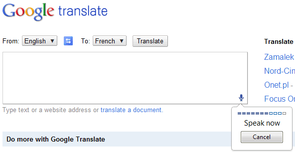
1. Use the Speech Input API by visiting Google Translate and selecting "English" from the list of input languages. "With this API, developers can give web apps the ability to transcribe your voice to text. When a web page uses this feature, you simply click on an icon and then speak into your computer's microphone. The recorded audio is sent to speech servers for transcription, after which the text is typed out for you."
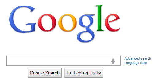
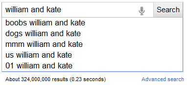
Google tests a similar feature for Web search:
2. A new interface that notifies users when popup windows are blocked. Here's a site that lets you test Chrome's popup blocker.
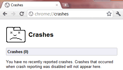
3. Type chrome://crashes in the address bar to see a list of the most recent crashes.
4. Delete multiple search engines from the tabbed settings page. Press Ctrl while clicking the search engines you want to delete.
5. A new Chrome icon. "Since Chrome is all about making your web experience as easy and clutter-free as possible, we refreshed the Chrome icon to better represent these sentiments. A simpler icon embodies the Chrome spirit — to make the web quicker, lighter, and easier for all," explained Google last month.
April 20, 2011
Google Toolbar 7 for Internet Explorer
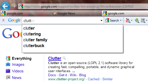
Google launched a new version of its toolbar for Internet Explorer, but it's only for IE8 and IE9. Google Toolbar 7 focuses on search: there's support for Google Instant, the search box is a lot bigger and all the other features are available in the "More" drop-down.
There's a funny help center article titled "Where did my buttons go?" which answers the most obvious question after installing Google Toolbar 7.
"You may have noticed that some or all of your Toolbar buttons have disappeared with the latest update of Toolbar. The newest version of Toolbar helps you focus on the features you use the most, by removing your less frequently used buttons from view. If you've recently used a specific Tool on your Toolbar, its button will be pinned to the Toolbar so that you have easy access to it. Otherwise, all buttons are removed by default. Don't fret -- you can easily add your favorite features back to the Toolbar. Click More next to the search box and select the tool that you want to add. It'll automatically appear back on the Toolbar."
So Google Toolbar features are less discoverable, users lost some of their preferences, but the toolbar is less cluttered.
Google Instant integration is not enabled by default, but you can open the options dialog and check "Enable Instant for faster searching and browsing".
For some reason, Google also installs Google Toolbar 7.1 for Firefox, which is an old version of toolbar and doesn't include the new features. The extension can be uninstalled from Control Panel, not from Firefox.
April 18, 2011
The Future, According to Google's Results
Today's XKCD comic explores the future using the top Google results for queries like "by the year *", "by <year> *". According to Google's search results, one year after the 2012 Apocalypse, "microchipping of all Americans begins". In 2014 "GNU/Linux becomes the dominant OS" and by the year 2020, HTML5 is finished and "newspapers become obsolete and die out".
Here's the entire future timeline, which includes prediction about Android, US debt, India, world population, global warming and robot policemen.
{ comic licensed as Creative Commons }
Here's the entire future timeline, which includes prediction about Android, US debt, India, world population, global warming and robot policemen.
{ comic licensed as Creative Commons }
Java and QuickTime Require Permission in Google Chrome
Last year, Chrome's team promised to add some features that improve plug-in security. One of them is already included in the latest dev builds: "some plug-ins are widely installed but typically not required for today's Internet experience. For most users, any attempt to instantiate such a plug-in is suspicious and Google Chrome will warn on this condition."
Two of the plug-ins that require permission every time you visit a site that uses them are Oracle's Java and Apple's QuickTime. The two plug-ins are enabled by default, but you need to click "Run this time" or "Always run on this site" to load the full content of the page. You can manually whitelist domains, but there's no way to disable the infobar.
While not many sites use these plug-ins, it's surprising to see that Chrome requires permission before loading Java or QuickTime content, even if you've updated to the latest version of the plug-in. The infobar warning is annoying, some users might ignore it, while others could think that the page tries to install malicious software.
"The reason is to protect the (estimated 90% - 95%) of internet users who do not ever need to instantiate various lesser-used plug-ins. Remember that you just have to press a single button on the sites that you trust to run Java. And then you're done. In fact you're much better than done: you've limited your exposure to Java security vulnerabilities such that a drive-by malware Java ad won't automatically run. I encourage you to read about the evolution of drive-by downloads and pay particular attention to how Java is being used in a lot of current attacks, even when it is fully up to date," explains a Chrome engineer.
An article from November 2010 informs that "a Java exploit has replaced exploits of PDF file weaknesses to become the most common threat, according to G Data SecurityLabs. Java vulnerabilities offer cyber criminals a lot of potential on the technical side, said researchers, and the development and distribution of malicious code is considerably easier than other methods of infecting a system. Topping the list is Java.Trojan.Exploit.Bytverify.N, which exploits a security hole in Java's byte code verifier. Using this exploit allows the execution of malicious code which could enable an attacker to gain control over a victim's system. This trojan is typically found on hacked websites, where it attempts to infect PCs through drive-by download through a manipulated Java applet, researchers said. Just visiting an infected website with an unprotected computer will be enough to infect a system." G Data expects "a significant rise in the number of Java-based malware in the coming months".
April 16, 2011
Videos Uploaded to Google Video Will Be Removed Next Month
Google sent the following message to everyone who uploaded videos to Google Video:
It's really disappointing to see that Google doesn't provide an option to migrate your videos to YouTube. In fact, this option should've been available two years ago, when Google Video became a search engine. There are about 2.8 million videos hosted by Google Video and it's hard to believe that all of them will be manually uploaded to YouTube.
Google Video is an archive of high-quality videos: there are many documentaries, interviews, lectures and it's sad to see them disappear. Even if Google Answers was discontinued in 2006, the archived content is still useful.
{ Thanks, Richard and Kevin. }
Later this month, hosted video content on Google Video will no longer be available for playback. Google Video stopped taking uploads in May 2009 and now we're removing the remaining hosted content. We've always maintained that the strength of Google Video is its ability to let people search videos from across the web, regardless of where those videos are hosted. And this move will enable us to focus on developing these technologies further to the benefit of searchers worldwide.
On April 29, 2011, videos that have been uploaded to Google Video will no longer be available for playback. We've added a Download button to the video status page, so you can download any video content you want to save. If you don't want to download your content, you don't need to do anything. (The Download feature will be disabled after May 13, 2011.)
We encourage you to move to your content to YouTube if you haven't done so already. YouTube offers many video hosting options including the ability to share your videos privately or in an unlisted manner. (...)
If you have many videos on Google Video, you may need to use the paging controls located on the bottom right of the page to access them all.
Please note: This download option will be available through May 13, 2011.
Thank you for being a Google Video user.
It's really disappointing to see that Google doesn't provide an option to migrate your videos to YouTube. In fact, this option should've been available two years ago, when Google Video became a search engine. There are about 2.8 million videos hosted by Google Video and it's hard to believe that all of them will be manually uploaded to YouTube.
Google Video is an archive of high-quality videos: there are many documentaries, interviews, lectures and it's sad to see them disappear. Even if Google Answers was discontinued in 2006, the archived content is still useful.
{ Thanks, Richard and Kevin. }
April 15, 2011
Google Quick Scroll Integrates with Instant Previews
If you use Quick Scroll for Chrome or Google Toolbar, Google highlights the sections of the page that are the most relevant to your query. That means you can click on a search result and quickly find the best matches.
Google Quick Scroll now integrates with Instant Previews, so you can click on a highlight from Google's screenshot to be magically taken to that part of the page. It's a lot faster to find what you're looking for, especially if you have to scroll to the bottom of the page.
Google's previews are now available for Microsoft Office documents and presentations. There's also support for Flash, so you'll no longer see a puzzle piece image instead of a Flash object.
{ via Google Blog }
Better Google News in Opera Mini
Opera Mini is one of the most popular mobile browsers, but not many websites optimize their interface for Opera Mini. Most Google services have two mobile interfaces: a basic WAP interface and a more advanced interface for smartphones. Opera Mini always displays the basic interface because the browser is actually a thin client that can't handle web apps properly. Fortunately, there's an exception to this rule: Google News shows the smartphone interface in Opera Mini.
"While the Google News team has been hard at work redesigning our service for smartphones, we've also been thinking about our milllions of users around the world who access the web not from a smartphone, but from a feature phone, using Opera Mini as their browser. So we have rolled out a redesigned Google News for Opera Mini in all 29 languages and 70 editions of Google News. This includes an enhanced homepage featuring richer snippets, thumbnail images, links to videos and section content without explicit navigation, a convenient search bar, comfortably spaced links and the ability to access your desktop personalization on your phone," informs Google.
Google's blog post ignores that Opera Mini is also available for iOS, Android, Symbian and other mobile operating systems, so it's not just a browser for feature phones. Opera Mini is really useful while roaming, for slow Internet connections and for data capped mobile contracts. Hopefully, Google News won't be the only Google service optimized for Opera Mini and Google services like Google Docs, Google Calendar, Picasa Web Albums will fully support Opera's desktop browser.
April 14, 2011
Google Translate, Now With Voice Input
Google Chrome 11 added support for HTML speech input API. "With this API, developers can give web apps the ability to transcribe your voice to text. When a web page uses this feature, you simply click on an icon and then speak into your computer's microphone. The recorded audio is sent to speech servers for transcription, after which the text is typed out for you."
Google Translate is the first Google service that uses this feature. If you use Google Chrome 11 Beta, Google Chrome 12 Dev/Canary or a recent Chromium build and visit Google Translate, you can click the voice input icon. Right now, this feature only works for English, so you need to select "English" from the list of input languages.
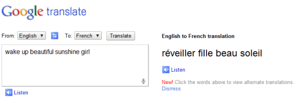
Unfortunately, the results aren't great. I tried to translate "beautiful sunshine" into French, but the speech-to-text engine didn't work properly and Google had to translate "wake up beautiful sunshine girl".
{ Thanks, Kalin. }
April 13, 2011
Google Highlights Recent Image Search Results
Google started to index images a lot faster and it now even highlights recent results by showing a small label like "1 day ago" or "22 hours ago" below the image. You can't yet restrict the results to recent images, but I'm sure that this feature will be available in the near future.
Here's an example of a query that returns many recent results. It's easy to notice that not all the results are from news sites, so the images aren't from Google News.
Google's Big Blue Bar
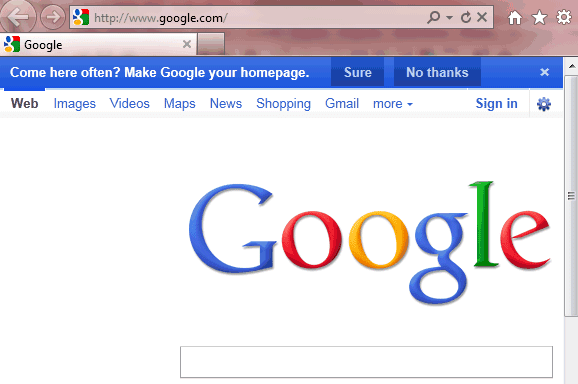
"Come here often? Make Google your homepage" is the new promotional message that tries to convince Internet Explorer users to set Google as their homepage. After all, it's easier to convince people to change the homepage than to install Google Toolbar or Google Chrome.
Google no longer shows the message below the search buttons: it now displays a big blue bar at the top of the page. If you click "no thanks" or the "x" icon, Google will no longer display the message.
Sometimes Google also shows a Chrome ad and it's really difficult to sign in or go to iGoogle without clicking on one of the ads.
Why target Internet Explorer users? IE is the only important browser that doesn't use Google as the default search engine and doesn't even include Google in the list of search engines.
{ Thanks, Sterling. }
Google Calendar's Favicon Changes Every Day
When Google Calendar changed the favicon, many people wondered why it only shows 31. "Does it mean that starting today, every day will be the 31st ? Serously, favicon should be changed everyday to match the date," suggested a Google Calendar user.
Google listened to the feedback and the favicon will now change every day. "When you look at the Google Calendar icon at the top of your browser window, it will no longer always display 31 but will instead change to reflect the current day of the month. Today's date is now always a short glance away."
Google Calendar is the first Google service that has a dynamic favicon, but you can change Gmail's favicon to show the number of unread messages.
Opera Turbo Uses WebP to Compress Images
Opera is probably the best browser for slow Internet connections, especially if you enable Opera Turbo, a proxy that compresses web pages. Opera 11.10 improved this feature significantly by replacing highly compressed JPEGs with WebP images.
"The most noticeable difference is probably WebP. An open standard image format that was released with some fanfare by Google last year. We thought it was about time to replace the 20 year old JPEG format with something more modern. Overall, WebP produces images with less artifacts and crisper details, even though the image takes less space," says Opera's Audun Mathias Øygard.
Here's an image from BBC's site in Opera 11.01 (JPEG) and Opera 11.10 (WebP):
Opera's tests showed that there's an important speed improvement: "about 22% less data transferred compared between old and new Opera Turbo". For example, BBC's science page uses 724.1 KB, instead of 1111 KB, in the old version of Opera Turbo.
There are two browsers that support WebP: Chrome and Opera 11.10, but Opera's team found a great way to use it. It's important to mention that WebP is based on WebM/VP8, a video format open sourced by Google.
{ via FavBrowser }
April 12, 2011
Google Docs Adds Pagination and Native Printing
After two months of testing, Google Docs added a very useful feature: pagination. Google Docs adds "visual page breaks while you're editing your documents, so now you can see how many pages of that report you've actually finished. Headers now show up at the top of each page instead of just at the top of your doc, manual page breaks actually move text onto a new page and footnotes appear at the bottom of the pages themselves."
If you use Google Chrome, you'll see an important change when printing a document: it's no longer converted to PDF. "We've worked closely with the Chrome team to implement a recent web standard so we can support a feature called native printing. (...) With native printing, you can print directly from your browser and the printed document will always exactly match what you see on your screen," explains Google. Until now, Google converted the document to PDF and you had to download the file and print it using Adobe Reader or a similar PDF viewer.
Google Docs looks more and more like an advanced word processor. You no longer have to use workarounds for basic features like pagination and printing.
A Google a Day
Google launched a site that shows a puzzle which can be solved using Google Search. "A Google a Day is a new daily puzzle that can be solved using your creativity and clever search skills on Google. Questions will be posted every day on agoogleaday.com and printed on weekdays above the New York Times crossword puzzle," informs Google's blog. Some may say it's just a way to increase Google's market share in the US, now that Bing is increasingly popular. Microsoft also used games to attract more users, so it's not a new idea. Unlike Microsoft's Club Bing, there's no monetary incentive to solve Google's puzzles.
"A Google a Day" was created by Daniel Russell, a Googler who has a great blog about web search. "For the past several years I've been trying to put together some kind of game that would engage people in a playful way to learn how to search. After many trials, we FINALLY got one version of the Search Game out into the world! AGoogleADay.com is a simple game that poses a daily search puzzle for you to solve. The game starts today (Monday April 11, 2011) and will run for the next four weeks with each day's puzzle getting harder from Monday through Friday. The secret agenda here is to get people to play around with search and to learn all they can do. I've felt for a while like Goggle gives people intergalactic hyperdrive starship capabilities, but most people only explore the shallows by paddling around with their shuttlecraft," notes Daniel.
The most interesting thing about Google's new site is that it uses an index called Deja Google which leaves out recent web pages. "To keep the game interesting for everyone, we created Deja Google – a wormhole inspired time machine that searches the Internet as it existed before the game began. Because nobody wants someone's recent blog post about finding an answer spoiling their fun."
Until Deja Google becomes a standalone service, you can use agoogleaday.com to remove recent pages from the results and to search Google's index from April 5. You can also bookmark this URL: http://www.google.com/webhp?esrch=Agad::Public&nord=1.
Google's Inconsistent Menus
The trouble with using two menus instead of one is that you never know which menu is the one you need. That's probably the reason why Chrome's team opted for a unified menu.
Here's the menu displayed when you click your name in Gmail:
... and here's the options menu, this time in Google Search:
Notice that "account settings" and "privacy" are added to both menus, depending on the service you use. It's likely that the first menu is used for account-related features and the second menu is used for features related to the service you're currently using, but that's still confusing.
April 9, 2011
The Brilliant Bing for iPad
Microsoft has recently released an iPad app for Bing that's really impressive. "Bing for iPad goes beyond the traditional search experience, offering a unique and visually rich way to search the Web. The app is designed from the ground up for touch. You can quickly browse news, movies, Bing homepage images, local business listings and much more – all with the swipe of your finger," informs Bing's blog.
Bing for iPad transforms a bland search engine into a visual application that lets you interact with information. The app is fluid, the integration of all the specialized search engines is almost seamless and there are a lot of small features that make your life easier. For example, you can quickly highlight matches, go to the next image result using gestures and go back to the list of search results using a back swipe.
Unfortunately, Bing's results aren't always great, but they've improved a lot lately. Voice search didn't work well for me and there's no visual search.
Google doesn't have a search app developed specifically for iPad, but there's a universal app for iPhone and iPad that adds features like voice search and visual search to the standard Web interface. The latest version of the app added two gestures that enhance the interface, but many users complain that they slow down the app. While Google's results are still better, Google has a long way to go to catch up when it comes to the user interface.
April 8, 2011
Google Tests a Search Option for Definitions
Google experiments with a search option that lets you find the definition of a word without using the define: operator or adding "definition" to the query. Selecting the "dictionary" option from the sidebar doesn't restrict the results to sites like Dictionary.com and Answers.com, but shows the information that's available in Google Dictionary. To be fair, Google includes a section called "web definitions" that shows definitions from Wikipedia, WordNet and from different glossaries.
This feature is not yet available to everyone, but you can always install extensions like Google Dictionary for Chrome, Google Dictionary and Google Translate for Firefox or add Google Dictionary to your browser's search engines.
Reading Levels in Google's Sidebar
Google's search options sidebar includes a feature that was only available in the advanced search page: filtering results by reading level. If you enable this feature, Google will classify search results based on the complexity of the text. You can restrict the results to "basic" pages, "intermediate" pages and "advanced" pages, which are mostly scholarly articles.
"Sometimes you may want to limit your search results to a specific reading level. For instance, a junior high school teacher looking for content for her students or a second-language learner might want web pages written at a basic reading level. A scientist searching for the latest findings from the experts may want to limit results to those at advanced reading levels," explains Google.
April 7, 2011
Gmail Lets You Disable Auto-Adding Contacts
As previously announced, Gmail added a setting that lets you disable automatically saving email addresses to your contacts. Go to the Settings page, find the section "Create contacts for auto-complete" and you'll notice that the following option is enabled by default: "When I send a message to a new person, add them to Other Contacts so that I can auto-complete to them next time". Now you can disable this feature and select "I'll add contacts myself".
This is one of the features from a long changelog of small improvements. "Refresh" is now a button, the keyboard shortcuts guide is now available even if keyboard shortcuts are disabled (just press Shift+?), Gmail shows more useful warnings when you leave out the "." in ".com" from an email address and there are fewer warnings when you reply to a message in the Trash.
April 6, 2011
Google's Tilted Easter Egg
If you search for [tilt], [tilted] or [askew] on a smartphone using Google, you might notice a strange special effect: Google's search results page is tilted to the right. It's an Easter Egg, just like the "did you mean" link displayed when you search for [recursion].
{ via Search Engine Land }