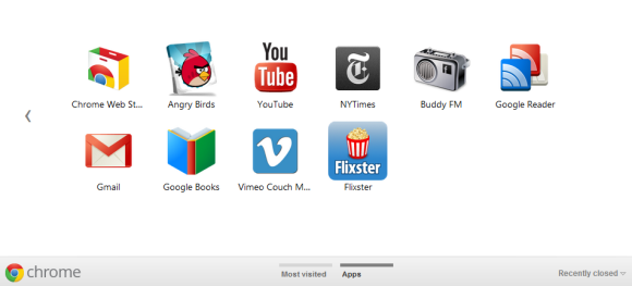
1. A redesigned new tab page inspired by mobile interfaces. There are two "homescreens" for apps and most visited pages, but you can create a new "homescreen" by dragging apps and pages to the bottom bar and selecting the new "homescreen". You can also remove pages and apps by dragging them to the bottom bar and then to trash area ("remove from Chrome"). Any bookmark can now become app: just drag it to the new tab page. This also works for the most visited pages.

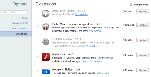
2. The extension manager is now a section of the options page and has a new interface. You can now use the inline search box to find extensions. The old interface is displayed if you type chrome://extensions in the address bar, while the new address is: chrome://settings/extensions.

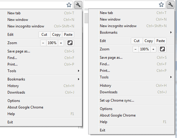
3. Chrome's menu has changed: the bookmarks menu is easier to find and there's a new item for Chrome sync.

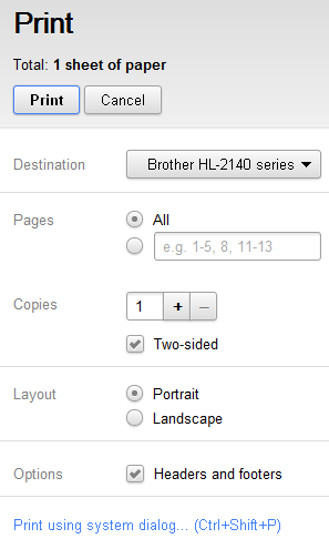
4. If you don't like Chrome's print preview page, use a shortcut to open the native print dialog: Ctrl+Shift+P (Cmd-Shift-P for Mac).
5. You can now print headers and footers.

Can you find other new features?
just found the extensions thing in options today and liked it. nicely done.
ReplyDeleteIn about:flags there are some new options:
ReplyDelete- Smooth scrolling
- Open Tabs sync
- ...
The windows toolbar icon now shows a badge for Incognito.
ReplyDeleteStill no multitouch support though :(
you can create groups/folders by drag&dropping an app (at the bottom next to "most visited" and "apps")
ReplyDeleteGo back just by scrolling right on Mac (MagicMouse)
ReplyDeleteNow with animated arrows
In my opinion, there should be additional 'tabs' in the New Tab Page.
ReplyDeleteThe "Recently closed" should be a tab, not a side button.
There should also be a "Bookmarks" tab that contains ALL my bookmarks.
Vote here: http://www.google.com/support/forum/p/Chrome/thread?tid=6fb665f01a460bdb
All of the icons should be customizable.
yay...just use Opera...
ReplyDeleteThanks for the heads-up. I have one concern.. is this safe for browser for loading? because in firefox i saw some minor problem when you have lots of plugins which cause to hang the browser.
ReplyDeleteWhen are they going to fix the flash crashing problem?
ReplyDeletei just hope that chrome will make the plugin extension smoother.. sometime i find that the java script function always crash.. is it my laptop or the whole chrome thing is the problem??
ReplyDeleteWTF with Angry Birds everywhere??? Stop that.
ReplyDeleteIf you end up with a blank tab on the new tab screen, the only way to clear it is to restart Chrome.
ReplyDeleteShame you cannot rename the new pages either.
I believe Dev users and canary users have had these features for months? I am on 17.0.919.0 As everyone seems to be on 15ish
ReplyDeleteI like the drag and drop apps. Angry birds rule!
ReplyDeleteI was kinda freaked out at first coz I couldn't find the "pinning" option on most visited pages (the option is gone now). Then I found that sites can now be pinned as apps rather. Not bad.
ReplyDeleteDo you know how to remove created "homescreen"?
ReplyDeleteTo remove a homescreen, drag all the apps or pages to a different homescreen. When you open a new tab, it should be gone.
ReplyDeleteThey added the elastic effect on Mac, just like it is on Safari for Mac OS X Lion. Now you can scroll passed the page, up and down.
ReplyDeleteAnd just like Safari, you can navigate previous and next by scrolling left and right.
Pretty cool!
Very nice post about google analytical post. I like it. Thank you.
ReplyDeleteHopefully it is stable enough, new features are irrelevant, if it is still crashing because of flash...
ReplyDeleteI don't like the "new tab - page" because in the most visited tab i don't have that thing that will keep my favorite pages in the right positions that i want.
ReplyDeleteWake me up when you can ctrl+tab to different tabs in most-recently-used order.
ReplyDeletei'm not into apps, so i found the apps in the base of chrome new tab kind a not so useful.. :-( maybe they can put bookmark link or news link...
ReplyDeleteChrome was good for now. And I hope it will last. Unlike in Firefox. I experience hang and I don't know why...
ReplyDeleteThere are good things and bad things. But there's a terrible mistake: the new "new tab" tab.
ReplyDeleteSeriously. You have really fucked up zillions of people with this.
Why do I have to choose between the most visited and recently closed lists? I want both! Everybody wants both on the same page, without unnecesary clicks!
Bad Google Chrome Tea. Too bad. This is almost as bad as the humongous hike in HDD's retail prices. But not as bad as the 'The Office' new episodes.
Why are you microsofting yourselves and hinder your users bye changing the place of things and hiding options or prohibitting them? Is Google going to be as dreadful an anomic as Apple?
¡Viva Opera!
For me chrome was good in service. Anyway, Thank you for allowing me to be updated.
ReplyDeleteHow do I get rid of the new tab page, all I want is a simple blank page when I click new tab.
ReplyDeleteStuff like this puts me off chrome - no warning that I saw that it was going to be changed (so no chance of saying 'no thanks'), and no way to control it so that it does what I actually want.
Is Google Instant in the Onmibox enabled by default? Because I switched it off before and now it's on again. And I get HTML5 video in Youtube
ReplyDeleteHow do I hide it all. I like just seeing my theme background...not websites. I want it to be blank or at least put back the option
ReplyDeleteLike many others I am dismayed at the introduction of yet another selling ploy on the Google Chrome new tab page. I was more than happy with the previous plain page and now extremely angry at this imposition. I am now looking for another browser which will not inflict Google's invite to visit their web store. Change for change sake and clearly a lot of unhappy customers.
ReplyDeleteThanks for totally screwing up my Google Chrome!
ReplyDeleteThis new bar at the bottom of the tabs page is absolutely ridiculous with no way of shutting it off! Who comes up with this garbage?!!!!!
ReplyDeleteGoing to remove google chrome now. The new tab is a complete joke. i don't have a need for images and or most visited sites. Obviously, google's apps are crap, so no need for those. I just want a new tab to open to a BLANK page. Horrid update.
ReplyDeleteI totally agree. We should have the option of a simple page with only the beautiful theme. Everything else should be able to be pulled up or hidden.
ReplyDeleteGoogle is beginning to look as ugly as Windows 8. Why not at least give us choices?
I also totally hate the new bar at the bottom of the page. At least let us hide it or make it transparent.
ReplyDeleteChrome used to be wonderful and unique; it is sinking to the lowest common denominator.
Good to know this valuable information you share. Thank you for post new update with regards in chrome.
ReplyDeleteWhen there is no internet connection, all the apps are greyed out except some offline apps like Scratchpad.
ReplyDeleteHTML5 fullscreen video now works (enable html5 video in youtube at youtube.com/html5)
ReplyDeleteSaw the angry birds logo and got excited! I love Angry Birds!!!!!
ReplyDeleteThe only problem I have with Chrome is that it keeps crashing after using Shockwave. Why????
ReplyDeletelove chrome. thanks keep it coming
ReplyDelete