November 30, 2011

How to Try Google's New Navigation Menu

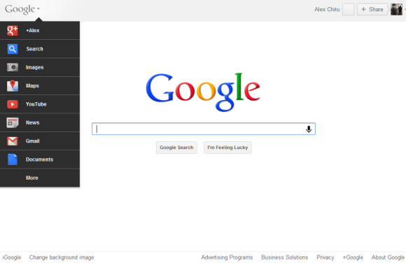
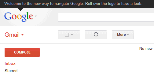
Google has recently announced a new interface that hides the navigation menu until you mouse over the logo. If you'd like to try to interface before, you can edit your Google cookie and use some values that trigger the new UI.

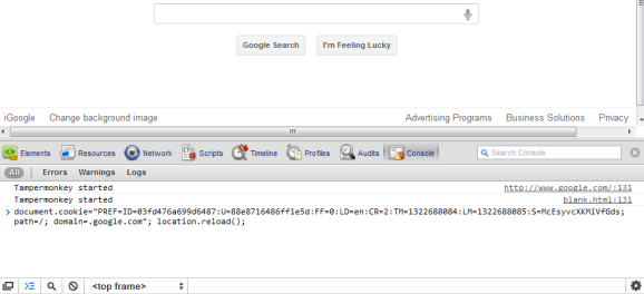
If you use Chrome, Firefox, Safari or Internet Explorer 8+, open google.com in a new tab, load Chrome's JavaScript console (Ctrl+Shift+J), Firefox's Web Console (Ctrl+Shift+K), Safari's Web Inspector (how to do that?) or IE's Developer Tools (press F12 and select the "console" tab) and paste the following code:

document.cookie="PREF=ID=03fd476a699d6487:U=88e8716486ff1e5d:FF=0:LD=en:CR=2:TM=1322688084:LM=1322688085:S=McEsyvcXKMiVfGds; path=/; domain=.google.com";window.location.reload();


Then press Enter and close the console. If you're not in the US and you're using a different Google domain, replace ".google.com" with your domain in the code (for example: ".google.co.uk" in the UK). Please note that this only works for the English interface, so you many need to adjust the language in the preferences page.


{ via Tecno-Net }

Google's Hidden Navigation Menu

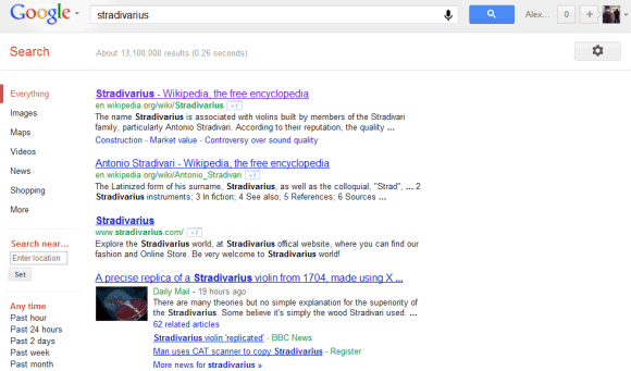
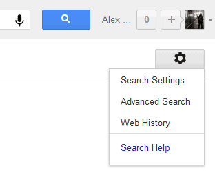
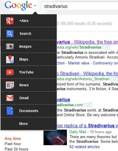
As previously anticipated, Google will drop the black navigation bar and will use a simplified navigation interface that will make the transition between two Google products seamless. Google+ notifications, the sharing box and the profile menu will be displayed next to the search box, while the list of Google services will be placed in a drop-down menu next to the Google logo.

"The Google bar, which runs across the top of the browser of nearly all Google services and offers easy access to Google's products, has recently updated its look for a more consistent, streamlined user experience and increased visibility of the most popular services," explains Google.


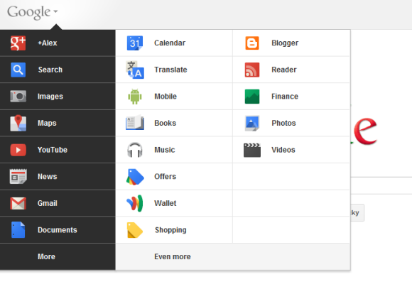
The new navigation interface no longer uses additional space, it's more compact and the short list of Google services that's displayed by default matches Google's simplified product line. The menu links to Google+, Web Search, Image Search, Google Maps, YouTube, Google News, Gmail and Google Docs, but you can mouse over "More" to see additional services. Here are the services that have never been included in the navigation bar until now: Google Wallet, Google Offers, Google Music, Google Mobile and Blogger.

While the new interface looks modern, it's also less user-friendly because the navigation links are hidden behind a drop-down menu and the average user might not be able to find them. Android's menu button wasn't a great idea and Ice Cream Sandwich made menus more visible, so it's not clear if this is going to work. Google's homepage will expand the product menu by default, but it will be interesting to see if Google users will actually notice that mousing over the Google logo lets them access Gmail, Google Docs and other services.


I don't see the new interface yet, but it's likely that it will be rolled out in the coming days.

Update: try the new interface.

November 29, 2011

Smooth Scrolling in Google Reader

Google Reader's settings page has a new section where you'll find "experiments you can choose to opt-in and try out". It's like a small Google Reader Labs that only has a single experiment you can enable: smooth scrolling. This feature makes the transition between items smoother and it's especially useful in the expanded view.


While this feature is more difficult to find, you've probably noticed the colorful ball that's displayed when Google Reader loads new posts. The animation is one of the few colorful elements from the new Google Reader interface.


{ Thanks, Venkat. }

November 28, 2011

Cached Pages in Google Mobile Search

Maybe it's not so obvious, but the link to the cached version of a search result is still available when you're using Google Search on a mobile phone. Just like in the desktop interface, you need to click the Instant Preview icon (a magnifier) and you'll find the "cached" link.


For some reason, the links to the mobile formatted version and to the list of similar pages are no longer displayed. To go back to the old interface that displayed all these links next to the search results, bookmark http://www.google.com/m or replace "google.com/search" with "google.com/m/search" in the URL (just add the two characters in bold).

November 23, 2011

Google's Broken Drop-Down Lists

Google has recently redesigned the advanced search page and removed two options that weren't used very often: finding pages that are similar to a page and pages that link to a page. You can use the similar: and link: operators and "similar pages" and still available in the Instant Preview pane, so the features haven't been removed.


What's disconcerting is that Google made drop-down lists a lot more difficult to use in the new interface. Until now, you could use the tab key to select a list, but this no longer works. After clicking a list, you could use the up/down arrows or Page Up / Page Down to move between the options, but you can no longer do that. It was much faster to type the first letters from the name of the language or the country to quickly find an item, but this is another feature that no longer works. Basically, the only way to use the new lists is to scroll up or down until you find the item you were looking for.


Google's lists are also inaccessible to screen readers, so they can't be used by people who are blind or visually impaired. The explanation is that Google now uses regular lists with custom styles instead of drop-down lists (or drop-down menus). Disable CSS and you can no longer select an item from the list.


You can check the old advanced search page at the Wayback Machine or the advanced image search page, which still uses the old interface.

Another service that makes drop-downs more difficult to use is Blogger. If you have a long list of labels, you can no longer find a label by typing the first letters.


Google Reader's new interface lets you use arrows to move between the items from a list, but you can no longer type some letters from a subscription's name in the "All items" drop-down. This was a non-standard featured added back in 2007, when Google Reader added a search engine.


Hopefully, Google will address these issues and will no longer remove basic features that are taken for granted by many users.

November 22, 2011

Restrict Google Results to Mobile Apps

Google's search engine for mobile apps is now available in the sidebar. Just click "More" in the left sidebar and select "applications" to restrict the results to Android and iOS applications. The results aren't only from Apple's App Store and Google's Android Market: you'll also find results from AppBrain, AndroidZoom, CNet and more. Unfortunately, you can't restrict the results to iOS apps or Android, find iPad apps or filter the apps by rating or price.

Here are the results for [games]. The search engine doesn't have a proper homepage, but you can bookmark this page.


The search engine for mobile apps was initially available in the mobile version of Google Search as an OneBox, and then as a search option. Earlier this year, Google added support for app-related rich snippets.

Google Help Forums Migrate to Google Groups

Back in 2009, many of the official Google discussion groups moved from Google Groups to a new platform called "Google Help Forums". Now it's time for them to go back to Google Groups.

"Over the next several months, we'll be migrating our 250+ help forums in 20+ languages to the new Google Product Forums platform. Built on the new Google Groups, Google Product Forums provide users with a fresh interface and robust features for asking questions and discussing our products. The new platform brings some exciting new features to our forums. For example, you can now select between starting a discussion or asking a question, quickly indicate your own interest in a question that has been asked by voting 'Me too!,' and easily share a topic with your circles on Google+," explains Google.

Google+ and Chromebooks Central already use the new platform and you'll be able to find the upcoming forums if you bookmark this odd URL.


{ Thanks, Herin. }

Google Discontinues Knol, Friend Connect and Other Services

Google closed a lot of services this year, but there are still a few projects that weren't successful enough and have to be discontinued. Probably the last batch of services that bite the dust includes: Google Bookmarks Lists, Google Friend Connect, Google Gears, Google Wave and Knol. Google also removed the timeline search option, which created "a graph of historical results for a query".

Google Friend Connect will be replaced by Google+ pages. It will still be available until March 1, 2012 for non-Blogger sites, while the Blogger feature will continue to work for a few more months. Google Wave will become read-only on January 31 and it will be closed 3 months later. The Gears-based offline mode will no longer work in Google Calendar and Gmail starting from next month, so if you're still using an old version of Firefox or Internet Explorer for this feature, you'll have to switch to Chrome. Bookmarks Lists will continue to work until December 19, but I'm sure that not many people will miss it.

Knol is a project that attracted experts who wrote a lot of interesting articles, but it wasn't successful enough to make a difference. After all, Knol was a niche service and Google's goal is to "focus on products that can benefit the most people and solve the most important problems". Google informs that "Knol will work as usual until April 30, 2012, and you can download your knols to a file and/or migrate them to WordPress.com. From May 1 through October 1, 2012, knols will no longer be viewable, but can be downloaded and exported. After that time, Knol content will no longer be accessible." Why not preserve the content? Some Google Answers pages are still useful after so many years.


It's interesting that all these projects, except for the Gears plugin and the timeline option, had a social component. Now that Google+ is Google's social hub, it makes sense to replace these projects with Google+ features.

November 21, 2011

Updated Google Search App for iPad

Google's search app for iPad needed an update. That was especially obvious if you installed the Bing app, probably the best search app for iPad.

Now you can try the latest version of Google's app, which adds a lot of useful features on top of the regular web interface. "We have added new features to make the app more interactive, more visual and to help you find what you want more easily," explains Google.

You'll see the results faster because Google Instant is enabled by default. Once you've clicked a search result, you can +1 the page, share it or highlight one or more keywords. To go back to the search results page, click the Google logo or slide the page to the right.


Google Image Search lets you see the results in a slideshow, an improved version of the similar feature from the mobile interface. "Tap on any image result to use the new image carousel, which lets beautiful images shine. You'll see the image you selected expand, and you can easily swipe through the carousel to see other similar images."


There's also a new interface for Instant Preview that lets you explore the list of results in a visual way. The same interface is also used to display the search history.


The app is available in the App Store, but you can only install it if you've updated the iPad to iOS 4 or iOS 5. It's a major improvement, but the Bing app is still more fluid, has more features and it takes advantage of the iPad's capabilities to display maps and local search results.

Chrome's Enhanced Spelling Suggestions

I've mentioned in a previous post that Chrome will use a web service to improve spelling suggestions. This feature is already available in the latest Canary / Dev Channel builds and you can test it. As you can see in the image below, this is a minor enhancement that adds one suggestion at the bottom of the list, but only if it's useful.


The left screenshot shows the result obtained from Google's online spell checker: "Gmail" is the most likely spelling correction for "Gmal", but a dictionary-based approach can't tell you that. Google can:


"Google Chrome can provide smarter spell-checking by sending what you type in the browser to Google servers, allowing you to use the same spell-checking technology used by Google search," explains Google.

It's disappointing to see that the most useful suggestion is added after all the other suggestions, which are terrible. After all, Google's search engine has probably the best spell checker and Chrome only uses it to supplement the list of suggestions that's generated locally. The latency makes it difficult to instantly display the suggestions obtained from a web service, but Google should find a way to minimize the delay and switch to the online spell checker.

Right now, the feature is disabled by default, but you can enable it by right-clicking on a text box, mousing over "Spell-checking options" and clicking "Ask Google for suggestions". The feature can also be enabled from the settings page in Chrome Canary: just go to the "Under the hood" tab and check "Use a web service to help resolve spelling errors". This only works in the latest Canary/Dev Channel builds and in Chromium.

Hopefully, the updated privacy policy won't make users hate this feature and Google will anonymize the data, just like it does for the Omnibox suggestions.

YouTube Tests a New Homepage

YouTube experiments with a new homepage that makes it easy to filter the videos from your subscriptions, social networks and your account from the homepage. YouTube calls the new homepage a guide, probably because it recommends new channels. There's even a page that lets you browse popular channels by category, including a list of recommended channels.

The nice thing about the new homepage is that you can click an option from the left sidebar and the corresponding videos are displayed without opening a new page. Now you can quickly access the list of videos you liked or your history, the latest videos from a channel and the most popular YouTube videos directly from the homepage. Unfortunately, the updated YouTube.com doesn't look great when you're not signed in since most features are missing and YouTube emphasizes the "sign in" button.


YouTube also updated video pages. The background is now light gray, just like on the homepage. Buttons are embossed, there are new icons for the buttons and for the full screen/larger player options.


To try the redesigned homepage and the updated interface of the video pages, edit the VISITOR_INFO1_LIVE cookie for youtube.com and use the following value: ST1Ti53r4fU. For example, in Google Chrome, go to YouTube's homepage, open the JavaScript console (Ctrl+Shift+J or Menu > Tools > JavaScript Console) and paste the following code:

document.cookie="VISITOR_INFO1_LIVE=ST1Ti53r4fU";

Then press Enter, close the console and reload YouTube's homepage.

You can also use extensions like Edit this cookie (Chrome) or Cookies Manager (Firefox). Opera's cookie manager is really advanced, so you don't need an extension to edit cookies.

To go back to the old interface, open your browser's cookie manager, search for youtube.com and delete the VISITOR_INFO1_LIVE cookie.

{ Thanks, Emerson and Mushaf.}

YouTube's HTML5 Player Gets Better

YouTube's HTML5 player has improved a lot lately and it's almost ready to replace the Flash player. You can enable annotations and captions, the contextual menu lets you copy the embedding code and the video's URL, YouTube now offers 480p and 1080p options for WebM videos and there's native full-screen support if you use a Firefox nightly build or Chrome's dev channel.


I've also noticed that sometimes embedded videos use the HTML5 player even if you've already installed Flash and you haven't enabled the HTML5 trial.

November 18, 2011

Google Checkout Merges With Google Wallet

When Google Wallet was introduced, I described Wallet as "Google Checkout's extension to offline payments". Now Google Checkout is transitioning to Google Wallet and Google will no longer have two payment services. "We're starting to take all the great functionality and ease-of-use you've come to know with Google Checkout and merge it with Google Wallet to create a single wallet, whether you're buying online or in-store. We're also starting to integrate Google Wallet as the payment method on Android Market, YouTube, Google+ Games and many other Google sites."

If you already use Google Checkout, the site will redirect you to wallet.google.com, where you can manage your transactions and payment methods. Google Checkout is now known as the Google Wallet Online Service, "a free service that lets you carry your wallet on the web". Not all the sellers will use the new name right away, so you'll still see Checkout's logo in many sites.


For now, the offline Google Wallet only works in the US and the Android app is only available if you buy a Sprint Nexus S 4G phone. "Our goal is to make it possible for you to add all of your payment cards to Google Wallet, so you can say goodbye to even the biggest traditional wallets. This is still just the beginning and while we're excited about this first step, we look forward to bringing Google Wallet to more phones in the future," said Google back in September, when Google Wallet was launched.

Find WebP Images

WebP started as an experiment to create a better format for image files. Google's format has recently added a lot of features: animation, ICC profile, XMP metadata, transparency and more. "Photographic images typically encoded as JPEG can be encoded in WebP lossy mode to achieve smaller file size. Icons and graphics can be encoded better in WebP lossless mode than in PNG. WebP lossy with alpha can be used to create transparent images that have minimal visual degradation, yet are much smaller in file size. Animations compressed as GIFs can use animation support in WebP," explains Google.

WebP is the one-size-fits-all solution that can replace all the other image formats. Unfortunately, it's only supported by Chrome, Opera and Android's browser (Ice Cream Sandwich). You can also install the WebP image codec in Windows, use image editing software that supports WebP (GIMP, ImageMagick and more) or install a Photoshop plugin.

Now you can also find WebP images using Google's image search engine. Just add filetype:webp to your query or go to the advanced search page and select "WebP Files" in the "File types" section. Here's an example.


If you restrict the results to .com domains, Google only returns 1830 WebP images. There are 115 results for [Google], 7-9 results for [webp] and 88 results for [image].

{ Thanks, Herin. }

November 17, 2011

Table Snippets in Google Search

Google has improved the snippets for the pages that include big tables. They're just like the snippets for lists, but columns are clearly separated and snippets also include the table header.


Barry Schwartz says that "Google is trying to figure out the make up of the old fashion HTML tables to show the snippet in a table format". Google also finds the most relevant columns from the table and usually displays the first two rows.

{ Thanks, Herin. }

November 16, 2011

Google Music Store

Google Music is out of beta and users can now buy songs, but only in the US. Business Insider reports that the store has 13 million songs from 3 major labels (EMI, Universal, Sony) and other independent labels, self-released artists can upload their own songs and T-Mobile customers can pay for songs on their phone bills.

Google Music Store is available in the Android Market (both the web interface and a new version of the mobile app that will be released soon). A surprising feature is the integration with Google+: "if you use Google+ to share a song or album with someone either privately or through a circle, the person who receives the share will get one free full play of the song or album. If you do a Public share, people in your circles will get one free full play of the shared song or album. Everyone else who sees the share will get a preview."

Google offers a lot of exclusive songs and albums, but you can't download the free songs from the store without associating a US credit card to Google Checkout.


Google Music will store the songs you've uploaded or bought and now you can also download them. For example, in the web interface, click the arrow icon next to a song and select "Save to computer". The catch is that "you can only download each purchased track from the web 2 times". To download all the songs you've purchased from Google Music, use the Music Manager app.


"Google Music is about discovering, purchasing, sharing and enjoying digital music in new, innovative and personalized ways. Google Music helps you spend more time listening to your collection and less time managing it. We automatically sync your entire music library — both purchases and uploads — across all your devices so you don't have to worry about cables, file transfers or running out of storage space," informs the Google blog.

Gmail's Hybrid iOS App

Two weeks after the embarrassing launch, Gmail's app for iPhone and iPad is back in the App Store. Google fixed a bug that broke one of the main features: notifications and that's the reason why the app has been temporarily removed from the App Store.

Gmail's "native" app is actually a wrapper for a new version of the Gmail web app, enhanced with a few features that integrate it with the operating system: basic push notifications, image upload and a new navigation menu. It's interesting that the new interface of the mobile web app is only available if you use the "native" app.


I've always thought that Gmail's mobile web app is much better than the native Android app, so it's a pleasant surprise to see that Google didn't develop a completely new app for iOS. This way, you'll always get the latest features and you don't have to wait until Google releases a new version.

Regarding notifications, the app only supports badges and sound notifications, so you won't see the banner notifications introduced in iOS 5. Hopefully, Google will address this issue in a future update.

"To try out the Gmail app today, install it from App Store on any iOS 4+ device. Those who already have the Gmail app released Nov 2 must uninstall or log out of the old app prior to installing the new app," suggests Google.

Google Verbatim

Your query is just the starting point for Google's searches. Sometimes Google fixes misspellings, replaces some of the keywords with synonyms or other related keywords, disambiguates your query using your search history. These changes usually improve the quality of Google results because it's hard to come up with the perfect query and improving the query is the first thing you need to do to get better results.

Unfortunately, Google's adjustments aren't always helpful and this adds noise to the list of the search results. For example, I've noticed that Google matches many pages that mention "iPhone 4" when you search for [iPhone 4S] and that's a really big mistake. Having to use quotes every time you enter a query that includes "iPhone 4S" is annoying, but that's probably an issue that will be fixed when there are more pages that mention the name of Apple's latest phone.

Another way to improve Google's query adjustment algorithms is to use "Verbatim", a new feature from the search options sidebar. Just click "show more search tools" in the sidebar, select "Verbatim" and Google will no longer change your query.


"With the Verbatim tool, you can search using the exact keywords you typed," explains Google. Verbatim disables Google's spelling corrections and Google no longer replaces some of your keywords with synonyms (e.g.: television / TV), similar terms (e.g: buy flowers / send flowers), words with the same stem (e.g.: fixing / fix). Verbatim also disables search personalization.

Here are the results for [iPhone 4S fixing battery], after/before enabling Verbatim.


"In addition to verbatim search, which will be rolling out to all users over the next few days, we're also applying similar ideas directly to our algorithms, such as tuning the accuracy of when our query broadening search improvements trigger. In the meantime, if you want to search for a very specific term, be that [carosel] or the [etymology of sissors], give the verbatim tool a try," mentions Google.

{ Thanks, Venkat and Herin. }

November 14, 2011

Google X

New York Times has an interesting article about Google X, a secret lab where Sergey Brin and other Google employees tackle important projects that aren't yet ready for primetime.
In a top-secret lab in an undisclosed Bay Area location where robots run free, the future is being imagined. It's a place where your refrigerator could be connected to the Internet, so it could order groceries when they ran low. Your dinner plate could post to a social network what you’re eating. Your robot could go to the office while you stay home in your pajamas. And you could, perhaps, take an elevator to outer space.
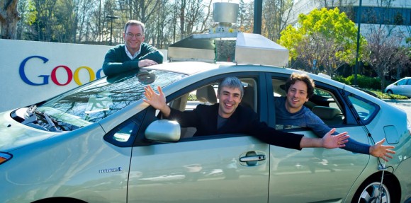

Google X is the place where Google works on the driverless car and New York Times reports that Google is considering manufacturing the cars in the US. Many projects are related to Android @ Home, an initiative announced this year that tries to make everyday objects smarter. "We want to think of every appliance in your home as a potential I/O device," said Google's Joe Britt. Google tries to build the "Web of things" by connecting home accessories, wearable objects to the Internet.

Most of the ideas tackled at Google X involve robots. "Fleets of robots could assist Google with collecting information, replacing the humans that photograph streets for Google Maps, say people with knowledge of Google X. Robots born in the lab could be destined for homes and offices, where they could assist with mundane tasks or allow people to work remotely".

It's interesting to note that one of the Google X projects could be released by the end of the year, although it's not clear what it does. At the I/O conference, Google announced that it will introduce "a Web-connected light bulb that could communicate wirelessly with Android devices," so this might be the product that will be released.

Google has always tried to solve big problems, even if many people think that it should focus on improving search results and ad quality. "Larry and Sergey founded Google because they wanted to help solve really big problems using technology," said Sebastian Thrun, a robotics expert who invented the first self-driving car and now works at Google.

Google X could be the next Xerox PARC or it could fail, but it's important to think big and take risks. "I just feel like people aren't working enough on impactful things. People are really afraid of failure on things, and so it's hard for them to do ambitious stuff. And also, they don't realize the power of technological solutions to things, especially computers," complained Larry Page in Steven Levy's "In the Plex".

Hopefully, MG Siegler is right when he says that "whatever is going on inside of Google X, I'm fairly certain it's filled to the brim with the kind of stuff that made us all fall in love with Google in the first place".

{ Thanks, Venkat. }
Google's Info Panes

Google's search results are usually a great source of information, but Google's goal has never been to send users to other pages. If Google can provide an instant answer to a query, then the answer is usually displayed in an OneBox, at the top of the search results page. Here's a movie OneBox from 2007:


Google's OneBoxes have provided weather forecasts, simple facts, definitions, unit conversions, stock information, movie times, sports scores, maps, package tracking information, in addition to results from other specialized search engines. They're still useful, but Google can now provide a lot more information. You've probably noticed that OneBoxes are bigger and more complex these days:


Sometimes OneBoxes replace the top search results, as you can see if you try a query related to local businesses, like [pizza ny]:


The latest evolution of the OneBox is a huge section placed on the right side of the page. It doesn't have an official name yet, but I'll call it the info pane. For general local queries, it displays a static map. If you search for a local business, it now shows information about the business from Google Places.


Google also tests an info pane that shows information about people and companies: a search for [Twitter] shows the name of the CEO, the company's address and other information from Wikipedia. It's likely that the structured data is generated by Freebase, which is now owned by Google.


Google's info panes could include a lot of useful information: detailed answers, fact sheets, interactive widgets, music/video players, slideshows etc. It's a new way to display information and the space constraints of the OneBox have disappeared, now that the ads will be moved to the bottom of the page.

{ Thanks, Jérôme. }