If you use Chrome, Firefox, Safari or Internet Explorer 8+, open google.com in a new tab, load Chrome's JavaScript console (Ctrl+Shift+J), Firefox's Web Console (Ctrl+Shift+K), Safari's Web Inspector (how to do that?) or IE's Developer Tools (press F12 and select the "console" tab) and paste the following code:
document.cookie="PREF=ID=03fd476a699d6487:U=88e8716486ff1e5d:FF=0:LD=en:CR=2:TM=1322688084:LM=1322688085:S=McEsyvcXKMiVfGds; path=/; domain=.google.com";window.location.reload();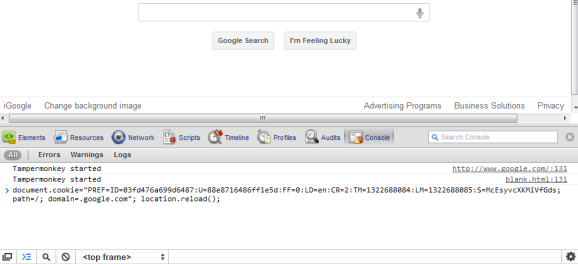
Then press Enter and close the console. If you're not in the US and you're using a different Google domain, replace ".google.com" with your domain in the code (for example: ".google.co.uk" in the UK). Please note that this only works for the English interface, so you many need to adjust the language in the preferences page.
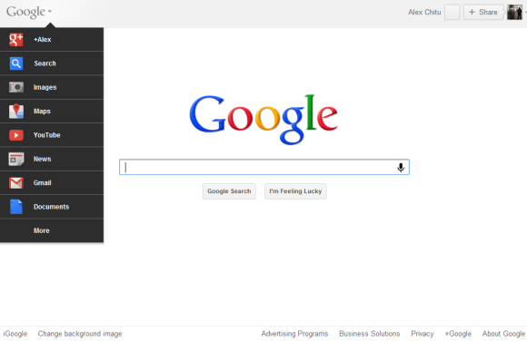
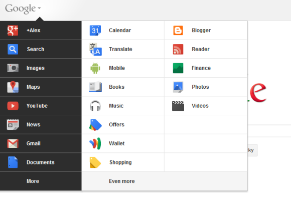
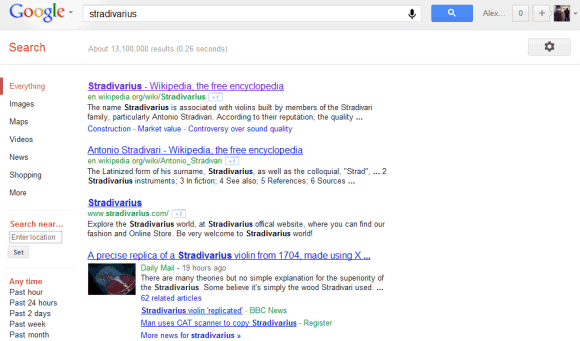
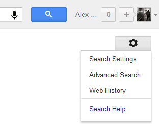
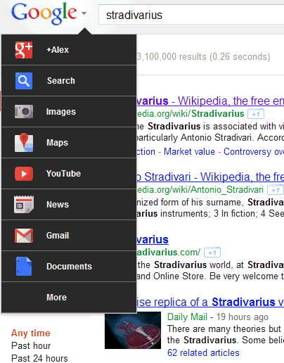
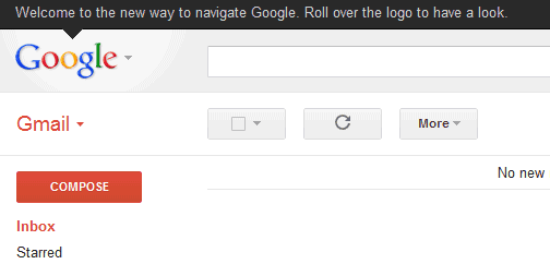
{ via Tecno-Net }
thanks, worked nicely
ReplyDeleteAnything on how to do it for Google Apps Account ? It doesn't seem to work.
ReplyDeleteMy iGoogle page still has the black bar... Work on that
ReplyDeleteShould be great if it could be configurable. To have, as exemple, The calendar link at the first access!
ReplyDeleteGoogle is being run by Indians, managerially and technically. Even though Page and Schmidt are CEO and Executive Chairman of Big G, but still we can’t forget that it was Amit Singhal, an IIT Roorkey Graduate, who re-wrote the whole algorithm of Google Search Engine in 2000 which made Google the best in the industry. Then, Nikesh Arora of BHU-IT is the Chief Business Manager; Vic Goundotra is the man behind the whole Google Plus… and, many many more. Search FAMOUS INDIANS WORKING IN GOOGLE for more details.
ReplyDeleteSO, who cares?
DeleteSeriously what is this post doing here .... in a company of 20K+ why does this matter, and who cares?
Deletecode worked perfectly!
ReplyDeleteI got 1 big problem with this and the rest of the gui changes.
Why so much white space?
and why aren't the white space controls available when the new look is launched.
eFFF'n annoying!
Time to chat with some scriptwrites to make a greasemonkey script to remove all this wasted space on Google serps.
отлично
ReplyDeleteProbably not available for Google Apps users. Though, that's nothing new :)
ReplyDeleteNot working on "Chrome 15.0.874.121m"
ReplyDeleteTried both google.com and google.it
The console always answer with:
i18n-values: Missing value for "ntp4_intro_url"
Its rolled out to everyone.. i can see it from the morning .
ReplyDeleteI still don't have it and I have a Google Apps account!!
ReplyDeleteThis trick doesn't work either.
Everyone who's failing to have the trick work, make sure you hit enter after pasting in the code.
ReplyDeleteOnce the window gets smaller than 980px in width, things start to vanish off the right hand side. Not a problem for people who have the browser full screen, but for those who have it next to something else, this is just bad!
ReplyDeleteTo revert back, nil the Pref+ID
ReplyDelete<code>
document.cookie="PREF=ID=:U=88e8716486ff1e5d:FF=0:LD=en:CR=2:TM=1322688084:LM=1322688085:S=McEsyvcXKMiVfGds; path=/; domain=.google.com";window.location.reload();
</code>
Me no likey.
ReplyDeleteNot all is good.
ReplyDeleteI used to click on the google pic in the left top corner to load the initial screen of a particulaar page say maps. That is not possible now :(
Thats cool, working fine with google pakistan at google.com.pk
ReplyDeleteNot working on Chrome 15.0.874.12
ReplyDeleteIt doesn't work regardless you are signed in or not.
ReplyDeleteIt works and I like it a lot. It will create a better workflow.
ReplyDeleteThanks
By me it works on Chrome but doesnt in Firefox 8 - I can paste in booth the code but just in chrome i have an eye of it...
ReplyDeleteFunny but ok :)
Please note that even if you clear cookies and revert to the old interface, you'll only delay the inevitable and you'll still get the new interface in a few hours/days.
ReplyDeleteGot the new youtube homepage but not this. I must have done something wrong or google is not allowing it in opera.
ReplyDeleteHow do you revert it back
ReplyDeleteIf we could configure the links we see on there, that would be AWESOME. I use Voice and Calendar more than YouTube or Shopping. But other than that it looks good just let me put on there the service I use.
ReplyDeleteThanks Alex! Worked like a charm in IE9 and Chrome beta.
ReplyDeleteHelp! There has to be an easier way for us newgoogleez,
Deleteabhishek, no, it's not. Maybe for you, but it's not rolled out to everybody yet.
ReplyDeleteNot working on "Chrome 15.0.874.121m"
ReplyDeleteWithout doing any of this I automatically got the new look yesterday. This is with Firefox.
ReplyDeleteUsing Google Chrome everything is the same. I Have signed into my Google accounts as well and it makes no difference.
Update.... I remember how this started!
ReplyDeleteI usually check my Google mail with Thunderbird or another client. Yesterday I logged into my mail account via the Google website and was asked if I would like the new 'mail look'.
I clicked yes and ~ poof ~ now I've got the new look in my browser as well.
not working on any browser.. I have a google apps account.. :( why is this so familiar...man boo hoo
ReplyDeleteNot working....can't choose buttons, tools, options. Help! About to uninstall.
ReplyDeleteWorks perfectly for me on Firefox as well as Chrome 15.xx
ReplyDeleteThe only thing I had to do was access google.com and not .co.in or .nl etc.
Looks good till now, but there should be a possibility for reordering the list on user preference.
this doesn't work for Google Apps account. :( I can't use it at work. so sad
ReplyDelete+1 to being able to configure this - I use calendar all the time. Guess I could pin a tab, but a configuration setting would be better.
ReplyDeleteThis appeared on it's own today.
ReplyDeleteI dislike that when I move my mouse to the tab bar (or anywhere above the frame) and cross over the Google, it pops open. I wish that it was a click-to-open menu. Maybe they can add a config for that.
Please, please let us configure this - I need my calendar FAR MORE than I need Google +!
ReplyDeleteJust had a quick look, I like it so far.
ReplyDeleteAgreed. I was quite surprised to see Calendar on the second page. It's the second most important product to me. I think they are pushing G+. They should allow ordering.
ReplyDeleteI don't like it
ReplyDeletetoo much grey space (very ugly when you have an image background)
redondancy in the functions (on the right side "your name" and "your photo" give the same info when you click on them. it should be only the photo.
it is very alpha version
No work if you are a Google Apps users
ReplyDeleteits work for me only on the search web but when im going to gmail\my plus, the new design not work
ReplyDeleteits not not working in my Firefox 8.
ReplyDeletesame time its disable my ant video down-loader.
now i want remove this setting or rollback in to my old setting how can i do it please help me out
Welcome to the new way of GOING ELSEWHERE AND USING SOMETHING ELSE other than ANY google "product" which can't stay the same for more than 12 months in a row. Asinine.
ReplyDeleteHow can I remove the new drop down menu ?
ReplyDeleteI liked being able to type straight into the search box not have to minimise the stupid new menu first and then manually click into the search box
Please make this new menu a configurable ON/OFF option please. I will be selecting OFF
@Crius and others. This UI works only in En locale for now.
ReplyDeleteThe error in 'ntp4_intro_url' could indicate that your locale is set to a diff lang. Go into the account settings page and change your primary language to English if you want to check out this new design.
This seems to be related to a problem I have with ChromeOS. Somewhere it redirects to a home/welcome/intro page with the locale. Hebrew locale completely blocks Google pages.
I'm guessing Google planned for automatic localization support but didn't include a 'default' landing page...
Another pointless update from google that didn't improve anything and actually made their services more cumbersome to access. Before if I wanted to go to Maps, News, Images, or Finance, I could just click a regular old fashioned link at the top, didn't even have to wait for the page to load. Now I have to wait for the page to finish loading before I can even see the menu. This is just like when they changed the news page a few months ago and made that worse too. What is it with these monkeys working for web companies that think the best way to improve something is to add a lot of java script and flash features? Don't these retards know that simplicity is best. What ever happened to good old fashioned HTML links? There's no improving on that!
ReplyDeleteI totally agree with you, they're silly monkeys with computers trying to reinvent the wheel of the Internet search experience.
DeleteLets face it Google has hit a development wall that they do not know what new idea to bring.
Love it! In fact, I've been using this since 1995 but it was called the "Start" button originally, now it's just a MS Windows icon in Win7.
ReplyDeleteBy the way, you can also do this w/o developer tools. Got to http://google.com, then when that loads, type in
ReplyDeletejavascript:document.cookie="PREF=ID=03fd476a699d6487:U=88e8716486ff1e5d:FF=0:LD=en:CR=2:TM=1322688084:LM=1322688085:S=McEsyvcXKMiVfGds; path=/; domain=.google.com";window.location.reload();
Code from this post w/ javascript: put in front for execution. Saves a little bit of time. Should work in all browsers, but I know it works in Google Chrome.
I JUST DONT WANT THE LINKS TO OPEN IN NEW TABS, EITHER IN THE OLD BAR OR THE NEW MENU.
ReplyDeleteEg: I'm in Gmail, I click Documents -> I wanna see documents, not another tab opening. If I have many tabs open I have to look for it and select it etc.. if I continue switching I end up with a mess = many TABS, many of them doubled.
Anyone been able to get this working with an account in a google hosted domain?
ReplyDeleteI hate it give me back the old view.
ReplyDeleteTakes up way too much screen real estate. Needs to be shorter and more condensed.
ReplyDeleteSnugglePuma, I agree!
ReplyDeleteThe drop-down interface is slow, clunky, and hard to use. It hides critical functionality where users can't see it. What will people do who aren't computer-savvy enough to mouse over the logo?
As Bruce Tognazzini recently posted,
"Graphic designers, left unchecked and unschooled, are likely to aim for maximum visual simplicity at the expense of both learnability and usability. Such interfaces require users to discover new capabilities by clicking around and seeing what happens. Users don't do that. In the most extreme cases, functionality desperately needed by the majority of users may actually be removed from products in the effort to generate visual simplicity."
Two thumbs down, Google. This stinks.
@Chris Beasley
ReplyDeleteIt technically takes up less screen real estate than before the recent change.
How do i get back to the old bar?????!!!
ReplyDeleteplease someone tell me in easy instructions how to revert the google bar
ReplyDeleteWorking nicely. But how to disable that?
ReplyDeleteIt doesn't work if you're using Google Apps though :(
ReplyDeleteDid anyone get it without changing instructions? I'm still waiting.
ReplyDeleteI like it, but it is a bit thick. It could be trimmed a bit vertically, or give the user an option of a 'condensed' version, like in gmail.
ReplyDeleteWTF? Does some reads the comments which are asking how to revert the change in the tollbar?
ReplyDeletePlease someone tell the tip!
If you want to revert this think, delete your cookies.
ReplyDeleteWorks on all google pages in chrome except the Igoogle page.
ReplyDeleteWorks for ff
ReplyDeleteIt's nice update by Google. I give them props for coming up with it. Although I like the one before simply because it was simple and easy to use. It had everything I needed so I was okay with it but this is also great.
ReplyDeleteTHANK YOU palaniraja for the instructions on reverting back to the old bar. You just became my personal hero for today.
ReplyDeleteLooks nice, but google site is not available from the icon in my menus, does this is pre-announcement ???
ReplyDeleteDoesn't work for me......
ReplyDeleteis any way to do this in opera?
ReplyDeleteSo now the new navigation menu is live for all, and a disaster for some, the sites option is no longer included without going to "even more!" Any ideas on how to edit the content of this navigation menu?
ReplyDeleteThanks!
Does anyone know how to fix this:
ReplyDeletehttp://cl.ly/0V3q2u1s1P2a3L2d0Z2X
It appears to only work on the Google Web Search, but not in the Google Apps. Plus, when I run Chrome in incognito mode, it works fine. So, it has something to do with my account. Can someone help me?
Thanks.
I wonder how many people here applied the YouTube cookie hack back in mid November (this is GoogleSystem Blog, chances are high) and don't realize that a side-effect of the YouTube cookie hack was that they can see the new header in other Google services as of Dec 1st. Clear your Google cookies people, you may get the old header back.
ReplyDeletePlease let us configure this! Or at least put Scholar on the menu! I use Scholar as much as I use Web Search, and it's nowhere to be found on the menu!! I'm considering switching to Microsoft Academic Search if Scholar isn't easily accessible anymore (please don't make me do that!).
ReplyDeleteAMEN !! Ditto! Exactly. Notice that Google has become like all Mega Corporations.,. too busy to actually talk to users.
DeleteApparently not listening to this forum either.
It's an excuse for egos too busy thinking big thoughts to bother with the users, and money and short-term profits above service, it appears.
It doesn't matter how fast, glitzy and great products are, it you tick off enough professionals (legal, science, inventors, etc.), some will come back to compete with them as a matter of principle.
Amen Selah!
DeleteWhy not allow one to configure the bar? Even Microsoft allows this [or did...].
Thanks! Works. Just simple press CTRL Shift J and paste the given script and then press Enter. (I used 15.0.874.121 m) ;)
ReplyDeleteThanks! Works. Just simply press CTRL Shift J and paste the given script and then press Enter. (I used 15.0.874.121 m) ;)
ReplyDelete*USABILITY FAIL*
ReplyDeleteI have to make one more click and move around my mouse cursor and its frustrating when you want to make a quick image search.
It went from a smart and simple top navigation bar to a WindowsXP-Start-Button failure. Don't confuse cleaning up the design with making the design better.
I'm using a script to reconfigure Reader, and the script interacts poorly with the black bar menu layout. So, I use your fix to apply the new Google menu style and all is great. However, every time I restart FF8, it reverts to the old black bar. Is there a way to make this fix permanent? Thanks.
ReplyDeleteGreat (I did this for Firefox)!! LOVE the new look. Thanks. BTW, it was already live and working great in Chrome.
ReplyDeletenot working on ccrome 15.0.874.121 m
ReplyDeleteHow long should I wait for the changes?
ReplyDeletethanks man.....
ReplyDeleteThe top bar is too thick and the 'hidden' navigation bar comes up on loading the page forcing me to hide it. Bring back the thin old top bar so I can enjoy my background image rather than view it in spite of. IMHO EPIC FAIL! >:-P
ReplyDeletei like new google menu
ReplyDeleteHate the new wide grey bar. Extra clicking to open, extra mousing to get to my most-used apps, and the G+ options are too prominent - I liked how subtle they were in the black bar (made it more palatable logged in at work). I REALLY want to be able to choose what I see first - half the stuff I need requires extra digging.
ReplyDeleteI think it sucks. Google should stop screwing around with its front page leave a good thing be.
ReplyDeleteStill waiting for the new navigation button to show up for my account. I still have the black bar at the top. What gives?
ReplyDeleteOh man. It's not working with Google Apps. Looking forward to the roll out to Google Apps.
ReplyDeletenew google doesent have a bar tomorrow for 2012
ReplyDeleteHow Can I disable it?.
ReplyDeleteCan I?
try
ReplyDeletedocument.cookie="PREF=ID=03fd476a699d6487:U=88e8716486ff1e5d:FF=0:LD=en:CR=2:TM=1322688084:LM=1322688085:S=McEsyvcXKMiVfGds; path=/; domain=.google.com";window.location.reload();
instead
To get it to work in chrome, I wiped my cookies. Kind of extreme but if you just clear the ones from EVERY google site then run this in the console, it should work.
ReplyDeleteworks great ... Thank you
ReplyDeletei assume that the code set my google cookie id to be the same as yours. so would you be able to view everything that i googled?
ReplyDelete@Anonymous:
ReplyDeleteNo, of course not. The cookie ID may be associated with your searches, but only Google can access the list of your queries.
I am a concept designer, so I need to know, when will it officially come? I can enable it with a cookie, but I don't want to change my concept every time this changes.
ReplyDeleteSo, please tell me, when will it officially come for everyone? Also, is it final look of it or it might change more?
Sorry about the same question on http://googlesystem.blogspot.com/2012/01/youtube-tests-google-integration.html
It's supposed to be available for everyone and even internationally, but I still see the old UI sometimes.
ReplyDeleteFound an extension to allow you to customize it: https://chrome.google.com/webstore/detail/oiamgkpplhllmgmjkmpoapkidpgfhmdo
ReplyDeletethanks very much anonymous (GREAT HELPER)
Deleteway too much whitespace, just like the reader redesign.
ReplyDeleteSo how do I DEactivate this function?
ReplyDeleteSTRAIGHT WACK.
ReplyDeleteHas anybody know how to remove this navigation menu?
ReplyDeleteI don't like the new drop down menu being dropped down already. It is an eye sore. I click the logo every time I google to get rid of it, then I click back in the search field. Adding steps to get rid of the badly designed unsightly large black drop down menu. Please give some sort of option to get rid of it.
ReplyDeleteerase all your browser cookies/history settings and see if that brings back the old google menu bar.
ReplyDeleteI don't mind it, but they need to put the Calendar in the first level of clicks, don't like having to go 3 clicks for it!
ReplyDeleteGreat work with the explainations Alex.
ReplyDeleteI just installed Firefox and it has the new look but could not get IE9 (my prefered browser) to update until reading this blog.
Nice Work Alex!
ReplyDeleteI had to install Firefox which came up with the new look by default.
Wondering why I was not seeing the same in IE9 I spent over an hour searching until I found this blog.
Clear instructions, easy to follow.
i don't like this innovation at all. It complicates things from "one click on scholar" to actually going through several steps. It's really annoying. What's even worse...I can't find a way to reverse back to the old version!
ReplyDeletePeople asking for a single click to access certain services might be interested in a browser tool called bookmarks.....
ReplyDeleterather than give me the drop down menu it gave me this new sort of menu, similar to the one before the drop down one but with bigger spacing, and no red line above the things like web and images. And the fonts a little thicker.
ReplyDeletesame thing happened to mine. I don't like the way it looks with the thicker font and it won't let me use the g.navigation menu code anymore. Any ideas on how to get that drop down menu back?
Deletei know, it looks like what we had in the 90's (i wasn't around then). i liked the drop down menu, but i think google may have changed it to this one (the one that we have) because so many people complained about the drop down menu, even though it was the best thing to happen to google since google.
Deletenot working in chrome 17.0.963.46 m
ReplyDeletei assume that the code set my google cookie id to be the same as yours. so would you be able to view everything that i googled?
DeleteWell, I _had_ the new UI automatically sometime in December, if I remember correctly.
ReplyDeleteLast week, it suddenly reverted to the old one again, with the slim dark bar across the top. Looks extremely clunky in comparison.
I managed to use the above method to bring it back - but only for a few days. It just went back to the old interface again, and now the cookie doesn't work.
Are you guys still experimenting that much? Why first give me the new UI, then a month later switch back to the old one again? I don't get it.
^ and by "you guys" I mean teh Google :)
ReplyDeleteGoogle, i love the new way everything looks and works thanks....
ReplyDeleteI cant get this bar and after running script i get an ugly black bar with bold links, what to do?
ReplyDeleteThis worked fine for a while, and then I also had an issue with it. The script no longer works.
ReplyDeletePLEAAAAAAAAAAAAAAAAASE GIVE US THIS NEW INTERFACE BACK. PLEASE.
ReplyDeletePLEEEEEEEEEEEEEEEASE GIVE US THE NEW INTERFACE BACK. It's pretty annoying having to use bookmarks to access specific Google services such as Google Music and Voice while services I don't ever use stare at me every time I'm on the Google homepage.
ReplyDeleteNew navigation has a simple interface but not so user friendly
ReplyDelete