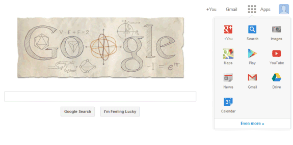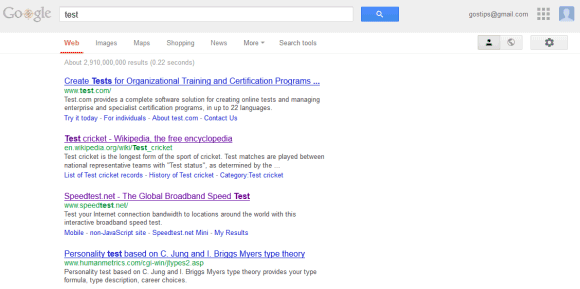
This experimental interface removes the Google+ share and notification buttons, but this could be a temporary issue. You'll only see the new UI if you visit Google's search properties, so the regular navigation bar will show up when you use Gmail, Google Drive, Google Maps.

Please note that the experiment is only available at google.com and only for the English interface. A quick way to switch to the English/US interface is to visit google.com/ncr.
Here's how you can try this UI if you use Chrome, Firefox or Opera:
* Chrome:
- install "Edit This Cookie" extension
- open www.google.com in a new tab
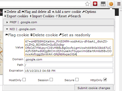
- click the "Edit This Cookie" button from the Chrome bar
- find the "NID" item and select it
- replace the "value" text with the NID cookie value (see below) and click "Submit cookie changes"
- refresh Google's homepage

* Firefox:
- install Cookies Manager+ and restart the browser
- open www.google.com in a new tab
- click the Firefox menu, select Web Developer < Cookies Manager+ - find the "NID" value for google.com, select it and click "Edit" - replace the content with the NID cookie value (see below), then click "Save" and "Close"
- refresh Google's homepage
* Opera:
- open www.google.com in a new tab
- right-click the page and select "Edit site preferences"
- go to the Cookies tab
- find the cookie value that starts with "NID", select it and click "Edit"
- replace the "value" text with the NID cookie value, then click "Save" and "OK"
- refresh Google's homepage
NID cookie value:
To go back to the regular Google interface, use the same instructions, but only delete the NID cookie value.
{ via Tecno-Net }
I prefer this kind of UI. The black bar doesn't fit into the over all UI, and speed shouldn't vary that much. Make it hover sensitive and then that issue is solved.
ReplyDeleteWill Google Reader be in the new app launcher?
ReplyDeleteProbably not, considering the fact that they're shutting it down.
DeleteI'd rather they improve the bar, rather than abandon it as a one click handle on their suite.
ReplyDeletei think those bars in google products are such a waste of space, thats why i made this style http://userstyles.org/styles/84699/barless-google to fill my monitor with content
ReplyDeleteThanks for the link.
DeleteI like the black bar, I don't get why the designers are so determined to get rid of it and save 20 pixels
ReplyDeleteI strongly dislike those 20 black pixels at the top of every google page. I know a lot of people like it, but I just don't get it. I've been hoping for a long time that Google would allow users to simply "disable" that nav bar. Not only do I not like it visually, I never use it, so I wouldn't miss anything by disabling it altogether.
DeleteCan't seem to get this to work on Chrome following the diredtions
ReplyDeleteI can't get this to work. it may be because my google.com is serving over ssl?
ReplyDeleteDon't work for me even if i like the black bar. It is useful and that's all i want.
ReplyDeleteMaybe I've missed something in the instructions or maybe you didn't read the entire post. I've tested this using the latest versions of Chrome, Firefox and Opera and multiple computers.
ReplyDeleteMake sure that you're using google.com, not google.co.uk, google.fr, google.de and that the interface is in English. Go to google.com/ncr to switch to the English/US site.
It worked for me only if I signed out of my Google account. But when I sign back in, it returns me back to the black bar.
ReplyDeleteI am using the latest versions of Chrome Version 26.0.1410.64 m
I had the same experience. Only works when I'm not signed in.
ReplyDeleteSame experience for me. Logged in is old interface but once i log out it works automatically. I remember it did the same with Youtube when you posted tutorials on how to get the new interface early.
ReplyDeleteGreat move by Google.
ReplyDeleteI was able to get google.com to show the new page, but any search I enter takes me to the error page ("503. That’s an error."). Any one else having similar problems?
ReplyDeleteGoogle Reader icon is missing in the new toolbar. :-/
ReplyDeleteI'm really glad they're going back to the simple page with just the logo and a text box. I love this simplicity. I hated it when they started mucking with this many years ago with iGoogle and the black bar and all the other stuff I didn't really care about. 90 percent of the time I'm there to do a search so I'm happy they're getting back to their roots.
ReplyDeleteWhat happened to the idea of clicking the Google logo to change service? has that been abandoned?
ReplyDeleteSame for me. Only works when not logged in. Nice to see it, but kind of pointless if I cannot be signed in.
ReplyDeleteWorked for me while I was signed in.
ReplyDeleteWas eager to try this, but like a few others, when signed in, I didn't change. I am connected via HTTPS, not HTTP. When I sign out, I see the updated navigation, which is very nice. Seems that this isn't ready for mainstream yet.
ReplyDeleteIt worked perfectly! The Google homepage looks very clean.
ReplyDeleteReally like where Google are going nowadays. I was actually thinking earlier on that the black nav bar just looked like it shouldn't be there. Can't wait to have a look at this properly.
ReplyDeleteDoesn't work
ReplyDeleteYep, only shows while signed out.
ReplyDeleteWhile signed in with my Google Account I get the old UI
Dự án The Golden Palm Lê Văn Lương
ReplyDeletechung cư Imperial Plaza Giải Phóng
chung cư Rivera Park Vũ Trọng Phụng
Riverside Garden Vũ Tông Phan
FLC Star Tower Hà Đông
Five Star Kim Giang chung cư cao cấp Thanh Xuân