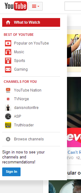
Just like in the previous iterations, the header is sticky and the layout is center-aligned.
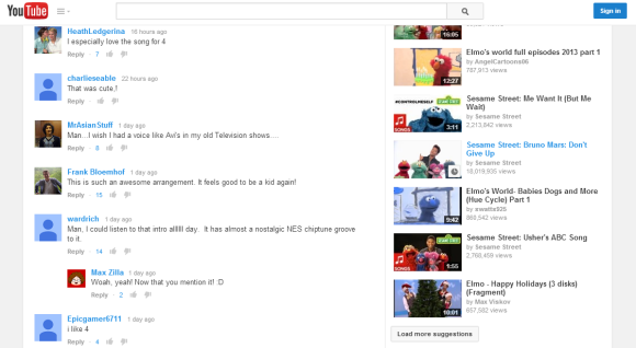
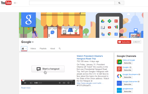
The homepage uses carousels and shows contextual menus that let you customize the sections.

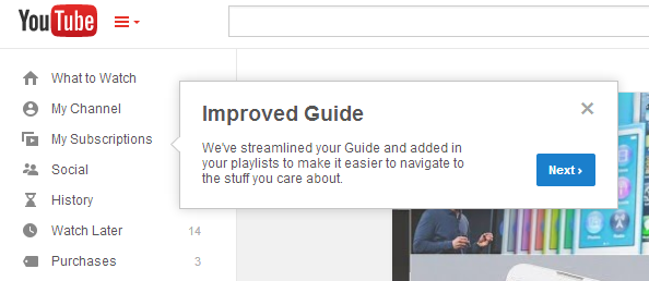
YouTube also shows a tour guide, which means that the updated interface is almost ready to be released for everyone.
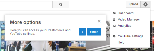
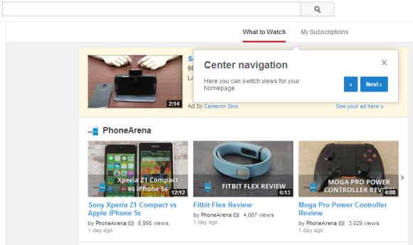
Here's how you can enable the experimental interface. If you use Chrome, Firefox, Opera, Safari or Internet Explorer 8+:
1. open youtube.com in a new tab
2. load your browser's developer console:
* Chrome or Opera 15+ - press Ctrl+Shift+J for Windows/Linux/ChromeOS or Command-Option-J for Mac
* Firefox - press Ctrl+Shift+K for Windows/Linux or Command-Option-K for Mac
* Internet Explorer 8+ - press F12 and select the "Console" tab
* Safari 6+ - if you haven't enabled the Develop menu, open Preferences from the Safari menu, go to the Advanced tab and check "Show Develop menu in menu bar". Close Preferences and then press Command-Option-C to show the console.
* Opera 12 - press Ctrl+Shift+I for Windows/Linux or Command-Option-I for Mac, then click "Console".
3. paste the following code which changes a YouTube cookie:
document.cookie="VISITOR_INFO1_LIVE=LlWIQlLwL_Y; path=/; domain=.youtube.com";window.location.reload();4. press Enter and close the console.
To go back to the regular interface, use the same instructions, but replace the code from step 3 with this one:
document.cookie="VISITOR_INFO1_LIVE=; path=/; domain=.youtube.com";window.location.reload();{ Thanks, Rubén. }
No comments:
Post a Comment
Note: Only a member of this blog may post a comment.