It is innovation's biggest paradox: We demand more and more from the stuff in our lives--more features, more function, more power--and yet we also increasingly demand that it be easy to use. And, in an Escher-like twist, the technology that's simplest to use is also, often, the most difficult to create.
Marissa Mayer lives with that conundrum every day. As Google's director of consumer Web products, she's responsible for the search site's look and feel. Mayer is a tall, blond 30-year-old with two Stanford degrees in computer science and an infectious laugh. She's also Google's high priestess of simplicity, defending the home page against all who would clutter it up. "I'm the gatekeeper," she says cheerfully. "I have to say no to a lot of people."
The technology that powers Google's search engine is, of course, anything but simple. In a fraction of a second, the software solves an equation of more than 500 million variables to rank 8 billion Web pages by importance. But the actual experience of those fancy algorithms is something that would satisfy a Shaker: a clean, white home page, typically featuring no more than 30 lean words; a cheery, six-character, primary-colored logo; and a capacious search box. It couldn't be friendlier or easier to use.
Here is how Mayer thinks about the tension between complexity of function and simplicity of design: "Google has the functionality of a really complicated Swiss Army knife, but the home page is our way of approaching it closed. It's simple, it's elegant, you can slip it in your pocket, but it's got the great doodad when you need it. A lot of our competitors are like a Swiss Army knife open--and that can be intimidating and occasionally harmful."
It would be lovely if Google's corporate mythology included an enchanting tale to account for the birth of this pristine marvel. But the original home-page design was dumb luck. In 1998, founders Sergey Brin and Larry Page were consumed with writing code for their engine. Brin just wanted to hack together something to send queries to the back end, where the cool technology resided. Google didn't have a Web master, and Brin didn't do HTML. So he designed as little as he could get away with.
The accident became an icon, of course, and a key reason the company enjoys a commanding lead. Google's design has been mimicked on the search pages of MSN and Yahoo, whose portals are messy throwbacks to the "everything but the kitchen sink" school of Web design. But they're poor imitations; according to Hitwise, Google controls 59.2% of the search market, up from 45% a year ago; MSN's share is down to 5.5% and Yahoo's is 28.8%.
With Google's extraordinary trajectory and the stratospheric success of Apple's iPod--itself a marvel of simplicity and, with 20 million units sold, a staggering hit--we seem to be nearing a seminal moment. Whereas endless Sunday Styles stories may have failed to get its attention, the tech industry's interest is invariably galvanized by cash. If the equation T (technology) + E (ease of use) = $ can be proven, the time may be right for the voice of the technologically challenged who can't operate their remotes to be heard.
In a 2002 poll, the Consumer Electronics Association discovered that 87% of people said ease of use is the most important thing when it comes to new technologies. "Engineers say, 'Do you know how much complexity we've managed to build in here?' But consumers say, 'I don't care. It's just supposed to work!' " says Daryl Plummer, group vice president at Gartner Group.
It's often that tension--between the desire to cram in cool new features and the desire to make a product easy to use--that makes delivering on the simplicity promise so hard, particularly in companies where engineers hold sway. At Google, it's an ongoing battle. As developers come up with ever sexier services--maps! news alerts! scholarly papers!--the pressure to lard on links is fierce. Mayer holds them at bay with a smile and strict standards.
To make it to the home page, a new service needs to be so compelling that it will garner millions of page views per day. Contenders audition on the advanced-search page; if they prove their mettle--as image search did, growing from 700,000 page views daily to 2 million in two weeks--they may earn a permanent link. Few make the cut, and that's fine. Google's research shows that users remember just 7 to 10 services on rival sites. So Google offers a miserly six services on its home page. By contrast, MSN promotes more than 50, and Yahoo, over 60. And both sell advertising off their home pages; Google's is a commercial-free zone.
So why don't those sites simply hit the delete button and make their home pages more Googlesque? Hewing to the simplicity principle, it turns out, is tougher than connecting with tech support, particularly if you try it retrospectively. "Once you have a home page like our competitors'," Mayer says, "paring it back to look like Google's is impossible. You have too many stakeholders who feel they should be promoted on the home page." (MSN says more than half its customers are happy with its home page--but it's experimenting with a sleeker version called "start.com.")
Google understands that simplicity is both sacred and central to its competitive advantage. Mayer is a specialist in artificial intelligence, not design, but she hits on the secret to her home page's success: "It gives you what you want, when you want it, rather than everything you could ever want, even when you don't."
To read more, visit The Beauty of Simplicity.
December 29, 2005
December 28, 2005
Top 5 Google acquisitions
5.
Urchin Software (March 2005), Web Analytics software.
Urchin is a web site analytics solution used by web site owners and marketers to better understand their users’ experiences, optimize content and track marketing performance.
4.
Pyra Labs (February 2003), editor of Blogger, blogging platform.
3.
Keyhole (October 2004), imagery by satellite.
Keyhole’s technology combines a multi-terabyte database of mapping information and images collected from satellites and airplanes with easy-to-use software.
2.
Kaltix (September 2003). Research on personalized search, from Taher Haveliwala, Glen Jeh, and Sepandar Kamvar.
Kaltix Corp. was formed in June 2003 and focuses on developing personalized and context-sensitive search technologies that make it faster and easier for people to find information on the web.
1.
Applied Semantics (April 2003), contextual advertising.
Applied Semantics’ products are based on its patented CIRCA technology, which understands, organizes, and extracts knowledge from websites and information repositories in a way that mimics human thought and enables more effective information retrieval.
Google Pays AOL $1 Billion For 5 Percent
CNN/ Reuters report the Google/AOL deal is final now:
“America Online said Google had agreed to invest $1 billion to take a 5 percent stake in AOL, as part of an enhanced pact where Google will move beyond text-based advertising to allow AOL to sell graphical ads to Google’s fast-growing ad network.”
Here’s the press release on the Google/ AOL “alliance.” Some key issues:
* Creating an AOL Marketplace through white labeling of Google’s advertising technology - enabling AOL to sell search advertising directly to advertisers on AOL-owned properties;
* Expanding display advertising throughout the Google network;
* Making AOL content more accessible to Google Web crawlers;
* Collaborating in video search and showcasing AOL’s premium video service within Google Video;
* Enabling Google Talk and AIM instant messaging users to communicate with each other, provided certain conditions are met; and
* Providing AOL marketing credits for its Internet properties.
Top Google searches in 2005
Google.com - Top Gainers of 2005
1. Myspace
2. Ares
3. Baidu
4. wikipedia
5. orkut
6. iTunes
7. Sky News
8. World of Warcraft
9. Green Day
10. Leonardo da Vinci
Google News - Top Searches in 2005
1. Janet Jackson
2. Hurricane Katrina
3. tsunami
4. xbox 360
5. Brad Pitt
6. Michael Jackson
7. American Idol
8. Britney Spears
9. Angelina Jolie
10. Harry Potter
Froogle - Top Searches in 2005
1. ipod
2. digital camera
3. mp3 player
4. ipod mini
5. psp
6. laptop
7. xbox
8. ipod shuffle
9. computer desk
10. ipod nano
More top searches.
December 20, 2005
PCWorld is evil, Google is not
Exclusive from PCWorld: winners and losers of 2005.
This is the last post in 2005. Merry Christmas and a Happy New Year. May your hearts be filled with joy and warm love. May your ideas sparkle in 2006.
Happy New Year, Google!
WINNER: Google
Meet your new best friends, Sergey and Larry. Want a free e-mail account? No problem. A blog? Satellite maps? How about a searchable library of every book ever written? Here, have some free Wi-Fi. Oh, and don't forget to enter the stuff you want to sell into Google's new classified ad/online garage sale/whatever-you-want database. No charge, and no need to say thanks. Remember that silly dot-com-era notion that you could make money by giving things away? Guess what? It actually works!
LOSER: Google
What does a company with staggering amounts of computing power, the world's best brains, and a share price north of $400 do? Anything it darn well pleases. But the next thing you know it's getting sued for copyright violations by the Association of American Publishers and becoming part of the hacker's tool kit. Google's seemingly unquenchable ambition and near-monopoly on everything it touches--otherwise known as "Microsoft Syndrome"--is making more and more people nervous.
This is the last post in 2005. Merry Christmas and a Happy New Year. May your hearts be filled with joy and warm love. May your ideas sparkle in 2006.
Happy New Year, Google!
What's your personality?
Take the Jung test to find out.
That's what I found about me.
INTJ
"Mastermind"
Introverted intellectual with a preference for finding certainty. A builder of systems and the applier of theoretical models. 2.1% of total population.
That's what I found about me.
INTJ
"Mastermind"
Introverted intellectual with a preference for finding certainty. A builder of systems and the applier of theoretical models. 2.1% of total population.
Create your own shortcuts on Yahoo
Yahoo extended their Search Shortcuts that allowed you to go to trigger shortcuts to special searches (news, video, image), simple answers (zip code, weather, calculator, definition) or interesting facts (information about patents, vehicle history using the 17-character Vehicle Identification Number, book price finder using its ISBN, manufacurer of a product using its 12-digits UPC code).
Now you can define your own shortcuts. Open Shortcuts are custom keywords that take you directly to a site, a search, or start a task right from the search box. In Unix speak: if the search box is the command-line of the web, shortcuts are aliases.
To use an Open Shortcut, you type ! (exclamation point) followed by the name of the shortcut in the Yahoo! Search box. For example, type: !ebay lamps. This takes you directly to www.ebay.com and searches for lamps.
You can create your own shortcuts to:
* Instantly navigate to any URL on the Internet
* Easily recall common searches on Yahoo!
* Quickly search favorite sites
* Jump start frequently used Internet applications
To create a navigational shortcut, use the keyword: !set with your shortcut name and destination URL.
!set shortcut_name URL
Try this
!set gops http://www.google.com/search?&q=%s+site%3Agooglesystem.blogspot.com
to set a shortcut for a search in this blog.
Some cool examples:
!mail sergey@google.com -- Compose a mail to Sergey Brin.
!wiki Sergey Brin -- Find information about Sergey Brin from Wikipedia.
!news Sergey Brin -- Search latest news about Sergey Brin.
The complete list of shortcuts.
December 19, 2005
Will Google fall in 2006?
David Kirkpatrick, senior editor at Fortune, says that Google will falter in 2006.
Google's response to Yahoo's My Web is Personalized Search, but the current implementation makes it hard for a user to rate a website or to categorize it. The bookmarking system is quite feeble. Integration with Google Toolbar and creation of a community with trusting hierarchies will be next challenges for Google.
Yes, I love Google, but my first prediction is that a year from now we won't think that the search company is the invincible behemoth that we do now.
Take a new concept known as "community-powered search." Yahoo is forging an early lead over Google in this fast-evolving technology with its acquisition last week of del.icio.us for a rumored $35 million (the actual amount was undisclosed). Del.icio.us operates on principles similar to the popular MySpace. But whereas that social network site helps members find dates, form groups, and share music picks, del.icio.us helps members find hot information--websites that others have found useful.
Soon we will see a new form of results, like "What Others Liked," on all search engines. It's how Amazon tells its customers what others have bought, except that these search results involve information. In many cases, community-powered searches will let members find what they're looking for more quickly than they would on a purely computerized type of web search, which Google does so superbly. Yahoo was already introducing community-based searches with >My Web 2.0. Of course, Google is surely working on its own alternatives.
Google's response to Yahoo's My Web is Personalized Search, but the current implementation makes it hard for a user to rate a website or to categorize it. The bookmarking system is quite feeble. Integration with Google Toolbar and creation of a community with trusting hierarchies will be next challenges for Google.
Google Labs Aptitude Test
Last year, Google published a booklet of 21 problems, called the Google Labs Aptitude Test. Readers of several technology magazines were asked to mail in their answers and promised that Google would get in touch with them if they scored well.
Judy Gilbert, Google's staffing programs director, says that the questions weren't really used for hiring. In any case, smart alecks soon posted the answers online so that they could be easily found by cheaters.
"It was a great PR move, and we got a lot of interest from it," Gilbert said. "As far as using those kinds of things to decide who becomes part of our team, we typically use more traditional processes."
Here are the questions from Google Labs Aptitude Test:
Solve this cryptic equation, realizing of course that values for M and E could be interchanged. No leading zeroes are allowed.
WWWDOT - GOOGLE = DOTCOM
Write a haiku describing possible methods for predicting search traffic seasonality.
What's the next line?
1
1 1
2 1
1 2 1 1
1 1 1 2 2 1
You are in a maze of twisty little passages, all alike. There is a dusty laptop here with a weak wireless connection. There are dull, lifeless gnomes strolling about. What dost thou do?
A) Wander aimlessly, bumping into obstacles until you are eaten by a grue.
B) Use the laptop as a digging device to tunnel to the next level.
C) Play MPoRPG until the battery dies along with your hopes.
D) Use the computer to map the nodes of the maze and discover an exit path.
E) Email your resume to Google, tell the lead gnome you quit and find yourself in a whole different world
What's broken with Unix?
How would you fix it?
On your first day at Google, you discover that your cubicle mate wrote the textbook you used as a primary resource in your first year of graduate school. Do you:
A) Fawn obsequiously and ask if you can have an autograph.
B) Sit perfectly still and use only soft keystrokes to avoid disturbing her concentration
C) Leave her daily offerings of granola and English toffee from the food bins.
D) Quote your favorite formula from the textbook and explain how it's now your mantra.
E) Show her how example 17b could have been solved with 34 fewer lines of code.
Which of the following expresses Google's over-arching philosophy?
A) "I'm feeling lucky"
B) "Don't be evil"
C) "Oh, I already fixed that"
D) "You should never be more than 50 feet from food"
E) All of the above
How many different ways can you color an icosahedron with one of three colors on each face?
What colors would you choose?
This space is intentionally blank. Please fill it with something that improves upon emptiness.
On an infinite, two-dimensional, rectangular lattice of 1-ohm resistors, what is the resistance between two nodes that are a knight's move away?
It's 2pm on a sunny Sunday afternoon in the Bay Area. You're minutes from the Pacific Ocean, redwood forest hiking trails and world class cultural attractions. What do you do?
In your opinion, what is the most beautiful math equation ever derived?
Which of the following is NOT an actual interest group formed by Google employees?
A) Women's basketball
B) Buffy fans
C) Cricketeers
D) Nobel winners
E) Wine club
What will be the next great improvement in search technology?
What is the optimal size of a project team, above which additional members do not contribute productivity equivalent to the percentage increase in the staff size?
A) 1
B) 3
C) 5
D) 11
E) 24
Given a triangle ABC, how would you use only a compass and straight edge to find a point P such that triangles ABP, ACP, and BCP have equal perimeters? (Assume that ABC is constructed so that a solution does exist.)
Consider a function which, for a given whole number n, returns the number of ones required when writing out all numbers between 0 and n. For example, f(13) = 6. Notice that f(1) = 1. What is the next largest n such that f(n) = n?
What's the coolest hack you've ever written?
'Tis known in refined company, that choosing K things out of N can be done in ways as many as choosing N minus K from N: I pick K, you the remaining.
Find though a cooler bijection, where you show a knack uncanny, of making your choices contain all K of mine. Oh, for pedantry: let K be no more than half N.
What number comes next in the sequence: 10, 9, 60, 90, 70, 66, ?
A) 96
B) 10 to the 100th power
C) Either of the above
D) None of the above
In 29 words or fewer, describe what you would strive to accomplish if you worked at Google Labs.
December 18, 2005
Gaim 2.0: multi-protocol instant messenger

Gaim is a multi-protocol instant messaging (IM) client for Linux, BSD, MacOS X, and Windows. It is compatible with AIM and ICQ (Oscar protocol), MSN Messenger, Yahoo!, IRC, Jabber (for example, Google Talk), Gadu-Gadu, SILC, GroupWise Messenger, and Zephyr networks.
Gaim users can log in to multiple accounts on multiple IM networks simultaneously. This means that you can be chatting with friends on AOL Instant Messenger, talking to a friend on Yahoo Messenger, and sitting in an IRC channel all at the same time.
Gaim supports many features of the various networks, such as file transfer, away messages, typing notification, and MSN window closing notification. It also goes beyond that and provides many unique features. A few popular features are Buddy Pounces, which give the ability to notify you, send a message, play a sound, or run a program when a specific buddy goes away, signs online, or returns from idle; and plugins, consisting of text replacement, a buddy ticker, extended message notification, iconify on away, spell checking, tabbed conversations, and more.

Gaim runs on a number of platforms, including Windows, Linux, and Qtopia (Sharp Zaurus and iPaq).
The last release of Gaim is Gaim 2.0 Beta 2 (Windows download).
For other platforms, download Gaim from here.
To configure Google Talk to work with Gaim, check this guide.
Google close to a deal with AOL
Time Warner Inc. ended talks with Microsoft Corp. Friday and entered exclusive negotiations with Google Inc. over a $1 billion investment and a broader advertising partnership with America Online, executives close to the talks said.
Shutting out Microsoft sets the stage for a high-profile agreement between two titans of the Internet.
Under the deal, expected to be announced as early as next week, Google would get a 5 percent stake in AOL, implying a $20 billion value for the unit, said one official with direct knowledge of Time Warner's negotiating position.
Google, which operates the Internet's dominant search tools, also agreed to highlight AOL's Web properties as sponsored links and integrate AOL's video clips in its fledgling Google Video service. In exchange, AOL will continue providing Google's search engine to its subscribers.
Officials described the negotiations on condition of anonymity because no agreement has yet been formalized. The deal could be finalized next week, when Time Warner's board meets in New York.
The deal shows that Google is willing to pay to preserve its lucrative relationship with AOL and prevent Microsoft from becoming a bigger provider of Internet search tools. A deal between Microsoft and AOL would have made Microsoft's own advertising network more attractive.
The struggle over AOL reflects the larger competitive landscape between rivals Google and Microsoft, said Internet analyst Scott Kessler of Standard and Poor's.
The proposed agreement with Google gives AOL more flexibility to sell Google search ads, and have them appear only on AOL sites. The online service currently directs advertisers to Google and cannot limit search ads to its own sites.
AOL is Google's biggest customer, accounting for about $420 million, or about 10 percent, of Google's revenue during the first nine months of this year, according to regulatory filings.
Most of the $420 million came from the ads Google distributes on AOL's Web site. The two companies first began working together in 2002 when Google wrestled away AOL from another online advertising network currently owned by Yahoo Inc.
Microsoft, which increasingly views Google as a fierce rival, has been negotiating with Time Warner since early this year but did not propose any cash investment in AOL, officials said.
AOL is shifting its business model from selling dialup Internet access to selling online advertising, which is booming. Google, Microsoft and earlier Yahoo Inc. all expressed interest in some kind of partnership with or stake in AOL to harness its reach among Internet users.
December 17, 2005
How to switch to GMail from Yahoo Mail or Hotmail
Switching to a new email address can be a pain, but it doesn't have to be. To get personalized help on how to switch to Gmail, visit the new Switch to GMail guide. You will learn how to import contacts into GMail and how to announce your new GMail address.
Some other nice links:
Some other nice links:
Next challenges for Microsoft in 2006

Take Vista into the Boardroom
Windows Vista could offer large organizations improvements in software development, security, reliability, systems management, and user interface. However, public demonstrations have been full of cool graphics effects and consumer features that probably turn off more IT staff than they attract, and sales of Windows upgrade rights to corporations have been disappointing. In 2006, Microsoft has to settle on a feature set for Vista that appeals to enterprises, explain clearly what that feature set is, and reveal what PC hardware and other infrastructure corporations require to reap the benefits.
"The Windows Client division has to tell corporate customers why they want Windows Vista, and why they shouldn't wait until they buy new hardware."
—Rob Helm, Director of Research
Lead on Application Security and Reliability
Microsoft has always offered guidelines for how to develop secure, reliable applications on Windows, but the company rarely had the discipline to enforce them, even with its own applications. The result has been a treadmill: developers inside and outside of Microsoft continue to write applications that fail or require unsafe levels of privilege to run, while the Windows team develops increasingly complex workarounds (such as the User Account Protection mechanism of Windows Vista) to keep these applications going. Meanwhile, Microsoft's antispyware team hesitates to say whether clearly malicious software, such as a recent digital rights management tool that shipped on some Sony CDs and that observers deemed a "rootkit," violates its guidelines. The run-up to Vista in 2006 could be Microsoft's last chance to stop badly behaved Windows applications by publishing a definitive set of guidelines, and enforcing the guidelines in its logo programs and malicious software protection products—even against its own developers.
"The time has come for Microsoft to show discipline in dealing with bad applications, and to lead in the war on spyware and other malicious software."
—Michael Cherry, lead analyst, Windows
Deliver Clarity on Managed Solutions
In 2005 Microsoft began to directly deploy and manage PC software for customers like Energizer Holdings. If expanded, this "managed solutions" business could be profitable in its own right, but could also boost the Windows and Office franchises, which together generate 50% of Microsoft's revenues and the bulk of its profits. However, expansion could also hurt the loyal systems integrator partners who not only move thousands of units of Windows and Office onto PCs, but also push the company's increasingly important server products. In 2006, Microsoft has to clarify how far it will go into managed solutions, and what parts of that business it will leave on the table for partners.
"Microsoft needs to map out where its managed solutions effort is going, how it will differ from what partners are doing today, and how it will kick-start financial growth."
—Paul DeGroot, lead analyst, sales and support
Get Going on Tools
Microsoft lavishly supports software developers with low-cost development tools and technical information, making developers some of the strongest advocates for Windows and other strategic products. However, the company's Developer Division just completed a difficult product cycle for Visual Studio 2005, and time is short to deliver the tools that corporate developers will need to take advantage of Windows Vista. In 2006, the division needs to get going on the next generation of basic tools to support Vista, so that companies start to see payoffs in the applications they develop.
"Parts of Vista like the Web services framework cry out for tools. Microsoft needs to get Vista tools out to developers, particularly to Visual Basic developers who are less comfortable programming to a raw API."
—Greg DeMichillie, lead analyst, developer
Refresh the Online Strategy, Again
Microsoft’s latest online strategy is to match Google’s every move in hopes of raking in more advertising dollars, while taking yet another stab at subscription services. 2005 saw a lot of motion—leaked memos, blog buzz, reorgs, and a new "Live" brand—but little progress in terms of service improvements, audience share, or dollars. So Microsoft’s online strategy must start to gel in 2006, or the company will find Google continuing to steal headlines and rake in the advertising bucks—or worse, building online services that begin to compete with Microsoft's core software franchises.
"Microsoft's online strategy has had more facelifts than an aging movie star. The latest strategy could deal with the Google threat, but Microsoft must get its new advertising platform up and running and clarify its offerings for small businesses."
—Matt Rosoff, lead analyst, consumer and corporate
Xbox 360 Final Death Match Challenge
Microsoft executives have promised that the Xbox business would become profitable by FY'07, which begins in July 2006. Many of the pieces are in place: Microsoft beat Sony and Nintendo to market with an impressive piece of hardware, has enlisted many new third-party publishers and developers (particularly important in Japan, where the first Xbox was a dud), and has more than two million paying customers for Xbox Live where its competitors are still figuring out their online strategies. Most important, Microsoft is committed to breaking even on the console over its lifecycle, leaving plenty of room to profit from games, Live subscriptions, hardware peripherals, and downloads. In 2006 Microsoft will have to justify the console's high price (or lower it to put price pressure on Sony), come up with the "must have" game title that was missing at launch, and prove that early shortages and glitches are temporary and solvable problems.
"Getting to profitability will require a big-name software launch while withstanding a concentrated marketing blitz from Sony. Anything less could mean years of red ink ahead."
—Matt Rosoff, lead analyst, consumer and corporate
Microsoft’s Top 10 Challenges for 2006
December 16, 2005
Will Google buy Opera?

Opera has not been approached by Google about a possible acquisition, an Opera spokesman said Friday, dismissing rumors that Google is eyeing a takeover of the Norwegian browser company.
“These are just rumors. We have not been approached,” said Tor Odland, communications director for the Norwegian company Opera.
The rumors appear to have stemmed from a blog posting Tuesday by Pierre Chappaz, a former head of Yahoo’s European operations. “According to a source who is usually well informed, Google is close to acquiring the Opera browser,” he wrote in his blog in French.
Officials at Google, in Mountain View, Calif., were not immediately available. A spokesman with the company’s public relations agency in Europe had no comment to make.
One analyst said buying Opera would make sense for Google, particularly given its expansion beyond search and its apparent ambition to offer productivity applications over the Web as a service.
Google announced a partnership with Sun Microsystems in October, part of which included finding ways to expand the distribution of OpenOffice.org, the open-source productivity suite on which Sun StarOffice is built. The companies offered few details, but some analysts saw it as a move towards Google offering hosted applications.
“Having a browser would make it easier to do the software-on-demand type of proposition they are getting into with Sun and OpenOffice.org,” said Mike Davis, a senior research analyst with The Butler Group, in the U.K. “From a pure design point of view, you want to have control over not just the back-end systems but the whole delivery process to the end user.”
Google could also optimize its own browser for even faster Web searches, he said. “It would be able to produce something very fast and slick and accessible.”
Google will inevitably have its own browser eventually, according to Davis. The question is only whether it will acquire one or develop it in-house, he said.
The company has already been rumored to be developing its own browser, he noted. “Buying an established one that already has a presence and a level of respect would be a sensible thing to do if it wants to continue its expansion outside search,” Davis said.
Another analyst called the discussion a good rumor that’s sure to “keep the perceived Google-Microsoft rivalry ratcheted up another notch.”
“Whilst it may be difficult for Google to make any direct income from acquiring a browser, there might be the advantage that the company could package a browser pre-configured with Google goodies that it could then attempt to get PC suppliers to preload as part of the machines’ base install,” said Tony Lock, chief analyst with Bloor Research of the U.K.
“This would give customers an alternative to Internet Explorer, but one with Google ‘preferences’ rather than Microsoft’s.”
In his blog posting, Chappaz said such a move by Google would allow it to respond to Microsoft Corp. if the company were to integrate its MSN search engine more tightly with its Internet Explorer (IE) browser.
GMail Mobile - http://m.gmail.com
Now you can access your GMail messages from the web browser on your mobile phone or device. Read and reply to your GMail messages any time, anywhere.
GMail Mobile offers a number of cool features:
* The interface is automatically optimized for the phone you're using
* You can access attachments, including photos, Microsoft Word documents, and .pdf files
* If you enter phone numbers in your Gmail Contacts list, you can reply to messages by call
GMail Mobile should work on most web enabled mobile phones and devices that have a wireless data plan. Try it out for yourself.
Point your phone's web browser to http://m.gmail.com.
Here is a list of phones that are compatible:
AT&T
* Nokia 3100
* Nokia 6010
* Nokia 6200
* Nokia 6820
* Treo 600
Cingular
* Audiovox SMT5600
* BlackBerry 7100G
* Blackberry 7290
* LG F9100
* Motorola V3 Razor
* Motorola V400
* Motorola V551
* Nokia 3200
* Nokia 6610i
* Nokia N70
* Siemens CT66
* Siemens+SX66
* Sony Ericsson k600i
Sprint
* LG PM-325
* LG VI-5225
* Nokia 6225
* Samsung MM-A700
* Samsung SPH-A700
* Sanyo PM 8200
* Sanyo SCP-4900
* Sanyo SCP-5400
* Sanyo SCP-5500
* Sanyo SCP-7300
* Sanyo TL-4920
* Toshiba VM4050
T-Mobile
* Blackberry 7100t
* iPAQ
* Motorola A630
* Motorola V300
* Motorola V600
* Nokia 3300
* Nokia 6230
* Sidekick II
* Sony Ericsson k500i
* Sony Ericsson Z600
Verizon
* Audiovox CDM8910VW
* Audiovox CDM8940VW
* Kyocera KWC-KX2
* LG VX6100
* LG VX8100
* Motorola E815
* Motorola V710
* Samsung SCH -A890
* Samsung SCH-I730
* Treo 650
Related:
Google to Reveal the Contents of a Gmail Account
5 fast ways to check your GMail account
Yahoo Mail Beta Review
December 15, 2005
A9 Top Searches

Here are 2005’s 99 top searched-for words that have 9 letters (A9):
1 equipment 2 refinance 3 furniture 4 insurance 5 marketing 6 wholesale 7 christian 8 treatment 9 corporate 10 directory 11 education 12 solutions 13 christmas 14 guestbook 15 personals 16 companies 17 francisco 18 microsoft 19 limousine 20 australia 21 satellite 22 downloads 23 financial 24 caribbean 25 wisconsin 26 vacations 27 apartment 28 wallpaper 29 arthritis 30 gardening 31 breakfast 32 community 33 nutrition | 34 tennessee 35 homesites 36 chocolate 37 promotion 38 franchise 39 packaging 40 paintball 41 biography 42 telephone 43 cartridge 44 childrens 45 halloween 46 financing 47 adventure 48 panasonic 49 broadband 50 executive 51 stainless 52 computers 53 elizabeth 54 resources 55 investing 56 minnesota 57 transport 58 hollywood 59 alexander 60 beautiful 61 generator 62 celebrity 63 herbalife 64 batteries 65 ecommerce 66 landscape | 67 amplifier 68 accessory 69 mortgages 70 affiliate 71 frequency 72 formation 73 charlotte 74 wrestling 75 emergency 76 honeymoon 77 infection 78 filtering 79 hurricane 80 universal 81 lakefront 82 milwaukee 83 projector 84 inventory 85 galleries 86 singapore 87 pregnancy 88 baltimore 89 christina 90 appraiser 91 barcelona 92 fantastic 93 converter 94 manhattan 95 spiderman 96 templates 97 interview 98 catherine 99 treadmill |
An Audioblogging Manifesto
AN AUDIOBLOGGING MANIFESTO
Transcribed from http://www.idlewords.com/audio/manifesto.mp3.
As broadband expands and as blogging tools become easier to use, a world
of temptations has opened up to the online writer. The latest of these has
been audioblogging, or posting snippets of speech. Videoblogging is
following on its heels.
At first blush, audioblogging sounds like a natural extension of online
writing. What better way to convey your own ideas than through your
own words, spoken in your own voice? Bloggers like Halley Suitt
(http://halleyscomment.blogspot.com), Dave Winer
(http://www.scripting.com), and Adam Curry (http://live.curry.com) have
taken this idea and run with it, mixing frequent audio posts with their
text content. In the highest-profile audio blog post to date, Winer
even announced the cancellation of a blog hosting service - affecting
hundreds of users - in a ten minute audio file (you can hear it at
http://cyber.law.harvard.edu/blogs/gems/crimson1/aboutWeblogsComHosting.mp3).
But before you jump on the audioblogging bandwagon, remember this - the
power of the Web is the power to choose. You make your own trails, and
your own links. You read what you like and skip the boring bits. And
audioblogging takes that power of choice away. Your listeners become a
passive audience - they have no power to skim, they can't skip the
boring parts, they can't link or excerpt your post effectively. Your
post becomes invisible to Google and other search engines. And anyone
who has a hearing problem, or a dialup account, or doesn't speak your
language too well, anyone who is trying to surf your site from the office,
or from an Internet cafe - well, they're just plain out of luck.
Consider also this - the average person speaks at one hundred, perhaps
one hundred fifty words per minute. Meanwhile, an accomplished reader
can read ten times faster - up to a thousand words a minute, and that's
straight-up reading, not even skimming. You're forcing people to listen
to you at a speed that's barely faster than the speed at which they can
type. Why are you wasting their time? Is your voice really that
beautiful?
From the invention of the alphabet, to movable metal type, to the advent of
cheap paper, universal mandatory public education, universal literacy,
the Internet - the modern world has built on the back of text! This is
not by accident! This is not a mistake!
Ask yourself - is the key to making your site more interesting really to
add rich media? Or is it possible that if you took more care in your
writing, said something passionate, grammatical, interesting, and pleasant to
read, it would actually make more of a difference?
Henry David Thoreau said "Our inventions are wont to be pretty toys, which
distract our attention from serious things. They are but improved means
to an unimproved end... We are in great haste to construct a magnetic
telegraph from Maine to Texas; but Maine and Texas, it may be, have
nothing important to communicate"
So what do you have to communicate?
Thoreau may not have been a big fan of technology, but we can still read
him one and a half centuries later and be pulled in by his beautiful
prose style. Is your audio post going to stand the test of time?
Brothers and sisters, we deserve better than this, and those whom we write for
deserve better. This is not what we built the web for! For the first
time in human history, you can have anything you write read by millions
of people, whether within days or within hours, and all it takes is
talent, imagination and the discipline to put up something worth
reading. There are no obstacles anymore - so why must we create new
ones? Just because you're going to be able to do a real-time three
dimensional high-definition interactive virtual reality fly-through of
the inside of your cat - does that mean you should? Does that mean it
belongs on your website? This is not the legacy we want to leave!
So stop the ridiculous self indulgence, and shut up and write.
And if you want a copy of this without having to listen through it, by God
you can find one at http://www.idlewords.com/audio-manifesto.txt.
August 31, 2004
Do you trust your computer?
 Already over 20 million PCs worldwide are equipped with a tiny security chip called the Trusted Platform Module, designed by Trusted Computing Group, an industry consortium including Microsoft, Intel, IBM, HP and AMD. But once merchants and other online services begin to use it, the TPM will do something never before seen on the Internet: provide virtually fool-proof verification that you are who you say you are. The chip permanently assigns a unique and permanent identifier to every computer before it leaves the factory and that identifier can’t subsequently be changed.
A 'trusted' computer does not mean a computer that is trustworthy. The Trusted Computing Group describes "Technical Trust" this way: "an entity can be trusted if it always behaves in the expected manner for the intended purpose." Critics characterize a trusted system as a system you are forced to trust rather than one which is particularly trustworthy.
Trusted computing:
- Unique machine/CPU is identified using certificates
- Encryption is performed in the hardware
- Data can be signed with the machine's identification
- Data can be encrypted with the machine's secret key
Why trusted computing is bad:
- Users can't change software
- Users don't control information they receive (DRM, restricted sharing)
- Users don't control their data (sealed storage)
- Loss of Internet Anonymity
Trusted Computing video
{ 3 min 30 sec - credits http://www.lafkon.net/tc/ }.
Can you trust your computer? (great essay by Richard Stallman)
Yahoo! Top Searches in 2005

Read the whole list of top searches from Yahoo.
December 14, 2005
Google Music Box

Google started to give some musical artists the star treatment by spotlighting links to their songs, lyrics and other related material at the top of the results page.
The music section is designed to provide a more direct route to the content that most music fans want to see when they inquire about a singer or band, said Marissa Mayer, Google's director of Web products. "We are addressing a deficiency in our Web search," she said.
The music section is similar in concept and placement to other special sections Google has created to make it easier to find information about airline flights, express freight shipments, news stories, movies and weather.
Among other things, Google's music section provides lists of all the songs recorded on a specific album and also will point to places where the music can be legally downloaded. Google is working with several online libraries to make sure its song list remains up to date.

Unlike Yahoo, Mountain View, Calif.-based Google has no plans to create a music library of its own, Mayer said. Google also won't collect a referral fee if its visitors click on the new music section and go on to buy songs from one of the linked libraries.
From Forbes.
MOMA - Google intranet
From Your MOMA knows best, a great article written by a Xoogler:
"MOMA, Google's intranet, was designed by and for engineers and for the first couple of years, its home page was devoid of any aesthetic enhancements that didn't serve to provide information essential to the operation of Google. It was dense and messy and full of numbers that were hard to parse for the uninitiated, but high in nutritional value for the data hungry.
MOMA displayed latency times, popular search terms, traffic stats for Google-owned properties and, at the center of it all, a large graph with colored lines labeled with the names of Muppet characters. I can't reveal what that graph represented, but if Rizzo or Fozzie started closing the gap with the Great Gonzo, Oscar would not be the only grouch on Sesame Street. (...)
As the company grew, the most useful aspect of MOMA for me was the phone list, which contained the title, email address, IM name, photo, extension and location of everyone on the payroll. The individual's name would be linked to a list of his or her quarterly goals and objectives, so you could understand exactly where your proposed project was likely to fit in their priority list before you even spoke with them.
I came to take it for granted that any information I needed about Google could be found on the intranet, from the status of products in development to the number of employees at any point in the company's history. Ironically, the lack of decent search capability would make some things hard to find in the early days, though Google finally hooked up one of its own search appliances to fix that problem."
Google Homepage API

Google Blog notes:
The personalized homepage was created to bring together the stuff that interests you from across the web. With the Google Homepage API, developers can now create modules for the personalized homepage. It's designed to be flexible and easy to use, and you don't need to download anything to create a module. To get the ball rolling, the team's created a few modules to add to the directory. So check these out and get started creating your own.
Google Homepage API lets you add XML modules that wrap existing content or applications.
Here is an example of a module that just uses HTML. This module displays a clickable photograph that opens a photo album in a new HTML page:
<?xml version="1.0" encoding="UTF-8" ?>
<Module>
    <ModulePrefs title="Go to Photo Album" height="250" scaling="false" />
    <Content type="html">
        <![CDATA[
          <div style="text-align:center">
            <a id="Riggs" title="My Photo Album" target="_blank"
               href="http://www.photo-hosting-site.com/photos/26243604@N00/">
            <img border="0" alt="Photo"
                 src="http://static.photo-hosting-site.com/27/62190238_2210325e9d_m.jpg"
                 title="Click Here.">
            </a>
          </div>
       ]]>
    </Content>
</Module>
December 12, 2005
AOL dumps Google for Microsoft
Time Warner Inc. and Microsoft Corp. are close to a deal to form an online-ad service rival to Google Inc., people familiar with the negotiations told The Wall Street Journal. Under the proposal, AOL would drop Google as its primary provider of Internet-search services and adopt Microsoft’s MSN service, the paper reported. Currently, AOL relies on Google's search-engine, and Google gives AOL a cut of the advertising revenue generated by AOL customers. Last year, Google turned over $300 million in revenue to AOL. Their current contract runs well into 2006.
PaidContent says the Wall Street Journal has more, although you can’t read it unless you are a subscriber. They say:
The deal would combine advertising-related assets, with minimal, if any, money changing hands…and of course, AOL would drop Google for search ads and use MSFT.
The deal would be done before year end, though there is a chance Google might still come in…
Another set of negotiations are over creating a joint ad sales force that would sell online ads across both the AOL unit and Microsoft’s MSN, while keeping the two online services under control of their respective owners.
The New York Times runs down the negotiations, saying that this was always about who would drive AOL’s search, and that talks only briefly escalated into mergers and aquisitions. Google’s primary bid was to give AOL more of what it is already getting:
By this account, Google, which values its neutrality, is making proposals that do not involve an investment in AOL at all. It would offer to give AOL an even greater share of the revenue - currently about 80 percent - from search-based advertising placed on AOL sites. Google would also find ways to drive traffic from its sites to AOL.com.
The Best Web 2.0 Software of 2005
Dion Hinchcliffe compiled a list of the best Web 2.0 software.

Here are some winners:
Best social bookmarking software: del.icio.us
Best peer production news: digg
Best image storage and sharing: flickr
Best 3rd party online file storage: openonomy
Best project management & team collaboration: basecamp

Here are some winners:
Best social bookmarking software: del.icio.us
Best peer production news: digg
Best image storage and sharing: flickr
Best 3rd party online file storage: openonomy
Best project management & team collaboration: basecamp
December 11, 2005
Google makes ads look like organic search
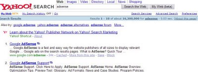
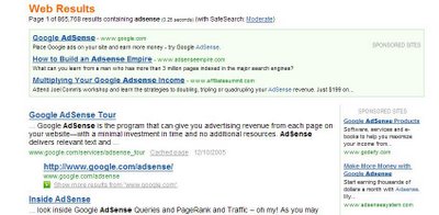
Google increased the font size of the AdWords ads displayed to the right side of search results.
As Philipp Lenssen notes, this is likely to be an effort of Google to increase the click-through rates for AdWords, thus make more money.
It seems that, for the first time, Yahoo! and MSN SERPs look less bloated than Google's.
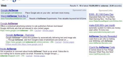
As Philipp Lenssen notes, this is likely to be an effort of Google to increase the click-through rates for AdWords, thus make more money.
It seems that, for the first time, Yahoo! and MSN SERPs look less bloated than Google's.


December 10, 2005
Google Doodles Holiday Logos

Google has always created beautiful holiday logos. Some Google fans created a series of logos that can be seen on Flickr.
You can find more about Google doodles from their Holiday Logos museum.
Dennis Hwang's creative logos have been expressing the playful heart of Google behind the impressive technology.
For Piet Mondrian's birthday, Hwang transformed the "Google" logo to emulate the artist's signature style of utilizing colorful blocks. Claude Monet's birthday saw the logo turned into a dreamy watercolor, complete with floating lily pads.
Yahoo buys del.icio.us
Social bookmarking service del.icio.us announced on Friday that it had been acquired by Yahoo. Financial terms of the deal were not disclosed. Joshua Schachter, creator of the site, said that the acquisition would allow it to work more closely with photo site Flickr, which was acquired by Yahoo in March.

Schachter created del.icio.us in 2003 as a way for himself and his friends to save and share Web pages that they visited. Earlier this year, del.icio.us, Inc. was formed to attract investment and help grow the service.
Since then, the site has received funding from a variety of companies and individuals, including Union Square Ventures, Amazon.com, BV Capital, Marc Andreessen, Esther Dyson, Seth Goldstein, Josh Koppelman, Howard Morgan, Tim O'Reilly, and Bob Young.
"I look forward to continuing my vision of social and community memory, and taking it to the next level with the del.icio.us community and Yahoo," Schachter said in a blog post announcing the acquisition Friday.
Yahoo Search's Jeremy Zawodny said the company has big plans for del.icio.us in the future. "Just like we've done with Flickr, we plan to give del.icio.us the resources, support, and room it needs to continue growing the service and community," he said.
Zawodny also hinted at some integration to come with Yahoo's My Web service and del.icio.us.
December 9, 2005
Windows Live Local
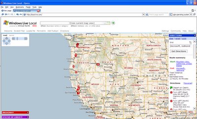
Microsoft launched Windows Live Local, a new version of its Virtual Earth aerial image service. Using images and technology from Pictometry International Corp., a specialist in this area that signed a licensing deal with Microsoft earlier this year, Windows Live Local will give users images of a much higher resolution and quality than Virtual Earth. Users will be able to zoom in much closer and also tilt the view to see buildings and streets from different angles, and not just directly from above. Virtual Earth is able to do this, but Windows Live Local's ability is more sophisticated and extensive.
Features like Birds Eye imagery and User pushpins are pretty nice. Right now that only covers about 25 percent of the market (U.S. metro areas). But eventually it will be national and international.
Try Windows Live Local.
What more to expect from Windows Live in the future?
- Windows Live Mail - a new, global Web e-mail service, built from the ground up to be faster, safer and simpler.
- Windows Live Messenger will help individuals deepen their connections with the people they care about through instant messaging, file and photo sharing, PC-based calling, and more.
- Windows Live Safety Center - a Web site where users can scan for and remove viruses from their PC on demand.
- Windows Live Favorites - a service that enables individuals to access their Microsoft Internet Explorer and MSN Explorer favorites from any PC that’s online.
Enjoy some pictures from Windows Live launch.
December 8, 2005
Bookmarking with GMail (GMail this)
Lifehacker.com shows how to use GMail as a bookmarking tool. Of course, it's easier to just use del.icio.us, but many GMail fans will love this trick.
First, drag this link to your browser's link bar (in Opera, you must right-click and save as bookmark; drag and drop won't work.):
GMail this!.
Clicking GMail this! creates a mini-interface to GMail prepopulated with a link to the web page you are visiting, as well as any text you have highlighted on that page.
If you aren't already logged into GMail, the log-in screen is displayed. You must log in and then re-launch GMail this!
More about GMail this!
To get started, login to your GMail account and click on the “Create a filter” link next to the searchbar. You’ll need to setup the filter criteria so that GMail knows what emails you’ve tagged for bookmarking and what emails to leave alone.
To ensure that legitimate emails aren’t whisked away to join your bookmarks, you want to use your email address for both the To and From fields. That way you can be sure that your bookmarks can only be added by you. Then add your tag to the Subject field. For our example, we’re setting up a tag for your holiday wishlist, so add “wishlist” to the Subject criterion.

On the next page, you want to set the action that GMail will take when an incoming message matches the filter criteria you’ve created in the last step. First, so that your inbox isn’t full of bookmarks, check the “Skip the Inbox” checkbox. Now you can create the new label for your bookmark.
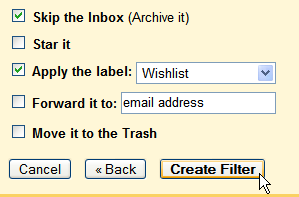
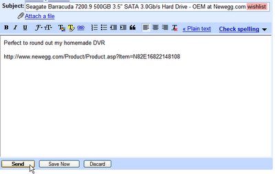
Now let's use this bookmarking style. From the page you’d like to bookmark, click the GMail this bookmarklet. Address the email to yourself, add your tag to the subject field, and send your bookmark. GMail will filter the email you sent into the label we set up earlier - in this case, Wishlist - and skip the inbox altogether. Just click on the Wishlist label in GMail to see all of your bookmarked pages. Need to send a couple of gift ideas home to the parents? No problem, just forward them a couple of your bookmarks!
While this system lacks the social aspect of other bookmarking systems like del.icio.us, it’s a quick and elegant way to integrate bookmarking into your GMail account.
First, drag this link to your browser's link bar (in Opera, you must right-click and save as bookmark; drag and drop won't work.):
GMail this!.
Clicking GMail this! creates a mini-interface to GMail prepopulated with a link to the web page you are visiting, as well as any text you have highlighted on that page.
If you aren't already logged into GMail, the log-in screen is displayed. You must log in and then re-launch GMail this!
More about GMail this!
To get started, login to your GMail account and click on the “Create a filter” link next to the searchbar. You’ll need to setup the filter criteria so that GMail knows what emails you’ve tagged for bookmarking and what emails to leave alone.
To ensure that legitimate emails aren’t whisked away to join your bookmarks, you want to use your email address for both the To and From fields. That way you can be sure that your bookmarks can only be added by you. Then add your tag to the Subject field. For our example, we’re setting up a tag for your holiday wishlist, so add “wishlist” to the Subject criterion.

On the next page, you want to set the action that GMail will take when an incoming message matches the filter criteria you’ve created in the last step. First, so that your inbox isn’t full of bookmarks, check the “Skip the Inbox” checkbox. Now you can create the new label for your bookmark.

Now let's use this bookmarking style. From the page you’d like to bookmark, click the GMail this bookmarklet. Address the email to yourself, add your tag to the subject field, and send your bookmark. GMail will filter the email you sent into the label we set up earlier - in this case, Wishlist - and skip the inbox altogether. Just click on the Wishlist label in GMail to see all of your bookmarked pages. Need to send a couple of gift ideas home to the parents? No problem, just forward them a couple of your bookmarks!
While this system lacks the social aspect of other bookmarking systems like del.icio.us, it’s a quick and elegant way to integrate bookmarking into your GMail account.

Google Transit (trip planner)
Google launched Google Transit Trip Planner. With it, commuters will be able to easily access public transit schedules, routes, and plan trips using their local public transportation options.
Unfortunately, you can't enter too many locations: Google only offers transit planning for the city of Portland, but they plan to expand to cities in the US and around the world.
Try, for example:
100 nw couch st, portland to hillsboro, oregon by 8pm
pdx to portland, oregon at 7pm
pdx to 100 nw couch st, portland, oregon
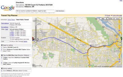
Read more from Google blog.
Unfortunately, you can't enter too many locations: Google only offers transit planning for the city of Portland, but they plan to expand to cities in the US and around the world.
Try, for example:
100 nw couch st, portland to hillsboro, oregon by 8pm
pdx to portland, oregon at 7pm
pdx to 100 nw couch st, portland, oregon

Read more from Google blog.
GMail introduces Web Clips
It's only been about a week since Google introduced Anti-Virus capabilities into Gmail, and now the Googlers are now ready to start offering a few more interesting features that may raise a few eyebrows. Their "What's New" page has changed once again and outlines a few extra features that aren't yet available.
One of the new features is "Web Clips". They will enable you to view your favourite RSS feeds right in Gmail just above the archive and report spam area. Unfortunately it doesn't seem like it will be integrated with Google Reader.
Viewing some types of attachments is also getting easier. For Microsoft Office, Open Office or PDF attachments you will be able to view them as "HTML" by clicking the link similar to the one you find on search engine result pages. This will save time by allowing people to view their attachments without downloading anything.
Google will now also scan your emails and display relevant information about things it finds in your email, such as driving directions and package tracking. This mashup information will be displayed on the right hand side of the screen — probably above the Google ads.
December 7, 2005
Gates: Google’s business model not based on free software
Bill Gates answered a host of questions at an event “Entrepreneurs to Icons’’ organised by The Indus Entrepreneurs in New Delhi. Here are some excerpts from his responses on business, competition, entrepreneurship and leadership.
On what gets him worried
What keeps me worried is if we miss some very big technical change. Press loves the new challenger. If someone invented AI (Artificial Intelligence) before we did, that would worry me. The key for a large company is to maintain willingness to take risks. We’ve got to be at the forefront of technology. Now it’s Google more than anybody else. We love the fact that there are areas where people are underestimating us.
On the next disruptive technology
The next generation disruptive technologies will be low cost computing, speech recognition software, a computer the size of a tablet which lets you do a variety of things. In future, software will work magic. Phones will be able to recognize your speech and navigate maps. They will be able to organize your schedules. Rather than interrupting, they will put you back in control of your life.
On the US market economy
The US offers a market economy working at its finest. But US policies also affect our business in many countries around the world. People hate US as it’s the most richest country. But they also love US for the same reason, With Microsoft too, it’s the same love/hate relationship. On whether he will ever enter politics No. No chance.
December 6, 2005
Google: Ten Golden Rules
Getting the most out of knowledge workers will be the key to business success for the next quarter century.
says Eric Schmidt in an interesting Newsweek article.
What follows are seven key principles Google use to make knowledge workers most effective.
* Hire by committee. Virtually every person who interviews at Google talks to at least half-a-dozen interviewers, drawn from both management and potential colleagues. Everyone's opinion counts, making the hiring process more fair and pushing standards higher.
* Cater to their every need. As Drucker says, the goal is to "strip away everything that gets in their way." We provide a standard package of fringe benefits, but on top of that are first-class dining facilities, gyms, laundry rooms, massage rooms, haircuts, carwashes, dry cleaning, commuting buses—just about anything a hardworking engineer might want.
* Pack them in. Almost every project at Google is a team project, and teams have to communicate. The best way to make communication easy is to put team members within a few feet of each other. The result is that virtually everyone at Google shares an office.
* Make coordination easy. Because all members of a team are within a few feet of one another, it is relatively easy to coordinate projects. In addition to physical proximity, each Googler e-mails a snippet once a week to his work group describing what he has done in the last week.
* Eat your own dog food. Google workers use the company's tools intensively. The most obvious tool is the Web, with an internal Web page for virtually every project and every task.
* Encourage creativity. Google engineers can spend up to 20 percent of their time on a project of their choice. There is, of course, an approval process and some oversight, but basically we want to allow creative people to be creative. One of our not-so-secret weapons is our ideas mailing list: a companywide suggestion box where people can post ideas ranging from parking procedures to the next killer app.
* Strive to reach consensus. Modern corporate mythology has the unique decision maker as hero. We adhere to the view that the "many are smarter than the few," and solicit a broad base of views before reaching any decision. At Google, the role of the manager is that of an aggregator of viewpoints, not the dictator of decisions.
* Don't be evil. Much has been written about Google's slogan, but we really try to live by it, particularly in the ranks of management.
* Data drive decisions. At Google, almost every decision is based on quantitative analysis. We've built systems to manage information, not only on the Internet at large, but also internally. We have dozens of analysts who plow through the data, analyze performance metrics and plot trends to keep us as up to date as possible. We have a raft of online "dashboards" for every business we work in that provide up-to-the-minute snapshots of where we are.
* Communicate effectively. Every Friday we have an all-hands assembly with announcements, introductions and questions and answers. (Oh, yes, and some food and drink.) This allows management to stay in touch with what our knowledge workers are thinking and vice versa. Google has remarkably broad dissemination of information within the organization and remarkably few serious leaks. Contrary to what some might think, we believe it is the first fact that causes the second: a trusted work force is a loyal work force.
Google users are wealthier
U.S. residents who prefer Google’s search engine tend to be richer and have more Internet experience than those who primarily use competing search services from Microsoft, Yahoo, and America Online, a new study has found.
The longer people have been using the Internet, the more likely it is that Google will be their search engine of choice, according to a survey of 1,000 U.S. Internet users conducted by investment banking and research firm S.G. Cowen.
Moreover, people whose primary search engine is Google are more likely to have household incomes above $60,000 than people who use competing search engines.
Google also emerged as the search engine of choice, with 52 percent of respondents choosing it as their primary engine for general Web searches. Yahoo came in second with 22 percent, while MSN and AOL tied for third place with 9 percent. Ask Jeeves rounded out the top five with 5 percent.
Eric Schmidt's 20 percent time

Google engineers all have “20 percent time” in which they’re free to pursue projects they’re passionate about.
From Eric Schmidt on down, Google managers divvy up their time into three parts -- the core business of search and advertising, related projects, and entirely new businesses.
What do you do with your 20 percent time?
Well, 20 percent time applies to the technical staff. It does not apply to sales or management. Here’s how it works for management: We spend 70 percent of our time on core search and ads. We spend 20 percent on adjacent businesses, ones related to the core businesses in some interesting way. Examples of that would be Google News, Google Earth, and Google Local. And then 10 percent of our time should be on things that are truly new. An example there would be the Wi-Fi initiative -- which I haven’t kept up with myself. God knows what they’ve done in the last week. I’ve been too busy on core search and ads.
From: Bussiness 2.0 interview with Eric Schmidt
December 5, 2005
What should the future bring for Google?
What should the future bring for Google?
Here are some ideas.
A calendar feature for Gmail.
Free pc to mobiles thru Gtalk.
Google Photo.
Google Music Search.
Google Financial, Google's answer to Bloomberg and Reuters.
Google Earth for OS X.
Google OS and Browser.
Google Law; actively find and prosecute scammers and spammers.
Google TV. Release your own internet TV channel using unique content
Subscribe to:
Comments (Atom)

