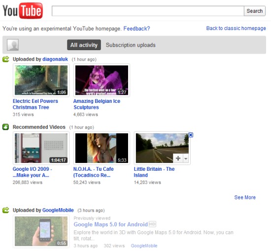
Combined list - Merges your subscriptions, friend activity, and recommendations into one easier-to-scan list
Don't miss a video - If a channel uploads 4 videos in a day, you'll see all 4 - instead of just the latest video
Delete anything - Hover over any video you don't want to watch and click 'x'
Or just grey it out - Videos you've already watched will be greyed out - so even without deleting, you'll know where you left off
Help me re-find stuff I just watched - Your homepage will include your recent likes and favorites so you can easily get back to them
Easy inbox - Links to your inbox (personal messages & comments) are front and center
Load much more - Watch older videos - all without leaving the homepage

YouTube wants to create a more comprehensive newsfeed that includes your actions and all the actions shared by your subscriptions and friends. Unfortunately, the homepage is no longer customizable.
{ Thanks, Sterling. }
The idea is interesting but if you have a lot of subscriptions it gets very full on the page. And there is still these "recommended videos" which looks like video from one of you subscribed channel, it is confusing and not helpful. I like to chose which channels are important to me and which are not and which information from those channels are important to me and which are not.
ReplyDeleteIt's quite enough good. Unfortunately, it's worse than the current homepage design like too much taking on the space. I miss some important and useful features such as Inbox status, not customizable Homepage, and Grid Box Subscription. 1 star.
ReplyDeleteAnon - I think all they read was "The idea is interesting--"
ReplyDeleteHedaru - I'm pretty sure they read "It's quite enough good," and decided that it really was.
Those are the only explanations I can think of to explain why they thought it'd be a good idea to force their crap heap of a new homepage onto everyone.
OHHhhhhh, I didn't realize it needed approval to be posted. I guess it'll never see the light of day, then. Can't believe this needs approval; but, the one where hundreds of people are saying the new homepage looks like words I don't want to say, is free to comment one. Meaning no one will ever see it, and they can claim no one said anything.
ReplyDeleteWell, just in case anyone working at youtube or google give a crap (which I already know they don't, so I can't figure out why I'm bothering), the page is at http://googlesystem.blogspot.com/2011/01/new-youtube-homepage.html?showComment=1295574740006#c1030242356938314168
There doesn't seem to be a post now it's been launched, so I'll reply here.
ReplyDeleteGoogle (or anyone working there), please check out the comments on this page:
http://googlesystem.blogspot.com/2011/01/new-youtube-homepage.html
Just skim through them a bit, you'll get the idea. Basically, about 9/10 people hate it, 1/20 likes it and another 1/20 doesn't care (it seems to me, I didn't count or anything).
Personally, I don't like it either. An option would be the best compromise here I think.
--lucb1e who was too lazy to login
Dear Google folks, on this Macbook running Safari, I can't even see a Search field on the YouTube homepage. There are several suggested videos you think I'll like (wrong), and when I click on the option to see more, the same ones are listed again, in a different order. Every time. I stopped after 4 tries and started hunting for a way to get the old homepage back. No luck yet.
ReplyDeleteThe new homepage is really awful. Even up to a point I don't enjoy visiting youtube anymore...what a mess. Former page was fine. At least give us options in stead of forcing someone's bad taste upon us.
ReplyDeleteI am a big youtube user have been for a long time and now I'm searching an alternative site. What you did on your homepage is unbelievable! I've never seen such a quality downscaling. For having browsed a little on the subject it appears that 99% (ok I'll give you 95%, just to be polite) of the users simply hate it. No worries everyone can make mistakes (even though this looks more like a suicide then just a mistake), so roll back. Anyway I'm searching for a new site to enjoy videos because this place has just become unusable and annoying.
ReplyDeleteThis is sad.
You can use this page: http://www.youtube.com/my_subscriptions, which looks almost like the old homepage.
ReplyDelete