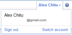

Another change is that Google shows your name instead of your email address. For some reason, Google doesn't link to the Google Profile and makes it more difficult to switch to a different account if you use multiple sign-in or Gmail delegation. Now you need to click "Switch account" to see the list of accounts you can use.

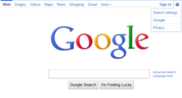
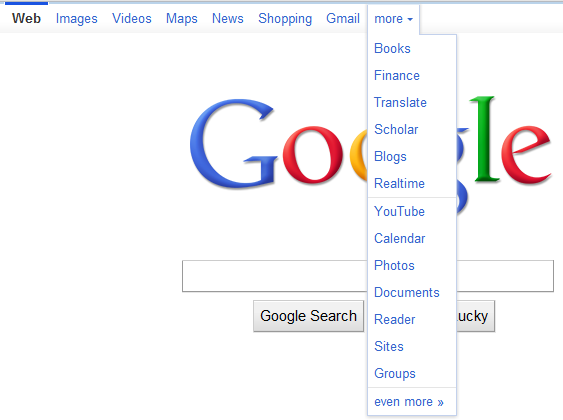
Unfortunately, Google didn't manage to add the bar to all its services, so you'll only see it if you use Google Web Search, Google Image Search, Google Realtime Search, Google Maps and Gmail.
{ Thanks, Benjamin and Locutus.}
google +1 is still missing...
ReplyDeleteThe non-integration with Google Profiles certainly is perplexing.
ReplyDeleteNo Google Docs and Google Reader? I wish it was customisable, or at least you would have a few spare link spaces which could have whatever you wanted.
ReplyDeleteI want to customize the links!
ReplyDeletegoogle docs just got the new nav bar..
ReplyDeleteIn google chrome, switching the accounts will not work. Would you believe that? In GOOGLE chrome... :-)
ReplyDeleteNow it takes two clicks to sign out?
ReplyDeleteThat's 100% more clicking effort. And also some mouse movement. Why Google, why? I thought you were all about making life simpler...
wow...good good
ReplyDeletenot in the uk, typical :-(
ReplyDeleteTwo clicks to sign out. Three clicks to switch account. :-(
ReplyDeleteTwo thumbs down, usability of those features got 100% poorer.
How often do you sign out? How often do you switch to a different account?
ReplyDeleteAn annoying side-effect of this change is that it's hard to tell which account you're currently using. If you sign in to multiple accounts and you use the same name for all your accounts, it's not that easy to distinguish the accounts. Maybe a profile image or a different color next to your name would solve this problem.
ReplyDeletethe color of the bar is quite disagreeable with my gmail background. why can't i customize the links? or why not prioritize them by the ones i click on most.
ReplyDeletehow to get it?
ReplyDeletecz im romanian and i dont have it.
is a a link or something if it i want it ok.
@Alex: Yep, I have multiple sign-ins enabled and in the new bar, it takes three clicks to do when in the old bar only two two clicks.
ReplyDeleteNow you have to first click on your name, then on Switch account, and finally click on the account you want to log in to. Before, it was just clicking on your email address logged into and then on the account switching to.
I got the new bar last night, but I can't say if I'm either excited by it or not.
+1 for customizable links!
ReplyDeleteIt looks good, an I have always like the design, still wondering when us poor UK web users will get access to it.
ReplyDeletethey dont put all services in the the navigation bar because not everybody has a cool resoulion
ReplyDeletethe majotiry of people have 1024x768. dont fit in the scren too many services.
Wow, sounds like they really made it worse.
ReplyDeleteThe worst part though is that they still don't allow it to be customized. I'm assuming this is because they want to have sufficient control to promote certain services through that bar, but the cost in usability for medium and advanced users is pretty big.
I like the look of the "Switch profiles" screen, though.
ReplyDeleteBooo... they made it worse. Hate the new "Switch Account" link. How do I get the old one back!? Who do I complain to?
ReplyDeleteSo many people just whine and whine. It's so annoying to read. How entitled do you all feel? It's pathetic. 3 clicks to switch accounts instead of 2?? OH MY GOD, THE HORROR!!!!!! Pathetic.
ReplyDelete1. would like to customize links
ReplyDelete2. and make the navigation bar transparent
3. fix/remove that thin blue line above the navigation bar—what's the use of it
Use the .co.uk domain for now to get the old bar back.
ReplyDeletePersonally, having just got it in my gmail, an finally able to get it on .com, I can see where google is going with this an what there thought process was. l
I don't want my full name showing in large type at the top of my Gmail page. Is there any way to change it to show my email address?
ReplyDeleteMake Google Doc Offline...please!
ReplyDeleteI m unable to see in india
ReplyDeleteYea, I'm not a fan of the two-click sign out...on a notebook touch pad, that's a little more annoying....
ReplyDeleteI can't understand why I have it on firefox and not in Chrome... that's just stupid
ReplyDeleteso when should we expect to hear about this in the news...ya know, a new security issue. I just heard a bunch of students talking about how they all were reading each others emails and sending emails to and from each other under different friend's accounts. good job google..another lawsuit in the making.
ReplyDeleteI'm seeing the new nav bar in every service. Seems like they have been slowly releasing it in each service over the past couple days. It also seems that some services show the email address while others show the name.
ReplyDeleteOne big problem with this: in gmail, I no longer have a "Manage this domain" link, anywhere in the UI.
ReplyDeleteOK, now I see it. They have an orphaned link on the far right side. Obviously they couldn't figure out where to put this in the new navbar, so they just stuck it over there by itself.
ReplyDeleteLame.
had in in the netherlands, came back to germany and it was gone!
ReplyDeletethat sucks!
I hate the blue bar @ the top of my gmail, messes with my cool theme :(
ReplyDelete1) Double-click sign out is a hassle. This is not complaining, it is fact. Many people (myself included) find it a necessary practice to sign out often.
ReplyDelete2) I am not interested in having my name displayed for everyone to see. I don't need Google to tell me my name. I do need to know which account I am in and I much prefer to not bleed time for that information.
The interface looks better, but the usability and security changes cause a large negative net effect on my user experience.
I don't want my full name showing in large type at the top of my Gmail page. When I'm in a public place (bus, subway, airplane, etc), I do NOT want my name to be prominently displayed.
ReplyDeletePLEASE let me have some privacy.
How can I opt out of this new setup?
Pretty lame!
ReplyDeletePerfect, but dont working google turkish, so never mind..
ReplyDeleteWhere is the sign-out ? Looks like google doesn't want its users to sign out ever..
ReplyDelete1) I hate like the double click signout.
ReplyDeleteAny people with more than one account need to sign out often.
2) I need to know the account I'm in, not my name.
3) I do prefer the old navbar.
I get the new nav bar in both my Education and Standard edition Apps accounts, but only from my office, never from home. After some testing I found that I only get it if I'm connected to Google via IPv6, never via IPv4. Does anyone else have the same experience?
ReplyDelete+1 in single sign-out -like before-
ReplyDelete+1 in not showing my name-as somebody already said, I do know what my name is.
+1 I like the new bar, but it could be greatly improved if added the first two options.
Where is the sign-out ? Looks like google doesn't want its users to sign out ever..
ReplyDeleteWhere is the sign-out ? Looks like google doesn't want its users to sign out ever..
Where is the sign-out ? Looks like google doesn't want its users to sign out ever..
i clicked a hundred times and it really doesn't work at all... tsk-tsk-tsk!
i'm disappointed.
Where is the sign-out ? Looks like google doesn't want its users to sign out ever..
ReplyDeleteAt work I have the new navigation bar...at home in my pc...no! I refreshed, cleared the cache, tried with Firefox and Chrome, but apparently my pc doesn't like the new navigation bar and it shows the old one!
ReplyDeleteWhy do I see new navigation bar in Firefox, but not in Chrome?
ReplyDeleteThat blue bar is intentional? I thought there had been some CSS failure. Wouldn't highlighting the current app similar to the mouseover highlighting look a little less....mistake-y?
ReplyDeleteI'm with other commenters. I know my name, and I would like to see which account I'm currently using instead.
I have the new nav bar in Firefox but not in Chrome as well. What gives?
ReplyDeleteSame as Freddy G. but only on Windows.
ReplyDeleteOn Ubuntu, I have it on both FF and Chrome!
Why is that?
I have been forced to use this new navigation bar for more than 2 weeks in chrome, and it's awful that I can't use the Gmail delegation feature any longer. As it doesn't display the other delegated account under "switch account" window. Anyone figured it out how to fix it? thanks.
ReplyDelete@Freddy G., @Tibi: Having your google.com preference set up to "google.com" might help to resolve the issue.
ReplyDeleteFor example: you live in UK, beside "About Google" you have a link to "Go to google.com", click on it. The link changes in "Go to Google UK" and the new navigation bar should be there.
I still got the old sign out bar on gmail when I use one of my computers. Does anyone know why that is?
ReplyDeleteI can't get this to show up on my account. anybody know why? or how i can activate it? (I use chrome on a mac.)
ReplyDeleteI'm not a big fan because it wastes more vertical space than the old one. Vertical pixels are very valuable on widescreen laptops and netbooks. In Google Docs, I want to see more document not more nav bar! Still, I can appreciate the need to be touchscreen-friendly and I guess a few pixels isn't all that much.
ReplyDeleteThe ugly thin blue strip on the top portion of the toolbar is hard on the eyes and now I have to click so many times to sign in/out of only one gmail account. My other gamil accounts have not been afflicted with this hideous toolbar - yet. If Google does not get this thing off my account I will have no use foe them anymore. Disappointed!
ReplyDeletenice post...thanks for info...
ReplyDeleteWorks on my laptop (Windows 7) but not on my desktop (Windows XP). Why?
ReplyDeletedoesn't appear in all accounts. not sure why.
ReplyDeleteWhat is the timeframe for the broad rollout? Do I need to add the button to my website?
ReplyDeleteNew navigation bar is not working in ie9.
ReplyDeleteThe new bar is really annoying and un-usable; now every link is more difficult to find and needs more clicks!
ReplyDelete+1 is there n really love it !!!
ReplyDeleteGoogle has really workd hrd on this.. n final results were rocking !
I'm not a big fan because it wastes more vertical space than the old one.
ReplyDeleteDaniel Hedgri