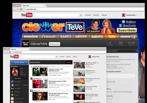
"We've given YouTube a refresh. When you login, you'll be greeted with recent activity from your subscriptions. You can also browse and add new Channels to your homepage. Connect with Google+ and Facebook to share your favorites with friends. There's plenty to discover, so login and give it a spin."

There's also an article about the new interface for channels.
This new look and feel makes it easier for viewers to to find and watch content. It also makes it easier for Channel creators to organize and showcase exactly what they want. We incorporated your Feedback from the "Cosmic Panda" Channels and Watch experiment, and are excited to present:
* A more streamlined and consistent design
* An easier way to find and view videos
* New, more flexible layouts for featured content, and
* A way to keep your audience engaged even when you don't have new uploads
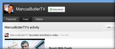
It's interesting to notice that the new homepage and the new channels are built around feed views and activity streaming to make YouTube even more social.

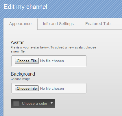
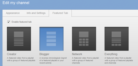
The new channels are less customizable: you can only choose an avatar, a background image, a background color and a template (creator, blogger, network, everything).


Update: The new interface is available for everyone.
I think the new channel layout is a bit confusing and it's going to take a while to get used to.
ReplyDeleteIt looks nice, but I don't know if I'd like to use it. The few times I've tried it, I've gone back to the current look in a matter of minutes.
I also don't like that Subscriptions, Likes, Favorites, and Comments are all in one feed on the homepage. Even videos that I liked show on my homepage! LOL
BTW, the "additional information" and "The new channels" links are showing a 404 error message?
ReplyDeleteI think this is one of the most significant info for me. And i am glad reading your article. I am going to share this with my facebook friends. Thanks a lot.
ReplyDeleteI think it's very informative article. I like it. Thank you. conveyancing quote
ReplyDeletesippp... check may channel :)
ReplyDeleteAs expected, youtube updated the same time Google has. Both have the same kind of interface, and overall the same features as well. I do like it better now, it's a much easier navigation than it was before. It looks so modern now, but I bet they will be doing a few more improvements to their new change.
ReplyDeletehay how do i go to favorites in the new you tube interface ?
ReplyDelete