There are multiple payment options in Google Play, from credit and debit cards to carrier billing and gift cards, but PayPal isn't one of them. Google Wallet competes with PayPal and this could be one of the reasons why you can't use PayPal in Google Play.
Despite this, some Google Wallet JavaScript files that are used in Google Play include many references to PayPal. For example, PayPal is placed next to Maestro, Automated Clearing House (ACH), proxy cards and carriers like Sprint, Softbank and Vodafone. Google's code also mentions PayPal UUIDs, which are used by the PayPal Merchant API, and there's a function named "onRedirectToPayPalPopup". There's also an error message: "PAYPAL_INSTRUMENT_ERROR" next to messages like "GIFT_CARD_ALREADY_REDEEMED" and "INVALID_CREDIT_CARD".
April 29, 2013
Google Now for iOS
Google Now is finally available for iPhone, iPod Touch and iPad. It's not a standalone application, it's just a new feature of the Google Search app.
Google Now for iOS has most of the features from Google's Android app and plenty of customization options that aren't available in the Android app. There aren't many missing cards: research topics, activity summary and events nearby.
I was surprised to see that Google added a lot of settings that let you tweak each card. For example, you can customize the traffic card and decide when it appears and the transportation mode for commutes and other trips.
Since most Google Now cards use location data, it's obvious that Google wants to update your location even when you're not using the app. "Location Reporting helps Google Now show you cards related to traffic alerts, directions, and more. Turning on Location Reporting allows Google to periodically access your location data, even when an app is not in use. If you have Location History enabled, reported locations are stored in your Location History. (...) Since Location Reporting has been optimized to use GPS as infrequently as possible, there should be minimal impact on your battery life." Location Reporting can be disabled from the app's settings section, while Location History can be disabled from the Google Latitude site.
It's interesting to notice that Google Now for iOS is placed less prominently, at the bottom of the screen. You need to swipe up to see the cards. Google Search for iOS doesn't show notifications yet, so you need to constantly open the application to see the new information.
April 25, 2013
No More Quick View in Google Search
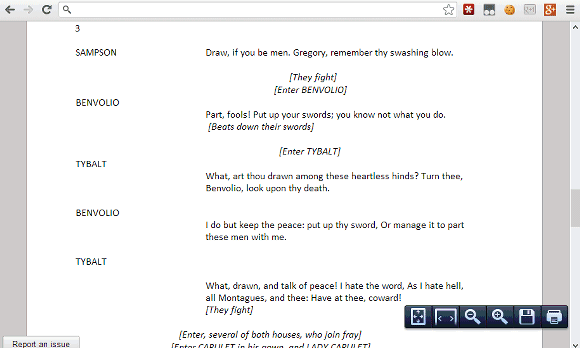
The latest Google Search update removed a very useful feature: quick view. The link was displayed next to PDF files and Microsoft Office files and allowed you to open them in the Google Drive Viewer.
Here's how Google described Quick View: "Annoyed by pop ups requesting you to download a specific software or plugin to visualize a document? Google Docs allows you to view any document directly from the search results without requiring any plugins. Just search for a document, for example [white paper on cloud computing] and then click on 'Quick View' to see the document in Google Docs."
If you don't want to download the file, you can click the green arrow and select "cached", but this shows a text-only version of the document that doesn't preserve formatting.
Please note that the feature has nothing to do with the "quick view" for mobile phones.
Chrome Viewer for Microsoft Office Documents
Last year, Google acquired Quickoffice, a mobile app for editing Microsoft Office files. The app is still available and it's not free. It's probably the only mobile Google app that's not free (there's a free version for Google Apps for Business users).
Google started to port Quickoffice to Chrome OS, first as a Microsoft Office viewer. Now the Office viewer is available as an extension for Chrome. It requires at least Chrome 27.0.1453.65 for Windows and Mac, so you can use it if you have Chrome Beta, Chrome Dev Channel, Chrome Canary or a recent Chromium build.
The extension lets you open Microsoft Office files that have the following extensions: .doc, .docx, .xls, .xlsx, .ppt, .pptx. It looks just like the PDF viewer, but it doesn't work as well yet probably because it's still in beta. Some files don't load, text selection doesn't work for presentations and zooming some documents sends you to a different page.
But why not open these files using Google Drive apps? Why not use the Google Drive Viewer? They're great options, but the Chrome Office Viewer is better than the Google Drive Viewer because it doesn't convert files to images. Opening files using Google Drive apps like Google Docs or Google Sheets takes more time: the files need to be downloaded and then converted to the Google Drive format. Another explanation: "Quickoffice has an established track record of enabling seamless interoperability with popular file formats" and this is especially important for business users. The viewer works offline, so Chromebook users can open Office files from a USB flash drive even when they don't have an Internet connection.
To test the extension, search Google for [fileype:doc essay], [fileype:ppt internet history], [fileype:xls gdp].
{ via Chrome Blog }
Google Chat in Google Docs
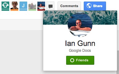
Do you remember the post about the animal icons from Google Drive? They're only displayed for anonymous users ("people who are not given explicit access"). For everyone else, Google will show the Google Profile photo and link to the Google+ page.
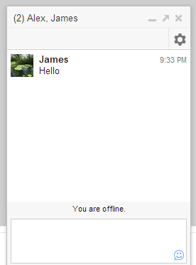
There's also a group chat feature powered by Google Talk/Chat. It's a simplified version of the chat feature from Gmail, Google+, iGoogle and orkut. There's only one chat box that lets you talk with the other signed-in users that edit or just view a document, presentation or any other file. For some reason, it doesn't work in Google Sheets/Spreadsheets.
"To begin a group chat with everyone viewing the document, click the Chat button, which you'll find in the top-right corner of your window. A chat box will appear at the bottom of your file, and everyone who's viewing the document and who's signed in with a Google account will be included in the group chat," explains Google.
The group chat feature from Google Drive doesn't support voice or video chat, conversations aren't saved in Gmail and they're not available in other services that use Google Chat. "If you've chatted in Gmail and Google+, you may have noticed that a chat started in Gmail will carry over into Google+, and vice versa. The same isn't true for chats in Google Drive. Chats you start in Google Drive won't carry over into other Google products, and chats you start in other products won't appear in Google Drive."
{ via Google Drive Blog }
April 24, 2013
New Drop-Down Menu for Google Search Results
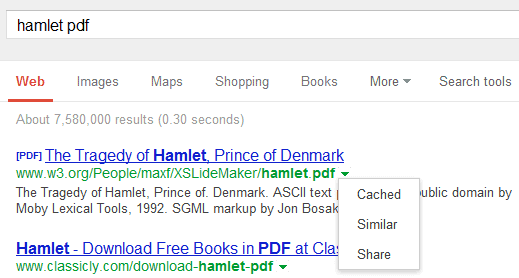
Google now shows a green arrow icon next to search results URLs. Click the arrow and you'll get a drop-down menu with up to three options: cached, similar and share. Google tested a different interface for the drop-down menu a few weeks ago.
Until now, Google only displayed the "share" link next to the results, while "cached" and "similar" were buried in the Instant Preview box. Instant Preview is no longer available.
Bing has a similar feature and Google probably decided to test it and see if it works well. Before accusing Google of copying a Bing feature, it's a good idea to check Bing's interface and see that it looks a lot like Google Search.
Here's a Bing vs Google screenshot for [ny times]:
Google Removes Related Searches Option
Back in 2009, Google added a sidebar with advanced search options like wonder wheel, timeline, sites with images, recent results and related searches (intially called "search suggestions"). Many of these features are no longer available, but there are some new features that have been added since then: verbatim, dictionary, visited pages.
Google has recently removed the related searches feature because few people used it. Don't confuse this feature with the regular related searches that are displayed below the search results. "We weren't seeing enough usage of this filter to maintain it in the toolbar, but we do display related searches at the bottom of the page when they seem relevant enough," explains Google.
Here's a screenshot from 2009 (licensed as Creative Commons by Search Engine Land):
"Related searches" allowed you to quickly check the results for similar queries. "If you're ever unsure about the precise terms you should use for your search, start out with a broader term then use the related searches tool to discover alternative search terms," explained Google. It was also used by SEOs to generated lists of related keywords.
The Google blog post from 2009 included the following video which shows a lot of features that are no longer available (review search, sentiment analysis snippets, longer snippets, wonder wheel, timeline, dictionary auto-linking, SearchWiki):
YouTube's Homepage Carousel UI
When you're signed in, YouTube's homepage now has a carousel interface similar to the new design for channels. The "what to watch" section groups recent videos from your subscriptions, recommended videos and now also shows popular videos from some of your subscriptions. For music artists, YouTube links to a playlists that includes their top tracks.
The new interface is more compact, it shows more videos, you can easily ignore recommendations and prolific channels can't "spam" your homepage. Unfortunately, you can no longer remove videos from the homepage, quickly unsubscribe from channels or see the videos you've previously watched. These features are only available in the "my subscriptions" page, which still has the old interface.
April 23, 2013
A Bogus DMCA Takedown Request (Part 4)
This is the last article from the series. I've received a bogus DMCA complaint, filed a counter claim, which was rejected by Google. Then I've contacted a member of the band who sent the DMCA complaint. He admitted that it was sent by mistake and promised to contact Google.
Today I got a message from Google which informed me that "We received an email from the complainant officially rescinding their complaint against your blog. We have reinstated your content located at http://googlesystem.blogspot.com/2008/02/lyrics-for-youtube-music-videos.html. The post in question has been reverted to draft. Please log into your blog and republish at your convenience."
The post is back online. I know it's obsolete, but at least it hasn't been removed by a DMCA complaint sent by mistake.
If you ever receive a similar DMCA notice, contact the owner of the site or his team and explain your issue. You'll probably find a contact form, an email address, a Facebook/Twitter/Google+ page. If not, a WHOIS lookup should help.
Thanks to everyone who helped me fix this issue and special thanks to James Trimble from the band Inspection 12 and +Thomas P. TechDirt has recently posted an article about this and its conclusion is that "the real culprit is the DMCA itself, which is constantly pushing companies like Google in this regrettable direction, and makes it all too easy for rightsholders like Inspection 12 to abuse the law".
How Accurate Is Browser Market Share Data?
It's really hard to get accurate browser stats. Some companies report the number of active users, others report the total number of users and there are many web analytics companies that report conflicting market share data.
Net Market Share is a service that collects data from "HitsLink Analytics and SharePost clients." Net Market Share explains that "the network includes over 40,000 websites, and spans the globe. We 'count' unique visitors to our network sites, and only count one unique visit to each network site per day. This is part of our quality control process to prevent fraud, and ensure the most accurate portrayal of Internet usage market share."
I tried to compare this information with the data obtained from browser vendors. Probably the most transparent company is Opera, at least when it comes to the mobile browsers. Every month, Opera reports the number of users for Opera Mini and Opera Mobile.
Here's the data from May 2012 to February 2013:
And here are two charts that illustrate the data:
Obviously, there are many factors that influence market share: maybe the number of mobile users grows, maybe there are other browsers that become popular. Still, the two charts show completely different trends. For example:
- from May to June 2012, the number of Opera Mini users increased with 4 million, but the market share dropped from 12.43% to 10.45%
- from June to July 2012, the number of Opera Mini users increased with 4.7 million, but the market share dropped from 10.45% to 9.32%
- from December 2012 to January 2013, the number of Opera Mini users increased with 7 million, but the market share dropped from 10.71% to 9.84%.
- from January to February 2013, the number of Opera Mini users decreased with 8 million, but the market share grew from 9.84% to 12.72%.
StatCounter reports different data: Opera's mobile market share continously dropped from May 2012 (21.9%) to February 2013 (15.4%). StatCounter's report shows that the Android browser is more popular than the Mobile Safari, while Net Market Share's data shows that Safari Mobile is 3 times more popular than the Android browser. It's important to mention that StatCounter measures pageviews, not unique visitors.
Opera's reports include a chart of the number of Opera Mini pageviews, which increased from 113.8 billion in May 2012 to 147.1 billion in February 2013:
If Opera's data and StatCounter's data are both accurate, then the total number of mobile pageviews almost doubled from May 2012 to February 2013.
What about the data from a popular site like Wikipedia? "Wikimedia traffic analysis reports are based on server logs of about 4 billion page requests per month, based on the user agent information that accompanied the requests. These server logs cover requests to all the Wikimedia Foundation projects, including Wikipedia, Wikimedia Commons, Wiktionary, Wikibooks, Wikiquote, Wikisource, Wikinews, Wikiversity and others." Wikimedia data for October 2012 shows that only 6.4% of the mobile requests were from Opera Mini users.
According to Clicky, Opera Mini's market share is only 3-4%. "Marketshare is calculated from nearly 500 million daily page views across the 500,000+ web sites that use Clicky Web Analytics."
As you can see, these stats are completely different. StatCounter is the only service which reports that Android's browser is more popular than Mobile Safari and UC Browser's market share is 8-10%. Opera Mini's market share is anywhere from 3% to 15%, depending on the service you use.
It's interesting that Opera's presentations include data from StatCounter. A recent presentation mentions that Opera's mobile browsers have "50 million Android users" and Opera has "10% browser market share" (probably Android market share).
Net Market Share is a service that collects data from "HitsLink Analytics and SharePost clients." Net Market Share explains that "the network includes over 40,000 websites, and spans the globe. We 'count' unique visitors to our network sites, and only count one unique visit to each network site per day. This is part of our quality control process to prevent fraud, and ensure the most accurate portrayal of Internet usage market share."
I tried to compare this information with the data obtained from browser vendors. Probably the most transparent company is Opera, at least when it comes to the mobile browsers. Every month, Opera reports the number of users for Opera Mini and Opera Mobile.
Here's the data from May 2012 to February 2013:
Month | Opera Mini users (million) | HitsLink market share (mobile browsers) |
05/2012 | 179 | 12.43% |
06/2012 | 183 | 10.45% |
07/2012 | 187.7 | 9.32% |
08/2012 | 191 | 8.59% |
09/2012 | 187.6 | 9.55% |
10/2012 | 194 | 8.24% |
11/2012 | 195 | 7.02% |
12/2012 | 208 | 10.71% |
01/2013 | 215 | 9.84% |
02/2013 | 207 | 12.72% |
And here are two charts that illustrate the data:
Obviously, there are many factors that influence market share: maybe the number of mobile users grows, maybe there are other browsers that become popular. Still, the two charts show completely different trends. For example:
- from May to June 2012, the number of Opera Mini users increased with 4 million, but the market share dropped from 12.43% to 10.45%
- from June to July 2012, the number of Opera Mini users increased with 4.7 million, but the market share dropped from 10.45% to 9.32%
- from December 2012 to January 2013, the number of Opera Mini users increased with 7 million, but the market share dropped from 10.71% to 9.84%.
- from January to February 2013, the number of Opera Mini users decreased with 8 million, but the market share grew from 9.84% to 12.72%.
StatCounter reports different data: Opera's mobile market share continously dropped from May 2012 (21.9%) to February 2013 (15.4%). StatCounter's report shows that the Android browser is more popular than the Mobile Safari, while Net Market Share's data shows that Safari Mobile is 3 times more popular than the Android browser. It's important to mention that StatCounter measures pageviews, not unique visitors.
Opera's reports include a chart of the number of Opera Mini pageviews, which increased from 113.8 billion in May 2012 to 147.1 billion in February 2013:
If Opera's data and StatCounter's data are both accurate, then the total number of mobile pageviews almost doubled from May 2012 to February 2013.
What about the data from a popular site like Wikipedia? "Wikimedia traffic analysis reports are based on server logs of about 4 billion page requests per month, based on the user agent information that accompanied the requests. These server logs cover requests to all the Wikimedia Foundation projects, including Wikipedia, Wikimedia Commons, Wiktionary, Wikibooks, Wikiquote, Wikisource, Wikinews, Wikiversity and others." Wikimedia data for October 2012 shows that only 6.4% of the mobile requests were from Opera Mini users.
According to Clicky, Opera Mini's market share is only 3-4%. "Marketshare is calculated from nearly 500 million daily page views across the 500,000+ web sites that use Clicky Web Analytics."
As you can see, these stats are completely different. StatCounter is the only service which reports that Android's browser is more popular than Mobile Safari and UC Browser's market share is 8-10%. Opera Mini's market share is anywhere from 3% to 15%, depending on the service you use.
It's interesting that Opera's presentations include data from StatCounter. A recent presentation mentions that Opera's mobile browsers have "50 million Android users" and Opera has "10% browser market share" (probably Android market share).
April 22, 2013
Google Tests New Interface for Related Image Searches
Google Image Search tests a new interface for related searches. Instead of displaying a list of thumbnails when you mouse over the related searches, this experimental interface shows a small collage of images above the queries.
Click one of the related searches and Google shows an additional box. It looks like the black box that's displayed when you click an image search result:
Here's the standard interface:
In other related news, search by subject no longer works. Hopefully, it's just a bug:
{ Thanks, Abdul. }
Click one of the related searches and Google shows an additional box. It looks like the black box that's displayed when you click an image search result:
Here's the standard interface:
In other related news, search by subject no longer works. Hopefully, it's just a bug:
{ Thanks, Abdul. }
April 21, 2013
Swipe Navigation in the Mobile Gmail Site
One month ago, Google updated the Gmail app for iOS and added a swipe gesture that lets you move between conversations without having to return to the inbox. At that time, the mobile Gmail site didn't have this feature, but now it's available.
If you like to use Gmail in the mobile browser and you don't want to install a special app for Gmail, you can now swipe left or right to the previous or the next conversation. Unfortunately, this feature is more difficult to use in Chrome because Google's browser has a similar gesture for navigating between tabs. You should avoid swiping from the edge of the screen when you open mobile Gmail.
It's interesting to notice that the "swipe to archive" feature of the mobile Gmail site doesn't work in Chrome for Android, but it works in the stock browser, in Safari and Chrome for iOS.
Outsourcing Blogger Comments to Google+
While Blogger's new commenting system has a lot of cool features, there's an important downside: Google+ Comments has nothing to do with Blogger.
The old comments are available in the new interface, but the new comments are not available in the old commenting system, if you decide to switch back. Blogger's comment feeds don't include the comments from the new interface, you can no longer manage comments from the Blogger dashboard and the new comments aren't included when you export your blog.
Here's the empty comment feed for a post that has a lot of comments:
When you switch to Google+ Comments, you outsource the comments to Google+, but Google+ doesn't have a section that lets you manage the comments and there's no way to export the new comments.
Google Now for Google's Homepage in Testing
It looks like Google Now won't be limited to Android, iOS and Chrome, it will also be added to Google's homepage. Some code from a page that's tested by Google offers more information about this feature.
"Get started with Google Now. Just the right information at just the right time." That's how Google introduces the new feature. "Google Now uses your Home location to show relevant information like weather, traffic conditions, and nearby places," explains Google. You can edit the home location, work location and the current location. Another feature lets you track your favorite stocks.
It's not clear how Google Now for desktop will look, but this screenshot reveals a possible implementation (it's from a Chrome extension developed by Google):
Here's the Google Search app interface for Android tablets (Nexus 10 gallery):
As I mentioned here, Google Now could replace some of iGoogle's functionality. Here's an early version of iGoogle from 2006:
{ Thanks, F. }
Add Google+ Comments to Any Web Page
Until Google launches an API for the Google+ Comments feature, you can use the code from Blogger. Browsing the Net found a way to embed Google+ Comments on any website or blog. Here's the code you could use:
Replace [URL] with the address of your page. If you enter the URL of a different page, Google shows some Google+ posts that link to that page and all the comments for that page. For example, if you enter the URL of this blog post, you'll see all the comments and Google+ messages from this page and you can also add a new comment.
It's important to keep in mind that this is an unofficial way to add Google+ Comments and Google can always change the code or remove some features.
{ Thanks, Jerzy. }
<script src="https://apis.google.com/js/plusone.js"> </script> <div class="g-comments" data-href="[URL]" data-width="642" data-first_party_property="BLOGGER" data-view_type="FILTERED_POSTMOD"> </div>
Replace [URL] with the address of your page. If you enter the URL of a different page, Google shows some Google+ posts that link to that page and all the comments for that page. For example, if you enter the URL of this blog post, you'll see all the comments and Google+ messages from this page and you can also add a new comment.
It's important to keep in mind that this is an unofficial way to add Google+ Comments and Google can always change the code or remove some features.
{ Thanks, Jerzy. }
April 20, 2013
Gapless Internet and Google Fiber
"A gapless album is a type of album in which some or all of the tracks are intended to be heard seamlessly without any pause. Instead of individual tracks being separated by a brief moment of silence, each transitions directly into the next track without a pause in the sound," informs Wikipedia.
Hunter Walk, a former Google employee, tries to explain why Google Fiber makes sense for Google:
Just like SPDY, Google DNS, PageSpeed, Google Fiber is all about making the web faster. When pages load almost instantly, interacting with the web is seamless. There's no "brief moment of silence" while waiting for the next page to load.
Hunter Walk, a former Google employee, tries to explain why Google Fiber makes sense for Google:
When you play with it, the gap between you and Internet totally disappears. The computer is responsive in a manner that I've never experienced before. (...)
People ask me what's Google's metagame with Fiber. My guess is the following: Use Fiber to reset consumer expectations of what a connected home should feel like. Continue to drive down the cost of deployment and sign up customers for a very sticky (high LTV) service by being first to market. If existing ISPs follow - or even beat Google in some many markets - Google still wins. Why? Because as I found out personally, when the Internet is this fast you do one more search per session, watch one more video per session, send one more email per session. A connected population benefits Google.
Just like SPDY, Google DNS, PageSpeed, Google Fiber is all about making the web faster. When pages load almost instantly, interacting with the web is seamless. There's no "brief moment of silence" while waiting for the next page to load.
Google Now Is Not Google Voice Search
Here's something I don't understand: why do so many people confuse Google Now with Google Voice Search? There are a lot of articles that compare Google Now with Siri or claim that Google Now is a voice assistant.
Google Now is a feature of the Google Search app for Android that shows information about what's happening right now or in the near future: weather, calendar events, reservations, travel information. Try this: disable Google Now in Google's search app and you can still use voice search. After all, Google Voice Search has been available before Google Now. Google Search for iOS includes Voice Search, but it doesn't have Google Now yet.
One of the explanations why many people confuse Google Now with Google Voice Search is that Google Now and the improved Voice Search have been announced at the same time, when Jelly Bean was released. Google Now is shorter and sounds better than Google Voice Search.
Even the Wikipedia article for Google Now is inaccurate: "Google Now is an intelligent personal assistant available for Google's Android operating system. An extension of Android's native Google Search application, Google Now uses a natural language user interface to answer questions, make recommendations, and perform actions by delegating requests to a set of web services. Along with answering user-initiated queries, Google Now passively delivers information to the user that it predicts they will want, based on their search habits."
April 19, 2013
Anonymous Animals in Google Drive
Google found a funny way to show the anonymous persons who open a document in Google Drive. Instead of only using different colors for each person, Google Drive associates each person with an animal, so you'll see things like "anonymous anteater", "anonymous moose", "anonymous chupacabra", "anonymous axolotl", "anonymous kraken", "anonymous gopher", "anonymous jackalope". Google also uses special icons for each animal.
For the moment, this only works for PDF files, photos, videos and other files that can't be edited using Google's apps.
To test this feature, click a random photo from this folder and click the "open" button.
Here's the list: alligator, anteater, armadillo, auroch, axolotl, badger, bat, beaver, buffalo, camel, chameleon, cheetah, chipmunk, chinchilla, chupacabra, cormorant, coyote, crow, dingo, dinosaur, dolphin, duck, elephant, ferret, fox, frog, giraffe, gopher, grizzly, hedgehog, hippo, hyena, jackal, ibex, ifrit, iguana, koala, kraken, lemur, leopard, liger, llama, manatee, mink, monkey, narwhal, nyan cat, orangutan, otter, panda, penguin, platypus, python, pumpkin (sic!), quagga, rabbit, raccoon, rhino, sheep, shrew, skunk, slow loris, squirrel, turtle, walrus, wolf, wolverine, wombat. Missing anything?
{ Thanks, Yu-Hsuan Lin. }
Blogger Comments Powered by Google+
I don't know if you've notice, but this blog's comments look different. That's because I've switched to the new Google+ Comments feature for Blogger.
The upgraded commenting system preserves the existing comments, but the future comments require a Google+ account. That means, visitors can no longer post comments anonymously, using an OpenID account or using a Google account that hasn't been upgraded to Google+. When posting a comment, visitors can also share it on Google+. The new commenting system doesn't just show the comments posted on Blogger, it also shows all the Google+ messages that link to the post and their comments.
Just like Disqus, Google+ Comments shows by default the best comments and there's an option to show the most recent comments. It's not clear how Google determines the top comments, but the number of +1s could be one of the signals. You can also restrict the comments to the people from your Google+ circles.
Bloggers will notice some other changes: the comment management feature from Blogger is no longer available and you can only manage comments for each post. That's a significant downside, especially if you receive a lot of comments. When one of your posts receive new comments, you'll see a notification in the Google bar and you'll get an email notification. I haven't found a way to disable these notifications, not even from the Google+ settings page.
How to enable Google+ Comments if you have a Blogger blog? "Google+ Comments is available for Blogger users who have created a Google+ profile and connected it with their blog. If you haven't upgraded your Blogger profile to a Google+ profile and would like to, you can start the process by clicking the Google+ tab on the Blogger dashboard. Once your blogs are linked to a Google+ profile, a new 'Use Google+ Comments' setting will be displayed on the Google+ tab of your blog," explains Google. If your blog has a heavily modified template, you may need to reset widgets or use the code from this page.
There are additional limitations: Google+ Comments is not available for private blogs and for blogs with adult content. This means that the old commenting system will continue to be available as long as Blogger supports these kinds of blogs. You can always disable Google+ Comments and go back to the legacy Blogger commenting system.
It's important to point out that Google+ Comments are embedded as an iframe (the URL starts with https://plusone.google.com/_/widget/render/comments) and the comments are no longer included inside the Blogger page. Google manages to index content from iframes, but the change could affect your Google rankings.
Another interesting thing: it's the first time when the official Google Blog has comments.
Some early thoughts:
* Blogger is now more relevant, it's less likely that it will be discontinued in the next few years
* Blogger finally has a modern commenting system
* Google+ Comments will be available for other blogging platforms
* "sign in with Google+" will make Google+ even more popular as an identity service.
April 17, 2013
Google Babel in Gmail
As Droid Life previously reported, Google already tests Babel, an unified messaging service that combines Google Talk, Gmail Chat, Google+ Messenger. There's a Gmail page that mentions "dogfooding Babel in Gmail" and it's supposed to be available only to Google employees.
"Upgrade Chat to Babel! Babel is Google's new messenger with clients for Android, iOS, Chrome, Google+ and Gmail. Access the same conversation list from anywhere!" That's how Google describes the new service.
"Some of the new features:
* A new, conversation-based UI
* Advanced group conversations
* Send pictures
* Improved notifications across devices."
It looks like you can go back to the Gmail Chat interface: "You're about to revert the Babel chat client to the old Gmail chat client. You can always opt in back from the chat roster menu."
Here's a screenshot (it's this image):
{ Thanks, F. }
How Google Quick View Works
I've mentioned in the previous post that Google launched a feature called Quick View that's designed to load search results faster on mobile devices. Right now, the feature only works for Wikipedia results and you'll only see it if you use google.com in English.
It's interesting to see how this feature works, especially when you consider Google's claim that pages load in less than 0.1 seconds. Like a magician, Google uses tricks to make people think that pages load faster than they really do.
All the Wikipedia results with a blue "Quick View" button have special sections in Google's source code that include the first part of the articles. When you tap the "Quick View" result, the article appears to load instantly, but you only see the first paragraphs, which are included in Google's code, just like snippets. Google loads in the background the rest of the article: it's a simplified version of the mobile Wikipedia article from the Google Cache. An example of page that includes the second part of a Wikipedia article: http://websearch-experiments.googleusercontent.com/B/08/d88ede51537960e3_926bb07ecb8a2bc1.htm.
Here's what happens if Google can't load the rest of the article: you get the error message "Error loading the entire article. Try again".
But is Quick View really fast? I've loaded the Wikipedia article about lettuce in the desktop Chrome and changed the user-agent to Galaxy Nexus/Android 4.0.2. Here are the load times obtained from Chrome's developer tools (I've only included the results for the main HTML file, the images are loaded from Wikipedia's site even when you use Quick View).
- Quick View: 120 ms
- Regular Wikipedia article: 522 ms
I've tested many other articles and Quick View pages consistently loaded in 100-130 milliseconds, while the original Wikipedia articles loaded about 4 times slower. It's a significant difference, especially if you use a slow mobile Internet connection with high latency.
Another improvement is that Google's search results pages already include the necessary CSS and JavaScript code for Wikipedia, while Wikipedia loads additional files: one CSS file and 7 JavaScript files.
Here's the total loading time for the page and its resources:
- QuickView: 30 requests, 143 KB transferred, 986ms total loading time
- Wikipedia: 36 requests, 296 KB transferred, 1.68 s total loading time
April 16, 2013
Google Quick View
Google Search for mobile has a new feature called "Quick View". Right now, it only shows up for Wikipedia results and it allows users to load search results almost instantly.
"Quick view is an experimental project and is currently enabled for pages from Wikipedia when you search in English on Google.com. We are working to expand this to additional websites," explains Google. There's a form for getting updates "about participating in the mobile quick view field trial". Apparently, Quick View loads pages in less than 100 milliseconds.
I've noticed a Quick View link next to Wikipedia results, but nothing happened when I clicked it. Even the search result link for the Wikipedia page was broken. I've checked the source code of the search results page and the code included an excerpt from the Wikipedia article. It's likely that Google hosts a simplified version of the Wikipedia article and that's the reason why it's supposed to load so fast. Here's Google's version of the Wikipedia page for "salmon" (check the source code).
Google also announced the "expandable sitelinks" feature I've mentioned a few days ago. "Now, there's a faster way to get to the Rotten Tomatoes page with just the info you need most -- just look for a new quick link for 'In Theaters' underneath the main Rotten Tomatoes link when you search on your mobile phone. You'll see these expandable sitelinks appear for many sites to help you get to a specific section quickly."
"Quick view is an experimental project and is currently enabled for pages from Wikipedia when you search in English on Google.com. We are working to expand this to additional websites," explains Google. There's a form for getting updates "about participating in the mobile quick view field trial". Apparently, Quick View loads pages in less than 100 milliseconds.
I've noticed a Quick View link next to Wikipedia results, but nothing happened when I clicked it. Even the search result link for the Wikipedia page was broken. I've checked the source code of the search results page and the code included an excerpt from the Wikipedia article. It's likely that Google hosts a simplified version of the Wikipedia article and that's the reason why it's supposed to load so fast. Here's Google's version of the Wikipedia page for "salmon" (check the source code).
Google also announced the "expandable sitelinks" feature I've mentioned a few days ago. "Now, there's a faster way to get to the Rotten Tomatoes page with just the info you need most -- just look for a new quick link for 'In Theaters' underneath the main Rotten Tomatoes link when you search on your mobile phone. You'll see these expandable sitelinks appear for many sites to help you get to a specific section quickly."
A Bogus DMCA Takedown Request (Part 3)
I've mentioned in the previous two posts that Inspection 12 sent a DMCA notice for one of my posts, Google took it offline and rejected my counter notice.
Now I realized that Google made a mistake: the DMCA complaint was related to web search, not Blogger. Inspection 12 actually requested to "to have this URL and others like it to be excluded from google search results for the name 'Alden Howell'".
My post didn't include that name and a search for 'Alden Howell' didn't return that blog post. The obvious reponse would be that there's nothing to remove from search results. Instead, Google decided to reset the post to "draft" status and tell me to "edit the post to remove the offending content and republish, at which point the post in question will be visible to your readers again."
As I've explained in the previous posts, there's no offending content to remove: my post had nothing to do with Inspection 12 and it didn't include their lyrics. The post only linked to a Greasemonkey script that displayed music lyrics next to the YouTube player. That script obtained lyrics from sites that now license content from Gracenote and some of those sites actually allow third-party software to use the lyrics. Ironically, the script no longer works.
Just in case anyone is wondering, the obsolete post from 2008 is not the main issue, I'm worried that it's too easy to remove web content. Google says that "if it is brought to our attention that you have republished the post without removing the content/link in question, then we will delete your post and count it as a violation on your account. Repeated violations to our Terms of Service may result in further remedial action taken against your Blogger account including deleting your blog and/or terminating your account. DMCA notices concerning content on your blog may also result in action taken against any associated AdSense accounts."
Update: I found this information from the Google Transparency Report. "From time to time, the Search team may receive copyright removal requests for search results that link to other Google products like Blogger or YouTube. In these cases, we forward these requests to the appropriate teams to evaluate the allegedly infringing material."
I've contacted Inspection 12 and they say "that must have been submitted in error. not fully understanding the DMCA notice. our intent wasn't to post on a blog or complaints about a blog. it was to submit a complaint to google about websites that are posting lyrical content that is falsely described as Inspection 12 lyrics in order to sell ringtones." How to fix this?
Here are the other sites affected by a similar requests (all of them are lyrics sites). 18 of the 20 pages have been removed by Google from search results.
Update: happy end.
April 15, 2013
A Bogus DMCA Takedown Request (Part 2)
In a previous post I wrote about a strange DMCA complaint. Inspection 12 claimed that a post from this blog "is one of nearly 20 song lyrics sites who have attempted to post lyrics for the song titled 'Alden Howell' by the artist Inspection 12. The lyrics posted on this and other sites are not accurate and the artist has not given them permission to post lyrical content."
The post actually linked to a Greasemonkey script that displayed music lyrics next to the YouTube player. In fact, the script doesn't even work right now, probably because the author hasn't updated it since 2009.
I've sent a counter notice to Google and here's the answer I've received:
I understand that it's now illegal to link to infringing content, but I don't see why that script infringed Inspection 12's copyright. The script obtained lyrics from sites like lyricwiki.org, songmeanings.net, metrolyrics.com, which license lyrics from Gracenote and LyricFind. Some of these sites have APIs, so Greasemonkey scripts could use their lyrics. Since 2008, when I wrote that post, many lyrics sites started to license content, just like Google's YouTube did.
That script is no longer functional, so my blog post is obsolete, like many other posts from this site. A non-working script can't infringe Inspection 12's copyright (unless the band started to write JavaScript code).
Another issue is that all the claims from the DMCA notice are inaccurate and show that Inspection 12's representatives didn't even visit my blog.
Does this mean I now have to delete all the posts about lyrics sites and plug-ins? Am I allowed to link to lyrics sites? Is it OK to send bogus DMCA notices to Google and remove any page that links to lyrics sites and plug-ins?
Update: Part 3 and Part 4.
The post actually linked to a Greasemonkey script that displayed music lyrics next to the YouTube player. In fact, the script doesn't even work right now, probably because the author hasn't updated it since 2009.
I've sent a counter notice to Google and here's the answer I've received:
We have received and reviewed your DMCA counter notice. At this time, Google has decided not to take action based on our policies concerning content removal and reinstatement. We encourage you to review http://www.educause.edu/library/digital-millennium-copyright-act-dmca for more information about the DMCA.
I understand that it's now illegal to link to infringing content, but I don't see why that script infringed Inspection 12's copyright. The script obtained lyrics from sites like lyricwiki.org, songmeanings.net, metrolyrics.com, which license lyrics from Gracenote and LyricFind. Some of these sites have APIs, so Greasemonkey scripts could use their lyrics. Since 2008, when I wrote that post, many lyrics sites started to license content, just like Google's YouTube did.
That script is no longer functional, so my blog post is obsolete, like many other posts from this site. A non-working script can't infringe Inspection 12's copyright (unless the band started to write JavaScript code).
Another issue is that all the claims from the DMCA notice are inaccurate and show that Inspection 12's representatives didn't even visit my blog.
Does this mean I now have to delete all the posts about lyrics sites and plug-ins? Am I allowed to link to lyrics sites? Is it OK to send bogus DMCA notices to Google and remove any page that links to lyrics sites and plug-ins?
Update: Part 3 and Part 4.
Try Google's Experimental App Launcher Button
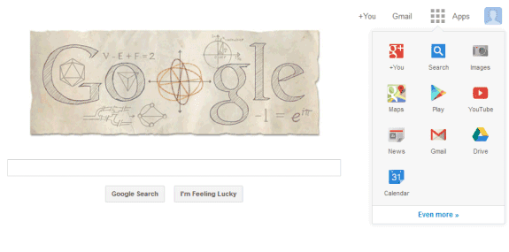
Google tests an interface that removes the black navigation bar and replaces it with a button similar to the Chrome app launcher. Click the button and you can visit popular services like Google+, Google Maps, YouTube, Gmail and Google Drive. There's a redundant link for Gmail and an "Apps" label, but only on the Google homepage.
This experimental interface removes the Google+ share and notification buttons, but this could be a temporary issue. You'll only see the new UI if you visit Google's search properties, so the regular navigation bar will show up when you use Gmail, Google Drive, Google Maps.
Please note that the experiment is only available at google.com and only for the English interface. A quick way to switch to the English/US interface is to visit google.com/ncr.
Here's how you can try this UI if you use Chrome, Firefox or Opera:
* Chrome:
- install "Edit This Cookie" extension
- open www.google.com in a new tab
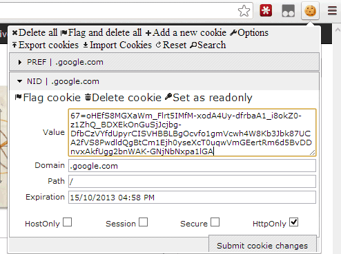
- click the "Edit This Cookie" button from the Chrome bar
- find the "NID" item and select it
- replace the "value" text with the NID cookie value (see below) and click "Submit cookie changes"
- refresh Google's homepage
* Firefox:
- install Cookies Manager+ and restart the browser
- open www.google.com in a new tab
- click the Firefox menu, select Web Developer < Cookies Manager+ - find the "NID" value for google.com, select it and click "Edit" - replace the content with the NID cookie value (see below), then click "Save" and "Close"
- refresh Google's homepage
* Opera:
- open www.google.com in a new tab
- right-click the page and select "Edit site preferences"
- go to the Cookies tab
- find the cookie value that starts with "NID", select it and click "Edit"
- replace the "value" text with the NID cookie value, then click "Save" and "OK"
- refresh Google's homepage
NID cookie value:
To go back to the regular Google interface, use the same instructions, but only delete the NID cookie value.
{ via Tecno-Net }