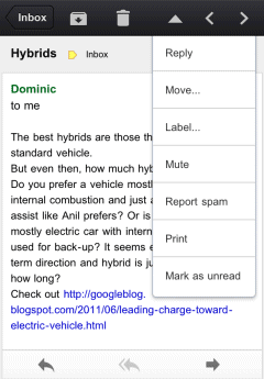
What's old is new again. The first version of the Gmail app for iOS included this feature, but it used arrow buttons instead of gestures, just like the desktop Gmail and the mobile site.

For some reason, the buttons have been removed in Gmail 2.0, released in December.

Gmail 2.1 uses swipes for navigating between messages, but this features is not yet available in the new mobile Gmail site.
While buttons may clutter the interface, gestures could be more intuitive if they're properly implemented. Google made at least two mistakes when it added gestures for navigation: the mobile interface for Blogger blogs and the mobile Chrome. The original version of the mobile Blogger interface was terrible because it was easy to accidentally load the next/previous post when scrolling. Chrome for Android/iOS still has an annoying feature that lets you navigate between tabs using swipes. Try to use Google Image Search and you'll notice how easy is to trigger this feature accidentally.
Fortunately, swiping works better in the Gmail app for iOS, just like in the Gmail Android app.

This comment has been removed by a blog administrator.
ReplyDeleteI'm a big fan of the swipe, even just the swiping motion. In my opinion it's the one thing Apple has over Windows.
ReplyDelete