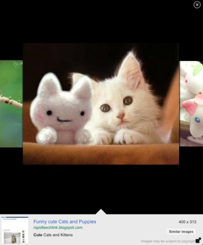
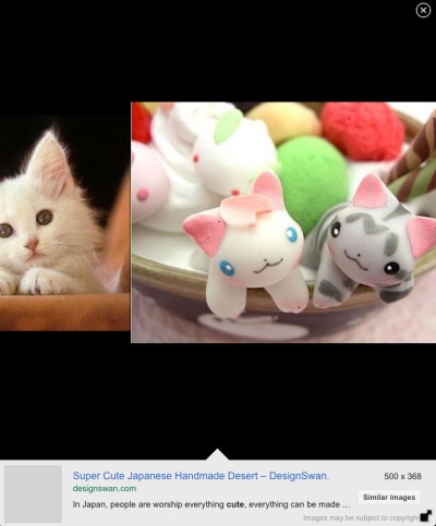
Google tests a new tablet interface for the image search engine. The new UI uses a carousel that lets you browse through the image results, just like the
search app for iPad. Google no longer loads the corresponding websites and only focuses on the images.
A similar slideshow is available in the smartphone interface and it will be interesting to see if it will be added to the desktop interface.


I'm not seeing it on my Xoom. I still have the previous tablet UI.
ReplyDeleteI wish they would stop trying to be Apple as these display techniques are terrible IMHO
ReplyDeleteBaidu has been displaying images in this way for years.
ReplyDeleteTo tell you the truth, I am not so impressed with their new tablet. It's good but it is not blowing me away, I do hope that they find something new that will get the people turning their heads.
ReplyDeleteObvious question - I hate it, can I go back please...?
ReplyDeleteSince it's still an experiment, clearing the cookies might help.
ReplyDeleteLove this new Gooolge image UI as I don't care that much from where I get the image but I need to make sure that images looks good and that's it.
ReplyDeleteGoogle lately have done really good changes to their service UI and usability hopefully they won't just stop there.
It was fine the way it was - and now you have "improved" it to be unusable. Hate Google images on my iPad now. Please let user go back to the previous version. Or fix the brain dead interface. The problem is that it takes real work to just get the image to fill my screen. I don't want to go to your stupid imitation of cover flow and I don't care to go the website. When I click on the thumbnail, please just give me the freaking image without wasting the bottom fifth or so of my screen.
ReplyDeleteGive us a way to disable this. Just leave google the same on my tablet as my desktop. This "improved" look is horrible and makes image searches pointless and unusable.
ReplyDeleteIt sucks now. What's the point in searching for large dimension images if you can't view the image alone and pinch/stretch to zoom anymore? Instead you are stuck inside this stupid carousel that you can't get out of. It's ok for browsing images, but for actually viewing the original images themselves it's comp,early useless. Furthermore, scrolling to the bottom of the search results page and selecting "classic" instead of "tablet" does nothing - you are just eventually sent back to tablet image search, again.
ReplyDeleteGoogle, it's crap. Change it back or fix what you have. Quit trying to make tablet versions of everything. I view my tablet more like a computer, not a table. Just give me normal browsing and quit with all these tablet bells, whistles and kazoos.
Great look. They really are optimizing their services for everything that can access the web now, which is such a great news.
ReplyDeleteis there a way i can download the image on my tablet.. coz i have tried everything so far and have not been able to
ReplyDeleteHORRIBLE interface, no ability to get from this stupid carousel to the actual image to either save or zoom in on, and workarounds are slow and tedious. Total fail Google just give us the interface we all are used to from the Desktop - my Asus tablet is not a 3.5"-screen phone.
ReplyDelete