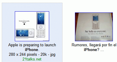
Here are some comments from Google Operating System visitors. I'm sure Google received much more similar comments and decided to put back the more traditional design:
"Google image search is a work tool, and reducing the amount of useful info you get at a glance makes it considerably less useful and more time-consuming to use. At least Google should allow the user to choose which version they want to see."
"I normally look at the url text to check the validity of the image. If, for example, I saw a picture of the iPhone before it was announced and was located at apple.com then I would know its the real thing, or if it was located at joke.com then I would know its a fake picture."
"This new design is absolutely less functional . . . when I look for images, I do not click on the "best image," I make judgments based on where the image is from, how many other images may be at that site, and how large the file is."

{ Thanks, Douglas. }
Hooray! They really listened!
ReplyDeleteA big part of not being evil is being willing to correct one's errors. My hat off to Google.
Its good to see them back in action!!!
ReplyDeleteNot only did Google change the layout back, but it seems that Google also updated their search results.
ReplyDeleteI'm an earth science teacher. I was searching for images of specific geologic features yesterday, but today I'm getting different (yet better) results.
I don't have any screenshots to prove this, but is anyone else getting any different results for specific searches?
But I liked the old design, it was clean. :(
ReplyDeleteIf you liked the old design, you can try:
ReplyDelete* SearchMash - an experimental Google site (so you'll find the same Google results)
* Windows Live Search, which I think is one of the best search interfaces I've seen lately.
Hurrah! I love the original image search, it is much more useful in locating images. Having to mouse over was terrible.
ReplyDeleteI am seeing it the old way too. I think its better.
ReplyDeleteGIS works normally again with the GOS fixes undone in IE and Firefox.
ReplyDeleteI'm feeling much better now — thank you, Google!
I'm amazed they listened. Thumbs up!
ReplyDeleteNow for IMDb!!
Yaaaaaay! Thank you Google for listening and responding in a timely manner.
ReplyDeleteI would have been happy if the change could have been implemented as a preference setting, thereby satisfying both camps, but if an option check box wasn't feasible for some reason, then I believe it makes sense to "err" on the side of giving more info at a glance, not less.
Well done, Google... (Applause.)
That they would even do that to the public w/o any UI options shows the mentality at that place.
ReplyDeleteThis "new" Google bites!! I'm going back to the old Google!!
ReplyDeletethey didnt change any thing
ReplyDeleteGoogle! Please change your image search back or at least give us the OPTION to view it the old way. Honestly, the new image search sucks just like MSN and Yahoo.
ReplyDeleteAll I ask for is the OPTION to be able to search with the "classic" style. Jeez
This issue has happened before, and everyone liked when you changed it back. Why did you do it again?
OMG GOOGLE! PLEASE FIX IT BACK! I NEED AT LEAST AN OPTION TO TURN OFF THE NEW FEATURES. OMG RLY...
I HATE THE NEW POPUP THING, I HATE THE HOVER THING, I actually kind of like that there are a lot more pics on the page, but REALLY! COME ON! Do you just change crap to start an uproar and see if people STILL don't want the internet to suck.
OMG REALLY!