A video from Google's YouTube channel (
update:
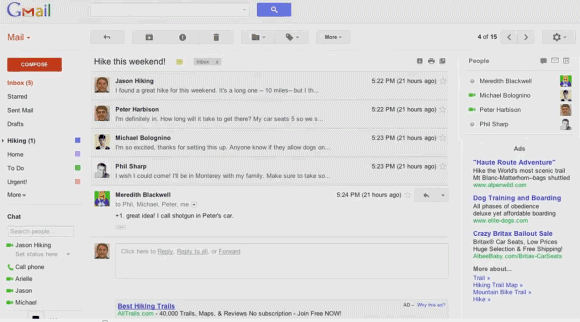
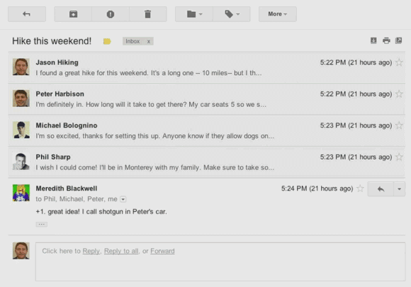
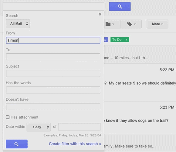
the video is now private, but there's a mirror here) introduces a new Gmail interface. It's based on the Preview theme that's already available in Gmail, but there are many other changes: an action bar that uses icons instead of text labels, a completely new interface for conversations, profile pictures next to contacts, a flexible layout that adapts to any window size, display density options like in Google Docs, resizable chat/labels sections, new high-definition themes and an updated search box that includes advanced options.
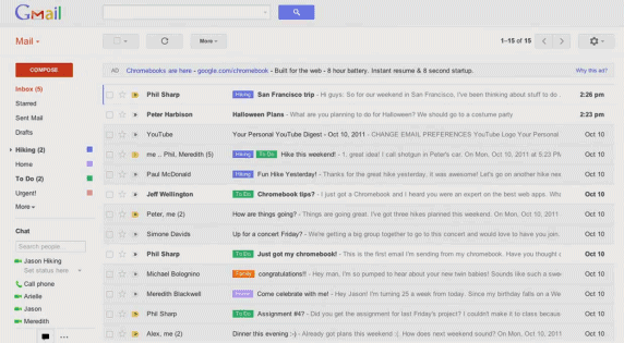
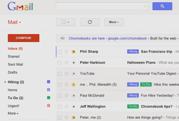
I don't see the new interface yet, but it will probably be available soon. It's interesting that there's an arrow next to "Mail" and the links to Google Contacts and Google Tasks are missing. Maybe you'll be able to use the arrow to switch to other Google services.
{ Thanks,
Carlos. }

Wahoooooo! FInally!
ReplyDeleteI don't know about you but the video I watched said "Internal only and confidential, do not share this video externally" So maybe these are future changes and not rolling out now. Although I hope they are.
ReplyDeleteAnd Themes? I use Themes. ¬___¬
ReplyDeleteYes yeeees! I want it NOW !
ReplyDeleteLooks good - look forward to it being rolled out (whenever that'll be!)
ReplyDeleteThe down arrow next to "Mail" is probably a drop down menu for Contacts and Tasks. This is already in place in the current version, you just have to hoover over the "Mail" link and click on the "-" sign that appears on right.
ReplyDeleteVideo is appearing as Private now
ReplyDeleteAnd .... it's gone.
ReplyDeletethe video has be marked private.... google didn't want this out yet apparently, anyone have a mirror of it?
ReplyDeleteCool, matches up with the Docs changes... Nice!
ReplyDeletehttp://youtu.be/CUz8czy9BZc mirror
ReplyDeleteupdated with more mirrors and youtube in http://crlsndrsjmnz.blogspot.com/2011/10/primicia-video-filtrado-del-rediseno-de.html
ReplyDeletegoogle? I love you
ReplyDeleteLove this!! Hope it happens really soon. The new Gmail look is really really nice.
ReplyDeletehttp://alwayslive4him.blogspot.com
Any word on whether they will be updating offline into something useable?
ReplyDeleteCompact view, please.
ReplyDeleteThis is fantastic! I really like it. I hope they release it soon.
ReplyDeleteUnfortunately, my wife will only use it if she can sort her email like in Yahoo.
It says to me "This video is private". I Can't see it...
ReplyDeleteCome on, not available
ReplyDeleteGmail settings > Theme > Preview and
Gmail settings > Theme > Preview (Dense) themes have been accessible for like three months?
Is that a new ad above the inbox? In addition to the ads on the side?
ReplyDelete@sunshine.by:
ReplyDeleteI've already mentioned about the Preview theme, but this is a new interface, not just a theme. All the changes I've mentioned are nowhere to be found if you switch to the Preview theme. Right now, the new interface is not available.
The video is available here:
ReplyDeletehttp://www.youtube.com/watch?feature=player_embedded&v=CUz8czy9BZc
I think it looks nice. It's like the Preview theme, but with newer things.
ReplyDeleteI hope that ad bar at the top of the message list can be removed (probably by turning off Web Clips) and that the Tea House theme has been updated and it looks nice.
I hope it's released soon!
Seems, someone got fired!!!
ReplyDeleteI've used your pics to create my blog post, but I've given due credits and also all of the image onclick take to this blog.
ReplyDeleteHope, you don't have problem in this.
search looks nice and useful. The rest seems like a step backwards IMO. It looks like it just takes up more space with unused blank grey space. It looks like in the old view you could get more of a conversation on one page without the face icons, and unused space.
ReplyDeleteEven the dense theme is far less dense than the old interface, showing me fewer email threads and mailboxes and far more white space. I'd like it denser still.
ReplyDeleteAwesome Google
ReplyDeleteAwesome Gmail
This looks nice. I see similarities from Google Wave project here.
ReplyDeleteHope they incorporate changes into blogspot as well. I like the new background choices.
ReplyDeleteWhy does Google think we all want giant amounts of white space (or grey space)?? It's not clean-looking, it's inefficient and wasteful. Even the compact settings are not dense enough.
ReplyDeleteUgh this is terrible. I guess I'd like the whitespace on a iPad or something, but on my laptop, I want to see as much information as possible at once.
ReplyDeletehere's the actual leaked video.
ReplyDeleteThis new version is horrible and I hope we are not forced to use it. If we are I will have to consider something else.
ReplyDeletelooking forward to this
ReplyDeletewhen are they going to figure out the apps issue? can't use it w/ + and it's most of my google products are attached to my generic gmail account (youtube, etc). it's a usability nightmare
ReplyDeleteWhy? What is that saying about not messing with stuff that isn't broken?
ReplyDeleteAwesome Job Google! Now can you work on the interface of Blogger/blogspot? Wordpress is kicking your butt!
ReplyDeleteLooks like all the other Google+ crap coming out of Google. Anyone dumb enough to like it deserves it.
ReplyDeleteHorrible. So tired of this new dumbed down "pre-school" look across Google apps. This will just drive me further into using Mail.app and other Exchange/IMAP clients to acces my Gmail.
ReplyDeleteWe all love(d) Gmail because it was dead simple and yat it got the job done, with these new intrusive features I think it will scare off a lot of users!
ReplyDeleteMultumesc, esti roman dupa nume nu? super blog acum l-am decoperit
ReplyDeleteHmmm.Google always enhances Gmail experience and i love it.Hope i will love this too.
ReplyDeleteThis is really a awesome..
ReplyDeleteLooks much better than the bland format now
ReplyDeleteAnonymous said...
ReplyDeleteWhy? What is that saying about not messing with stuff that isn't broken?
An what is the saying about those who do not change and adapt, die.
for me, gmail should take a look at yahoomail interface... on my option, yahoomail interface looks are soft but elegant whereby gmail looks kind a hard and complicated.. :-)
ReplyDeletejust an opinion here..
I certainly hope, after years of myself and others BEGGING them, they will FINALLY implement order by column so I can FINALLY ditch my 3rd party email program that has been - up to now - necessary to sort by subject, sender, etc. I would really love to finally clean up my inbox, since it's now holding over 27,000 emails because I HATE having to boot up Thunderbird or OE to properly sort/delete.
ReplyDeleteTerrible. Compact view needed.
ReplyDeleteAdded more mirrors on
ReplyDeletehttp://crlsndrsjmnz.blogspot.com/2011/10/primicia-video-filtrado-del-rediseno-de.html
Google claimed ownership of the video on youtube and apparently is blocked worldwide.
Here are my thoughts:
ReplyDeletehttps://plus.google.com/u/0/116616674660628253713/posts/PhQLQWR8NQ7
This is not really true as far as I can see. I applied back in April 2010 and have never heard anything back from Youtube. The signup link above takes me to a page informing me that I already contacted them in April 2010.
ReplyDeleteThanks for an excellent article! I appreciate your insights and agree with what you wrote. home security systems
ReplyDeleteWhy would you change the words in the tool bar to icons? I now have to stop and think what each icon means rather than just reading the word which is easy!!
ReplyDeleteBad idea google
Need a high information content 'compact view' now. The new look wastes too much screen/UI real estate.
ReplyDeleteI'm I the only person who thinks this new interface is complete crap? Can I please at least have a revert to 'classic' interface button? I've already made a crappy as hotmail account, I hate this gmail... I'm done.
ReplyDeleteI cannot see the images on the buttons. E.g. Refresh, move forward/backward signs. Is there a setting that blocks these signs to appear?
ReplyDeleteAll the nice designs won't work on my office computer, the images are not shown. Is it because I'm behind a proxy?