July 30, 2012

Yet Another YouTube Homepage Experiment

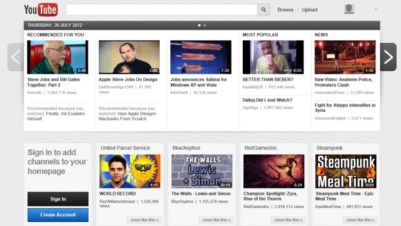
Last month, I reported that YouTube tested a new interface for the homepage. Now YouTube experiments with a slightly different version of the UI. There are some useful new features, but also many poor choices.

The new experiment puts all the recommended videos in the activity stream and you can no longer restrict the stream to uploads. If you click the "my subscription" link from the sidebar, you can hide the recommendations. YouTube shows too many recommended videos and they're not always relevant.

The right sidebar only shows recommended channels and topics instead of the list of video recommendations. Another change is that you can mouse over an item from the activity stream, click the arrow icon and access options like: "hide this activity", "unsubscribe", "only show uploads from this channel". There are also some new filtering option for subscriptions: click the arrow next to the search box from the left sidebar and you can sort the channels by name, new activity or relevance (the default option).


To try the new experiment, check the updated guide from this post.

Update (December 7, 2012): The new interface is available for everyone and you can no longer go back to the old layout.

July 26, 2012

Handwriting Recognition in Google Mobile Search

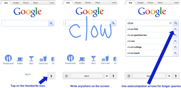
Google's mobile search site has a new feature: handwriting recognition. Instead of using your mobile device's virtual keyboard to type the query, you can just write the letters with your finger.

This feature is disabled by default, but you can enable it on your mobile phone or tablet, by visiting the settings page, tapping "enable" in the "handwrite" section and then saving the settings.


"Say you're standing on a busy street corner, in a bumpy taxi ride, talking with a friend, or sitting on the couch with your tablet. Handwrite enables you to search by just writing letters with your finger most anywhere on your device's screen — there's no keyboard that covers half of the screen and no need for hunt-and-peck typing," suggests Google.

While this feature could be useful for short queries or popular queries that only require entering a few letters and using Google's suggestions, it's more efficient to use the virtual keyboard instead of writing each letter.


Google's Handwrite feature works for iOS5+ devices, Android 2.3+ phones and Android 4.0+ tablets and it's available for 27 languages.

Actively Discussed on Google+

Google shows a new annotation next to some web search results and image search results: "actively discussed on Google+". If you click "show", Google displays a recent Google+ post that includes the URL.

The feature is potentially useful, but it needs some fine-tuning because the Google+ posts aren't necessarily popular, while some search results don't need special annotations.


It's interesting to notice that Google+ popularity is a ranking factor for Google's search engine even when you're not logged in.

YouTube's Carousel Experiment

YouTube tests yet another homepage interface. This time, the interface is called "carousel" and it doesn't show videos from your subscriptions. For some reason, YouTube redirects users to youtube.com/lohp when they try to load the homepage, but this page returns an error if you're not part of this experiment.

The experimental homepage has a simplified layout: it only shows a long list of popular videos from various channels and categories like "news" and "music".


Here's how you can try the latest YouTube experiment. If you use Chrome, Firefox, Opera, Safari or Internet Explorer 8+, open youtube.com in a new tab, load:

* Chrome's JavaScript console (Ctrl+Shift+J for Windows/Linux/ChromeOS or Command-Option-J for Mac)
* Firefox's Web Console (Ctrl+Shift+K for Windows/Linux or Command-Option-K for Mac)
* Opera's Dragonfly (Ctrl+Shift+I for Windows/Linux or Command-Option-I for Mac)
* Safari's Web Inspector (how to do that?)
or
* Internet Explorer's Developer Tools (press F12 and select the "console" tab)

and paste the following code, which changes a YouTube cookie:

document.cookie="VISITOR_INFO1_LIVE=eKxEWQ3xcc8; path=/; domain=.youtube.com";window.location.reload();

Then press Enter and close the console. Go to youtube.com/lohp to see the experimental interface.

July 25, 2012

New Interface for Google Calculator

Google's OneBoxes start to become interactive gadgets. After launching a new mobile weather OneBox and an updated unit conversion OneBox, it's time for Google Calculator to morph into a calculator app.

Just type a query like [73-45] in the search box and you'll get more than just the result. Google also displays a mini-calculator with real buttons for digits, parentheses, arithmetic operations, trigonometric functions, exponential and logarithmic functions.


It's certainly more efficient to just type the expression you want to calculate, but some people might prefer the traditional buttons. They can search for [calculator] and use the new Google Calculator interface.

It's worth noting that Google's calculator doesn't mimic a standard pocket calculator: you can enter a long expression with multiple operations and Google doesn't display the result until you press the "=" button. This way, you can enter "3+3*3" and still get the proper result. Another thing to keep in mind is that you can't press the "1" button and then the "sin" button to compute sin(1), you should press the "sin" button first and then enter the argument of the function. There's no persistent "clear" button, but you can long-press the "delete" button.

{ Thanks, James. }

Use Your Real Name on YouTube

Now that YouTube uses Google Accounts and integrates with Google+, it's a lot easier for Google to bring more Google+ features to YouTube.

You can now use your full name on YouTube. Just go to YouTube's settings page, click "advanced" next to your email address and click "Begin using my full name on YouTube".


What will change after enabling this feature?

1. Your full name from your Google+ profile will replace your username on YouTube.

2. Your channel title and photo will change.

The YouTube username can still be used to log in and the channel URL will stay the same.

Google's goal is to use the same identity on YouTube, Google+ and other Google services so that it can provide an unified experience. For example, other people that know you will find your YouTube videos much more easily if you're using your full name and your photo. YouTube's commmenting system can also improve if people use their real identity.

Obviously, not everyone will want to drop their username, especially if they like/need anonymity or their username is very popular. That's probably the reason why this feature is optional.

A Google spokesperson told LA Times that "YouTube will let people change their usernames back if they decide to start using their full name. (...) New users can still set their YouTube name however they want. The prompt comes up only for users who have a Google+ profile."

"You'll see this option when you upload or comment on YouTube (...). For partners, brands, and organizations, you won't see this just yet. In the coming months we'll be working on new options to give you even more control over your presence on YouTube," informs Google.

{ Thanks, Katty. }

July 24, 2012

Google Tests an Expanded Knowledge Graph Box

Google tests a new feature of the knowledge sidebar: a link that invites you to "explore more". The Knowledge Graph section doesn't allow Google to show more than 5 related people, books, albums, movies, so the experiment displays more of them below the search box.

For example, when you search for a movie and click "explore more", Google shows more cast members. You can use the arrow icons to switch to a different category.


{ Thanks, Maarten. }

July 19, 2012

Google's Weather OneBox for Tablets

Google has a new tablet interface for the weather OneBox. It now looks more like an application and it includes more information: precipitation, humidity, wind speed, hourly weather forecast, 10-day forecast. The OneBox is interactive and you can select an hour or a day to see the forecast.

"When you type [weather] into Google on your tablet, you'll see the current weather and you can scroll through the hourly and ten-day forecast. You can also toggle the Precipitation and Wind buttons to check out the percent chance of precipitation and wind direction/speed, respectively," informs Google. It should work for iPad and Android tablets.


Ironically, the desktop weather OneBox has less information than the mobile OneBox (both the smartphone interface and the tablet interface). The smartphone UI was more colorful, but now it looks just like the tablet OneBox. Sure, it's more likely that you'll need weather information when you use a mobile device, but the desktop interface used to be richer and more comprehensive.


{ via Search Engine Roundtable }

Google Tests a Share Link for Search Results

Google tests a new "share" link for search results pages. The link lets you share a search result on Google+ and it replaces the "+1" button, which only added a page to the "+1" section of your public profile.


The "share" link is only displayed when you mouse over the search result, just like the "+1" button. When you click the link, Google shows the standard Google+ dialog for sharing content. Unfortunately, you can't "+1" pages.


I think it's a bad idea to replace the "+1" button with the "share" link. The "+1" button works as a social bookmarking tool: you're not only bookmarking pages, but you also help other people find useful pages (and they help you). When you "+1" a page, your action is not automatically broadcast to everyone that follows you, so you're likely to use it more often. The "share" link creates a Google+ post, so you might only use it to share important things.

It's not clear why Google didn't enhance the "+1" button from search results pages by adding the sharing feature that's already available for the regular "+1" button used by so many sites. This way you could both "+1" a page and share it with other people.

Customize Blogger Permalinks

Until now, Blogger automatically generated the URL of a post using the first words from the title. If you want to customize the URL, there's a new "permalink" option in the "post settings" sidebar. When you create a post, click "permalink", enable "custom URL" and type the file name. You can only customize the file name (it's highlighted in the following example):

http://googlesystem.blogspot.com/2012/07/custom-blogger-url.html

... and you can only use alphanumeric characters, underscore, dash and period.


It's important to note that you can choose a custom URL only when you create a post and you can't change it later.

Why use this feature? Create shorter permalinks, use different keywords in the URL, improve search rankings. "A site's URL structure should be as simple as possible. Consider organizing your content so that URLs are constructed logically and in a manner that is most intelligible to humans," suggests Google.

As a side note, there's a mistake in the help center page for this feature: "Because Blogger automatically creates the URL from information from your post title, your URL would change should you decide to edit the title. This would result in broken links, and fewer visitors to your blog." That used to be a major annoyance in the pre-2006 Blogger, but it's no longer the case today.

Usage Examples in Google Translate

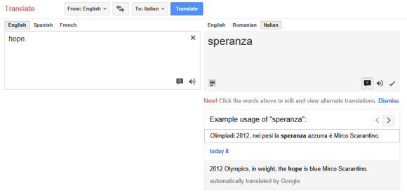
Google Translate has a new button that shows word usage examples from the web. This works for both original text and the translated text, but it's no limited to single words: Google can also find examples for longer texts and even translate them for you.

"At Google we're always curious about new words from around the world, from all languages, and we think one of the best ways to understand and make sense of new words is by observing them in their natural habitat. Our latest feature does just that by providing you with example sentences taken from fresh new stories around the web," explains Google.


There's also a "select all" button that selects the entire translated text, so that it's easier to copy.


{ Thanks, Emanuele and Dean. }

Chrome Extensions Not in the Chrome Web Store, More Difficult to Install

Chrome 21, currently in beta, brings bad news to those who install extensions from third-party sites. Users will no longer be able to install extensions, apps and user scripts by simply downloading them and clicking "install" in a Chrome box.

Chrome 21 shows a message that's actually inaccurate: "Extensions, apps and user scripts can only be instlled from the Chrome Web Store." When you click the "learn more" link, you'll found there's actually a way to install .crx files: just download them, open their folder and drag them to Chrome's extensions page (Tools > Extensions).


"Previously, any website could prompt you to add an extension into your browser. In the latest version of Google Chrome, you must explicitly tell Chrome that you want to install these extensions by adding them through the Extensions page," explains Google. The reason for this change is that Google can only find and remove malicious extensions in the Chrome Web Store. "Online hackers may create websites that automatically trigger the installation of malicious extensions. Their extensions are often designed to secretly track the information you enter on the web, which the hackers can then reuse for other ill-intended purposes."

Most likely, this change won't affect too many users and it will encourage developers to submit their extensions to the Chrome Web Store. Power users will complain that it's more difficult to install user scripts from sites like userscripts.org and extensions from sites like chromeextensions.org. Maybe Google could add an option in the settings page that lets you disable this security feature.

Update: There's a command-line flag that disables this feature: --enable-easy-off-store-extension-install. Use the instructions from this page to add the flag. Please note that the feature is available starting with Chrome 21 (right now it's in the beta channel, but it will be in the stable channel next month).

{ Thanks, Sterling and Ruben. }

July 14, 2012

10 Google Features for Slow Internet Connections

It's not easy using Google services when your Internet connection is very slow. Here are some helpful features:

1. Gmail's basic HTML mode - https://mail.google.com/mail/h/. It doesn't have all the features of the regular Gmail interface, but it lets you read messages and compose mail. This interface uses JavaScript sparingly and every click means a new page request. The good news is that there isn't much too load, so the basic HTML interface is better suited for slow connections. You can even set it as the default interface.

2. Disable Google Instant from the search preferences page. Just enable "never show Instant results" and click "Save" so that Google never tries to load search results as you type the query. Google will still show suggestions, but you can disable this feature by using this URL.

3. YouTube Feather is an experimental interface that's intended to "serve YouTube video watch pages with the lowest latency possible". You can still play videos, check related videos, subscribe to channels and read a few comments, but these are all the features that are available. Since your connection is slow, it's a good idea to select "240p" from the list of resolutions.

4. The old Google image search interface is better for slow connections, but you should bookmark this URL to use it. Unfortunately, you can't switch to the old interface and the "switch to basic version" is placed at the bottom of the page in the standard version.

5. Chrome's click-to-play feature is great because it loads content that requires plug-ins on demand. That means you have to click a gray box to load Flash content, Java applets etc. It's an excellent alternative to extensions like FlashBlock and it's built into Chrome. How to enable click-to-play in Chrome? Type chrome://chrome/settings/content in a new tab, press Enter, enable "click to play" in the "plug-ins" section and click "OK".

6. Google's transcoder available at http://google.com/gwt/n is optimized for mobile devices, but it also works on a computer. Just type the URL of a page and Google will display a compressed version of the page with smaller images, simplified layout and no JavaScript.

7. The text-only Google Cache lets you load a simplified version of the page directly from Google Cache. Sometimes it's an old version of the page, but at least it loads fast. You can get this version by clicking "text-only" in the header of the regular cached page, but that's not efficient. There's also this URL you can use:

www.google.com/search?strip=1&q=cache:www.domain.com
(replace www.domain.com with the URL of the page)

8. Chrome's custom user agent feature is great if you want to pretend you're using a different browser. If your connection is really slow, pretending that you're using a smartphone has an important advantage: many sites will load the mobile interfaces, which are lightweight. To change the user agent in Chrome, open the developer tools (Ctrl+Shift+I for Windows/Linux, Command-Option-I for Mac), click the "settings" button at the bottom of the window, click "user agent", enable "override user agent", select "Android 4.0.2 - Google Nexus" or "iPhone - iOS 5.0" from the list and disable "override device metrics".

9. Google Public DNS is a simple way to speed up your browsing experience if the DNS service you're using is slow. "The DNS protocol is an important part of the web's infrastructure, serving as the Internet's phone book: every time you visit a website, your computer performs a DNS lookup. Complex pages often require multiple DNS lookups before they start loading, so your computer may be performing hundreds of lookups a day," explains Google.

10. Use a browser that supports SPDY, a new protocol "designed for low-latency transport of content over the World Wide Web." Right now, SPDY is supported by Chrome and Firefox, while many Google sites use it.

If Chrome or Firefox aren't good enough, use a browser optimized for slow connections: Opera and enable Opera Turbo, a feature that uses Opera's servers to compress pages and their resources. Opera uses Google's WebP image format to save even more data and show crisper images. The average compression ratio for Opera Turbo is about 60%. Turbo is also available in the Opera Mobile app for Android, Symbian, Windows Mobile and you can use the Opera Mini app for a higher compression ratio (up to 90%). Opera Mini can be installed on most phones, including feature phones and the iPhone.

Find Public Google Docs

Google Docs and Google Drive don't offer the option to find public files, but you can do that using Google search. Now that the Google Docs robots.txt file allows search engines to index most of the public files, you should be able to find them, assuming that there are some links that point to them.

Search engines only index the files that are "public on the Web". By default, files are private, but you can change the visibility from the "Share" box.

Here are some useful queries that let you find public Google Drive/Docs files (you can append some keywords to the queries):

* [site:docs.google.com/document/d] - find text documents

* [site:docs.google.com/presentation/d] - find presentations

* [site:docs.google.com/drawings/d] - find drawings

* [site:docs.google.com/file/d] - find files: images, videos, PDF files, Microsoft Office documents and more (you should click "repeat the search with the omitted results included" since there are many files with similar titles)

* [site:docs.google.com/folder/d] - find folders (collections of files and other folders)

* [site:docs.google.com/open] - find other documents, folders and files (the links redirect to other URLs)

Public spreadsheets and forms can't be indexed by search engines.

The Game of Life Easter Egg

Google shows a clever Easter Egg when you're searching for [conway's game of life]. It's a low-key simulation of John Conway's model devised in 1970. "The universe of the Game of Life is an infinite two-dimensional orthogonal grid of square cells, each of which is in one of two possible states, alive or dead. Every cell interacts with its eight neighbours, which are the cells that are horizontally, vertically, or diagonally adjacent," explains Wikipedia.


It's not an actual game because it doesn't require input. There's an initial configuration and all the other configurations are obtained by applying 4 rules:

"Any live cell with fewer than two live neighbours dies, as if caused by under-population. Any live cell with two or three live neighbours lives on to the next generation. Any live cell with more than three live neighbours dies, as if by overcrowding. Any dead cell with exactly three live neighbours becomes a live cell, as if by reproduction."

Conway's Game of Life is a cellular automaton and it can emulate a universal Turing machine.

You can pause Google's simulation and even hide the search results by clicking the maximize button. If you don't like the Easter Egg, click the close button and it disappears. There's also a simplified version of the Easter Egg for smartphones and tablets, but the controls are missing.


{ Thanks, Dan. }

July 13, 2012

Google's Interactive Unit Conversion OneBox

Google updated the unit conversion OneBox and this time it's interactive. For example, you can search for [10 pounds in kg], get the result and quickly change the number of pounds or kilograms directly from the OneBox. You can also select a different unit of measurement from the list: metric ton, gram, stone, ounce.


Google's gadget even lets you change the conversion type and switch to a different category: speed, length, temperature, volume, area, fuel consumption, time or digital storage. The gadget is only displayed for common measurement units, so you'll still see the old interface when you search for [10 pascals to Torr] or [2 radians to degrees].


Now you no longer need iGoogle's metric conversion gadget.


{ Thanks, Diego. }

July 3, 2012

iGoogle Will Be Discontinued

Google's personalized homepage will no longer be available starting from November 2013. The official explanation is that "with modern apps that run on platforms like Chrome and Android, the need for iGoogle has eroded over time".

iGoogle started as a custom Google homepage that allowed you to add gadgets for weather, news, mail and more. "The goal of this initiative is to bring together Google functionality, and content from across the web, in ways that are useful to our users," explained Google in 2005.

Just like My Yahoo, Netvibes and other custom start pages, iGoogle became a dashboard that gathered your favorite content from the web. It was a simplified feed reader, a platform for mini-apps and games, a great homepage for your browser. Social networks and smartphones addressed most of these use cases and iGoogle's popularity declined.

Most likely, Google will promote Google+ as an iGoogle replacement, even though it lacks many of its features. Google+ apps, themes and maybe even a dashboard-like interface could fill iGoogle's void.


iGoogle is not the only Google product that will be discontinued. Google Mini, Google Talk Chatback and the Symbian Google Search app will no longer be available, while the videos uploaded to Google Video will be automatically be migrated to YouTube starting from next month. "Google Video stopped taking uploads in May 2009. Later this summer we'll be moving the remaining hosted content to YouTube. Google Video users have until August 20 to migrate, delete or download their content. We'll then move all remaining Google Video content to YouTube as private videos that users can access in the YouTube video manager," mentions Google. You can manage the videos uploaded to Google Video using this page.