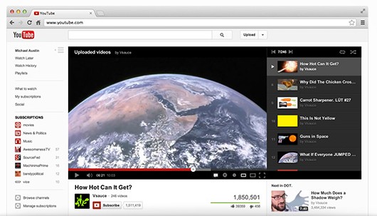
"On YouTube video always comes first, and with this new design the site gets out of the way and lets content truly shine. Videos are now at the top of the page, with title and social actions below. Also, playlists have been moved up, so you can easily browse through videos while you watch. Now when you subscribe to your favorite channels, we will add them to your Guide and make them available on every page of the site, and on your mobile device, tablet, and TV," explains YouTube.
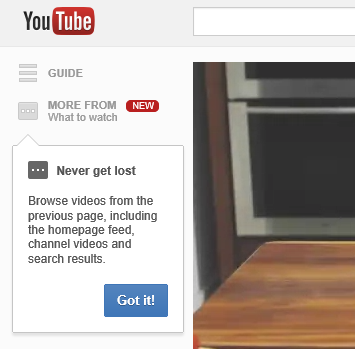
The guide is actually a sidebar that's now available on every YouTube page and lets you check your subscriptions, your playlists and the video history. You can also see a list of other videos from the previous page, so you can quickly watch another search result, a different video from the same channel or another video from the homepage.

new you tube interface looks awfull in full screen full hd monitor.
ReplyDeleteA few weeks ago we showed you how to access the new YouTube interface that they were testing out. If you followed the steps and began ... DB Mall
ReplyDeleteIt's so painfull to select "My subscribtions" -> "Uploads only", the page never saves my selections! FAIL!
ReplyDeleteBookmark the "uploads only" page in the my subscriptions tab instead of the homepage ;)
DeleteThis new layout is so awful.
ReplyDeleteWell I wonder who thought of making everything on the left?
ReplyDeleteI mean it must be fun having a 30 inch monitor and having the video play on a small portion of it on the left.
I mean seriously, the whole site sits in like 20% of the screen and on the left, making the center of the screen just a blank spot.
Seriously, I always enjoyed watching youtube on the page with the larger player. It was big and was centered. Now it just hurts my neck.
Totally agreed. A quick fix -- click here: http://userstyles.org/styles/50092/google-new-design-center, install stylish, install theme. Done!
DeleteI agree, I was just googling to see how to get everything back to the center of the screen.
DeleteAnd the white glare of the page hurts my eyes so I have to wear tinted glasses to cut the glare down and prevent ruining my eyesight. Youtube has turned into an electronic GMO. AquarielCharm
DeleteFirst experiment in the new YouTube interface: http://tecno-net.blogspot.com/2012/12/first-experiment-new-youtube-interface.html
ReplyDeleteНовый интерфейс просто убог по сравнению с бывшим, могли бы свистелки-перделки и в старый добавить. И заодно потестить на HD мониторах
ReplyDeleteThe new design looks clean, good and elegant, but the Google team is making the same mistake over and over again: too much white.
ReplyDeletePictures and videos should not be surrounded by so much white and light colors, because it distract the user of the media content. It's like watching a movie in the cinema with all the lights of the room on.
Youtube should be a dark page (maybe dark gray) and leave the terrible bad idea of make it so white.
Get Stylish. Extension for Chrome and Firefox.
DeleteA few months ago yt tested out their "lights out" feature in all YouTube videos, which would dim the entire page into dark grey or black. It was perfect Thomas but short lived.
DeleteThe next day Lights Out was gone. It was too good for it's users, our eyesight and our brains and removed it so now we have this horrid white glare that is exactly like snow blindness and probably doing the same damage to eyesight. AquarielCharm
I kind of like the new YouTube layout except for 2 things: The homepage defaults to What to watch and I'd rather have My subscriptions be the default and there's just too much white space on the right side of all page because it looks like the site is now left-aligned.
ReplyDeleteSo far those are the only two things I can say that I don't like and what it changed, but the look is nice.
a nao gostei esta ruim muito ridiculo!
ReplyDeleteObviously we are stuck with the new design, which is pretty annoying. But you can use extensions for your browser to increase the default player size and what not.
ReplyDeleteMy biggest annoyance is with the homepage 'what to watch.' Recommended videos aren't highlighted easily, are chosen not very well (from popular channels i don't want to be recommended a video a year+ old). There should be options for recommended videos (don't show, show from channels less/ most viewed) so people who don't like don't have to click 'my subscriptions' every time.
Кошмар! Все хорошее, что было в поиске (HD, отбор и сортировка по времени и пр.) - пропало!
ReplyDeleteОни там что, с ума посходили???
These so called improvements is some of the worst yet.
ReplyDeleteMixing Recommendations and Subscriptions is only creating an inefficient way of finding your subscribed videos, I don't want to scroll down 10 recommendations to get to a subscription video, if it now even is the latest sub vid in the list as sometimes you can have a vid from 5 days ago that you have already watched on top with newer vids that you have not seen yet below. Where is the logic in that?
"In this new layout, you’ll find the most crucial elements are front and center" The most crucial should be the video and it is not in the center, plz move it back to the center.
- the comments are really impossible to read, the nickname takes more space ie shows more off then the comment itself
ReplyDelete- this ui is not suitable for large screens, i rather have content then a large white spot to the left, and still the comments at the bottom are outside the display...
- overlays are below the flashplayer
etc...
screenshot:
http://roadbiker.student.utwente.nl/newyoutube20121207.PNG
im having the same problems as everyone else, too much white, too much hassle getting to my subscriptions, the comments on videos and all that is too hard to see, just not very organized
ReplyDeletei hate to reply to my own comment but youtube should take hints from its owner google and another pretty popular website, craigslist. both of these share one thing, they never change their UI.
DeleteThis glaring white page even as I type this message is exactly like snow blindness... no difference. AquarielCharm
DeleteFirst Google update I've disliked. I hope this isn't a trend :(
ReplyDeleteReturn to old YouTube interface: http://tecno-net.blogspot.com/2012/12/windows-close-resizer-button.html
DeleteI love this new player. It's so awesome! But whenever i hit the "Full screen" button, it stays focused, so if i press Space to pause/play a movie while in full screen, it just gets me out of full screen, instead of pausing. What to do?
ReplyDeleteMost horrible UI update yet. The guide sidebar is totally wasting real-estate on screen and because of it, the right hand side related videos is not viewable by default unless I scroll over.
ReplyDeleteReturn to old YouTube interface: http://tecno-net.blogspot.com/2012/12/windows-close-resizer-button.html
DeleteWhen will they improve, really?
ReplyDeleteWhat about coding some true new functionnalities? In years they haven't bring anything new to the table.
The "Watch later" one is getting worse. Impossible to manage your list easily and correctly, you have to remember the precise list of videos you've already seen when you're finally able to remove some of those...
ugh i HATE HATE HATE the new design! it's completely confusing and looks horrible! I am so pissed off right now :( i want the old youtube back! they should really give us a chance to choose which lay out we want. I know which one i would choose... SERIOUSLY, WHO CAME UP WITH THIS CRAP?!?! i'm not usually a fan of 'hate mail' posts but i just... arghhsddflkfjl :( youtube, you've disappointed me.
ReplyDeleteReturn to old YouTube interface: http://tecno-net.blogspot.com/2012/12/windows-close-resizer-button.html
Deletewhile playing youtube video, sleep mode kicks in, which didn't occur previously.
ReplyDeleteIt sucks and everyone hates it. It's not 1992 anymore, we have browser windows wider than 800 pixels, let's use some of them. Also you broke better loopy again with your new player that adds no features and doesn't do anything different.
ReplyDeleteAlso, there's still no loop button, what the heck.
So... this was the result from actual testing?
ReplyDeleteYikes.
Word!! AquarielCharm
ReplyDeleteI think @YouTube have removed the "Favorite a video" option from the "Share your activity" in youtube settings, http://t.co/LOHO4aCq
ReplyDeleteNow when we add something to favorite, it won't appear on facebook or twitter. they basically removed it without any explanation... :(
This is horrible. What were the actual goals given to designers? They've moved my ability to take a subscription to email me with updates. Can't access it from the channel page, or any of the video pages. Why? Why did this get removed? I have to click about five times to go into my subscriptions and scroll through all my subscriptions to check a box. Why? How could this be better than hovering over the subscribe button (on any video of the channel or the channel itself) until the two checkboxes appeared?
ReplyDeleteThe new design looks horrible, less information, harder to use. FAIL.
This new interface stinks, my young son would spend hours on the older app and now I am trying to revert it because the options "similar to" videos on the right are minimal. They might have optimized it for subscription usage but it is vastly inferior and less aesthetic to me and my way of using the app.
ReplyDeletePlease Change the Layout not Centering in the Screen ?
ReplyDeleteI want the option to return to the way YT was before this latest UI update. I no longer have recommended videos on the right, now it is recommended channels and mostly not really interested in trying to sort through a lot of channels vids trying to find something interesting. The pre-update style of having a list of recommended videos worked very well. Most were always something that inerested me and I would watch many of them. It worked very well matching me up with videos that suited my viewing habits. The new layout really can't match that.
ReplyDeletePlease give us the option to use the old interface with all the features that were included with it.
Thank you
Butch
YouTube tries to add the VISITOR_INFO1_LIVE cookie back when you try to delete it. Well, it is OK to post inappropriate language. There is a question, will you censor them or not?
ReplyDeleteBate it, want the old YouTube back
ReplyDelete