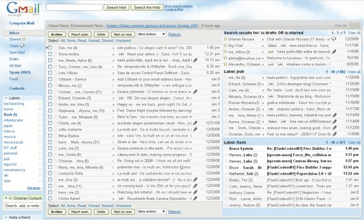
Use the advanced search operators to build searches like label:name-of-label, subject:linux or is:unread -in:inbox. If you were expecting to actually see the inboxes of multiple email accounts, you can achieve this by using Gmail's mail fetcher, which automatically labels the messages fetched from other accounts and archives them. You can then create panes that have the following format: label:myotheraccount@gmail.com or to:myotheraccount.com.

"After you turn on Multiple Inboxes from the Labs tab under Settings, you can configure what you want to see, as well as set the number of messages displayed and the positioning of your panels from the Multiple Inboxes section under Settings," explains Octavian Costache, who created this feature.
"Multiple inboxes" works especially well if you have a high resolution monitor and if you use filters that automatically archive some classes of messages.
Related:
Simplified Gmail searches
A dashboard for Google Docs

i hav check the problem is should hav wider view...if you have 17" monitor and 1024x 768 resolution....then the boxes are overlaping each other. either you have to reduce the text or increase the solutoin....if you resize the brouser window then also these boxes are overlaping
ReplyDeleteThis is brilliant for people with widescreen monitors. It has made the front page far more useful for me...
ReplyDeleteBuggy as all heck.
ReplyDeleteI switched it on, put it above my Inbox, set it to show Starred mail, five per page.
Looked fine, but when I clicked on 'older' to show the next five starred items it changed to show 'no items' and also made my regular Inbox pane disappear.
Also, it doesn't use Theme colours yet -- the new pane header was showing black text against very dark grey of my theme colour scheme. Unreadable.
Plus -- and this is unforgivable -- when you go to Labs, there is no 'send feedback' for this new Multiple Inbox feature. So how can you send feedback like I wanted to?
I got rid of this Lab experiment 10 min after installing it. When they fix the obvious faults I'll definitely bring it back.
@Belzecue:
ReplyDelete- The "older" bug has nothing to do with this lab feature.
- I tried different themes and I don't see any issue. Use Ctrl+F5 to refresh Gmail.
- Post your feedback in the Google Group for Multiple Inboxes.
Thanks for the link to the Multiple Inboxes Group, Alex. I see the issues I raised have been reported already by others:
ReplyDelete>> - The "older" bug has nothing to do with this lab feature.
http://groups.google.com/group/gmail-labs-help-multiple-inboxes/browse_thread/thread/8dab9fff2d8292f3#
"When you see within the boxes, like in "real" inbox, you can see movement links like "older", "oldest"... If you try to use this links, the new inbox turns to search window, and you loose your view."
>> - I tried different themes and I don't see any issue. Use Ctrl+F5 to refresh Gmail.
http://groups.google.com/group/gmail-labs-help-multiple-inboxes/browse_thread/thread/bdd1e6c6953b7cf0#
"The themes issue is really difficult if any of your themes have a dark background. The view all and inbox title disappear completely on darker themes. Its clear the multiple inbox container divs just need a background colour / or image."
Cheers,
Belzecue
Good direction, e-mail viewing and composition still take a whole pane though :( . Also having the extra inboxes to the side is nice but if they have too many labels or the labels are too long, you can't read the subject. This is still a good idea though and I hope they continue development on it in the future.
ReplyDeleteIt's totally bogus that the button bars for the new "inboxes" (which are not visible when the inboxes are positioned to the right of the main inbox) are visible when you select to put the inboxes above your regular inbox. It would be bitchin' (maybe even rad) if the inboxes above utilized the same space-saving headers used on the inboxes to the right.
ReplyDeleteAnd still no preview pane? Please add a preview pane.
ReplyDeleteWhy Gmail tries to imitate Outlook?
ReplyDeleteI use shortcuts and works perfect for me.
Octavian Costache? sounds like another Romanian at Google :)
ReplyDeleteYes, you can check his great blog at http://www.vivi.ro/blog.
ReplyDeleteWell does a preview pane imitate outlook? No, but when you receive 100's of emails a day, open and click open and click.. it's tiring, monotonous and boring. Make gmail productive not destructive.
ReplyDeleteLove it, I think I need a way to have different colours on all my inboxes. Or a big black line in between or something. I am going to try some different themes and see if I can make it more obvious where one inbox ends and another starts.
ReplyDeleteWould love to see REAL multiple inboxes - not just pre-archived/labeled existing messages. Also would like the ability to select/create multiple filters for each "inbox", i.e. different "to" fields all need to go to the same inbox, different "from", etc need to go to the same "inbox". Unless I'm missing something, I can only allocate one email address per "inbox".
ReplyDeletechecked email in new boxes and can't seem to delete, mark read etc. They seem to point at the original inbox checked emails only
ReplyDelete