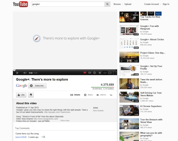
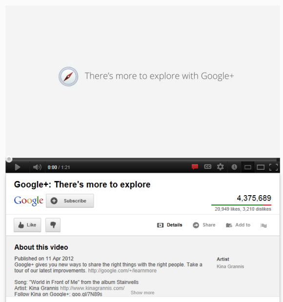
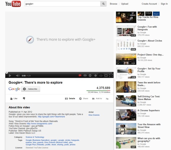
In addition to the lighter background color, the experimental "watch" pages move the video title and the channel information below the video, make buttons less obvious and show more information about the video by default.


Google's search engine has already indexed many YouTube pages that used this interface at that time.
Here's how you can try the new interface. If you use Chrome, Firefox, Opera, Safari or Internet Explorer 8+:
1. open youtube.com in a new tab
2. load your browser's developer console:
* Chrome - press Ctrl+Shift+J for Windows/Linux/ChromeOS or Command-Option-J for Mac
* Firefox - press Ctrl+Shift+K for Windows/Linux or Command-Option-K for Mac
* Opera - press Ctrl+Shift+I for Windows/Linux or Command-Option-I for Mac, then click "Console"
* Safari - check this article
* Internet Explorer - press F12 and select the "Console" tab.
3. paste the following code which changes a YouTube cookie:
document.cookie="VISITOR_INFO1_LIVE=wyVhs9Df-0E; path=/; domain=.youtube.com";window.location.reload();4. press Enter and close the console.
Update (December 7, 2012): The new interface is available for everyone and you can no longer go back to the old layout.
{ Thanks, Nedas. }

Anyone notice that the "Movies" link is gone in this test?
ReplyDeleteHow can you activate it. Would love instructions like before.
ReplyDeleteMaybe in a future update. It's all about the magic cookie ID that I don't know right now.
DeleteI have this new design. You need add this cookie:
ReplyDeletedocument.cookie="VISITOR_INFO1_LIVE=CuSA6Z9VUog; path=/; domain=.youtube.com";window.location.reload();
Thanks. I updated the post.
Deletelooks great check out the video tutorial
ReplyDeletehttp://www.youtube.com/watch?v=ok1bJGYjLkw
Enabling this experiment disables the other one (the new homepage). :(
ReplyDeleteIs there a way to get both of the new designs?
Maybe there is, but I don't know one. I assume they're both part of a future YouTube redesign.
DeleteI tried this once before and I got the new design. I then reverted back, but now I can't re-revert to the new design again for some reason.
ReplyDeleteIt's not bad, I don't like it. I just tried it and can't find the other videos by the same uploader.
ReplyDeleteI still do not understand why they have totally removed the +1 button from YouTube pages!
ReplyDeleteCookie doesn't work!
ReplyDeleteI ca't optin I paste the code into firefox doesnt work
ReplyDeleteAre they testing it again? It's back.
ReplyDeleteIt doesn't work..
ReplyDeletewhen i hover on subscribed there will be a bubble thing but it won't disappear.
ReplyDeleteI got a newer code: document.cookie="VISITOR_INFO1_LIVE =kMAQoe8txGM; path=/; domain=.youtube.com";window.location.reload();
ReplyDeletewell it is a tiny bit different: the small partner banner thing on the videos has been removed, and some of the buttons above the comments have changed.
Thanks for the instructions on disabling that.
ReplyDeleteOnce I get used to the interface, it's being changed. And I haven't found how to disable autoplay for playlists now and where is the link to playlists with all videos by a certain user.
It's weird that Opera shows this design and Firefox and Chrome show the old design...
ReplyDeleteI prefer this new one because it's less cluttered somehow and shows the thumbnail of the uploader. It feels easier on the eyes...
We can't scroll through uploader's videos in the same page anymore, but that function was kind of obsolete anyway since it only allowed to go through 24 videos...
I find it harder on the eyes and kinda annoying. everything looks too much alike.
ReplyDeleteAlso I have added that cookie and got a new design. Little new thing for me.
ReplyDeletedoesnt work anymore
ReplyDelete