Michael Leggett, Gmail's lead user interface designer, explains how he came up with this widget:
It IS odd. And yet, both the checkbox and the menu part tested very well in the lab. The people who hated the widget outside the lab also understood how to use it but promised others wouldn't b/c it was so "weird."
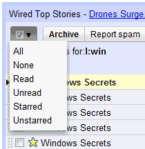
We tried a few things (like putting the select actions under "More actions") but I didn't have high hopes for any of them except the widget that launched. It tested better than I had hoped (all of the participants in the usability study were able to select all, unread, and none). We launched it to all Googlers months ago and listened to feedback (everyone was able to figure it out... some just hated the change).
More about why the change: The "Select all" link is used by <1% style="font-weight:bold;">I wanted to simplify the interface and give back that space to users.
Since features like "select unread" or "select starred" were used by a lot less than 1% of the users, it made sense to hide them. Power users can always learn how to use keyboard shortcuts and an extra click doesn't mean too much for a feature that's rarely used.
Michael Leggett also says that the link to Buzz will be added at the top of the page, next to Contacts and Tasks, and users will be able to hide the links to service they don't use.
{ via Ignore the Code. Thanks, Jérôme Flipo. }

I used the "select unread" message SEVERAL TIMES A DAY. The new control is very odd and I find myself individually selecting each message instead of using it. Looks like I need to re-train myself.
ReplyDeleteI agreed. The checkbox is just wrong.
ReplyDelete@Anonymous:
ReplyDeleteEnable keyboard shortcuts in the settings page and use *u to select unread messages. It's not difficult to remember the shortcut. To select all the messages, you can use *a and to select none, use *n. For more shortcuts, type ? in Gmail.
There's also a new option in the more actions drop-down: "mark all as read", which combines two actions ("select unread", "mark as read").
Okay. So we just waiting again for the new re-redesigned GMail.
ReplyDeleteI'm afraid I love that little checkbox! (Only, being English, I'd probably call it a tickbox ;-) I find it much quicker and more intuitive than individual links, so much so that I have to force myself to remember Gmail before the changes...
ReplyDeleteSince you can click, hold, drag, and release on the widget, it's technically still one click. :)
ReplyDeleteI prefer to gain the extra line of real estate in my mail window. This is a change that seems pretty easy to adjust to (and yes, it's something I use).
ReplyDeleteI was very unhappy when the links were switched to a menu, since I too used those several times a day. But then I finally had a good reason to learn (and start using) the keyboard shortcuts. Much faster.
ReplyDeleteIt is made it a lot easier for me, and it makes sense to me.
ReplyDeletea saved search to "is:unread label:inbox" helps a lot so i just have to click on the [X] in this weird user checkbox-dropdown. :-)
ReplyDeletecant edit my text above: i saved this search to the quick links lab feature :-)
ReplyDeletestupid stupid stupid decision. Give us back 'select unread' link. I don't care about lab usability test. This is VERY annoying
ReplyDeleteThe only problem I have with the new check box is that now I have to remember where each selection is and that sometimes I click on the checkbox instead of the drop-down menu.
ReplyDeleteI neither like nor dislike the checkbox. I guess I just don't use it as often as others.
I prefer the check/combobox. When you're big like gmail (or windows, youtube, etc), no matter what changes you make, no matter how good they are, there is always going to be a huge crowd of people who complain for no reason other than that they are change averse.
ReplyDeleteDon't forget changing the compose button back to a link so you can CTRL+select to compose in a new tab.
ReplyDelete@reysbro You can Shift-Click the Compose button to open it in a new window. If you have your browser set to open windows in a tab, it would duplicate your Ctrl+Click.
ReplyDeleteI hated the change until I read this blog! I had not looked at the shortcuts for a while, so had not see the '*' shortcuts. Also I love the "mark all as read" option - if only this could replace the "Mark as Read" button from labs on the menu bar.
ReplyDeleteCan't see a keyboard shortcut for "mark all as read", which I would love... *ui is a bit of a handful!
The angle brackets got removed from my last post! This last sentence meant to have read:
ReplyDelete*u < shift > i is a bit of a handful!
This is a classic case of "why not just give an option to the users". In Settings.
ReplyDeleteDoesn't anyone have problem accidentally clicking on the new button while meaning to click on Archive button? It may be that the Archive button was originally at that location, and my muscle memory is causing me to make that mistake. It doesn't bother me too much though, as I use the keyboard shortcut anyway, but occasionally gmail doesn't have the keyboard focus and "y" doesn't work, so I end up clicking on the button.
ReplyDeleteI use 'select unread' several times a day too. Clicking once was so convenient, clicking twice is really annoying. The rest I don't care about, but can we have a labs feature that gives us a link on button for one click for 'Select Unread'?
ReplyDeleteStill: being part of that "less than 1%", I can say it sucks. I don't want to use shortcuts for that (I use them for other things, but not for this).
ReplyDeleteIt was very useful to select unread and then mark as read and/or archive. It was FAST, easy, etc.
It also pushed me to use keyboard shortcuts but... the trouble so darn few Google people realize is that not everybody on this planet has English keyboard, so some key combinations that look easy can get absolutely counter-productive!
ReplyDeleteHere's a solution...use 3 small icons to replace the dropdown box. A circle, check mark and star.
ReplyDeleteClicking each will select/deselect emails and will change shape (solid/hollow) to indicate it's state as follows:
Circle : All / None
Check Mark : Read / Unread
Star : Starred / Unstarred
This would probably only use a few more pixels than the new dropdown and would allow one-click actions like before.
And, another suggestion for the delete button...
Add a graphical "X" to the Delete button (or replace the letters entirely). It makes it so much easier to distinguish from the other buttons and is a very common symbol for the delete action across many apps.
This is like Google Voice, right?
ReplyDeleteI prefer it hidden in the menu, even though I did use it. It's much cleaner this way. Now I just hope it gets rolled out to Apps users soon...
ReplyDelete@Vacilando - I've just discovered 'Custom keyboard shortcuts' in Labs - may help you. I've changed 'select unread' from *u to ** and 'Mark as read' to -
ReplyDeleteDoing this on a numeric keypad is much quicker than using a mouse!
Well I love it. Anything to decrease the clutter.
ReplyDeleteWell what about that strange " compose mail" mail button ? It looks so odd at the place it is current placed... especially who use themes.
ReplyDeleteshouldn't have changed that at all.
"...a lot less than 1%..."? Sorry, I find that difficult to believe. (Of course, do users who don't really use the browser interface at all really matter?) A stupid design decision is still a stupid design decision no matter what justification you give for it. And reclaim pixels for what? (Geez.) Fortunately, there's userstyles.org for those of us who want everything back where it was before this "update".
ReplyDeleteI'm in that 1% too. I suspect a lot of the users are people who subscribe to mailing lists. 1 click Select Unread was so convenient. This new checkbox makes it such a chore.
ReplyDeleteIts just one of those things, you can never please everybody.
ReplyDeleteI hate the new widget .. extra click
ReplyDeleteThe new layout is wrong - the select button is not a big evil, the contact and tasks are also acceptable (although I used about 1000% more the select buttons than contacts and tasks), but the major annoyance is the ugly Compose email old-school button. Please change it back to something more appealing like buttons under YouTube videos, seriously.
ReplyDeleteFeedback thread about he Gmail UI changes.
http://www.google.com/support/forum/p/gmail/thread?tid=4247c6baf8830ace
It should come as no surprise really. With Gmail it is mostly a matter of waiting to see how they can &%*# it up some more, and then work on the scripts to undo what Gmail says it so desperately needed.
ReplyDeleteIts like the compose button. Even at its basic, aesthetic level, it's just wrong. And then you have tasks and contacts above that. Most people hated this change as well. So it comes as no surprise when most people do not like the check box. I do not like the check box. Now it takes two moves to do what I normally did in one move.
So we wait.
We wait to see what Gmail will &%*# up next.
My motto old but true - IF IT AIN'T BROKE, DON'T FIX IT!!
I HATE the new clickbox. HATE HATE HATE. Everyone I know HATES it. I wish I had an option for even an even larger font size because I'd be yelling in your ears at the top of my lungs how idiotic this is. Oh and all those people complaining about it? Nah, never mind them. Nobody ever used the select unread anyway. Way to go Google. Not. The first chance I get, ie. I find a mail with 'conversations' I am saying bye bye and not for the change but for NOT LISTENING TO US!
ReplyDeleteto bring your favorite button back you can install a chrome extension here:
ReplyDeletehttp://chrome.manabase.com/subdomains/chrome/gmailcustombutton/
I call it time saver button :)