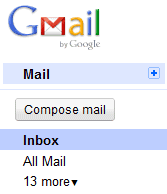
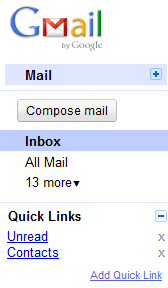
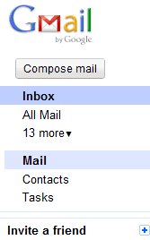
Google added a small button that lets you collapse the group of links, but the setting wasn't preserved when you reloaded the page because of a bug. Now you can permanently hide the links to "contacts" and "tasks".

If you ignore the blue bar at the top of the page and you don't click on "Mail", you'll no longer see the two links. Gmail could add an option to move the horizontal navigation bar below the list of labels, even as a Gmail Labs experimental feature. I partially solved this problem by enabling "Quick Links" in Gmail Labs and adding links to the contact manager and to a mail view (is:unread).

Another option is to use this userscript that moves the links below the labels. The script should work in Firefox (Greasemonkey is required), Chrome and Opera.

Apparently, Gmail's links bar is quite important and it's likely that Gmail will add links to other services. A Google employee detailed its purpose:
"Gmail is home to a few different apps, including Mail, Contacts, and Tasks. The links on the left below the app navigation change depending which app you're using, while the app navigation links remain consistent so that you can go between apps. If you're in the Contacts app, the big action button becomes the way to add a new contact. We use this button as the way to create things in other products like Google Docs and Google Calendar, too."

that option is not new
ReplyDelete@Anonymous:
ReplyDeleteRead the second paragraph.
Now that's better.
ReplyDeleteI can't see the meaning of 2 buttons with the same target ("Inbox" and "Mail" do both bring me to my mail=inbox). What's the purpose??
ReplyDeleteIt doesn't make too much sense this early on, but it will over time as they expand.
ReplyDeleteIf you think about Mail, Contacts, and Tasks as being three completely separate applications... and imagine that INBOX is simply the default folder/label when you load MAIL... then it makes sense.
If you click on MAIL, it takes you to the MAIL application... which also happens to default to the INBOX.
If you click on CONTACTS... the INBOX link is nowhere to be seen, which makes sense... "inbox" doesn't make sense for a contacts application. So, when you click on CONTACTS, you simply aren't in MAIL anymore. You've switched the application.
TASKS is the odd one out, because it only loads the little window in the corner. However, I suspect that TASKS will eventually load in full screen like MAIL and CONTACTS do.
Hypothetically, they could add additional links for additional applications. A CALENDAR link could take you to Google Calendar... a VOICE link could take you to Google Voice... etc...
Wait, how did you make a Quick Link to contacts??
ReplyDeleteGo to the contact manager and click on "add quick link".
ReplyDeleteI assume that the "app navigation links" refers to the app links at the very top of the web page.
ReplyDeleteWhy in the world don't those reflect the apps that we use? Google should customize them based on what we use or let us customize them.
I use the same set of Google apps every day and half of them are not in that list (and half the apps in that list I never use). That bar could be very useful.
a little bit better, but still looks ugly
ReplyDeleteOne thing that I hate about the new links is that I sometimes get confused and don't know where to click: Mail or Inbox. Both take me to the inbox (the same thing happens when I click on the Gmail logo) but, I'm not yet used to the new links.
ReplyDeleteI actually liked the old one.
ReplyDeleteAlso Google Health (http://health.google.com) and Google Voice (http://voice.google.com) have a nice favicon and are very useful as well.
But it's a pity that there are no special favicon for other services (books, images and more).
Works perfect! Thanks :)
ReplyDeleteI use a bookmark to enter Contacts and I never use Tasks.
To remove the Mail/Contacts/Tasks submenu entirely, you can use this Greasemonkey script, which is also available as a stand-alone Firefox add-on:
ReplyDeletehttp://coding.pressbin.com/36/Remove-MailContactsTasks-from-top-of-GMail-sidebar/