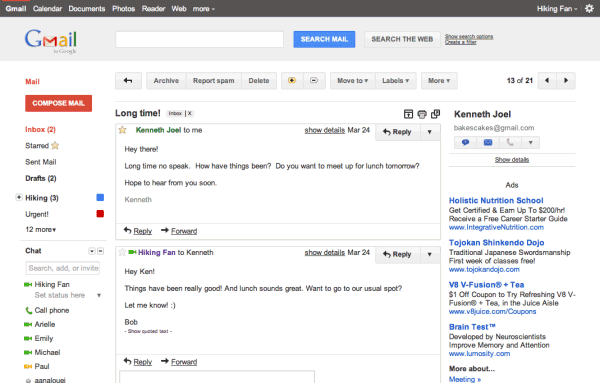
The new interface uses the same color scheme from Google Maps, Google Calendar and Google Search, the same gray header and blue search button. Since Gmail has two search buttons, Google had to use labels to distinguish between the button that lets you search your message and the Google Search button. The interface is cleaner, since it uses a lot of white space to separate the different sections.
Even if you don't enable the new themes, you'll still see some subtle design changes: many links are now buttons (navigation links, "Back to message list"), the "Refresh" button uses a familiar icon, the "More actions" button changed the label to "More" and Gmail's footer is much cleaner. These are just the first UI updates, so we'll see many other changes until "Preview" becomes the default theme.

Gmail is a complex application and it's difficult to simplify the interface and make it more consistent, especially when you consider the numerous Gmail Labs features and themes. "You can expect some updated themes that embody the same design principles but are better suited to working in a dark environment, use a different color palette, or include the illustrations that we know many of you love to see around your inbox," mentions Gmail's blog.
It should be obvious right now that Google+ is more than a social network or a social layer, it's a Google-wide initiative that affects both the form and the functionality of Google's applications. It's actually a new Google, a social Google that tries to offer cutting-edge apps and a cohesive experience.
{ Thanks, Maarten, James, Yasar, סמנה, Mushaf, Kai, Anthony, Jason, Kartik, David and Karol. }

right side chat is a mess with this new theme... and you dont have oldest button when going thru bunch of mails ;/
ReplyDeleteNow we have 2 way to manage groups : contacts and circles ... please I want only Circle in the future !
ReplyDeleteHere you can see that other services will get a new layout soon too http://whatsnew.googleapps.com/new-look
ReplyDeleteSo, no actual "color" [scheme] at all. The "shortening" of the button bar(s) is actually good (removing extraneous words and using images w/tooltips instead); but with the [now] floating upper bar, we don't really need a lower bar anymore. Google+, however, won't be the "death of facebook"--it'll likely be the death of Google. (All of the social morons are already on facebook. Why exactly do we need them in Gmail, too?)
ReplyDeleteAnd once again, GAFYD is left out.
ReplyDeleteI would like to know if google reader is going to have the same changes, I think it could look pretty good. Also I like this change google services need a revamp,the visual design is working for me.
ReplyDeleteLove it!
ReplyDeleteplease bring it to Google Apps users!
I actually don't like the new one.
ReplyDeleteI always complain about people complaining about new interface changes, and now it's me who isn't very fond of the new one :-|
I'm more than ok with the Tea House theme.
Nooo what are they doing?? Calendar and Gmail both look horrible like this... grey and red aren't nice at all, and a load of space is wasted with the huge header they now have. Please Google, see some sense!
ReplyDeleteNew interface just arrived on my laptop.
ReplyDeleteAdvanced Search not working as far as i can see. When you hit the button the page simply refreshes. You can only get there by opening Go to Google.com first.
I'm on Chrome. Latest Beta: .... .41
It's nasty. Both this and the new Calendar design are - to me - much more user unfriendly.
ReplyDeleteThe lack of colour is a bit annoying. But the black bar at the top of Gmail is much better than the black bars on other apps (its lighter). Why can't they still get the grey header the same size on each app??? And the huge amounts of wasted space on the left and right is extremely annoying, overall though I'm glad they are making each app have the same UI.
ReplyDeletehttp://whatsnew.googleapps.com/new-look
ReplyDeleteThe support portal has a new look, too. http://www.google.com/support/reader/?hl=en
ReplyDeleteit means more scrolling, I don't like it and will be sticking with the fantastic ninja theme!
ReplyDeletethe purpose of the black navigation bar, according to chris wiggins designer, is "elasticity," making the pc look like a mobile device. as soon as i find an alternative google stylesheet i will stop complaining about illegibility and failure to meet W3C standards for accessibility due to very low contrast of grey on black.
ReplyDeleteLike the new calendar interface, MUCH TOO MUCH WHITE SPACE! Running on a pair of 1920x1080's on a desktop it should look fine, but on a 1280x800 laptop, those wasted pixels make these new interfaces far less useful than the old ones.
ReplyDeleteThese new interfaces using 10% of the page for the f@$*king logo and search box might make things easier for newbies, but I want *density* of information.
You don't have to do any setup to enable this feature of gmail. Just choose an extension and start sending emails to it.
ReplyDeleteWhy do you have ads on Gmail? Don't you use an adblocker?
ReplyDeleteYou shouldn't block ads, they are what make most of Google services free and awesome. :)
ReplyDeleteThere is a way to tell Google what you think about the new look:
ReplyDeletehttp://www.google.com/support/bin/request.py?hl=en&contact_type=surveyk&ctx=go
Not a big fan of this one. I don't like the big red button and the increase real estate for the google logo and search windows.
ReplyDeleteI like everything else google has done. Literally, everything else.
ReplyDeleteBut this, the gmail change, I do not like. I liked the compactness the current schemes offer. I definitely love the neatness and how much info it packs on one screen. The Preview shows that everything is incredibly spread out, it makes gmail seem so empty, so lacking.
I hope they change it... I'm perfectly fine with my planets or mountains theme.
It is insulting that they spend time on this cosmetic nonsense while neglecting offline access.
ReplyDeleteStill no option for gmail autosave FREQUENCY - i.e. and about 10 other basics that are not fixed yet. What's with the use of the color RED for ordinary i.e. non-error indicators. It's a good thing google is not writing software for the military or they'd be getting us into another war. There are so many failings of UI-101 where do I begin.
ReplyDeleteI like the new calender designs. Not to clean on this design so far. But think that mainly down to there being virtually no different between the read and not read colors. If they change to a dark color to highlight the read email first then I think I may switch. But I do like the planet theme so I may not switch anytime soon.
ReplyDeleteright away go to my profile to check out new themes
ReplyDeleteBig fan of Google everything about it is logical and easy. Logged in the other day and noticed some differences "Like it"
ReplyDeleteThey changed all links to buttons. Well, almost, they missed one: In Contacts, when you open any contact "Back to My Contacts" is still a link...
ReplyDeleteIn both new looks (gmail & Calendar) there is a lot more wasted space, I get 10 less emails on screen compared to classic which to be honest is pretty rubbish! Also calendar now shows less when in the monthly view, my eye sight is fine I dont need huge spaces between lines of text! Make a compact version.... yes more than the current one!
ReplyDeleteUI doesn't add much... what I want is REAL features like the ability to do superscript and other formatting, what about inserting tables in messages or will I be forced to use Google Docs all the time... they're worse than Microsoft because Google Docs don't really open in anything else!
ReplyDeleteI think it's pretty cool. It's a different change. Looking forward to some more updated themes.
ReplyDeleteWhen wil be ready tu use.
ReplyDeleteHOPE THAT THE TRAY OF EMAILS WILL BE NEAT
i want to new interface my account
ReplyDeleteas currently setup in themes, i would not want to use the new look as it wastes way too much screen real estate on boarders and edges. it also wraps very badly in both regular and dense mode. I really hope they make further adjustments, I dont see how anyone at google honestly things this is better than the existing default
ReplyDeleteNice interface gret and awesome google produts are best i love and feel good when i using google services nice thanks.
ReplyDeletePeople, just take it easy, Google sags very clearly that this Preview theme is as it is called, a preview for us to test and somehow feedback, therefore meny adjustments are surely to yet come in the near future.
ReplyDeleteRead here: http://gmailblog.blogspot.com/2011/06/preview-of-gmails-new-look.html
NooooOOOOO, stop the scrolling google , have mercy on my poor fingers.
ReplyDeleteI used to be able to switch between contacts and email with one click, now it takes two clicks.
ReplyDelete