Gmail's new look is based on the "Preview" theme, but it's much more than a theme. There are a lot of changes: Contacts and Tasks are now included in a drop-down menu below the Gmail logo, buttons like Archive or Label are only displayed when you select at least one message, there's a new settings menu that lets you change the display density, gadgets and the chat box are now resizable, there's a new interface for conversations, advanced search options are now displayed when you click the arrow in the search box and you can try HD themes.
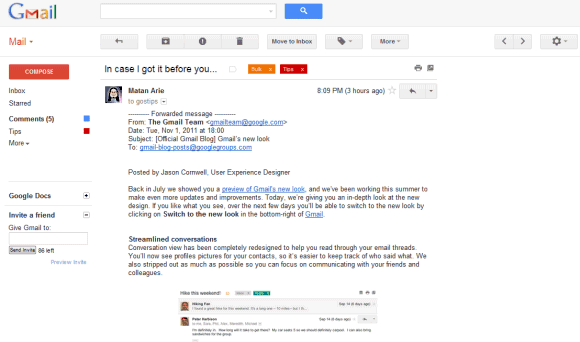
For now, you can switch to the old interface from the settings menu, but Google says that this option will be removed soon.
{ via Gmail's blog }

Its cool.
ReplyDeleteConversation view is nice but once again, there's a total waste of vertical space. The layouts of both Google Reader and Gmail got pretty much horrifying.
ReplyDeleteI like the new look of Gmail, but I think some of the HD themes transparency is too high and the text (message snippets) are kind of hard to read.
ReplyDeleteAlso, the text on chat contacts is colored black over a dark background in the Tea House theme.
A problem I'm having is dragging and dropping messages into the Trash.
I can believe that the "Invite a friend" box survived the redesign! Isn't it time to get rid of this? I've had 80 invitations left for years.
ReplyDeleteI can't use gmail anymore for this reason. Google used to represent clarifying simplicity - now it's just a mess that stresses me out. I just want to be able to see all my folder (tags) at once. Why the hell can't this be done. Has anyone at Google actually watched someone using Gmail these days?
DeleteI agree, Gmail's label menu on the left side is horrible. Who's idea was that? I have to fiddle around with the mouse to get the scroll bar to appear, then when it does it is too thin. When I finally get it under my mouse I have to go and click a tiny little arrow, and then its back to fiddling with the mouse to get the cursor on the thin scrollbar. When I finally get top the label that I wan to use, I can't read it because the entire menu is too small/thin so that it will nor display the whole label. Frankly, it sucks.
DeleteSorry, I meant to say "can't believe".
ReplyDeletea pity that this change didnt make it into apps accounts. :(
ReplyDeleteI like the new features. On the other hand, I'm really disappointed with the look and feel, for the moment, particularly in High Score. Even on compact density, I feel bloated, like I'm going to float away into the tablet zone. I really hope the Gmail team will sharpen the overall image and, as has been mentioned, above, cut down on the bloat space.
ReplyDeletegreat google... i like all the google new interface...
ReplyDeleteThere is no "Create your own theme" feature in Gmail's New Look...
ReplyDeleteIs it possible to transfer custom colors Gmail theme to New Look?
For some strange reason, since I switched to the new look, all my google voice texts are coming into my gmail inbox. I am unable to turn this off!! I went into google voice and it's set NOT to forward my texts to e-mail.
ReplyDeleteI tried it for a while but ended up reverting to the previous version. Here's the feedback I submitted:
ReplyDelete- It's noticeably slower. Even mousing across the left pane presents lots of lag in highlighting the labels.
- My favorite theme, Steel, evidently didn't make the cut. The next closest theme automatically selected is an ocean of grey (which is only slightly better than the default ocean of blinding white).
- It looks weirdly unorganized-- huge amounts of padding and wasted space with enormous buttons and lack of even subtle visual separation between objects.
- Loss of ability to quickly collapse/expand the Chat section.
nice i think now look like yahoomail
ReplyDeleteUtterly horrendous. If they force me to change, I'll stop using Gmail.
ReplyDeleteit's available for apps too
ReplyDeleteunbelievable bad design for reader and gmail too. unbelievable.
ReplyDelete+sammydavisjrjr. My wife and I noticed the Google Voice text messages in our Gmail inboxes, before we switched to the new interface (and then switched back).
ReplyDeleteI'm confident it's unrelated to the refresh. Although, I'm also perplexed and have failed to turn it off.
I tried it and it really doesn’t work for me anymore. I use gmail for my business and I really need for the folder tabs to stay visible at all times. I have a lot of filtered mail going in to cretin folders so I can prioritize which emails need to be answered first. I really need to be able to see at a glance what folders and how many unread letters are in these folders. Having to drag the mouse over it to show the tabs doesn’t work for me at all with the high volume of email that my business receives. If this doesn’t change to were it will work for my business I will have to go back to using Yahoo mail or Hotmail where I can see at a glance the unread mail in my folder tabs. And it was a great disappointment to see I have lost my custom theme with my company logo on it !!!! Some things are better just left alone. When something isn’t broken DON’T fix it !!!!
ReplyDeleteExactly. This hits the nail on the head.
DeleteGuys, if you don't like the new GMail, give Zoho Mail a try. Brilliant and free.
ReplyDeleteugly. hire a designer, please.
ReplyDeleteThe new themes lag badly. Firefox 8 here. When I revert to older style everything runs nice and smooth.
ReplyDeletePlease fix before you deploy, or I might have to go elsewhere :(
Too much white. I'm getting blind.
ReplyDeleteAnd the new themes suck, btw. I want "desk" & "classic" theme back.
I am getting blind also--too much white, and I do not have a Themes tab. I have been reading and reading what has worked for others. Nothing has helped me. I use DSL Extreme and they only offer Gmail. Like they say, "If it ain't broke, don't fix it," or something like that.
DeleteAgreed, all the white is hurting my eyes. Google, please put some colour back in the inbox.
DeleteTerrible. I cannot work like this and will switch to a different (read: non-ad producing) interface if I can't switch back.
ReplyDeleteHow do I go back to the theme I was using? The new themes are, every single one of them, hideous. Seriously, surely Google can afford to hire interface designers who know what they're doing. Stop outsourcing to third graders. The new interface looks like that's who came up with it.
ReplyDelete+Joel. If you want to use your old theme in the new Gmail, I assume it's unavailable, at the moment.
ReplyDeleteIf you want to go back to the old Gmail, click on the gear icon right above your email list. I'm confident there's an option to switch back, in there.
+Cougar. You're correct on the theme being gone. As to switching back, I haven't found a way yet. I've looked through all of the options in Mail Settings.
ReplyDeleteJust in case, I'm talking about the bigger gear with fewer bumps/ridges that has the downward arrow next to it.
ReplyDeleteClick on that gear, then click on "Revert to the old look temporarily," beneath the word "Compact" and above the word "Settings."
Hope this helps.
The new look of Google products looks terrible in multiple ways. Looks very amateurish.
ReplyDelete1. Too much white-space bloat.
2. The CSS is poor. Text is not centered inside buttons, text extends outside of boxes etc.
3. The black Google Bar at the top is hideous.
4. The default black on white is blinding and eye-fatiguing to look at.
5. The reduced use of color in the interface makes it harder to find GUI elements.
6. Replacing text buttons with icons slows me down--it is harder to decode icons than to read text, e.g. a Stop sign means “Spam”?
7. Google claims to reduce clutter, but adds a photo of people?
8. Stars are at left in Inbox-view, but on the right in conversation view. Inconsistent.
9. The HD themes have too much transparency and make the text hard to read. Didn’t designers learn lessons from the failures of Web 1.0 with the flashing text and wallpaper behind text?
10. Needlessly removed themes that people were using, and totally removed the ability to customize a color theme.
11. In conversation view, lack of distinction between sender info and actual message is confusing.
Why fix what was not broken, I am very happy with the old style & will not switch across to the new look. Far too much bling in all google products already which I remove using external programs, if I am forced to change over I will go elsewhere for my needs(already looking). I did not like any of the themes provided apart from the classic style which I have used for years since opening a gmail account. Gmail used to be good until they started adding unnecessary bling to it, now it's just a copy of what else is already out there.
ReplyDeleteGo to the Gear Icon, on the right hand side,
ReplyDeleteClick on Gear Icon
An there an option temporary switch back the old Gmail.
I do not know why you want to switch back, I am liking the new interface and I like the new Space theme
I don't like the screen size, now the labels and chat is all messed up there.
ReplyDeleteThey're just trying to make all things look like Google+
http://www.vectorash.ro/gmail-just-got-a-new-look/
Kevin W pretty much nailed it. But regarding #1, a really simple solution would be to offer compact "Display Density" option in Reader as you do in Gmail. There is WAYYY too much wasted space in Reader without this option Thanks.
ReplyDeleteI notice this morning the update window, but i don't like to change what i already use successfully.
ReplyDeleteI just read all the informations about this new update and thank you Alex for sharing with us this informations.
I'm not sure if i will change right now nut it is good to know everything about this.
I love trying new designs, like with facebook. It wasn't long before I switched back to the old gmail today, though. My eyes started to hurt because of all the white. And so much padding and wasted space. Bad design
ReplyDeleteDamn..... Can't attach a file in the new Gmail!!!!!
ReplyDeleteI still don't have the option to switch to the new design. For the last two days I've been re-logging and shift+refreshing several times throughout the day, and I still don't have any option to switch.
ReplyDeleteUpdate: More fail on Google's part. Apparently I didn't have the link to switch to the new look because I have my tasks minimized at the bottom and they put the link for it UNDER that so it's not possible to find.
ReplyDeleteThe messages in the dark theme has white background and dark text? Ouch, it hurts. Again not a single really dark theme!
ReplyDeleteThis is hideous. How do I switch back?
ReplyDeleteThe interface is so painfully slow that I have switched back to a mail client. Something I moved away from before I got gmail all the years ago.
ReplyDeleteWhile I like the new search options, I completely agree with all the "bad design" comments above as well as the sentiment that "if it's not broken....why fix it?" If Google forces everyone to switch to the new interface without revamping all of our favorite themes and correcting the numerous design flaws, they will be "pulling a Netflix" on loyal gmail users and I predict a mass exodus.
ReplyDeleteReader, Docs and Gmail redesigns are horrific. The huge buttons and massive wasted spaces - particularly at the top of the page - are ridiculous. I use a small compact laptop and I don't really appreciate 1/4 of my viewable space being lost to bloat. Truly awful.
ReplyDeleteHow in God's name can they be 'excited' to offer this to the masses?? It is so poorly designed its not funny. I won't bother going into design flaws as they have already been pointed out in posts above.
ReplyDeleteGoogle.. don't force this down our throats... if you do, I have a feeling you'll see a lot of users switch to another mail service.
Lunatic redesign!!!!!! Get real Google, this BAD design. Not usability centered, and just too complicated!
ReplyDeletethumbs down
ReplyDeleteWhite space is GOOD! Makes it less cluttered, EASIER to read, good design.
ReplyDeleteAbsolutely terrible. Reverted back. Please don't make me switch over permanantly any time soon. I already can't use Reader because of the switch. It's unreadable with all the black and white look and soooooo much extra space. Feels bloated. What was wrong with the old interfaces. Way better as it was!
ReplyDeleteMost definitely need to allow us to transfer our custom theme to the new look. I had to switch back since there was nothing even close to my theme.
ReplyDeleteIt's awful, I really hate the new gmail, there's so little contrast, lines blur together, oceans of white unless you put a theme on, which just adds oceans of another saturated colour. It's tiring on the eyes and brutal to use for a long period. Seriously, the prior layout was classic: Clean, simple, easy to read.
ReplyDeleteWhat do you want this to be? An email server or a tart's handbag?
From what I've observed, it seems like the major critiques are look/feel and speed.
ReplyDeleteOn the other hand, for those saying, "If it ain't broke, why fix it?" my response is: Why would we want technology to remain the same, forever? I'm all in favor of implementing greater functionality and ease of use. I hope the speed and look/feel issues are simply introductory hiccups at the beginning of a dynamic upgrade.
ABSOLUTELY TERRIBLE!!!!!!
ReplyDeleteugly. hire a designer, please.
ReplyDeleteMessage to Google: design is not in your DNA and never will be. Do not try to be hip and cool and "clean."
ReplyDeleteThere is a reason millions of people LOVE Google's products: your focus on utilitarian design. Remember 41 shades of blue? That represents the pursuit of UI perfection. Just so you know, the 'U' stands for user. Your products were never considered works of art, but we connected with them because you understood the user. No one wished it could look more hip, more web 2.0. It worked because you kept it simple and applied utilitarian perfection.
Unfortunately I fear that the new movement with the Google redesign is a very introverted one—the vision of one designer rather than the consideration of the person who uses the product.
I would strongly advise you to resist the urge to push forward with a low contrast, monochrome design that many people are telling you is 'hurting their eyes.' These are your users and they are giving you valuable feedback.
Go back to your roots. Don't try to be something your not. Give us the Google we love.
Ugh. Awful. Like many have pointed out - wasted space, too low contrast. I want the option to keep the old look permanently. Otherwise, may go elsewhere. What a waste of their time.
ReplyDeletelooking good ,but where is the invisible login settings option in chat.
ReplyDeleteand how to go back for old version
Not much in the switch makes me very angry or very happy...overall "meh"; though for the life of me I can hardly differentiate the shading between new messages and ones that i have read. Can this be adjusted, is it my settings, my eyes? (Didn't have problem with old version).
ReplyDeleteThey're changing it again. Unbelieveable. Too much time and money. Change it change it change it change it change it change it change it it's an epidemic now. Can't get used to it - then oops it's changed AGAIN. Arrogance and an excess of $$$.
ReplyDeleteI'm sorry, November 4, 2011 5:19 PM, Anon, am I hearing that the now-"old" Gmail was too complicated and people are just now getting used to it? Which features are too complicated or too hard to use?
ReplyDeleteAlso, if we're going to throw in the excess $$$ and arrogance arguments, why leave out their faithful companion, greed? . . . Please promise me one thing, we'll avoid camping out outside of Google for three weeks and, instead, we'll let the Gmail team make the necessary tweaks in peace.
Thanks.
Yes, bring back custom colors. And while you are at it, please do the same for iGoogle.
ReplyDeleteIt looks very old fashioned to me compared to others
ReplyDeleteI hate the new look. I use two browsers - Chrome and Mozilla Firefox. And Gmail and Google Reader are so slow now in both browsers. Not all icons are uploaded. "Mark all as read" in Google Reader doesn't work anymore. I want to keep the old look. I hope Google will respect the users and allow to keep the old look since it's just more convenient.
ReplyDeleteLooked at the new design on wife's computer while switching it back to old look for her because she was complaining about its ugliness and inconvenience. I totally agree. No way I will use it. I suggest google maintain both options permanently or they will lose lots of users.
ReplyDeleteNot happy with it. Please please please keep it as is.
ReplyDeleteSimply bloated, low contrast, bad font/background contrast. I really detest it after using it for 10 minutes.
ReplyDeletePlease do not make this the default, people will hate your for it. How about testing it in labs and getting it to a satisfactory quality before dumping it on millions of users?
Its ugly. I dont like icons appearing/disappearing depending what I do. Thats a feature of MS Office that I turn off. People want consistency, not an iterface that morphs on the fly. Currently I get my email on the Web. If they do this I will go back to getting my mail inside of Apple's mail application. YUCK.
ReplyDeleteAnnoying. I open an email and can't even find the attachments. SUPER annoying. Going back for as long as I can and will consider changing email providers.
ReplyDeleteSorry google, You failed in this new interface. It's ugly. PLEASE CHANGE A DESIGNER!
ReplyDeleteThis goes the same for what you have done to Google Reader.
Change the damn designer. And btw, your new interface script is BUGGY!
More forced "fanciness" and again less granular customization. You WILL use it THIS way and we WON'T be giving you granular UI layout choice and customization, just "prettier" baby-blue colors. "hey everyone" have fun! Just absurd. Is there anyone at google over the age of 28 now?
ReplyDeleteWhy have you used that horrible brown colour?
ReplyDeleteNone of the themes you can change it too are much better.
Creating filters is much harder.
You're not Apple, give us a chance to customise.
If it ain't broke, don't fix it.
ReplyDeleteQuote "On the other hand, for those saying, "If it ain't broke, why fix it?" my response is: Why would we want technology to remain the same, forever?"
ReplyDeleteBecause new design doesn't mean better functionality, it can mean "different look". People appear to be telling you they don't like the new look.
awful new look. please reconsider this option, because is ugly and less productive than the current one.
ReplyDeletePlease give us the option to keep the old look.
ReplyDeleteLet those who want the new look have it.
There seem to be dozens of sites and blogs and lists appearing where people are begging to retain the old look for all the reasons listed above.
For me, I am very uncomfortable with the stark feeling of the new look.
Wow the themes are horrific -it's impossible to see your text!! Please let us create our own!!! BTW if your mail screen is too big, click the gear sign for compact -a bit better
ReplyDeletei switched for a while but i can't stand it. it's hard to locate things like attach a file. It doesn't operate as smoothly as the old look. it's feeling like there are too many options. KEEP THE OLD LOOK! THE NEW ONE IS ANNOYING MANY OF US! GIVE US A CHOICE!
ReplyDeleteThe new look is a horrible failure. It's a bland aesthetic nightmare. No color. No contrast. The themes are either changed or magnified to the point of being a solid color on most of the screen. Forget about adding the "beta" to the new Gmail's logo. Something so horribly fugly and unappealing should be labeled either "alpha" or outright "rejected." It would be fine if changing over to it was optional. HOWEVER! Forcing such an unpleasant change on all users, especially the countless many that hate the new look, will only kill a lot of Gmail's support. People will still stick with it because they hate change (well, I personally won't continue using it) but they won't love Gmail like they used to. Because Gmail's new look is the exact opposite of everything that made Gmail great.
ReplyDeleteI can only repeat the words of another user from above:
ReplyDeletePlease give us the option to keep the old look.
Let those who want the new look have it.
Please!
New look is just to laggy to be taken seriously.
ReplyDeleteApart from that, i don't like the very limitted choice of themes and the contrast is very bad.
Altogether: DON'T LIKE!
It really needs borders/lines around the messages, otherwise it's impossible to visually distinguish the mail from the other page elements.
ReplyDeleteHIDEOUS. Can someone please tell the people at Gmail to make the change optional? I am very happy with the way things are now. Typical Google it seems-- my sis worked with them and said things were always changing. She was forced to change her office space countless times.
ReplyDeleteCan someone please help me, I cannot find the change to new gmail button!
ReplyDeleteTruly, a lot of very bad design decisions being made on Google's part across the board right now. The gmail inbox redesign is the worst of them.
ReplyDeletePlease Google, don't ignore the people who are telling you this new look is poorly designed. We're not saying it out of spite. This isn't about hating change, it's about usability and the fact that some terrible UI decisions have been made. At least consider providing a theme that mimics the old style for those of us who can't stomach the new one.
Nothing like UTTERLY "changing" the UI familiarity around FOR NO @#$% REASON every 15 months *WITH NO @$#%-ING OPTION TO PRESERVE A CLASSIC in other words FAMILIAR INTERFACE. This is 2012. It would BE EASY TO GIVE USERS DETAILED (NOT MEAGER OR "CUTE" OR "COZY" OPTIONS - BUT DETAILED UI BEHAVIOR OPTIONS AND THE OPTION TO PRESERVE A FAMILIAR CLASSIC INTERFACE. What a bunch of under-30 (no offense) year old a-holes at google. "Look what we can do" "we're so great" "look at our fancy crap." Asinine.
ReplyDeleteAll the negative comments here are correct. The new interface lacks design integrity - some buttons inexplicably changed to icons (all grey, hard to distinguish) while others remain text, but with huge wasted space around them. I've made an effort for 2 weeks now to learn to like this, but instead keep discovering other problems - scrolling windows within scrolling windows being one, and the hunt for the "send" button - sometimes it's above the message I'm writing, sometimes below, very frustrating. As someone who has designed interfaces I can't understand what Google was thinking. Why not just offer the old, functional interface as an option? The new one is so bad I'm even thinking of going back to Outlook, which means I'll never see an ad. Come on Google, listen to your users!
ReplyDeleteI would like to second the two Anonymouss comments above. Generally speaking it seems the new design suffers from "programmer thinking."
ReplyDeleteJust because a google programmer thinks it is cool and makes sense, doesn't make it so. As a matter of fact, it makes it less likely that a layperson would dig it.
You guys have way too many MS's in computer science in your organization and not enough people with actual real world experience with your products. Which is why invariably you will fail again and again with these rollouts - they are cute, slick and intuitive to ONLY THE GOOGLE PROGRAMMERS WHO DESIGN THEM.
IF IT AINT BROKE DONT FIX IT or in GOOGLE SPEAK--> TRY AND MAKE IT CUTE AND FUCK IT UP COMPLETELY.
LET THE USER CHOOSE.....OLD OR NEW
ReplyDeleteI'll pick the old style
Absolutely ulgy design. A big red compose button and a bland of gray text and background, who can actually read this thing?
ReplyDeleteThe design team and their manager, who were responsible for the new ugly look should be fired.
ReplyDeletethe new look shouldn't be made mandatory...cz if it is made mandatory i will have to move to another email client.
ReplyDeleteI have been using GMail since 2004. When you allowed the modification of the colours of the screen I was quite very happy as I use my machines in rather dark areas and I have established a set of screen colours and layout that allows me to see the screens in a dark. Now I have totally lost this ability, the dark screens waste a lot of space and I can not set the colours to where I can use them in the common places I need to be able to use them. Please give us the ability to go back to our old screens and setups many of us have very concrete reasons for having modified our screens and layouts to what we did. Obviously your designers have not had to work in strange and unusual conditions.
ReplyDeleteWHEN SOMETHING ISNT BROKEN DONT FIX IT.
ReplyDeleteDONT FUCKING FIX IT!!!
I cant tell how many unread emails in my categories w/ a glance. The huge white empty void takes more than 70% of the screen space. Not to mention the horrible, horrible, horrible, HORRIBLE color theme.
The design team and their manager who were responsible for the new ugly look should be fired.
Tried it, found that too many things have deteriorated from the previous incarnation (a selection of those documented above, most notably the wasted vertical space, the white and screwed up priorities). Looks like I'll be using my old POP account a lot more soon.
ReplyDeleteReally didn't like Microsoft's collapsing menus in Office, and really don't like them on GMail, either. Please give us the ability to turn the collapsing feature off. I am referring to the collapsing menu that displays our gmail labels/folders.
ReplyDeleteChoosing one among many hilarities, the "More" drop-down menu has only one option by default (unavailable options used to be dimmed, but are now hidden entirely). Well, someone must have noticed that that's not sensible, so they've added a message *explaining that there are sometimes more options*. Self-documenting is good. But self-apologetic interface elements should be a red line.
ReplyDeleteHow do i switch back...? Anything make me think more to read my meail is a bad idea. Too much spacing...i need my folders on left top to see who sent email.
ReplyDeleteEmail site should do email thing correctly first before adding all kind of junk to email. Never change font , spacing...leave that to theme so people look at different theme and make their own choices. New look just odd thing everywhere. Not arranged correctly. Default should mimic old style with new changes as option or theme. DON'T FORCE THINGS. IT WILL BE IMMEDIATELY REJECTED!.
ReplyDeletePlease do not get rid of the old look. Some people might like the new look but my organization does not. We have just switched to Google apps(City of Pittsburgh) and no one likes the new look.
ReplyDeleteI HATE the new "look" on google because it is NOT functional but "fashionable". It has huge wasted white spaces and big stupid red buttons as if people can't find the buttons on their own. And particularly with wide screen video monitors these new templates are a DISASTER.
ReplyDeleteThe new look sucks and is not user friendly. You guys could not have done your homework. You have to check it out with users first!!!! Num nuts~~ Of course YOU rae excited abut it. You designed it and know how to use it. That does not make us read your mind and experience the same. Are you on drugs? Do some research for God;s sakes!!!!!
ReplyDeleteYou guys have way too much time on your hands maybe???? The change is horrible in a word. Or is it just to make you happy and not the users?
ReplyDeleteI could not use the new look gmail It's awful & changed back to the old look- I couldn't scroll down long emails -either it wouldn't move at all or would finally skip to the bottom of the message. Totally useless!!!!! Also could not scroll through my contact list. Switched back to the old look & it worked perfectly. If the new look is forced on me I'll have to change to another email provider.
ReplyDeleteThere is no theme feature but other wise it is good.
ReplyDeleteI sort of appreciate the effort ... however I also dislike this new design. It loads slower, reacts slower to changes and does not pack as much information in the same space. It goes against what we have been expecting from google, something light and extremely responsive... the push of the google+ features reminds me of yahoo moving to my.yahoo and all the clutter that came with it, that's exactly when people moved out of yahoo to google...
ReplyDeleteYOU @#$% HEADS BEETTER PUT BACK THE THEME CUSTEMIZATION BACK!!!
ReplyDeleteIt's arrogance and an excess amount of both time and $$$ with rich software managers sitting around with nothing to do and the "look what we can do" change-for-no-reason epidemic and arrogance, period.
ReplyDeleteIt's utterly arrogant TO NOT PRESERVE a UI's long-time familiarity with detailed options (not some abstract "cute" or "cozy" option) and UN-WASTE the screen space and provide things that are practically standard after 10 years, like the choice of icons only or button TEXT AND icons both. An awareness campaign is needed for people to get a clue and realize they shouldn't put up with such design-arrogance.
+ALL: If you have yet to try the new look for a couple days, give it a shot (use it for at least one or two days straight). I did and was rather surprised/impressed. Here's my experience/reaction: http://cougarabogado.blogspot.com/2012/01/eating-crow-and-liking-er-1ing-new.html
ReplyDeleteQuote "If you have yet to try the new look for a couple days, give it a shot (use it for at least one or two days straight). I did and was rather surprised/impressed"
ReplyDeleteWe would all be impressed if google could learn a basic little thing called USER INTERFACE LAYOUT OPTIONS and preservation of familiarity including the granular control over the UI layout and un-wasting ALL screen space (not talking about 'cozy' or 'cute'). Could google spend "one or two days" and actually code USEFUL layout options instead of just "cute" or "compact"?
+Anon from January 31, 2012 4:40 PM.
ReplyDeleteDid you take the challenge?
They desperately need a UX expert, every UX professional knows that icons on their own do not work. http://uxmyths.com/post/715009009/myth-icons-enhance-usability
ReplyDeleteQuote: "Did you take the challenge?"
ReplyDeleteDid you hear what I said?
This is 2012, not 1992, and the user should be given the OPTION to (1) keep the interface the way it was, and (2) *UN* *WASTE* as much screen space as they so desire and (3) be able to CHOOSE whether it's "icons only" or icons/text or text only, like in other products, many years ago, BEFORE GMAIL.
* AND FIX THE 6 OR 7 OTHER BASIC THINGS WRONG WITH GMAIL* instead of making the UI "fancier" every 14 months.
GET A #@$%ING CLUE.
P.S. It's Anonymous not "Anon"
First of all, "Anonymous," I read what you said. GOSH. Get it straight.
ReplyDeleteAs for the arguments:
Yes, this is 2012. +1
1) So far as I'm aware, Gmail users can still keep the old interface if they want. How many other email clients allow for that in an a major upgrade?
2) Have you tried the compact display setting in the new interface?
3) Which other email clients allow the user to choose between "icons only" or icons/text or text only?
Name the dates where Gmail's interface had a major overhaul. How close were they to every 14 months?
From what I can tell, given Gmail's extensive testing, it did get a clue.
Finally, please tell me, Anonymous, what percentage of Gmail users (particularly those who have tried it for more than a day or two) are dissatisfied with the new look? I'd also like to know where you obtain your numbers in response because I imagine 90-100 users on Google Operating System blog might be slightly less than 1% of all Gmail users.
P.S. Thanks for the usage tip.
INCREDIBLY BAD ANNOUNCEMENT OF NEW GOOGLE GMAIL. When initial screen presents, everything is greyed out except the 'continue to new look' button. You say we can opt out temporarily, but this is not possible. Can't even scroll to look for other button options. I do not want to accept it now, and you have made it IMPOSSIBLE for me to get to gmail. I VERY MUCH RESENT BEING FORCED INTO SOMETHING, EXPECIALLY WHEN I'M TOLD ON THE SCREEN I DON'T HAVE TO DO IT NOW. CARELESS DESIGN AND INCOMPETENT EXECUTION.
ReplyDeleteHOTMAIL, HERE I COME...
ReplyDeleteI believe you could do better with gmail, after all you are Big Google!!
ReplyDeleteI like the old look better don't take it away.
ReplyDelete-1 for the new look
ReplyDeleteGoogle... You failed.
ReplyDeleteLooking for a new mail provider. Anyone have any suggestions?
ReplyDeleteDear Google:
ReplyDeleteI have been involved with computers since the early days. My Dad put a book to learn PL/I on a table for me in 1973. We got our first computer, an IMSAI 8080, in 1976. The founders of the first open-access UNiX BBS are friends of ours; we were charter members.
I have been interested in graphic design since I was 16 (that's 45 years). I am very good at it, and get paid to do it by invariably happy customers. (I am also an editor.) My goal is to make it easy to see and assimilate the message that the advertiser or author wants communicated.
I ditched Northern Light and went with Google in the very early days.
Forgive me, but your new design is - no other word for it - awful. It is very hard on the eyes. It is difficult to distinguish one letter from another in a conversation. The labels are overlarge.
I conduct my business entirely through Gmail. Now that I am stuck with this design, I will either have to look elsewhere (Yahoo!, probably), use a Greasemonkey script (please don't block this), or continue to lobby you to revert this design change.
There are a number of excellent aspects to the changes you made, no question about it. Having the Chat/SMS widget always visible was nice (and I'm glad it is togglable).
Certain commenters above a correct: you have superb engineers at Google (I know a thing or three about coding and what good code looks like). You should not, as some of my best engineer friends would attets, allow engineers to design. Human factors engineering properly belongs in the hands of graphic designers in this case.
Apple did it right - they had aa design-obsessed guy at the top who kept on asking his engineers to make his visions reality. You need both at Google - superb engineers and the best UI people (you've hired away people from every where else - why not from Apple?) You've got one of these. Please get some of the other. In the meantime, I'll be looking elsewhere.
Dear Google:
ReplyDeleteI have been involved with computers since the early days. My Dad put a book to learn PL/I on a table for me in 1973. We got our first computer, an IMSAI 8080, in 1976. The founders of the first open-access UNiX BBS are friends of ours; we were charter members.
I have been interested in graphic design since I was 16 (that's 45 years). I am very good at it, and get paid to do it by invariably happy customers. (I am also an editor.) My goal is to make it easy to see and assimilate the message that the advertiser or author wants communicated.
I ditched Northern Light and went with Google in the very early days.
Forgive me, but your new design is - no other word for it - awful. It is very hard on the eyes. It is difficult to distinguish one letter from another in a conversation. The labels are overlarge.
I conduct my business entirely through Gmail. Now that I am stuck with this design, I will either have to look elsewhere (Yahoo!, probably), use a Greasemonkey script (please don't block this), or continue to lobby you to revert this design change.
There are a number of excellent aspects to the changes you made, no question about it. Having the Chat/SMS widget always visible was nice (and I'm glad it is togglable).
Certain commenters above a correct: you have superb engineers at Google (I know a thing or three about coding and what good code looks like). You should not, as some of my best engineer friends would attets, allow engineers to design. Human factors engineering properly belongs in the hands of graphic designers in this case.
Apple did it right - they had aa design-obsessed guy at the top who kept on asking his engineers to make his visions reality. You need both at Google - superb engineers and the best UI people (you've hired away people from every where else - why not from Apple?) You've got one of these. Please get some of the other. In the meantime, I'll be looking elsewhere.
The new design is awful.
ReplyDeleteWhy, just why google has to impose this on us? For no good reason.
I'll use Thunderbird IMAP more often, like 99% of times from now on.
All the essential of why this new look is no good have already been posted. It saves me the rant.
The new design is awful, ugly, poor.
ReplyDeleteWhy?
It is very difficult to use it as a email box. I cannot see and click the common used button. What's worse, i cannot even change back to the old look now.
It seems that Google would like to beat Facebook via damaging Google's good products? In other way, is that anyone in Google now but want to join Facebook later damage the Google's reputation? I think that would make sense.
Hope Google take serious about their successful product, don't make it becomes the IE in Microsoft!
Dear Gmail,
ReplyDeleteThe new look of gmail HURTS MY EYES. I will be forced to look for another account after using gmail for ages. How is it possible that you just "enforce" a new look that is so poorly designed and not user friendly.
The white email text is too glaring and, as mentioned, simply hurts my eyes. Remember the rule: if ain't broke, don' fix it? The classic look was superb, user friendly, classy looking. And, need I mention, that the other themes you added simply look childish?
I just got the new gmail. My problem is: I must reset the font when Replying every time that I do so. I have gone to Labs and Settings to no avail. It changes the font permanently in Compose, but not in Reply. The automatic font is way too small for me.
ReplyDeleteHELP PLEASE!!
I am unable to reset the Font permanently in Reply. Must do it every time. I went to Labs and Settings, to no avail. Thanks
ReplyDeleteI am unable to reset the font permanently in Reply, only in Compose. thanks
ReplyDeleteI have just been permanently switched to the "new look" with no more options of going back to the "old look" on gmail. EVERY TIME it switches me to the "new look" I can't pull up ANY of my contacts. I do what everything says about clicking on "contacts" and then "more" (I tried all 3 of the "more"s) for more options, but they never show up. I know they're still there because they always came back when I went to the "old look". There must be a simple solution to this; just don't know what to click!!!
ReplyDeleteI switched to basic HTML on Gmail so I could read my email again. The new interface with no option of the old design is a horribly readable interface. Poor choice of not including the old design in the new, forced look. The new interface with ANY of the new themes hurts my eyes to read. We should at least have the option of changes colors.
ReplyDeleteOkay, Google, we are waiting for you to make Themes available to those who are going blind seeing so much white. We are yelling and screaming. You certainly are arrogant not responding to the multitude who are pleading to you to acknowledge our complaints and letting us know you hear us and are working on the problem. P-L-E-A-S-E !
ReplyDeleteI've tried every theme and the look is still so bad! If Google does not bring back the "Old Look" or an option in the "Themes" for the old look i will be forced to switch my whole companies email accounts to another provider!!
ReplyDeleteI am so glad to see others are still complaining about the new, horrible look of Gmail. What were they thinking?
ReplyDeleteI was forced to drop the web version of Gmail because I just cannot function efficiently in that mess of what they think is a user interface. It looks like every big company out there wants to push this unnecessary synergy of desktop/smartphone design and combine the experience, when all I think is that they're reaching in order to keep up with Joneses and not really getting it from the majority user's point of view. This hack job of the Gmail interface is bad. Not only can I not use it, I simply refuse to use it. Luckily I can go back to alternate clients, like Thunderbird, in order to fulfill my mail needs. At least until six months later when Google and Microsoft and Yahoo! find something else to distract their small attention span and give the developers something to do. Until then, I'm avoiding this version of the UI.
ReplyDeleteGmail is now "New Coke"
ReplyDeleteKeep the comments of being unhappy with the "New Look" that Gmail has saddled us with. Perhaps sometime in the next millenium they will hear us--after we have checked out of this life! I wish to restate being unhappy with not having a Themes button available so I can get rid of this blinding white screen.
DeleteI also really really hate the new look. On a laptop running Safari with text zoomed in it's really really hard to use -- you can't, for example, scroll (even to press Send!) without resizing or moving your window.
ReplyDeleteThe multiple scroll bars are annoying, too -- especially on a laptop where they don't all fit without resizing the text or window.
Google, I hope you are listening.....
I am looking around for another mail system I hate this so much. It seems designed to try to get people to spend more time looking around their screens (probably, so that they will see ads) -- but we are not reading the ads, we are just getting annoyed!
I really don't like the new look. It should be optional, as it has been for months to have the new look or the old look as an individual preference. My inbox is now black with white writing and I can't figure out how to change it... what a hassle. Not a smart move, Google. :(
ReplyDeleteWow, you have my sympathy. I thought mine was bad (stark blinding white with black print). I do not know why Google cannot make "Themes" available to everyone. How long could it take for them to fix it or give us back the option of the Old Look?
DeleteI read your post of yesterday regarding Google's Gmail. I agree completely that "it sucks." I was really happy with Windows Mail until my internet service provider switched us to Gmail with no other option. If it weren't for the fact that otherwise they give good service and support at a reasonable price I would switch. I know what you mean about the little scrollbar that isn't there until you try to find it with the mouse and then disappears again.
ReplyDeleteThanks for fucking up gmail and making it really hard to use, it's pretty stupid when i have to look at a symbol instewad of a word to try and guess what the buttons really are. Holy crapif i wanted a social networking site i would go one facebook not gmail you stupid douches change the email back to the way it should be or else i am done with google for good, you cant make a browser either google chrome is complete shit pretty much as bad or worse than internet explorer. if you fix your email i will gladly use it used to be better than hotmail but now it's the worst email ever and why does gmail take so much longer than any other website it's like ive gone back to dial up, google is supposed to be the forefront of web technology but to me it's about as good as web technology was back in the late 90's fix your broken programs and dont claim it's plugins or addons because everyone knows it just slopy coding or work on googles part and they could care less about there customers, thanks for your time i hope somebody at google listens but i doubt it because google could care less about it's customers, they just want to be trendy and hip, when all i want is aclean easy to use browser.
ReplyDeleteWow, another google apologist, that, like google employees, can't stand one grain of criticism (THAT is the opposite of Scientific Method go look it up).
ReplyDeleteQuote "Have you tried the compact display setting in the new interface?" Gee, thanks for the BASICS gee I didn't know there was a "cute" "cozy" "cuddly" or otherwise some kind asinine-named "interface" "option" I only have 2 degrees and 35+ years software experience.
Quote "Which other email clients allow the user to choose between "icons only" or icons/text or text only?" Are you 15 or 16? WHAT AGE are you? What part of PRESERVE FAMILIARITY AND *USER* *CHOICE* DO YOU NOT UNDERSTAND.
BASIC GMAIL PROBLEMS THAT HAVE NEVER BEEN FIXED, THAT ARE BASIC UI 101 AND STILL EXIST SOLEY BECAUSE OF GOOGLE/GMAIL *ARROGANCE*.
- No wildcard searching, only "whole word" searching, i.e. can't search for arrog*
- Can't sort by size, sender, subject, etc. LIKE WE COULD 10+ years ago with OTHER practically-standard email software.
- "Autosave" can't be configured, user can't specify every 5 minutes, every 30 minutes etc. LIKE WE COULD 10 years ago with other familiar software.
- DELETED DRAFTS DO *NOT* GO TO TRASH, DID YOU GET THAT, DELETED DRAFTS DO NOT GO TO TRASH, *ASININE*.
- Can't turn off the annoying search "suggestions" that just seem to mock what the user is typing anyway, that fast users do not need or want, - lack of options
- Annoying "Show quoted text" for content that is ONLY ONE LINE - WTF just display the one line NOT "SHOW QUOTED..."
- Annoying "Search The Web" button, if I want to search the web I'll freaking load the main search page.
- Annoying non-linear date presentation i.e. Jul 30, 9:16pm, 9-5-09 (and still using ambiguous 2-digit years 10 years after 2000)
- If you send yourself an email note, you get an annoying "me" from "me" etc. instead of just plain displaying email addresses period, again no option to display REAL EMAIL ADDRESSES INSTEAD OF NOUNS.
- After more than five years, still only a tiny little edit box for messages and tons of wasted real estate on the screen. It's like gmail managers must use something OTHER than gmail or they would be annoyed within five minutes.
- And the biggest problem of all: gmail managers and developers and user-apologists are too inexperienced and too arrogant to listen to input from degreed professionals, after multiple suggestions, after input from MANY different sources.
"Why Do People Hate Gmail? 42% Do"
42% IS NOT A SMALL NUMBER. 42% IS THE RESULT OF PEOPLE, ON THEIR OWN, FINDING THE VOTING/POLL SITE, AND CRITICIZING GMAIL, ON THEIR OWN, I.E. UNBIASED.
http://amplicate.com/hate/gmail
Do your own UNBIASED research please.
The reason that google/gmail never placed a true unbiased poll at the bottom of the GMAIL SIGN-IN PAGE is that (1) they cannot stand criticism (2) they implement change for no reason and (3) they just will not honor long-time practically standard UI conventions and options for the user(s).