Gmail's engineers spent a lot time improving this feature, minimizing page loading time and making sure that the original message is preserved, but few people use it.
Now Google tries to bring this feature to everyone by opening a chat-like panel inside Gmail's interface when you compose a new message. It's a feature currently tested by Google that will be rolled out in the coming months.
"The new compose pops up in a window, just like chats (only larger). This makes it easy to reference any other emails without ever having to close your draft. You can even do a search or keep an eye on new mail as it comes in. And because the compose window works the same way as chats, you can write multiple messages at once and minimize a message to finish it later."
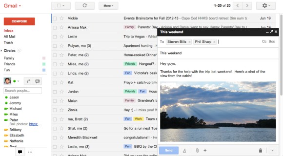
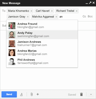
The new interface also brings a feature from Yahoo Mail: recipient boxes that can be removed or dragged and dropped to other fields ("to:", "cc:", "bcc:"). There's a new icon that shows text formatting features, an icon for attachments and a "+" icon for embedding photos, links, emoticons and Google Calendar events.
Google also improved the interface for replying, but it looks like you'll still reply inline by default. "The reply experience has been designed to fit better inline as part of your conversation - replies take up much less vertical height, intelligently expand to fit your content, and always keep the recipients and other controls in view no matter how long your message gets."
To try the new interface, open Gmail, click the "Compose" button and look for the "new compose experience" link right next to the "Labels" button. If you can't find it, you'll have to wait until it's added to your account. For now, you can switch to the old interface if you don't like the changes. Some features are not yet available in the new interface: inserting emoticons and event invitations, adding labels to outgoing messages, canned responses.
Google tried to streamline the "compose" window, so many advanced features will be more difficult to find. You'll have to click different icons to find text formatting options, add events or spell check your text. To send mail from another address, you'll have to "click into the 'To' field, then click the 'From' link to select which address you'd like to send mail from". Gmail is suddenly more difficult to use, but the interface looks better.
{ Thanks, Ben. }

See, that's bass-ackward to me. I want it to be fast, functional and easy to use first. Pretty is a distant second. You'd think a bunch of engineers would know better than to let the marketing department do design for them.
ReplyDeleteI hate, loathe, despise, and abhor these changes. Bring the old gmail back!
DeleteAgreed! Awful, awful, awful...not user friendly, really stupid design.
DeleteAgreed, awful awful, awful
DeleteI do agree with Awfki to an extent, but I think that google have it down to a fine art. Creating great fast systems with nice smooth interfaces that not only get the job done but also ensure that its a nice experience using the app.
ReplyDeleteI just tried the new compose window and it isn't as intuitive as the current version. Too many clicks.
ReplyDeleteThis is a very good development. Like it.
ReplyDeleteMy GOD! I just spent the last 5 minutes trying to switch back to the old compose. Really unfriendly feature.
ReplyDeletePlease tell me how to switch back to the old compose!
Deletehttp://support.google.com/mail/bin/answer.py?hl=en&answer=2645922
DeleteThe concept itself is good but its current execution, unfortunately, is not.
ReplyDeleteIn my opinion, composition window is way too small (feels cramped) and the lack of any meaningful visual context except fuzzy borders and that ugly black header makes it quite arduous to distinguish between different functional screen regions (recipient, subject, message, buttons).
I really do hope Gmail team has the courage to go back to the drawing boards with this one. There is a lot of room for improvement.
I totally agree. I was disheartened to see a message stating that I could switch back but that the old one was going away. I'm so cramped in that little box in the corner. I feel that I'm being punished. lol.
DeleteI quite liked but switched back because the new version has lost the "Tx" button that removes formatting. When I cut and paste into the compose window, the font is often too large or wrong in some other way. I use the Tx button a lot.
ReplyDeleteThe "Tx" button is still there, under the formatting options.
DeleteI agree, concept is good - but canned responses (from gmail labs) does work on the new interface.
ReplyDeleteHow do I switch back?
ReplyDeleteThe bottom right corner of the new compose window has a drop down that lets you go back to the old compose.
ReplyDeleteThis compose is terrible and distracting. The old one made you focus productively on what you were doing.
This looks like a Microsoft app, not streamlined Gmail.
I switched back too. Depending on who I'm emailing, I like to send from different email addresses and the new compose has no option for selecting the 'From' email account.
ReplyDeleteIt looks pretty, but no thanks.
It does. Just click the "from" link next to "cc" and "bcc". If you don't see it, "click into the 'To' field, then click the 'From' link to select which address you'd like to send mail from" (Google's instructions).
DeleteToo many clicks required to do basic things like formatting text, having to reveal parts of the interface via hover, no manual size adjustment, etc. Like other Google "improvements", such draining useful color from the UI, I worry that a less user-friendly product is going be forced on us.
ReplyDeleteI like it except I need to be able to move and resize the new compose box. It's too small and to far right for composing message where I dont need to see the old messages.
ReplyDeleteI went back to the old way so I could forward but also change the subject. Didn't see a way to do that with the new UI. But I would like to try it out some more now, not sure how to turn the new UI back on again. We can keep switching back and forth, right?
ReplyDeleteOh, I found it - just hadn't clicked to compose a brand new email yet...
DeleteAlso now found that the little icon in the top left corner lets you switch between reply, reply all, forward, or "start new conversation" which lets you specify a new subject.
DeleteI guess once you get used to it and know how it works, it may be more efficient... We'll see.
Hi Brian,
DeleteI cant figure out how to Fwd a msg and edit the subject. Can you pls explain how you did this? Thank you!
:)
G mail doesn't allow to send executable files and supports only 25 Megabytes of size.
ReplyDeleteMessages
very sad about this. I write very long emails on a daily basis and even the previous compose window often would feel too small for me.
ReplyDeleteI looked at it, but didn't like it, so I switched back: the compose message view was smaller than what gmail has now (and that's too small), the format is confusing (I've been sending e-mails out for well over a decade - do you think I want to learn how to send them out again?), and the whole layout is too much of a distraction (since you see the inbox while you're typing).
ReplyDeleteAs is the case with pipi lala, I also send out long e-mails on a regular basis (plus I attach pictures to them), so this new change would make doing them even harder.
I never had a problem with having to close a message I was composing, to refer to another e-mail: I merely saved what I was working on, and went to the other e-mail, before continuing to write the first one. It is really easy, and convenient to use.
In short, this new look does nothing to make gmail easier to use, and, in fact, makes one problem I do have that much worse. I don't like it, and do not want to have to use it.
You can pop out the small compose window to a larger version, then maximize that and it's a nice compose experience. But that's too many clicks. I keyboard shortcut for composing in a large, maximized window would solve that problem for me.
DeleteI didn't use this way in-spite of it that i am regular user of Gmail services, after read your post and benefits of this feature i am feeling lucky to be a Gmail user.
ReplyDeletebusiness logo design
Now I can'tcompose emails at all. The compose tab does not work. The screen juat stays the same.This is a disaster forme
ReplyDeleteIt's too small. It works for small, quick emails but if I'm creating a large email, perhaps with copied content etc it just feels WAY too cramped.
ReplyDeleteWhy did gmail change this anyway? If it aint broke...
adding labels to outgoing messages is available now, btw.
ReplyDeleteWould like the Compose window a little bigger and MUST always show CC field (or an option to set that). Having to 'open' this each time is driving me crazy.
ReplyDeleteOverall...I like it. Particularly that the reply compose window expands for larger emails.
ReplyDeleteI haven't figured out how to format links like I used to. As with all ``intuitive'' interfaces, it is really hard to do things functionally as the mechanisms are buried under multiple clicks or tricks. It will be fine after I am used to it, and I like the idea of supporting more searchable e-mail, but too much functionality has been streamlined away! So, a good idea, but perhaps the aesthetics of the design have outweighed the use cases?
ReplyDeleteIn the OLD version, I can't see more than the first 2 letters in my Recipient's Field (To...) so I can't see whom I have listed, if I'm sending to Joe Smith or Jo Rowling, etc., etc. How does one expand it? I just spent 20 minutes trying to forward 3 emails to "Joe" and they were actually going to "J." >:-P And does one really have to click "Forward twice" in order to forward? (i.e. "Click here to forward" and in the upper left of the message? Thanks!
ReplyDeleteTo summarize all the above: There is a yearning from your public for you (Google) to revise your e-mail layout.
ReplyDeleteAnd so far there is no feedback from your side (Google) that you have any inclination to help.
We ALL know that OUTLOOK is a great system:
- The ability to expand the composition area (Beyond a "Small Portal" size).
- Send button, etc stays always in one place and does not scroll up and out of the viewing area.
Just because your layout (Google) seems graphically "with the time," it is not satisfying the feneral public (Based upon all the above remarks).
I really hope Gmail won't make the new compose interface mandatory, because I really don't like it. I almost gave up on Gmail when they changed the look to this awful new design one year ago, and took away our old beautiful themes. I kind of got used to the new look, but this is too much. If they won't let us have a good way to compose messages either, I will have to find another solution to email. Is it really necessary to ruin a great product?
ReplyDeleteI used this for a couple of months to give it a fair chance, but I never got over finding it clumsy and have now switched back. What I really want is full customizability (without writing a userscript that must be changed constantly), but the first step is undoubtedly to make the composer window resizable (and make it remember its size). "Intelligent resizing" means that it does what the designers want, not what I want.
ReplyDeleteUnusable in the current state. New window is too small in the lower right corner, I have to crook my neck to type in it. Very "helpful". Formatting buttons are hidden, citation button is gone...
ReplyDeleteWhy, Google, why do you keep breaking our worflow? It's like there's a traitor in your midst on a mission to drive people away from your products. ...But you're too big to give a damn, right?
I have tried using this on desktop computers which are wide screens and the position of the reply window to the bottom right is just terrible. I am no longer looking straight at my screen. And there is no way to move it either apparently. Gone back the old version.
ReplyDelete@Pawel Wozniak , thanks for that link. I am now back to the old compose. Hated having to drop down menus to just add a cc or change or even see subject etc. Whew, sometimes new is not always better....
ReplyDeleteYeah, that's what we need google--the ability to "compose more than one message at a time". Could you be any more ADD? Going back asap, and not because I'm not for new and improved. But the new has to be an improvement and this one definitely is NOT.
ReplyDeleteThis is to the "engineers" (and I use that word loosely!, decided to introduce a change without notice at 11:30 pm on Good Friday eve, a holiday. Let me assure you that you will never work for a corporation who has customers who pay for service, like a bank. You pull this kind of stunt and you will be out on the street so fast you will be trying to figure out what happened.
ReplyDeleteI do real work on this system. If you don't want me here, just tell me, don't cause me more problems for which I have to find my own solutions. You must have some leftover Microsoft people there; they do the same thing when they "upgrade" software. They sit in their offices thinking, " how can we make this difficult for the users to be productive with this new product?". If that is how you feel, then get a job making buggy whips, where you will affect the least number of people.
The best line I saw regarding this is the message I got when I switched back to the useful format; this change is coming, so get used to it. I guess I'll get used to another email server instead.
Thanks for the memories.
Jim
Fantastic Jim!.. I think you capsulized what all of us are thinking and nagging about.. Maybe the google janitor will pass our opinions on this dumb a$$ decision to those who may be concerned in retaining their customer base..(fingers crossed).
DeleteWhy do Gmail team put "More options" menu in the bottom right but not the top right of the new interface?
ReplyDeleteNow to label an email, I must click 2 times while in the old Gmail interface, I just needed to click 1 time only, it was much faster and more convenient.
You are a bunch of moronic wuckfits. Doing this, as mentioned, on a holiday, when nobody will see it for three days (so that you idiots can say "nobody complained") is worthy of the most horrible NPE. With W8 users can get their Start button back (should they be so stupid to buy it), you are no doubt going to force me into this sh*the interface!
ReplyDeleteGoogle: we only do little bits of evil at a time, so that users get accustomed to it and we can do more evil later...
ReplyDeleteI don't like this new compose popout./popup.
When I first saw this new 'compose' feature I thought my gmail account had been hacked, or that I got a virus or something.
Well, Hotmail forced its whole new look on users a month ago and now Google. All these changes, note the flat minimal look of all the webmail services now, are because of increasing mobile users who need to use webmail without a keyboard. Why not just create another mail interface for them? Let us keep our elegantly designed web mail interface that nothing is wrong for the laptop user!
ReplyDeleteStick this new compose up where the sun doesnt shine .. I will switch emails.. go to hell google..
ReplyDeleteI absolutely hate the new compose, and so glad that I finally found out how to switch back.
ReplyDeleteI hope Gmail doesn't force this change on us. It just doesn't do everygthing the 'good' interface does, and it is just way to small.
ReplyDeleteAt very least they should always give us the opition to keep using the old (good) interface, not make it a temporary change.
@Sterling is right "too many clicks" this new interface is counter intuitive and it lacks of usability, for me that I am an engineer, the old interface has it all that I need at only one click.
ReplyDeleteGoogle, please do not copy Microsoft with the the infamous Windows 8, if you are not sure what to improve, please do not touch what it is currently working fine, please, please.
Normally people is very busy and do not have the time to cick and clik and look and look, all the main functions has to be in plain view, easy to locate an only one click, please, please, restore the old Editing Interface that works wonderful.
Hope Google read all these constructive negative comments and go back to the old interface.
Thank you and regards.
OK - all of a sudden the whole usefulness of gmail interface for composing a quick email got thrown out the window. What were you guys smoking when you dreamed up this change. Are you also unplugging your ethernet cables or T1's and going back to 1200 baud modems?
ReplyDeletePlease provide an option to go back to sanity
Thats the problem Bob, they aren't "smoking" anything (thus the imagination becomes null).. my take on it is that their 'drinking' some bad hooch instead and while that particular indulgence is legal in all the 50 states and outline borders, b'ness decisions and brain pounding hangovers don't mix well (present decision exampled).
DeleteThis is the worst thing Google could do to Gmail. Why fix it if ain't broke? In an effort to "enhance" features, Google is making stupid changes that will hurt it in the long run. I just tried Yahoo mail and I think while Yahoo is adding some useful features, Google is moving in the other direction. Too bad!
ReplyDeleteAwful...
ReplyDeleteI much prefer a full screen for writing an email, especially long business emails. I thought the whole point of tabbed browsing was to make it easier for the user to refer to multiple pages for reference.
ReplyDeleteAll I want is to compose an email in a new tab. I often write multiple emails at the same time and need to refer back to my inbox. How can I switch back to this feature as I'm now wasting my morning.
It must be an April Fools Day joke?
ReplyDeleteNope.. Here it is the 2nd and it's still being pushed on us.. We're the only fools google is targeting.
DeleteI totally hate this. I'm going to leave Google entirely. Goodbye Google, Hello Bing. Goodbye Chrome, hello Firefox. It's Microsoft, Apple, Yahoo or Mozilla for me. What an arrogant F**k our users, F*ck the copyright laws, we know what is best for us, company Google has become. It takes some effort to make Microsoft and Apple seem user sensitive by comparison.
ReplyDeleteI really miss the old compose. I have not yet been able to successfully change the font sizing, type or color on my emails, and am extremely frustrated!
ReplyDeletePlease give us the option to KEEP the old compose box and features.
P-L-E-A-S-E !
agree 100% very, very buggy...changing fonts colours, can't be done retrospectively only on new words typed after you select the colour..
DeleteVery clunky trying to move the cursor or select sections of text.
Switched back to the old interface today..and will abandon gmail..if this becomes mandatory.
Okay, look.
ReplyDeleteAn email is not an instant message, they have different communication requirements, and confusing my interface so that they look the same is dumb.
Please make turning this feature off a normal feature, just like Compact view. Gmail != GChat
I agree shadow.. I don't mind the new look but make it a choice, not mandatory.. I would be happy to retain the old mail and just as happy that those who prefer the new have a choice as well. Good b'ness all around.
DeleteNot everybody is a Facebook chat/chat anything freak, and for Google to make this irritating new interface that appeals to THEM - default for everyone is absolutely ridiculous. I never thought I could feel betrayed by a corporation. It is going to be a long hard goodbye to Gmail if this really does stick. UGH! I hope they are reading these messages.
ReplyDeleteanyone figure out how to edit the subject line?
ReplyDeletewhen forwarding an email?
ReplyDeleteanyone figure out how to edit the subject line?
ReplyDeletefound it: There's a drop-down menu in the upper/right of the reply frame where you can select Reply, Forward, or Start a new conversation (change subject). It's not as obvious as the old "edit subject" link, but it does the same thing.
ReplyDeleteSeems to me it's catering to the 'go-getters' who depend on b'ness tactics that relate to multiple conversations.. The average Joe simply wants to concentrate on one message at a time with options readily available without having to search and click.. I've tried this and at present am not thrilled with it's look or it's function.. I'm going to use the old version until they take it clean away from me then I may find a competitor to make me feel at home again.. Sorry Gmail but you've played a Netflix on your customers.
ReplyDeleteThe newly proposed interface is VERY inconvient.
ReplyDeleteREVERT IT NOW !!!
OR HOTMAIL welcomes me
Sigh..... total cack.
ReplyDeleteThe old interface was way way better
Fewer mouse clicks,
A decent amount of space to compose mails.
...
If I'm writing a mail, why would I want to be browsing my other mails???????? I just want to write the mail and send it.
Please give us the option to use the old interface.
I hat it, how can I use the old one?
ReplyDeletefound it at - http://dottech.org/86145/how-to-disable-gmails-new-compose-new-email-pop-up-window-how-to-guide/
Deletebut is seems that it is only temp , google are going to cancel the old new message compose way.
2 bad, I hate the new one
amirb
Guys, the new UI is not the cherry on the cake.
ReplyDeleteComposing a new email has become a chore, I can't format the content as I used to, I have to look for the formatting buttons and I can't find all those I need/used to use.
Please, if you're so in love with the new UI at least allow for the old one to live for those that choose to use it.
Thank you.
Why can't I add numerous emoticons at a time without having to reopen the emoticon window via numerous clicks?
ReplyDeleteThank the lord that I still have Mozilla Thunderbird and that I use it to do most of my mail. If I had to use this new UI for sending e-mail, I would certainly have to say good bye to G-Mail.
ReplyDeleteI can see where it may fit in better with the smart-phone people but don't leave your old PC-using customers behind.
Does anybody know how to move this new message compose box to another location? Right now it covers my emails. This is really a stupid idea. And, it erases the person's email from the new message box so I can't even see what I'm referring to. IF nobody knows how to move this box to another location, other than covering my emails, can someone suggest the best other email systems to use? Is Bing the best one or are there others? Thank you. Carol Rosin space treaty@gmail.com
ReplyDeletespacetreaty@gmail.com or peacemother@gmail.com HELP PLEASE...this awful gmail system's NEW MESSAGE compose box is covering my emails so I can't see my emails if I try to compose an email. Does anybody know how to literally move the new message BOX to another location? OR, what are the best emails to use if I get out of gmail? ThANK YOU> Carol Rosin
ReplyDeleteYou can minimize the box by clicking the bar or the "minimize" icon. You can also resize the browser window. Another option is to click the "pop-out" arrow icon and open compose in a new window, which can be moved and resized.
DeleteI HATE the new compose system. It autosaves and moves the cursor to the beginning of the line. As long as I have the option to go back to the old compose, I will. When I no longer have the option to go back, I'll find a new mail service UNLESS Google fixes this.
ReplyDeleteBrowser? Google Chrome 26.0 on Mac 10.6.8
Real Bad Bad Bad Bad
ReplyDeleteHOLYMATHA
ReplyDelete