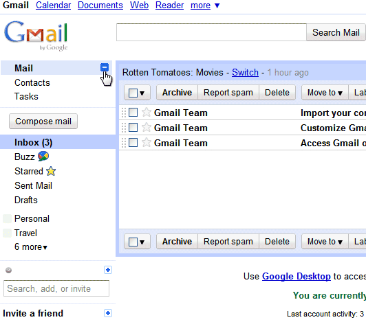
"Overall, there's now a smaller header area that puts the first message in your inbox about 16 pixels higher on the screen than before," explains Google.

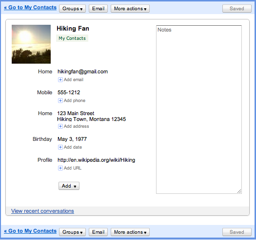
Gmail's contacts section has also been redesigned to better integrate with Gmail. The updated interface supports keyboard shortcuts, saves the changes automatically, adds structured name fields and lets you sort contacts by last name. The notes field is now really big, but I don't think it deserves so much attention.

These features will be rolled out today to all Gmail accounts. The new Gmail contact manager won't be available in Google Apps right now, but it will be released in the near future.
{ Thanks, Sterling. }

Funny, we saw some of this in the screenshot from the Chromium OS bug, from this gOS post.
ReplyDeletefinally!
ReplyDeleteI've been using Google Contacts as my CRM exclusively for about two years, but the slow development was frustrating me. It's good to see that they've been working in the background.
The "Google Voice" under phones option is nice.
I do wish that "Tasks" was a full-screen instead of a pop-up
At this point, however, it's mostly cosmetic. Hopefully they'll add new functionality to contacts soon.
I think it looks like the internal news source (Upcoming Gmail Features) hit things pretty much right on the money.
ReplyDeleteNow all I feel I'm missing (off the top of my head) is the Gmail/Google Voice VoIP phone icon and functionality.
Any word on when that will get put in?
Bueno, valió la pena aguantarse a gmail caído toda la mañana y parte de la tarde :P
ReplyDeleteKind of a minor thing, but I like that Compose will now be a button instead of a link. A link implies a place to go, while a button implies action.
ReplyDeleteI'm not seeing it yet, but that's no surprise.
ReplyDeleteWhat I would like to see in the Contact manager is a more "social" way to link your friends. Couples and kids are the obvious ones, but I'm looking for something that more intuitively manages related groups of people - more intuitively than manually created groups I mean.
Great! The only inconsistency is that Buzz should be under Tasks or Mail, not below the Inbox as if it were part of Mail stuff. Otherwise, a nice improvement :)
ReplyDeleteDoes anybody know, what "File As" in contact menu is for?
ReplyDeleteStill not seeing the new interface updates here in Canada. Hope they are rolled out in the morning!
ReplyDelete@roody102: I don't see that option in the new Contacts page. Where is it?
ReplyDeleteBTW, love the skyscraper photo on your blog :-)
@ jasonvaritekfanL It's in "Add" dropdown menu, when You edit any contact.
ReplyDeleteThe skyscraper is not a photo - it's only a computer picture (the one in the middle). The text is about problems with builiding permitions. It's Daniel's Libeskind project in Warsaw, Poland.
I see no ability to delete or rename contact's group anymore.
ReplyDeleteSelect a group, click on "More options" and you can rename it or delete it.
ReplyDeleteOne thing I’m missing is the dynamic search, which was a nice feature for me and it took me a while to figure the pagination :).
ReplyDeleteI noticed something else, which I could not find before and I was really hopping they will incorporate. Under chat, you search for a contact and under Video&More you have contact details now – nice. You have to move just to one page.
Oh, I haven't noticed that :) Thanks, Alex!
ReplyDeleteOk now:
ReplyDelete1) Move up Buzz with Mail/Contacts/Tasks
2) Change to a fullscreen Task Manager
3) Add a fullscreen simple "Notes" manager (with a link below tasks)
That would make me very very very happy
Can´t believe that there is no sync between Google contact picture and picasa name tag thumbnail ?!?!?!?
ReplyDeleteContact thumbnail on first side would be nice
Does GMail still rely on Adobe Flash for some parts (sounds, attachments) ?
ReplyDeletehttp://mail.google.com/support/bin/answer.py?answer=99915
As usual, paying Google Apps customers get the new features last … :(
ReplyDeleteAmen Martin from another Google Apps user.
ReplyDeleteOne thing I would really like to see in Google Contacts is the ability to share contacts - either the whole address book or the option to share a group or even an individual contact with another GMail (or Google Apps) user. Take it one step further and specify what edit permissions other users have, similar to what you have in Google Docs. I could see this being very useful in maintaining a customer file between multiple users. Everyone would (in theory) have the most up to date info and each person could update the notes section of the contact record.
Great to see that First Name / Family Name fields are now available in Contacts... overall nice clean up for both Gmail and Calendar.Looks great!
ReplyDeleteWould it be possible to allow for the Drag and Drop of the "modules" on the left side to the right side...
Yahoo has infinite In Box for their email service...how about and even 10Gb for Gmail?
Google Notebook, I really enjoy using it... please bring back support for Google Notebook!
Cool, I see I can add relationships to a person. Although it doesn't link them to that person if they're in my contacts too. And some of those relationships could use dates (like adding a Spouse should add a "Wedding" or Anniversary date and apply it to both - if they're both contacts). But I like where Contacts is going!
ReplyDeleteArgh, I just noticed that the select: "all, none, read, unread..." buttons have been moved to a drop-down. Somewhat irritating to have to use an extra click each time I want to change selections.
ReplyDelete"file as" ?
ReplyDeletewhy in the world would this not be linked with google voice so that one could call a contact directly without having to jump to another contact list?
ReplyDelete@tom It's a Microsoft Outlook thing (maybe others too). You could File As: First Last; or Last, First; or Company Last, First; or ...
ReplyDeleteAnd then if you sync to a PDA or phone that doesn't have as many fields as Outlook it will use the File As for a simple Name & sorting field.
The search-as-you-type feature in Contacts is gone. It was never available in Apps anyway, but it was convenient to have at least in gmail. Hey, Gmail team, how about putting it back? :)
ReplyDelete@roody102; @tom: I have no idea what File As does. I tried editing a contact and once I was done, I had no idea where that contact went! LOL It was removed from my Contacts list and I had to go search for the contact and remove what I had entered in the File As field to get that contact back on the list.
ReplyDeleteI think Schulzter might right.
@roody102 -- Re: the skyscraper. I thought it was a real building. It looks cool.
@Alex: Thanks for the tip on renaming a group. I'm still getting used to the new Contacts layout.
Its just a feedback to the new design.
ReplyDeleteI love the new design, but found one small error(according to me),
The "Compose mail" button has small 'm' in mail.
Which is inconsistent to "Search Buzz", "Sent Mail" , "Send Invite".
They may want to change it to capital M :-)
I Still don't have interests over the streamlined gmail interface... My friends and coworkers use facebook a lot and if only they can integrate it to gmail then it's much easier for me to get a solid contact list
ReplyDeleteWhew! I just noticed a very interesting and weird thing: I added a Google Voice number to a contact in Gmail, and when I went to see that contact in the contacts in Google Voice (which is, as a matter of fact, not yet updated) that number automatically appears labeled as GrandCentral!
ReplyDeleteContact's thumbnails must be sync with picasa's thumbnails !! Easy to do and very usefull, so please do it Google :) . And even possibility to add contact's thubs from picasa PRIVATE albums (not only public albums !)
ReplyDeleteThe "Mail" and "Inbox" link points to the same thing, which is inbox, y do we need redundancy???
ReplyDeleteWhy doesnt gmail gives a proper drop down specifically for label, like they have done for "Mail"
Love it!
ReplyDeleteSize of chat: tiny, small, etc.
There's no option for either Online or Offline? Common sense...
Thanks :)
@Anonymous:
ReplyDeleteThe "mail" and "inbox" links point to different things. "Mail" sends you to the most recent Gmail page you've visited before switching to the contacts app: it could be the inbox, one of your labels, a message etc.
@Anonymous:
Yes, there is. It's called "sign out of chat".
Sorry, I mean if you can sort contacts by Online/Offline, instead of -Tiny, Small, Medium, Large- :) Thanks
ReplyDeleteReally not liking the field size for the phone numbers. Most of my contacts have area code listed with them ie. 123-456-7890 or 1(123)456-7890 and the last digit of the phone number is being cut off. I can see it if I click on the number and scroll right, but thats annoying.
ReplyDeleteWhat @GRC said. You can use Google Apps to set up sharing, but it makes so much more sense to share them like Google Docs.
ReplyDeleteAlso, the Groups menu has been improved with check boxes. But if you have more than just a few groups it becomes a scrolling menu, which is a pain.
A couple more things I'd like to see:
ReplyDelete1) a flag for the default e-mail address (I keep outdated addresses on file for a contact so I can keep their conversations grouped together but I never want to send an e-mail to that address again).
2) Move the Compose button to the header above the e-mails, where all the other buttons are!
@alex chitu, i agree what u say, but still, dont you think its redundant, cuz anyways, u have to click once to go to any other page..... i seriously dont see, how's that gonna help me better?
ReplyDeleteI absolutely agree with the Anonymous person higher above who said:
ReplyDeleteOk now:
1) Move up Buzz with Mail/Contacts/Tasks
2) Change to a fullscreen Task Manager
3) Add a fullscreen simple "Notes" manager (with a link below tasks)
I would add - use the (allegedly discontinued) Google Notebook for #3!
That would make so much sense!
Super ! c'est mieux ainsi !
ReplyDelete@vacilando, Yes
ReplyDeleteHow do I browse my contacts by group now? If there is a way in which to select a group instead of searching for it, let me know. If not, this refresh was wiped down with a sour rag and the stench lingers.
ReplyDeleteIm using HTML in google crome,what good is Gmail If yur missing,
ReplyDeletemissing add a contact,missing contact manager button, missing Import & Export button.
Note! Google is directing me to HTML.
And standard http will not boot up.
What's Googles problem! NOW.
I put high value on the Notes area. In Outlook I used this space for client notes, it often got quite long. Google, I'd like to see Notes support links.
ReplyDelete