An unofficial blog that watches Google's attempts to move your operating system online since 2005. Not affiliated with Google.

Send your tips to gostips@gmail.com.

June 20, 2012

Gmail's New Custom Themes

When Google released the new Gmail interface, one of the missing features was custom themes. Now you can create your own themes, but they're very limited as you can only choose between a light or dark interface and pick a background image.

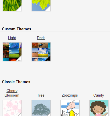
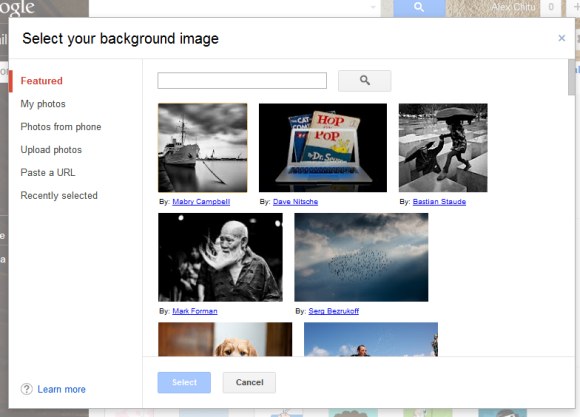
To try the new feature, click the "settings" button, choose "themes" (or use this URL), scroll down to "custom themes", click "light" or "dark" and select an image. You can pick one of the great featured images from Picasa Web, choose one of your photos, use the search feature, upload an image or paste a URL. A similar interface is used for Google homepage's custom background feature.
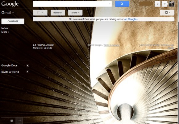
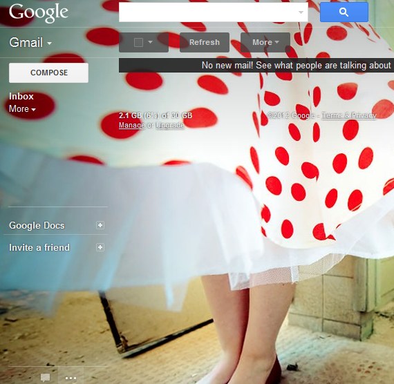


You'll probably notice that custom themes are just like Gmail's HD themes launched last year, except that you can choose your own image. "Themes are now implemented as semitransparent layers on top of a large background image. Each theme uses either a dark or light variant of most UI elements to balance legibility and visibility of the background image, allowing the background image to peek through and provide color and personality," explained Google at that time.

Gmail's new themes are more adaptable and show the entire image, but you can't customize colors, fonts and all the other details of the interface. The old custom themes feature allowed you to "select colors for everything from the background of your inbox to link text".

{ via Gmail Blog. Thanks, Sterling. }

June 14, 2012

YouTube Tests a New Homepage Interface

YouTube experiments with a new design of the homepage. The left sidebar now lists all your subscriptions and you can see the number of recent videos from each subscription. There's also a search box that lets you find a subscription. The sidebar no longer includes popular YouTube categories and the suggested channels are displayed below your subscriptions in the scrolling list.

Another change is that the videos from your feed take up a lot more space because the thumbnails are bigger. The new interface lets you hide videos from the feed, a feature that used to be available in the previous YouTube UIs. YouTube also shows a small "watched" label over the thumbnail after playing a video.

Here's the experimental UI:


... and the existing homepage:


Here's how you can try the latest Google experiment. If you use Chrome, Firefox, Opera, Safari or Internet Explorer 8+, open youtube.com in a new tab, load:

* Chrome's JavaScript console (Ctrl+Shift+J for Windows/Linux/ChromeOS or Command-Option-J for Mac)
* Firefox's Web Console (Ctrl+Shift+K for Windows/Linux or Command-Option-K for Mac)
* Opera's Dragonfly (Ctrl+Shift+I for Windows/Linux or Command-Option-I for Mac)
* Safari's Web Inspector (how to do that?)
or
* Internet Explorer's Developer Tools (press F12 and select the "console" tab)

and paste the following code which changes a YouTube cookie:

document.cookie="VISITOR_INFO1_LIVE=pfnTZqEKHEE; path=/; domain=.youtube.com";window.location.reload();

Then press Enter and close the console. To go back to the standard UI, follow the same steps, but use the following code:

document.cookie="VISITOR_INFO1_LIVE=; path=/; domain=.youtube.com";window.location.reload();

There are many improvements in Google's experiment, but the information density is pretty low and you have to keep scrolling down to see more videos.

Update (December 7, 2012): The new interface is available for everyone and you can no longer go back to the old layout.

{ via TechnoNet. }

June 13, 2012

The Chromebook Ultrabook

A few weeks ago, Samsung released the new Chromebook and Chromebox, a small desktop PC that runs Chrome OS. The new Chromebook focused on performance and, even though it's more expensive, it's no longer a netbook. It's almost an ultrabook.

Instead of using an Intel Atom N570 processor with really poor integrated graphics, the new Samsung Chromebook 550 uses an Intel Celeron 867 processor with much better graphics. From an Atom CPU to a Sandy Bridge CULV processor, there's an important step up. Intel Celeron 867 is a low-end processor that lacks many features that are available in Core i3/i5/i7, but it's 3 times as fast as the old CPU (according to Google).

The new Chromebook doesn't meet Intel's requirements to be called an ultrabook, but it's almost there. It has an Intel Core CULV CPU, the height is 20 mm instead of 18 mm and the battery life is more than 5 hours (it's actually 6 hours).


The old Chromebook was pretty expensive for a netbook, but the new one is cheap for an almost-ultrabook that actually has a matte screen, a great keyboard, a powerful touchpad, it boots almost instantly and is not hindered by an operating system that gets in the way. Now that Chrome OS has a more familiar interface and Chrome can run native apps, the new Chrome devices could gain more traction.

Ode to ICS

Apple showed that a great interface can change the way you use a mobile phone, but Android's team didn't take this seriously until ICS. Android has never been about multitouch interfaces, intuitive apps, polished and refined user experience. Google spent a lot of time adding new features, powerful APIs, improving Android's performance, but the interface wasn't a priority. OEMs created their own interfaces, but something was missing.

Ice Cream Sandwich changed everything because it finally added the "soul" to the machine. The interface is consistent, there's a coherent design language that connects so many disjointed pieces and makes using an Android phone a pleasant experience. ICS is great because it removed Android's rough edges, it brought hardware acceleration, fluid and responsive interfaces that make you use the device more often.

Matias Duarte and his team certainly deserve the Gold prize for best system experience received at the 2012 User Experience Awards. ICS is not just "a major user experience step in Android's evolution", it's actually Android redefined.

Google Hot Searches

Google has a new interface and a name for the Hot Trends feature: it's now called Hot Searches, it includes fewer searches and fewer links to relevant news articles.

"Hot Searches has gotten a refresh that makes the list of searches more visual, groups related rising search terms together and lets you see more information about those searches," explains Google.


For the first time, Google shows an estimation for the number of searches, so we can find out that more than 500,000 people searched for [Apple] yesterday in the US. For some reason, Hot Searches doesn't integrate with Google Trends and Google shows thumbnails from news articles instead of charts.

A Blessing in Disguise for Google Maps

The next version of Apple's iOS includes a new maps app that's no longer powered by Google Maps. Apple now uses data from TomTom, OpenStreetMap, Yelp to provide a more comprehensive experience that rivals the Android app for Google Maps. Apple Maps offers turn-by-turn directions, Siri integration, local business reviews from Yelp, "flyover" 3D maps.

Flyover lets you "see major metro areas from the air with photo-realistic, interactive 3D views" and it's a clever combination of Google Earth and Street View. Last year, Apple acquired C3 Technologies and used its technology for the 3D maps.


Obviously, Apple's new maps app no longer includes Street View, Google Transit, Google's comprehensive maps and local search and many users will miss these features. Google will lose a significant amount of mobile traffic and an important data source for Google Maps, but it will be able to release a much better Google Maps app, assuming that Apple approves it. After all, Google Maps is one of the best apps for Android and Google has constantly added new features, while Apple's maps app hasn't improved too much.

May 16, 2012

Googlepedia

As previously anticipated, Google introduced Knowledge Graph, a new way to handle queries that replaces keywords with objects. It's like replacing a dictionary with an encyclopedia.

"The Knowledge Graph enables you to search for things, people or places that Google knows about—landmarks, celebrities, cities, sports teams, buildings, geographical features, movies, celestial objects, works of art and more—and instantly get information that's relevant to your query. This is a critical first step towards building the next generation of search, which taps into the collective intelligence of the web and understands the world a bit more like people do," explains Google.

For now, you'll only notice a new info pane in the right sidebar that shows more information about your query. Google's graph has 500 million objects and 3.5 billion facts, so you'll see the new section quite often. Google shows a small thumbnail, a snippet from a Wikipedia article, a few relevant facts and some related queries. It's just like a Wikipedia infobox automatically generated using data from the Web and that's smart enough to only show important facts and hide the things people won't need.


The new info panes will also help users disambiguate queries just like Wikipedia's disambiguation pages help users find the right articles.


Wikipedia's internal links help you find other interesting articles. Google also adds links to all the other objects from the graph.

Some may say that Google borrowed too many ideas from Wikipedia, but that's one step that could help search engines evolve. Understanding the relation between entities and learning their attributes allows Google to answer more complicated questions and get better search results. As Mashable says, "the transition from a word-based index to this knowledge graph is a fundamental shift that will radically increase power and complexity."

Google "begun to gradually roll out this view of the Knowledge Graph to U.S. English users. It's also going to be available on smartphones and tablets". If you don't see the new features yet, check back later.


{ Thanks, David. }

May 15, 2012

New Interface for the Google Q&A OneBox

Google's OneBox for instant answers has a new interface that emphasizes the results. Google now displays the answer on the first line and the font size is bigger.


The Q&A OneBox now shows multiple answers for questions like [What is the cast of The Help?] or queries like [the dictator actors].


Until now, Google used the following template: "Best guess for ... is ...".


Just because Google no longer mentions that the answer is a "guess" doesn't mean that it's always accurate.


Research Sidebar in Google Docs

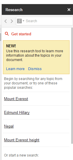
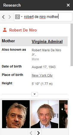
Google Docs has a new feature that lets you find more information about some of the words from a document and also add content from the Web. The research sidebar can be enabled from the Tools menu or by using the shortcut Ctrl+Alt+R (Cmd +Opt+R for Mac). You can also select one or more words from the document, right click and select "Research" from the menu.


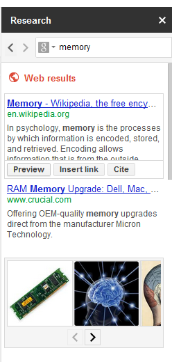
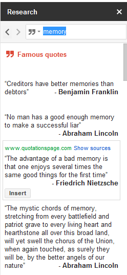
The sidebar includes the top Google search results, image search results, facts, maps, reviews and famous quotes. Click the icon from the search box to restrict the results to images and quotes.

When you mouse over a Web search results, you can preview it, insert a link or cite it. For example, you can select "Google" from a document, press Ctrl+Alt+R, mouse over the top result and click "insert link" to add a link to Google's homepage.


Restrict the results to images to quickly add an image using drag and drop. Google also has a specialized search engine for quotes and you can also add them to your document.


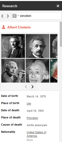
Search for a famous person, a place, a concept or any other entity and Google will display a list of attributes above the search results.


Maybe Google will also add features like translation and definitions to the research sidebar, so you can quickly find them.

{ Thanks, Scott and Evan. }

May 14, 2012

Google Tests a New Interface for Info Panes

Last year, Google started to test a new sidebar that offers useful information about your query. As the Wall Street Journal mentioned in a recent article, Google will soon "present more facts and direct answers to queries at the top of the search-results page". There's a large database of entities and each one has a list of relevant attributes.

For example, you could search for [California] and Google displays the capital of the US state, a list of important cities, attractions, the Secretary of State, a map and a snippet from Wikipedia. Google continues to test the info panes, but the interface has been updated, the main thumbnail is smaller and there's more information that's displayed. For singers, Google displays a long list of songs and some important albums.


Google's experimental sidebar is similar to Wikipedia's infobox, "a fixed-format table designed to be added to the top right-hand corner of articles to consistently present a summary of some unifying aspect that the articles share and sometimes to improve navigation to other interrelated articles". It includes structured information about your query, related queries and links to all the topics that are mentioned. Google will look more like an encyclopedia.

{ Thanks, Anirban. }