There's a new iGoogle interface that's only available to a small number of users. Google dropped the rounded corners and only shows the controls when you mouse over a gadget. Another change is that gadgets have a small icon next to the title.
Avery M., who sent this tip, noticed the new interface when visiting
iGoogle Japan, but that could be a coincidence.
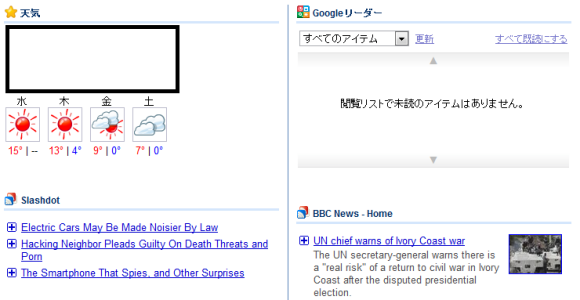
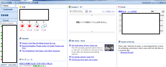
{ Thanks, Avery. }


love it
ReplyDeleteI think Google should have kept the round corners and I also think you should be able to change the icon.
ReplyDeleteI've actually seen this as well on one of the browsers I use at work. I'm in the UK. I like it. Cleaner.
ReplyDeleteWhen can we get ssl support for iGoogle pages?
ReplyDeletethis showed up on Firefox of my work computer in the US about 2 weeks ago. Absolutely love it. I have been waiting for an iGoogle refresh forever, the dopey rounded corners just piss me off after awhile. This is much, much cleaner.
ReplyDeleteHum... Seems the good and old times (and interface) of AOL...
ReplyDeleteHug,
Joao H. Priesnitz
When using Safari on my Mac Book Air I see the new design, when using Google Chrome on the same Mac Book Air, I see the old design.
ReplyDeleteStrange :-)
When are they going to get rid of the ridiculous left side tab bar so people without wide screens can actually use igoogle properly.
ReplyDeleteCome on Google, just make it optional ffs.
To be candid, I forget the last time I used iGoogle. I think I've gotten pretty jazzed about it a couple times, and each time that excitement fizzled after a couple days.
ReplyDeleteI have iGoogle! :D
ReplyDeleteYes, yes, yes. I love it.
ReplyDeleteI noticed this new style in firefox on my win 7 system at home and did a quick search to see why it was different and found nothing until I noticed this story. The new style is very nice and very clean looking. It actually had me scratching my head and was wondering if it was something I had installed to make it look different
ReplyDeletehow about updating the google.com page... and also the homepage in other languages needs better translation because it´s half-way done half in english e half in the other language...
ReplyDelete