Picasa Web Albums has a new zoom viewer that uses Flash. If you click on the magnifying glass icon next to a photo, you can select a rectangular region from the image and zoom in or zoom out. The feature is called "microscope zoom" and it doesn't fall back to the old version for users who haven't installed Adobe's Flash plugin.

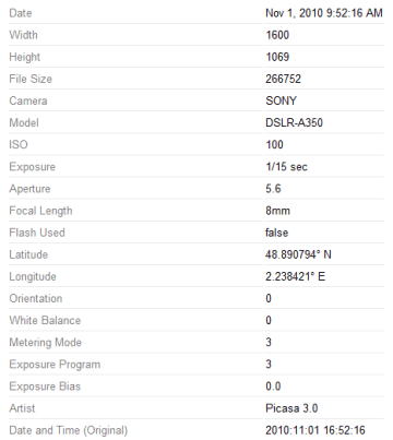
Another new feature lets you view all the EXIF tags that are available by clicking on "full details page". You'll find a lot of tags that offer more information about white balance, orientation, exposure, color space, brightness, light source and more.

{ Thanks, Bogdan. }


great !
ReplyDeleteIt will now zoom to 100% - whereas previously it only displayed a 1600 pixel image.
ReplyDeleteWhy Flash instead of HTML5?
ReplyDeleteHandles large photos well - it progressively loads in the background. For example, this image is 33 megapixels.
ReplyDeletePity the viewer doesn't use the full display size.
wonder why flash and not silverlight's deepzoom which already does this out of the box?
ReplyDeleteNow if only they could fix the broken nametags... they're still not being counted correctly, and you still can't change the default picture for each person as you could before.
ReplyDelete@sAmmy Presumably because "Silverlight penetration is around 60 percent as of May 2010. These numbers also show that most who have Silverlight installed on their system have not yet upgraded to the latest version. As of May 2010, only approximately 2 percent of all Web users have managed to upgrade to Silverlight 4." http://www.ehow.com/about_6561086_silverlight-vs_-flash-penetration.html#ixzz19QwAbfbx
ReplyDeleteI was kind of surprised they didn't do it with HTML5+JS ... but again, more users (96.31% according to the linked article) have Flash installed than can view standards-compliant HTML5+JS.
While I appreciate the move toward a fit-to-browser-window method of magnifying individual photos, this new feature nonetheless remains quite buggy. Here are my specific concerns:
ReplyDeletehttp://www.google.com/support/forum/p/Picasa/thread?tid=473c9ade0154cae2&hl=en
This is well annoying. Why take a feature that works fine and change it to use Flash? This is completely opposite to what I thought Google's philosophy was. (You know, standards and stuff.)
ReplyDeleteAnnoyed. You couldn't save big picture after all.
ReplyDeleteI'm beginning to think that Google's UI designers are double agents intent in torpedoing the company.
ReplyDeleteThis change is horrible from a user's point of view.
First, once you zoom in there are no options of going to the next, previous or any other image, so you have to close the pop up (why Google seems to be infatuated with pop-ups as of late I can't understand), go to the next photo, open the pop-up zoom and wait for it to load the image.
Second, there's no loading indication, so you have no idea how long you have to wait for the image to load, can be 5 seconds, can be 5 minutes, no idea. Just sit and wait for it.
Third, you can't save the image or get a direct URL for it, the photos I have are to share with people and friends, I'd like them to be able to save them as they see fit.
Fourth, the + and - buttons on the top right are redundant and don't seem to work well, so I have no idea what are they doing there except confusing people.
Fifth (?!), the zoom only goes up to 100%, many times is desirable to zoom in on an image to more than 100%; but sorry, can't do.
There's also the issue of using Flash when some networks block flash content, someone mentioned the default zoom displays small pictures fuzzy, there's no image file name, etc, etc...
It's remarkable how many things they got wrong in something so simple.
Here's a suggestion, make the zoom, or for that matter the gallery view the same as the Picasa image viewer, it would be much easier to navigate (or just plain possible!), and it would integrate seamlessly with the Picasa application, which is such an obvious UI advantage that I can't imagine why is not how they made it to begin with.