When you mouse over a search result, Google shows a bigger Instant Preview icon in a vertical bar. Mouse over the bar, and you'll a large screenshot of the page, the links to the cached paged and other similar pages and the Google +1 button.

Like the previous variation of the experiment, Google's header and the search options sidebar are sticky, so you'll see them even if you scroll down. It's the perfect interface for implementing infinite scrolling, which is also tested in a separate experiment.


{ Thanks, Herin. }

... I want this.
ReplyDeleteSticky sidebar and header? Want.
ReplyDeleteIcon-less interface? Do not want.
I have an interface that remove all the links except the +1 button. The interface don't have infinite scrolling.
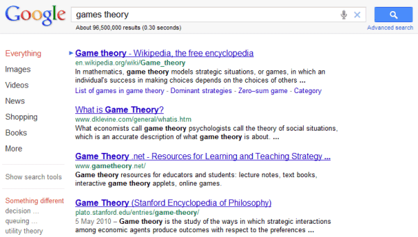
ReplyDeletehttp://i.imgur.com/g3Fs4.png
Good to see the annoying +1 buttons disappear from the results list. They add no value IMO, as I don't +1 a page before I even visited it, and it's highly unlikely that many users navigate back to the results page in order to +1 the page.
ReplyDeleteYou don't, but I do, it has saved me to visit commonly visited websites to +1 , even though they don't have a native +1 button.
ReplyDeleteWe cannot define it to be a cleaner interface. If hovering on the result would display the web page then it completely distracts the user. If a click displays that should be fine.
ReplyDeleteIt's less cluttered with images, buttons and links that are rarely used.
ReplyDeleteHere's how to use this interface: http://tecno-net.blogspot.com/2011/08/google-prueba-una-nueva-interfaz.html
ReplyDeleteThis looks much, _much_ better. Combine this with infinite scrolling and Google's on to a winner. The +1 buttons are utterly pointless before I've even visited the page, and I always thought the other icons were unnecessary. Nice move - roll it out!
ReplyDeletePlease get rid of the +1, I really don't like it either. It really is pointless.
ReplyDeleteI liked the original interface better than any of these recent examples
ReplyDeleteI really think they should NOT get rid of the icons. That would be really annoying.
ReplyDeleteI really think they should NOT get rid of the icons. That would be really annoying.
ReplyDeleteIt's a much better interface, less cluttered with things I don't use at all. Would definitely want to use it.
ReplyDeleteI have it, it looks awesome.
ReplyDeletei do not like the result with a large screenshot of the page, it make the search result too compress and not so beautiful, maybe Google should implemented something like a preview picture when people hover long enough on the resulted search ( maybe 2 to 3 seconds)
ReplyDeleteGoogle launches a similar interface today: http://blogoscoped.com/forum/180547.html
ReplyDelete