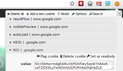
Here's how to do this in Chrome:
1. Install "Edit this Cookie", a cookie manager for Chrome.
2. Go to Google's homepage and click the yellow cookie icon from Chrome's toolbar.
3. Find the line that starts with NID, click it, select the value (Ctrl-A or Command-A for Mac), delete it, paste the following value (use Ctrl-V or Command-V for Mac) and click "Submit cookie changes":

Here are the instructions for Firefox:
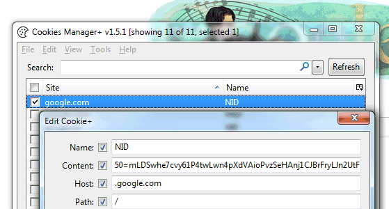
1. Install Cookies Manager+ and restart the browser.
2. Go to Google's homepage.
3. Press Alt-T and select "Cookies Manager+". You'll also find the option in the "Web Developer" item of Firefox's unified menu.
4. Search for google.com and find the entry named "NID". If you're not in the US and you use a different Google domain, search for your domain (for example: google.co.uk in the UK).
5. Click "edit" and replace the content with:

Opera already has a cookie manager that lets you edit cookie values. You only need to go to Google's homepage, right-click on the page, select "Edit site preferences", go to the "Cookies" tab and edit the item that starts with "NID".
I couldn't find some great cookie managers that worked in the latest versions of Internet Explorer and Safari, but the instructions should be similar.
Sharing the "NID" value allows other people to try an experimental Google interface. The next time when you find an interface that looks different and you send a tip to gostips@gmail.com, you can also include the NID value of your Google cookie.
If Google constantly changes the "NID" value and you can't use the experimental interface for too long, delete your Google cookies and start again. What if you don't like the interface and you want to go back to the regular UI? Just remove the "NID" key or delete its value using the cookie manager.

it seems to work for me but scrolling is broken! screenshot:
ReplyDeletehttp://i.imgur.com/AzUUv.png
Everything works fine here.
ReplyDeleteWorks fine for me
ReplyDeletejust like S scrolling now goes above search box.
ReplyDelete@S & @Laurie
ReplyDeleteThe same happened to me when I randomly got the fixed header experiment about a week ago, and I found that refreshing the page fixed it (or Ctrl+F5 to clear the cache and refresh; Shift+F5 on some browsers if I remember rightly). I guess a different CSS file or something needs to be loaded to the one in the cache.
Seems not to work very well with Chrome 14.
ReplyDeleteThe NID value gets changed constantly.
opera sucks
ReplyDeleteIs seems to only work for the first couple of letters I type in. some times it will work for the whole search I am trying to do. It always stops working when I press enter. I then have to repeat the process.
ReplyDeleteAlso the delete in Ctrl+a delete Ctrl+v is is not needed as just Ctrl+a Ctrl+v will have exactly the same effect.
ReplyDeleteIf you select "Set as readonly" the new interface doesn't stop working
ReplyDeletethere is a lot of change centered around Google+ and public profiles, the 'dashboard' included...google is looking for what facebook has, lots of personal data for advertising..
ReplyDeleteHonestly speaking, I tried this new interface but only after few searches I deleted the cookie.
ReplyDeleteNew interface is good to play however it is not in line with the Google philosophy of leaner and efficient interface.
Google tests another new interface with "Search" title below de Google logo. Here's how to use this new interface (three different tests): http://tecno-net.blogspot.com/2011/08/google-prueba-otra-nueva-interfaz-con.html
ReplyDeleteand for IE on Windows 7: navigate to C:\Users\USERNAME\AppData\Local\Microsoft\Windows\Temporary Internet Files. You might have to set Explorer to show hidden files and folders!
ReplyDeleteFind the Cookie:USERNAME@google.co.uk/ and doubleclick to open. Replace the NID value with the one above, save the document and enjoy the new interface
PS The only difference I see is that I have a location and a "the web" entry at the top of the list in the left pane, otherwise my google search pages already look like in the screen shot in the post..........
Thanks for sharing.
ReplyDeleteververy thanks
ReplyDeleteGoogle launches a similar interface today: http://blogoscoped.com/forum/180547.html
ReplyDeletethank you for your post. i'm searching this for hours
ReplyDelete