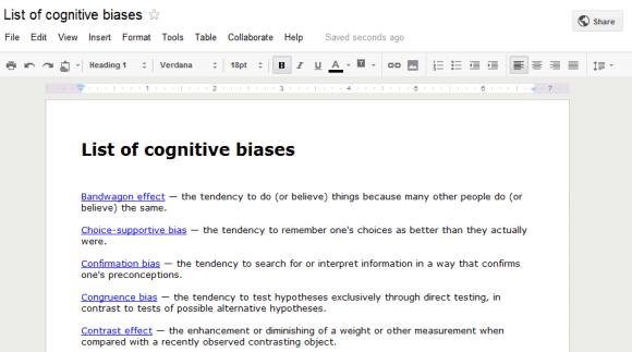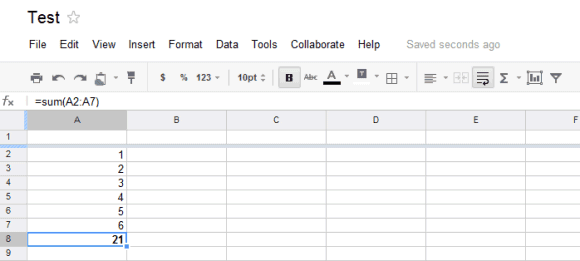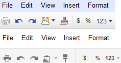


The new grayscale buttons from the toolbar make it more difficult to find the right feature. They're are less intuitive, harder to distinguish and look like disabled buttons. Compare the two versions of the "paint format" button (the fifth button):

Unlike the new interfaces for Gmail and Google Calendar, the updated Google Docs apps don't use too much whitespace. You can switch to the new interfaces by clicking "Try now" in a small message that announces the changes when you open a Google Docs document or spreadsheet. To go back to the old UI, choose "Use the classic look" from the "Help" menu.
In other related news, Google Sites also tests a new UI:

{ Thanks, András, Louis, Thomas and Cougar. }

I would like Google to resist devoting resources to redesigning the interface yet again, and to instead add some much-needed functionality, such as the ability to define styles.
ReplyDeleteI do not mind changes in the interface. There nothing really that radical here. It does look a bit more professional through. Same with all the other updates.
ReplyDeleteI didn't think I would like this but i think I do. First off yes there is no color, it blends in. I think that would be the way they intended, as the thing that stands out the most now is the document itself. I'm just saying if it puts the focus on what I'm creating, rather than the tool I'm using, sounds good to me.
ReplyDeleteFor who ever dares to think this is simply just another mindless change just like any other, you have no clue how absolutely slow and wrong you are. This changes has improved the loading speed of the documents by a 55% and allows any web browser to handle more then 148 documents at the same time.
ReplyDeleteThe new scrollbars are buggy too... If you scroll by middle clicking and moving the mouse, you can scroll infinitely in any direction.
ReplyDeletei'm not so used to the apps but i guess i could learn to do just that.
ReplyDeleteI happen to like the greyscale UI. I think they could darken the shade of grey on some buttons, since it makes them look as if they are disabled, but that's probably my only complaint.
ReplyDeleteI liked it!
ReplyDeleteLove the new UI's, keep em coming!
ReplyDelete+Alex. Here's a question: Why did the Docs team decide to hide the current sharing information behind the share button? Would it really clutter the interface _that_ much to have that information always visible (such as when the last edit was/by whom), right under the share button?
ReplyDeleteI thought this was a big security improvement in the old version, and they cut it out, I assume, too avoid clutter(?).
That was faster than expected! I really like it, just wish that:
ReplyDeletea) You could choose between thumbnail/list view like before
b) You could sort/filter by file size.
Keep updating us :D
I like the new Docs look. I think Google's new interface can be too "white" in some areas, like in Gmail with the "Preview" theme, but overall, I like the new look.
ReplyDeleteThe article and the first poster have hit the nail on the head, in my view. Google should be concentrating on fixing the many underlying problems, not fiddling with the user interface in response to someone on high dictating that there is "too much clutter".
ReplyDeleteThis latest UI change is absurd. Sensible use of colour is always helpful Here, all colour has been drained out of the menus. It's harder to use and a strain on the eyes. Absolutely awful.
I'm all for Google improving and standardizing their UI, but I find as in iTunes, the lack of colour in the icons makes it more difficult to quickly identify which button I want. I think I'm going to switch back to the old interface for now. Thanks for keeping an eye on the GOOG!
ReplyDeleteWhat are you on about? all the actions are obvious and easily distinguishable it is also very elegant and much less distracting.
ReplyDeleteNote that this doesn't apply for presentations...
ReplyDeleteotherwise I like the loading time of the new interface ^^
THANK YOU for describing how to get back to the old app interface!
ReplyDeleteI like the Google redesigns in theory, but I'm totally disappointed in their execution. Google has impressively created a design which simultaneously shows less information on the screen yet makes it *harder* to pick out the information you're looking for.
Color and contrast serve a purpose and direct the eyes toward the most important bits. When everything is gray or white, it's difficult to know intuitively where to look. When there is so much white space between documents in the document list, it creates more work for the eyes as you scan through.
I understand what Google is going for. They think that showing less information on the screen at once is "decluttering." Clutter comes in many forms, though, and contrast - which the old design did quite well - is a powerful tool to address it.
I wanted to switch back to the old design immediately after trying the new app design on one of my spreadsheets. Thank you for showing me how. I can only hope Google is paying attention and that the final designs don't throw out the baby with the bathwater.
I should add, though, that the one thing I do like about the new design is the faster loading time. That's still no excuse for reduced usability.
ReplyDeleteEverything there is too fucking big.
ReplyDeleteDid they try to use it on the small screens or tablets? It's awfull.
Awfull.
ReplyDeleteAlas.... where are those colorful Google days
ReplyDeleteDoesn't work well in chrome either. I can't select multiple cells.
ReplyDeletei like the idea of a new UI, but i think there's
ReplyDeletea) too much whitespace. I understand google's going for tablets, but they should make it usable on desktop first and provide tablets with an option to switch
b) too less contrast (part of whitespace's fault) = less accessible
hope google listen to us (which they never do, oh well)
not a fan of this redesign at all..sure it's nice and clean but efforts would be better spent on adding more 'word' like features to docs, formatting is still very limited
ReplyDeleteThe new Google Docs interface is drab and colourless...yech. I have a lovely HD LED screen because I like colour and last worked in monochrome 15 years ago, thanks very much.
ReplyDeleteDon't like it AT ALL
I hate the new look with a passion.
ReplyDeleteAt least they left us a way to go back to the previous design, but I am afraid they will try to force the new one at some point of time.
Faster loading time is good but not sure about the new layout and colourschemes.
ReplyDeleteJust adding my vote that the new look is lame. It looks washed out, and as someone else above pointed out, the buttons look disabled.
ReplyDeleteIt really seems like a major step backward in UI design and usability. I have found nothing to like about the new look.
I hate the new look. Improving functionality is good, but not when bad page redesign makes the basic interface harder to use and disrupts workflow. The monochrome high-contrast color scheme makes it harder to distinguish document content from controls, harder to find tools, and harder to use intuitively. Definitely a step backwards.
ReplyDeleteI think it's well needed. Looks tighter, and cleaner. The minimally styled icons are clear and make the space less distracting, helping me focus attention on the task. I do agree that it needs styles and theme control, but it's free and easy.
ReplyDeleteSorry, but the new UI is not an improvement. Incidentally improving the load speed of a document by 55% has feck all to do with the UI - the load speed could be reduced without this monochrome mess with a giant distracting red button here or there.
ReplyDeletemiddle-click to paste selected text is broken :(
ReplyDelete