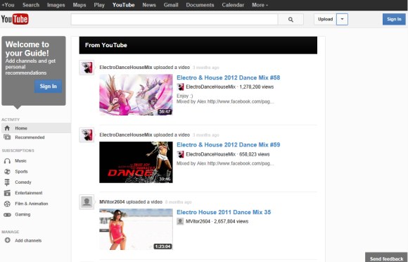
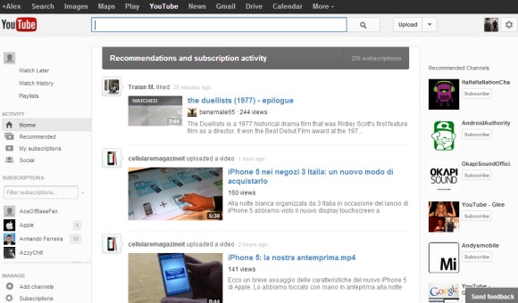
The upload button now has a drop-down that lets you go to the video manager and the analytics section, while the browse button has been removed. You can no longer go to the "inbox" from the homepage. When you click the button next to your Google Profile avatar (which is also new), YouTube sends you to the settings page, where there's a tab for the inbox.


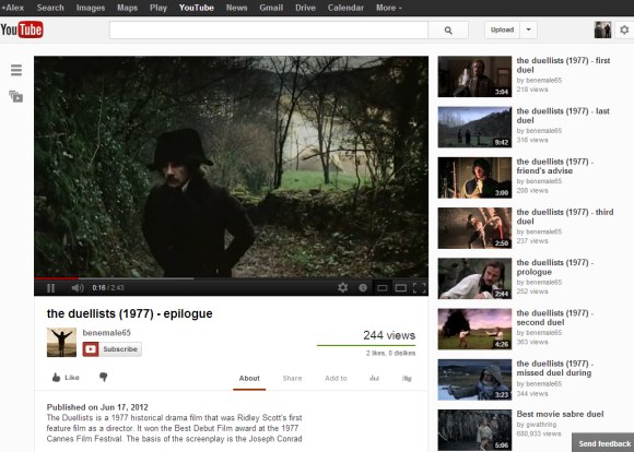
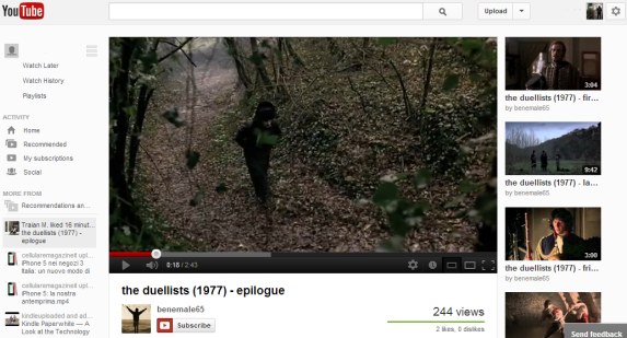
Video pages have a button that toggles the sidebar, so you can quickly access the feed, your subscriptions, the history and other sections without having to visit the homepage. It's interesting to notice that most YouTube sections have a consistent feed-like interface, whether they're displaying videos from your subscriptions, recommendations, playlists or your history.


Here's how you can try the new interface. If you use Chrome, Firefox, Opera, Safari or Internet Explorer 8+:
1. open youtube.com in a new tab
2. load your browser's developer console:
* Chrome - press Ctrl+Shift+J for Windows/Linux/ChromeOS or Command-Option-J for Mac
* Firefox - press Ctrl+Shift+K for Windows/Linux or Command-Option-K for Mac
* Opera - press Ctrl+Shift+I for Windows/Linux or Command-Option-I for Mac, then click "Console"
* Safari - check this article
* Internet Explorer - press F12 and select the "Console" tab.
3. paste the following code which changes a YouTube cookie:
document.cookie="VISITOR_INFO1_LIVE=vSPn-CmshUU; path=/; domain=.youtube.com";window.location.reload();4. press Enter and close the console.
You can also check the previous UI experiments for the homepage and "watch" pages.
Update (December 7, 2012): The new interface is available for everyone and you can no longer go back to the old layout.
{ Thanks, Pascal. }

it makes youtube left aligned on my end. i have a 30" display. this was awkward. http://imgur.com/vZKBm
ReplyDeleteMaybe they will bring the Google+ chat on Youtube...
Deleteeven with a chat bar on the left, there is still too much empty space. so much for a responsive design :)
DeleteIt look like shit -.-
DeleteI cant describe how this goes on my nerves, everything flees up to the upper right corner... ther rest is blank
looks*
DeleteExact same issue here. I understand that not everyone has such a big monitor, but left justification is a poor design choice here none the less.
DeleteAlso, the new UI has broken my favourite video looper userscript (Better Loopy for YouTube). There's no reasonable equivalent to loop videos in either the old or the new UI.
Actually, there is: http://www.youtube.com/v/VIDEOID&loop=1
DeleteI think I lose my "Favourites" list in the new interface.
ReplyDeleteIt's still there, the interface is just way worse.
DeleteFrom the front page select playlists and all playlists (including Favourites) should be visible. The UI doesn't appear to be working properly (eg. clicking the link of the name of the playlist next to the username fails for me, but clicking the "view full playlist" link takes me to the old Favourites page).
I've got no idea how to remove items from a playlist under the new UI.
On the plus side, it appears that deleted videos list both the name of the video and the reason for deletion.
How do I prevent YouTube from reverting to the standard UI whenever I restart Chrome? I want to keep the new interface and not have to paste the code in each time.
ReplyDeleteThanks!
If you don't delete the cookies or you haven't set up Chrome to automatically clear cookies when you quit the browser*, you should have the same cookie and the same interface.
Delete* paste chrome://chrome/settings/content in a new tab and make sure that "Allow local data to be set (recommended)" is enabled.
I checked that setting and Allow local data to be set was already selected. I tried clearing all cookies but when I pasted the code, the new UI is displayed but when I restart Chrome it still reverts. Any ideas?
DeleteI have the same issue.
DeleteActually, it's much easier to simply go to youtube.com, inserting the following into the browser's addressbar and pressing ENTER:
ReplyDeletejavascript:document.cookie="VISITOR_INFO1_LIVE=u8uWhAyPa3U; path=/; domain=.youtube.com";window.location.reload();
That sets the cookie without having to open the JavaScript console first. :)
You're right and that's the way JavaScript injection worked a few years ago before browser developers started to implement so many security features. Right now, if you paste that code in Chrome, "javascript:" is removed and you need to manually type it. If you paste the code in Firefox's address bar, the browser doesn't execute it. Unfortunately, developer consoles seem to be the right bet.
DeleteInsanely awesome update.
ReplyDeleteLooks like Google UX designers has not enough good and original conception ideas. It is still missing for responsiveness.
ReplyDeleteHow come this post was made on Spet 28 but it took IE9 to display it? Chrome didn't!
ReplyDeleteWell, yet another YouTube design! I kind of like it, it brings the Google nagvigation bar, but I'm not sure about the left-alignment.
I don't know about the rest of you guys but I absolutely abhor this new layout.
ReplyDeleteI want to try it, but this thing just isnt working for me. Is there any type of workaround for this? I really want to try it
ReplyDeleteYeah, the layout stopped working for me and I can't re-enable it. Wierd
ReplyDeleteSince they're experiments, they also have a time limit. I'll try to find another cookie ID that works. The post was updated 3 times with new cookie values.
DeleteWent back to old look yesterday and cookie doesn't work
DeleteThe new UI was pretty cool but the cookie is not valid anymore
ReplyDeleteTry the new cookie from the updated post.
DeleteHey, I need some help, I've done everything above, but now, when I paste the cookie to go back to the old UI, it doesn't go back to the old UI. I'm stuck in the new YouTube UI...
DeleteDo you have any idea why that is, and, how I can fix it to get it back to the normal YouTube UI?
I'd appreciate your help.
Thanks
That code only resets the YouTube cookie. If the new cookie set by YouTube is associated with the experiment, you should reset the cookie again.
DeleteYeah, it's not working man. I've repeated the steps again and again. I have deleted all of my history and every single cookie, and, even when I log into my Youtube account on another browser (without even copying/pasting the above cookies) I get the new YouTube UI... Correct me if I'm wrong, but, the cookie seems to be associated with my YT account now, if so, what have I done wrong, and, how do I fix this?
DeleteFrom what I know, the cookie ID is not associated with your account. Try a different browser, clear cookies and go to youtube.com. Do you get the old interface? If not, clear cookies again. Now log in. Do you get the new interface after logging in? I doubt it (but I could be wrong, YouTube changes all the time).
DeleteYeah, it's still not working. When I go into ANY browser, yes, I do get the old YouTube interface, at first... But, when I login to my YT account I get the new YT interface --no matter what browser I use, and, no matter how many times I clear all cookies... That is what's making me think it's associated with my YT account, the fact that; no matter what browser I use, when I login to YouTube now, I get the new YT interface.
DeleteSame problem. The funny thing is that I have 2 accounts and there linked and the one that i don't use very often has the old interface and my main one has the new one. no matter what I do i cant go back to the old interface on my main account.
DeleteYeah, logging out lets me see the new interface, but logging back in I see the old one
DeleteI'm stuck in the new UI and it won't go back to the normal YouTube page ... I get this error in the console, as well:
ReplyDeletePPB_Graphics2D.PaintImageData: Rectangle is outside bounds.
What do I do?
the new cookie is document.cookie="VISITOR_INFO1_LIVE=vSPn-CmshUU; path=/; domain=.youtube.com";window.location.reload();
ReplyDeleteIt doesn't seem to working anymore. Please update the post to the new-newer cookie please. :D
DeleteI don't like the new layout at all for the homepage. It wont filter my subscriptions with uploads only. It isn't loading chronologically. Is there anyway I can get it back to the way it was?
ReplyDeleteI really hate the new layout. When I go to YouTube I want to see my subscriptions feed first thing. I don't want to see a feed filled with recommendations and videos people have shared on Google+. I would be very happy if I was able to revert to the old layout! I do hope YouTube does revert to the old layout and soon!
ReplyDeleteThis
DeleteI can not delete my comments on the videos.
ReplyDeleteA friend of mine wont get rid of the new design as in when logged out it is the old (good) design but upon login it forces the new design (bad) examining the cookies my friends visitor_info1_live has the exact same value on mine and theirs but i have the good (old) design they the bad (new) and it is independant of browser so as it seems youtube does fore my friend to have the new design is that part of the "experiment"? to see how long it takes the average user to delete their account of they get a most displeasing design shoved up their nose? If not i would be most curios as to why my friend is no forced to this with no possiblity to revert (no matter of cookie deleting refreshing or else what changes and as mentioned the new design shows up only AFTER login). So anyone have a solution? anyone knows whats going on?
ReplyDeleteThis is terrible. The new layout is too in your face with everything. google plus only makes things worse. I can't even revert. There was NO notification I was going to be entered in this. It's like a maze to navigate through the options. They should just quit while they're ahead, and only make subtle changes.
ReplyDeleteThis time youtube outdid themselves. The worst layout ever! So dysfunctional, badly designed and not user-friendly at all. When will youtube programmers get a grip? Can't Google pay for decent programmers with all the money they have?
ReplyDeleteActually, you should blame Google, ever since they bought YouTube, it's going deeper and deeper into the shitter.
DeleteOMFG, this fucking layout must be a joke.
ReplyDeleteNowhere can I see (on the homepage) if someone have posted a comment on one of my video.
I actually need to go into the video management to check my "inbox" from there, I shouldnt need to click four different options to get my messages or comments.
I agree with you. It's a joke.. If you have switched to the updated layout it's almost impossible to get into inbox..
DeleteSeriously. i can't do anything on this new layout.. i hope those of us who don't like it aren't forced to switch over.. i didn't even want to switch over to it. i just logged on one day and it happened. my brothers youtube is just fine and normal. when i get on mine though, this happens. i can't even revert it by entering the command into the console. Plus all of the White that google seems to think we love is giving me a migraine. seriously. i don't want to get on for six seconds and have to take pills for headaches. please tell me how to permanantly fix this. i can't even see my messages anywhere...
ReplyDeleteThis whole new design is horrible..
ReplyDeleteSorry, but as a Youtube user fed up with all the changes, this is hideous. Where is the button to go to my channel? I don't want a Google+ account; I'd never even use one. Plus, my real name does NOT need to be connected to my Youtube account, ever, because just no. I don't want to have to go to some BS Google+ page every time I want to go to my inbox.
ReplyDeleteThis design is bad and whoever made it should feel bad.
ReplyDeleteThis IS the worst layout ever. I have been on youtube since before google bought it and that is saying something.
ReplyDeleteNO Browse button and all that comes with it, NO favorites, NO Easy way to my inbox, EVERYTHING is aligned left, On live stream videos... THE COMMENT BOX IN ON THE BOTTOM RIGHT OF THE LAYOUT... which makes it impossible to watch and comment live...... the list could go on and on.
PLEASE DON'T USE ME AS A GUINEA PIG AND AUTO OPT ME INTO THESE TEST. I would gladly test out new layouts and provide feedback, BUT I WANT THE OPTION TO SAY NO.
Also the code to turn it off.... DOESN'T WORK. so I am STUCK with this horrendous layout for now. PLEASE HELP
They've did this on purpose to confuse the user, or they hired monkeys to code for bananas!
ReplyDeleteBut don't worry YouTube, I'll create my own page with links from Your site, and will use your resources on my pretty new page so thank you for being an ignorant AS*HOLE!
This must be a glitch or something since it only changed on one of my accounts, the other still has the old UI intact. Hopefully it gets fixed soon seeing as how there's no god damn way to fix it yourself...
ReplyDeleteWow I love how there's no way to change it back... at least it's reassuring that it's not just me. Probably a glitch/error or something, hopefully they fix it soon...
ReplyDeleteNo way to access movies from the homepage. So much for us paying customers who actually buy content via Youtube. Pissing people off must be more important than making money.
ReplyDeleteOnce a video is watched, Youtube have removed the pop-down that gives immediate access to a handy tab of other videos from that channel. The result is that you must now click on the publisher of the video, and open another page, and manually trawl through their videos.
There is a huge blank space to the left of the video. Way to utilise space.
I hate the "Guide" feature. It keeps throwing videos at me when I prefer to access content by searching for stuff, and then clicking on related videos. I don't want "recommendations" rather than my own chosen links.
Fail.
Please google, please please please please please please please please please please please please please please please please listen to reason!
ReplyDeletePlease let us REVERT to the last layout. This new layout is so annoying to me eyes, that I may very well just leave. I can't stand it, and as I use the home page to navigate to new videos from my subscriptions, I know feel the need to rage quit the main page every single time. This is seriously one of the STUPIDEST things done. I mean seriously, is my 1080p gaming rig now a friggin mobile device that can't handle browsing a website with an intricate web layout? No! So don't force this blinding light layout upon us.
Also, way to go... I open it with ctrl shit j, enter the code to revert, reload and BAM! still the same blinding layout... Good fight me.
ReplyDeleteWOW! That code to reset it back didn't work! The new YT layout is so blinding and confusing that I might aswell peel my eyes out with a rock! SCREW THIS
ReplyDeleteOkay I just have to say as a huge Google fanboy, I really hope they don't continue with this. The layout is awful aesthetically, but mostly functionally. There's no way to sort by most-viewed! Wtf...that's definitely the feature I used most.
ReplyDelete@Stuart Anderson,
ReplyDeleteIt seems Better Loopy for YouTube is just updated a few hours ago for the new layout.
I use it often too!
The BROWSE button was the most important part of youtube and it needs to be returned to its former glory, it made all sections of youtube accessible for easy viewing. If I wanted to watch science and technology videos or news or movies I could simply click browse and go to that section to watch 100s of relevant recent videos.
ReplyDeletewhen you post to youtube you still put your videos in these sections but the section itself is no longer accessible without the browse button.
I understand the layout will constantly change but the content should not be restricted.
The new design seams to be geared towards directing people to specific content and subsequent related videos instead of offering them the chance to view whats popular throughout the world.
Without the browse feature and the related videos drop down I find myself closing the youtube homepage after a few minutes of viewing and going to other sites.
I hate the left align, and vast white space unused on the page. I really hate the guide and playlist sub-menus! Why should functions take multiple clicks to get what you want, when they used to take one click? Put the playlist bar back on the bottom of the screen, instead of blocking part of the actual video window, when there's unused space all over!
ReplyDeleteI really missed the BROWSE button. It is what made youtube, YouTube. YouTube, please understand that you became what you are because of those indie videos and 'those' indie video became indie videos, which in turn made those famous channels. It was all possible because of the browse button. Please bring it back. Thank You.
ReplyDeleteHorrible, horrible layout. And why change the last one anyway? It was good, and new. Are you planning on changing the layout every 2 month from now on? There's value in the comfort you feel when browsing a website you came to know by heart. Repeatedly changing things just for the sake of it is just irritating. And this from one of the biggest, richest software companies around.
ReplyDeleteWithout browse it is very sad. I went from watching several hours of Youtube a day to only a few minutes. I don't want to browse thousands of channels. Most channels I only watch one thing. Very difficult to watch You tube now.
ReplyDeleteAgreed - I have no desire whatsoever to "browse" channels.. screw channels. It was a pleasure to be able to browse through various videos and opt to view them. Youtube/Google now feels it is the best user experience to browse Channels? It doesn't even make sense. Very pathetic upgrade there google.
DeleteAgreed - Youtube is basically "user hostile" with this new er... upgrade. It is extremely difficult watching youtube. The Youtube/Google Design gang actually feels that forcing viewers to browse channels is the most efficient and intuitive way for users to access the millions of videos available? That approach does not even make sense. I agree, this so called upgrade is a complete and utter joke.
Deletecoz of this new design i rarely go to youtube now .....darn its just so horrible ,it really takes away all the pleasure of going random video streak
ReplyDeleteThis is garbage!
ReplyDeleteThe new design is cool, but I can't download videos to my iPhone.
ReplyDeleteThere is no way to remove that cookie; YouTube will add it back when you reload it. Wow, the blog post has foul language on comments.
ReplyDeleteAsma to find your inbox open your video manager and then look in the left hand column
DeleteOne might think that google/youtube with all their success and money would be able to provide their users with a decent interface that the user would enjoy to edit and navigate. But no. Again, HUGE failure ..
ReplyDeleteThat will be valuable to everyone who uses it, including myself. Many thanks!
ReplyDeletehappy FRIENDSHIP day
new year 2017 wishes
oneliner birthday quotes
Christmas Greetings Messages
short christmas Wishes
Basketball Quotes
teachers day quotes
kris jenner instagram
happy Janmasthami 2016
ReplyDeleteJanmasthami 2016 Images
Janmasthami 2016 SMS
Janmasthami 2016 Wishes
happy Rakha Bandhan 2016
Raksha Bandhan 2016 Quotes
Raksha Bandhan 2016 Images
Raksha Bandhan 2016 message
Raksha Bandhan 2016 Wishes
Raksha Bandha 2016 Whatsapp Status
Raksha Bandhan 2016 Greetings
Raksha Bandhan 2016 Cards
Raksha Bandhan 2016 Wishes For Brother
Raksha Bandhan 2016 SMS
Raksha Bandhan 2016 Message For Sister
Raksha Bandhan 2016 Whatsapp Message
Raksha Bandhan 2016 Message For Brothers
Raksha Bandhan 2016 Greetings For Sisters
When is Raksha Bandhan 2016?
Raksha Bandhan Quotes In Hindi 2016?
Raksha Bandhan Quotes message 2016
Raksha Bandhan Quotes wishes 2016
Raksha Bandhan pics wishes 2016
happy labor Day 2016
ReplyDeleteLabor Day Wishes 2016
Labor Day SMS 2016
Labor Day Quotes 2016
Labor Day Images 2016
Labor Day Wallpapers 2016
Labor Day Message 2016
Labor Day Slogans 2016
Labor Day Greetings 2016
Labor Day Wishing Quotes 2016
Labor Day Poems 2016
Labor Day Songs 2016
happy Teachers Day 2016
Teachers Day Images 2016
Teachers Day Message 2016
Teachers Day Quotes 2016
Teachers Day Wishes 2016
Teachers Day SMS 2016
Teachers Day Wallpapers 2016
Teachers Day Pictures 2016
Teachers Day Greetings 2016
Teachers Day Poems 2016
Teachers Day Wishing Quotes 2016
Teachers Day Songs 2016
happy Labor Day
ReplyDeleteLabor Day Images 2016
Labor Day Wallpapers 2016
Labor Day Quotes 2016
Labor Day Greetings 2016
Labor Day Message 2016
Labor Day SMS 2016
Labor Day Poems 2016
Labor Day Wishes 2016
happy Ganesh Chaturthi 2016
happy Ganesh Chaturthi 2016 SMS
happy Ganesh Chaturthi 2016 Wishes
happy Ganesh Chaturthi 2016 Message
happy Ganesh Chaturthi 2016 Quotes
happy Ganesh Chaturthi 2016 Images
happy Ganesh Chaturthi 2016 Wallpapers
happy Ganesh Chaturthi 2016 Greetings
happy Ganesh Chaturthi 2016 Poems
happy Ganesh Chaturthi 2016 Bhajans
happy Ganesh Chaturthi 2016 Whatsapp Status
happy Ganesh Chaturthi 2016 Wishing Quotes
happy Ganesh Chaturthi 2016 Pictures
happy Ganesh Chaturthi 2016 Photos
happy Ganesh Chaturthi 2016 SMS Wishes
happy Ganesh Chaturthi 2016 Message In Marathi Gujarati
happy Ganesh Chaturthi 2016 wishes quotes
happy Ganesh Chaturthi 2016 wishes message
ocean of games installation video
ReplyDeleteskyrim free pc download
Minecraft Free Download
Download atlantis quest
ReplyDeleteocean of games
hitman absolution Download
ReplyDeletevalentines day quotes 2017
valentines day poems 2017
valentines day week list
happy holi wallpapers 2017
happy mothers day wallpapers 2017
happy holi wishes
happy halloween day 2017
jimdo
ReplyDelete
ReplyDeletevalentines day 2017 quotes
valentines day 2017 quotes for facebook
promise day quotes 2017
tinder without facebook
valentines day cards
Happy Mothers Day 2017 Pictures
ReplyDeleteHappy Mothers Day 2017 Poems
Happy Mothers Day 2017 Images
Happy Mothers Day 2017 Wishes
ReplyDeletevtutu apk download
vtutu apk download
Hey Readers must Read Following posts on The Constructor Powered By Pro Civil Engineer Civil Engineering Interview Questions Concrete Slump Test – Procedure, Applications & Types of Slump Field Density Test Cracks in Wall - Cause and Repair What is Pier foundation ??
ReplyDeleteyou can the same topic here
ReplyDeletehttps://www.my9apps.com/
or
www.my9apps.com/
ReplyDeletehappy easter pictures download
easter egg images
Happy easter images 2017
ReplyDeletekkr squad list
rcb squad list
mi squad list
dd squad list
srh squad list
Have Lovely and Beautiful Salwar Suit And Many More…
ReplyDeleteWe Have Some For You In Your Budget For more…
Plz visit:- Bridal Lahenga
galaxy note 4 usb debugging
ReplyDeleteThanks for share
extratorent
ReplyDeletewhatsapp group names
ReplyDeleteExclusive Collection of Gown and Best Outfits For Young ladies,Womens and Girls
We Have Some For You In Your Budget For more…
Plz visit:- SilkSaree
Designer Salwar Kameez is perhaps the desire of every single girl in this world to look amazing on her wedding day.
ReplyDeleteIt is certainly important that the bride must be the star of the show.The most beautiful woman at the wedding venue.
In India,Salwar Kameez are the most obvious choice for the young Ladies and Girls.There are many designer Salwar Kameez in our site...
For more...
Plz visit:- Salwar Kameez
The Contemporary style of Punjabi suits exclusively available on Stylizone does offer picturesque of luxury, royalty and elegance. Be it flaring or twirling Ghera dress, with the simple clicks thousand of new styles and patterns are available.
ReplyDeleteDesigner Embroidered Lehenga