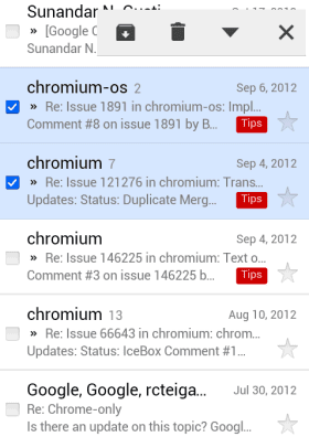
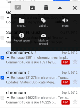
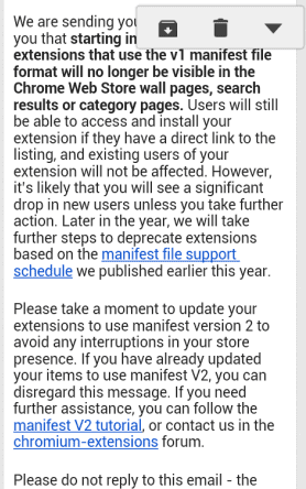
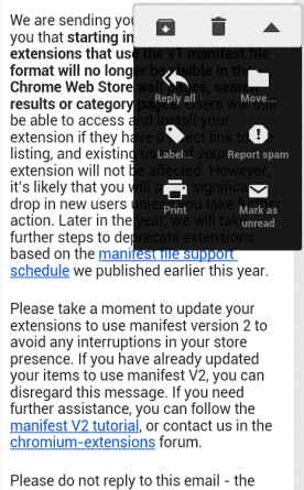
Here's the new interface that's currently tested (stock Android browser):
And here's the regular interface (mobile Chrome):
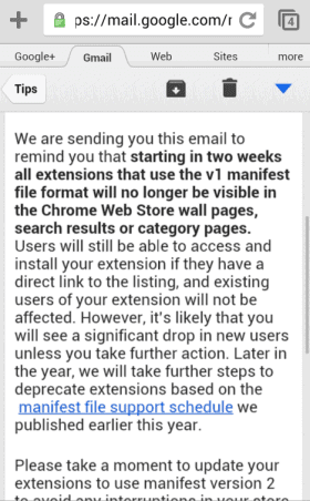
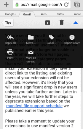
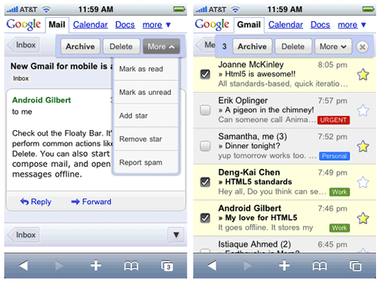
As you can see, the Gmail mobile site goes back to the roots. Back in 2009, Google added a similar bar to the mobile site: "We made extensive use of other browser functions too: for example, the floaty bar that lets you archive, delete or apply more actions is animated via CSS transformations and controlled in part with touch events (when you scroll the screen, it follows you)."

No comments:
Post a Comment
Note: Only a member of this blog may post a comment.