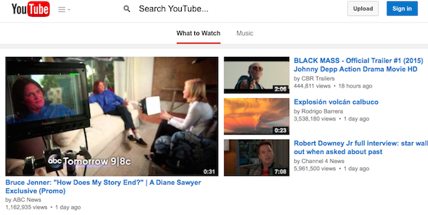
YouTube tests a new search UI for the desktop. The experimental search box uses a small magnifying glass icon and adds this text: "search YouTube", so that users know it's an actual search box.
The new search box is gray and has a special "Enter" icon, just in case you don't like the keyboard key.
Back in April, YouTube tested
a plain white search box.
{ Thanks,
Giorgio Marinelli. }


It would be nice if Google would "experiment" more with the search box on the iOS Youtube app. For some time now you need to tap the very small magnifying glass instead of the whole search box. This is very annoying.
ReplyDelete