An unofficial blog that watches Google's attempts to move your operating system online since 2005. Not affiliated with Google.

Send your tips to gostips@gmail.com.

May 20, 2015

Tweets in Google Search: the End of the Google+ Era

Google announced that it will start to display tweets in Google Search for mobile. "When you're searching on the Google app or any browser on your phone or tablet, you can find real-time content from Twitter right in the search results," informs Google.

There are two Twitter-related cards. One of them shows popular tweets related to your query and it's only displayed for news-related searches.


The second card enhances Twitter results with recent tweets. For example, when you search for [nasa twitter], Google displays the most recent tweets, including those that were posted a few seconds ago.


Basically, Google has access to Twitter's Firehose API once again, 4 years after Google Real-Time Search was discontinued and Google+ was launched.

Twitter's blog says that "the desktop web version is coming shortly, and we have plans to bring this feature to more countries in the coming months." Right now, this feature only works in the US. "By deeply integrating Twitter’s real-time content into Google search, we hope you find it easier than ever to explore your interests across both Twitter and Google."

It's the end of the Google+ era. Even if Google+ will continue to exist in one way or another, Google will stop promoting it aggressively and will probably use it as a backend service. Bloomberg reports that Google "is set to reveal an online picture sharing and storage service that will no longer be part of the Google+ social network" and "will let users post images to Facebook and Twitter".

More Related News in Google's Mobile App

I'm not sure if this is a new feature, but Google's search app for Android shows a list of recent articles from a news site below some search results. The list uses big thumbnails and you can swipe right to find more articles.


For examples, searches for [sports], [weather], [obama] trigger the visual list of recent articles.


Google shows related news articles.


This feature also works for news-related YouTube videos.


May 17, 2015

Material Design Update for Google Product Forums

Google Product Forums have a new interface that uses Material Design. "Our new design is focused on making it easier for you to find the answers you need and ask questions across all Google Product Forums," informs Google.


The new interface has removed display density settings and topic list options. Unfortunately, the new interface for topic lists uses a lot more space, so you'll see fewer topics in the same space. Here's a screenshot that compares the old UI with the new one: 12 topics vs 3 topics using the same window size. The compact view is no longer available and Google now shows the entire title of the topic, followed by a snippet from the first post and some information about the author, the number of posts and views.


To star a topic from the list view, you need to select it and use the Actions menu (or you can use the 's' keyboard shortcut). Now you can select multiple posts and star them or mark them as read.


Topic pages use more white space, bigger thumbnails and have some new buttons that let you jump forward or backward a few posts and go to the top or bottom of the page.


Many features from the old interface have been removed. I couldn't find a way to switch to the tree view or paginated view, to collapse or expand all the posts. You can only vote up a post, the downvote feature has been removed.

Google uses a funny message which lets you know that you can go back to the old interface: "Welcome to the new version of Google Product Forums! You can switch to the old design if you'd like (but really why?)."

{ Thanks, Mukil Elango. }

May 14, 2015

Google Play Music for Desktop Has a New Interface

Google Play Music's web app switched to Material Design and has a new interface that closely resembles the mobile UI. The left sidebar is now a hamburger-style menu, photos are bigger, there's more white space and everything looks like a mobile app stretched out to fit a much bigger screen.


"We're moving towards making the web feel more like an app and less like a series of web pages strung together by links," said Google UX designer Bryan Rea. "The new header, the slick transition as you scroll, the collapsible nav, new animations, these all feel like things you expect in an app not on the web. For the increased focus on big, immersive artwork, when you're listening to music, you can get lost in it (in a good way). With the new album and playlist pages, you enter an immersive world focused on the music you're enjoying."

YouTube Discontinues Collections

YouTube had a feature that allowed you to group subscriptions and create collections. This feature will soon be removed: "on 5/20/15, we'll discontinue Collections, as we'll focus on other efforts to make your subscriptions more enjoyable."


"A collection is a group of subscriptions you can create to help you organize and view content from the channels you're subscribed to. Collections can be created by themes (like 'basketball' or 'music')," explains YouTube.


Collections could be created, deleted and edited from the subscription manager. In many ways, YouTube collections were just like folders in a feed reader.

If you want to use a feed reader to manage your YouTube subscriptions, you can export them to OPML and import the file into your favorite feed reader. Open the subscriptions manager, scroll down to the bottom of the page and click "Export subscriptions". Another options is to use this link.

YouTube Switches to Roboto

After a few months of experiments, YouTube changed its font from Arial to Roboto. In addition to Android, many other Google apps and services use Roboto, a typeface designed in-house at Google by Christian Robertson.

Here are some screenshots from Firefox for Windows:


I've switched back to Arial and got this GIF animation:


Here's a screenshot from Chrome for Windows: it looks quite different.


Browsers like Firefox and Chrome show a lot of information about fonts: you can select some text, right-click, pick "inspect element", switch to the Fonts or Computed tab and find the fonts that are used.


9to5Google.com says that "the font comes in several weights, but the one Google has gone with is slightly lighter than what users may be used to compared to the Arial font. This will surely lead to some complaints about it being harder to read".

May 12, 2015

New Gmail Login Page

Gmail has a new login page. When you first sign in, Google only asks you to enter you email address. Click Next to enter your password and Google might show your name and your Google+ profile photo.


It's not clear if Google only shows the name and the profile photo for your Gmail accounts. I tried various email addresses and Gmail only displayed a generic image.


{ Thanks, Maurice Wahba. }

May 11, 2015

Google Translate Community Uses Material Design

Google Translate Community has a new interface powered by Material Design. It's a site that helps Google improve the quality of Google Translate. "Your help will enhance translations for millions of users," informs Google.

The new interface is more colorful and uses more images. There's a hamburger-style menu, a section that shows your stats and the badges you've earned. You can select 2 to 5 languages, including a few languages that aren't yet available in Google Translate like: Cantonese, Cherokee, Corsican, Tibetan, Guarani, Hawaiian and more. Then you only need to translate some phrases or rate translations.


Google also offers a simplified version of the Translate Community site, which uses the old interface.

May 8, 2015

New Menu for Desktop Google Maps

If you like Google Maps' mobile apps for Android and iOS, there's a good news: the desktop site now has a similar interface. The search box has a small icon for directions and another icon for the navigation menu, which lets you enable layers for satellite imagery, traffic, transit, bicycling, terrain, use My Maps, share maps, print maps and more.


The new hamburger-style menu adds features that were previously scattered in at least 4 other places: 2 menus at the bottom of the page, a satellite thumbnail and the search box.


Here's the old interface: the "getting around" card for layers, a small thumbnail for switching to satellite imagery (still available in the new UI), a help menu and a gear menu for sharing maps, Google Web History and search settings.


Another change is that you can switch to the lite mode, which replaces the old Google Maps:

Google Removes Reading Level Filter

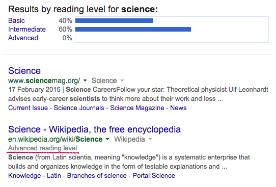
Last month, Google removed search filters for visited page. Now it's time for a new advanced search feature to be removed: reading level. This feature was introduced back in 2010 to let you find search results that are better suited for you. "Sometimes you may want to limit your search results to a specific reading level. For instance, a junior high school teacher looking for content for her students or a second-language learner might want web pages written at a basic reading level. A scientist searching for the latest findings from the experts may want to limit results to those at advanced reading levels," explained Google.

In February, I noticed that the reading level feature had a bug and no longer allowed you to restrict results to "advanced reading level" pages. Instead of fixing the bug, Google removed yet another advanced search feature.


Reading level is no longer available in the search tools dropdown or in the advanced search page. Verbatim is the only remaining filtering option and I'm sure it will be removed soon. Hopefully, Google won't remove time filters, which are more popular and easier to understand.


Here are some screenshots from last month: