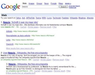
 Google tests another interface for search results. You can already see for some top results a list of three or four important pages from that site.
In this experiment, Google shows the links on separated lines and displays the URL the same way it does for standard results. Google knows that 62 percent of search users click on a link within the first results' page and most only on the top result.
Disclaimer: the line "Try your search on Yahoo, Ask, ..." was generated by a Firefox extension - CustomizeGoogle.

A French guy found the same few days ago.
ReplyDeleteScreenshot here
(and post here)
Never want to post the cookies?
ReplyDeleteI couldn't repeat this, so the cookie wouldn't be useful.
ReplyDeleteThe previous comment was mine :)
ReplyDeleteIt is strange to all of a sudden see an image of a google search page having a website made by myself as first reference (especially since it is in Dutch!).
ReplyDeleteI think it's even more strange that you found this site.
ReplyDeleteI was searching for latin expressions that use "nescio" (like "Nescio, sed fieri sentio et excrucior").
It appears ugly. Especially the extra spacing between the lines. I typically do not like just the first link.
ReplyDeleteMichael Hosting